General Information
Thank you for purchasing our theme. We are happy that you are one of our customers and we assure you will not be disappointed. We do our best to produce top notch themes with great functionality, premium designs, and clear code.
Attention! This documentation file is for theme versions 2.0.0 and above!
If you want to view the documentation file for theme versions 1.6.0 and lower, please click here.
License
With ThemeForest regular license you are licensed to use this theme to create one single End Product (the final website customized with your content) for yourself or for one client.
What is allowed with the single regular license:
- You can create 1 website (on a single domain) for yourself or for your client. You can then transfer that website to your client for any fee. In that case, the license is also transferred to your client.
-
You can install the theme on your test/development server for testing/development purposes (this installation should not be available to the public).
As soon as the project is ready for moving to another domain (create the backup to be on the safe side), please disconnect the license and activate the theme on another domain.
Development installation will still be functional except for importing/exporting demo data. -
You can have ONE active theme installation at a time. You can move the license to a different domain by "disconnecting the license" from the active theme installation and then re-entering the purchase key/token on a different WordPress installation.
For Envato Elements, if you want to activate another theme or install the same theme on a new domain, please generate a new token (1 token = 1 domain).
The number of theme activations (with ONE purchase key or ONE Envato Elements token) is LIMITED! - You can modify or manipulate the theme, you can combine it with other works to create the End Product.
- The theme updates for the single End Product (website) are free.
What is not allowed:
- With a single regular license you are not allowed to create multiple websites. For multiple websites you will need multiple regular licenses.
- To resell the same website (Single End Product) to another clients. You will need to purchase an extended license for this.
For more information regarding license regulations and policies, see the links below:
XD Files & Images
IMPORTANT! We do not include theme-related .XD files into the theme package, because it significantly increases the theme archive size. If you need those files, feel free to submit a support request.
All the clipart images included in this theme are copyrighted to their respective owners and are not available for download with this theme. Clipart images can not be used without express permission from the owner and/or need to be purchased separately.
Nevertheless, you can request the clipart-related image IDs/references and .XD files by contacting our support department.
Bundled Plug-ins
The theme package contains a number of bundled plug-ins. Please click here to view the list of plug-ins that come included into the theme.
If a new version of a bundled plug-in is available, it will be included in the next theme release. You can also request it by submitting a support ticket.
Bundled plug-ins are fully functional without the activation using a registration license key. In case you are willing to receive automatic updates and support from the plug-in team, you will need to purchase the plug-in separately. Only the direct buyers get the plug-in license key.
Help and Support
Support Policy
In order to receive a technical support assistance, you need to have a valid purchase code. To get the code, please navigate to your ThemeForest "Downloads" page and click on the theme download link. Check this guide for more details.
PLEASE NOTE! As authors of this theme we do provide support only for the theme-related features.
We do not provide support for additional customization, 3rd party plug-ins integration or any other compatibility issues that might arise. Nevertheless, there is an exception that is only applied to the plug-in(s) we have developed and integrated ourselves.
If you have any questions that are beyond the scope of this help file, feel free to contact us. We will respond as soon as possible (within 24 – 48 hours, usually faster). We are open from 10am to 7pm (CET), from Monday till Friday.
Please be aware that some questions are posted on our website in "Common Questions" section. So, before submitting a new ticket, please try searching our website for an answer, as well as checking our Video Tutorials and Articles. Our website has its own inner search and also has been indexed by Google, so if you can not find your answer with our website search, it is worth typing it into Google too. Please make sure you have looked at all the available resources before submitting a support request.
Third-party Extensions
Unfortunately, we do not provide support for third-party extensions. Please contact the author of the extension if needed. If you feel that you might have troubles with installing an extension, we advise you to order a professional installation service.
Articles & Video Tutorials
For more information regarding the theme's functionality, we suggest checking our Video Tutorials and Articles.
The most popular video tutorials:
Installation
WordPress Information
To install this theme you must have a working version of WordPress already installed. Below are some useful links regarding WordPress information.
- WordPress FAQ - General information about WordPress.
- WordPress Lessons - A great knowledge-base for WordPress beginners.
- PHP Function References - Detailed information on WordPress PHP functions and a lot of usage examples.
Theme Requirements
To use this theme you must be running at least WordPress 5.0, PHP 5.6.20 or higher (for Booked and WooCommerce plug-ins PHP 7.0+). If you use a hosting service with limited resources (e.g. GoDaddy!), you may experience issues with the "one-click" demo data installation.
We recommend that you contact your web hosting service provider to make sure that your server PHP configuration limits are as follows:
-
max_execution_time 600 -
memory_limit 128M -
post_max_size 32M -
upload_max_filesize 32M
If you are running unmanaged dedicated server or VPS,
you should check your php.ini file. Alternatively, you can edit .htaccess file in the root of your website and add the following values:
-
php_value max_execution_time 600 -
php_value memory_limit 128M -
php_value post_max_size 32M -
php_value upload_max_filesize 32M
Setting these values will ensure you will not get error messages during the installation. To safeguard your website, please use secure passwords and the latest version of WordPress and plug-ins.
Here is the list of web hosting service providers we recommend:
- Bluehost (Exclusive Offer for our Customers: -70% OFF)
- SiteGround
- InMotion Hosting
Theme Installation
Unpacking the theme
Before installing the theme, please make sure you unpacked the archive and extracted the theme files. Some of the folders names may slightly vary. Treat the screenshot below as an example only.
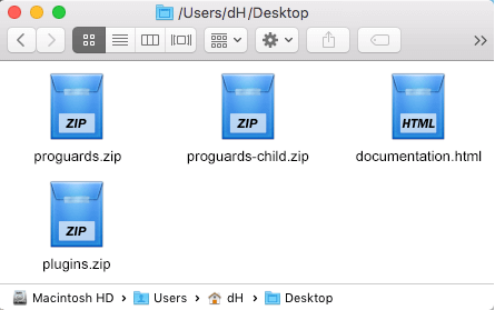
The main package contains archives with the main theme, child theme, documentation and bundled plug-ins.
If you try to install the wrong files, you will get the missing style.css error. This is the most common error that means you are trying to install an incorrect package.
In order to install the theme, you need to have a working version of WordPress installed on your server first. Check out this guide for detailed information on how to install WordPress. We also highly recommend updating your WordPress to the latest stable version.
Below you can find a video tutorial on how to install the theme.
There are 2 ways to install the theme:
- via FTP:
- Log into your web server with FTP client software.
-
Unzip the
proguards.zipfile and ONLY use the extracted/proguardstheme folder. -
Upload the extracted
proguardstheme folder into/wp-content/themes. - Navigate to the Appearance > Themes tab and activate the theme.
- via WordPress admin panel:
- Log into the WordPress admin panel.
- Navigate to Appearance > Themes and click on Add New and Upload Theme.
-
Select the
proguards.zipfolder and click Install Now button. - After the successful installation, click on Activate or navigate to the Appearance > Themes and click on Activate button to activate the newly installed theme.
- Install and activate ThemeREX Addons plug-in.
-
Enter your Purchase Code or Envato Elements Token and some personal information. Theme activation allows you to get access to plug-ins, demo content, support and updates.
To get the purchase code, please navigate to your ThemeForest "Downloads" page and click on the theme download link. Check this guide for more details.
In case you have downloaded the theme from Envato Elements, please view our guide to find out how to generate Envato Elements token.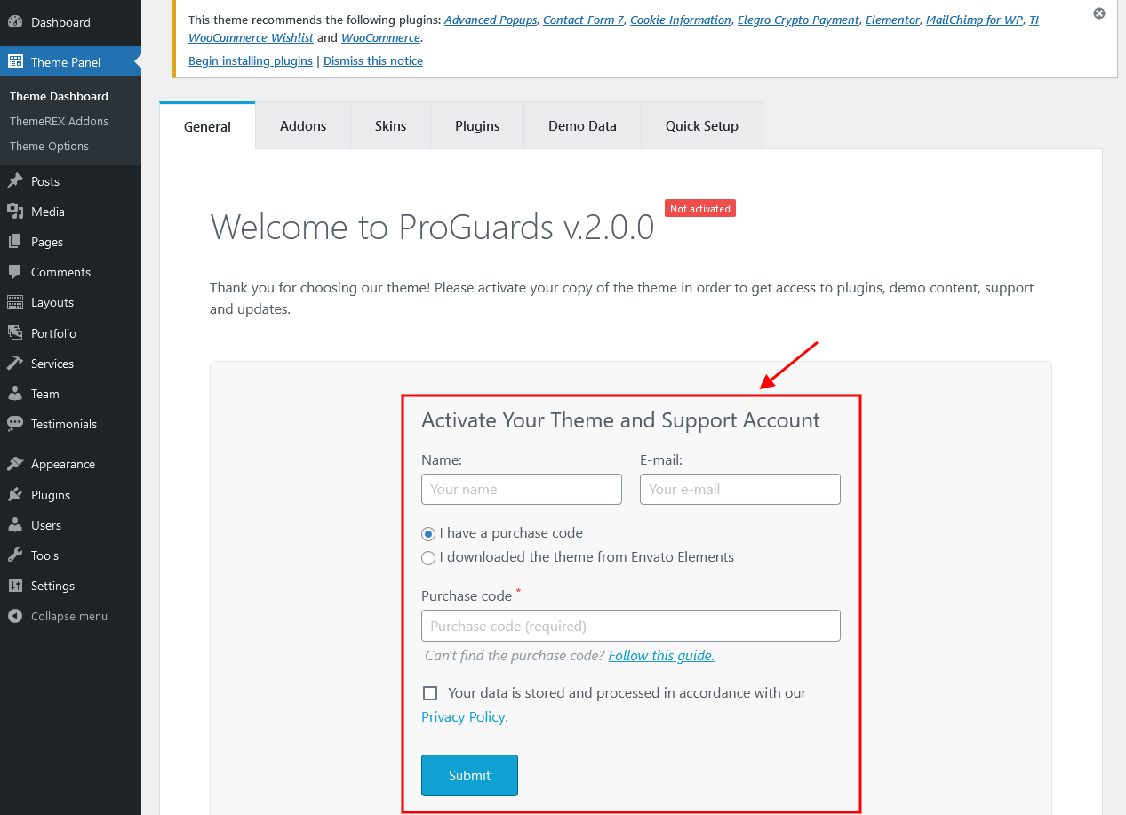 IMPORTANT! The number of theme activations (with purchase code/Envato Elements token) is LIMITED! For Envato Elements, if you want to activate another theme, please generate a new token (1 token = 1 domain). Anyway, you are allowed to activate your theme locally or on the dev server and then move the theme to the main domain. Please feel free to contact our support department if any issues arise.
-
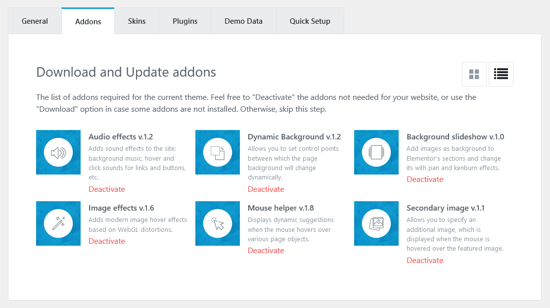
Make sure the required Advanced Theme Add-ons are active. You can find the description of each add-on here.
You can also watch our video tutorial on how to install a WordPress theme.
Attention! If you want to make changes in theme’s templates or functions, we strongly recommend activating a child theme before demo data installation. Please see the Child Theme section for more information.
The theme license allows you to install the theme on ONE domain only! In order to connect the license to a different domain, first click "Disconnect domain" (Theme Panel > Theme Dashboard > General) and then re-enter the purchase key/token on a different WordPress installation. For Envato Elements, if you want to activate another theme or install the same theme on a new domain, please generate a new token (1 token = 1 domain). If you have any questions, please contact our support department.
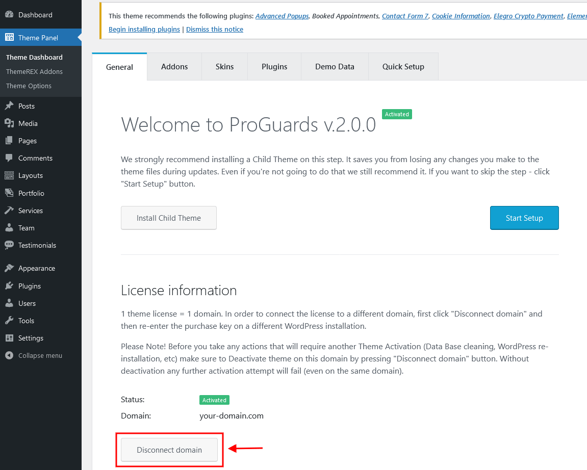
Attention! Before any manipulations that will require re-entering the purchase key/Elements token even on the same domain (e.g: WordPress reinstallation or cleaning the database), please FIRST disconnect the domain!
Plug-ins Installation
Below is the list of the plug-ins that come included into the theme.
Some of these plug-ins can also be installed from the WordPress.org repository.
- Advanced Popups
- Booked Appointments
- Contact Form 7
- Cookie Information (formerly WP GDPR Compliance)
- Elegro Crypto Payment
- Elementor (required)
- MailChimp for WordPress
- Slider Revolution
- ThemeREX Addons (required)
- ThemeREX Updater
- TI WooCommerce Wishlist
- WooCommerce
You can find a detailed overview of each plug-in in the Plug-ins section of this documentation file.
There is only one required plug-in for proper theme functioning, and that is ThemeREX Addons. The rest of the plug-ins are recommended for installation, but not required.
To make the theme look exactly as on the demo page, you would need to install the recommended plug-ins:
-
After the installation/activation of ThemeREX Addons plug-in and theme activation, you will see a prompt with a list of plug-ins to install. Click on the Begin installing plugins link or go to Appearance > Install Plugins.

-
Check the plug-ins you want to install, select the Install option and click Apply. Installation may take a few minutes, please be patient and do not refresh the page.
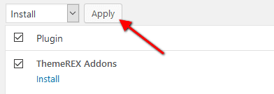
- Now, activate the plug-ins. Go to Appearance > Install Plugins, check all the listed plug-ins, choose Activate option and click Apply.
In case you are running a shared hosting with limited resources (e.g. GoDaddy), we do recommend enabling only the essential plug-ins (e.g. ThemeREX Addons, Elementor) and disable the rest. Otherwise, it may significantly increase the memory consumption, which might lead to unwanted issues.
PLEASE NOTE! The installation and activation of bundled plug-ins run automatically. Anyway, if you have any issues, please extract plugins.zip archive (from the theme package) and proceed with the plug-ins installation manually.
Gutenberg Compatibility
Our theme is compatible with Gutenberg page builder. You can create new pages using this editor, though you can still use pre-built custom header and footer layouts.
All existing demo pages and layouts are built through Elementor Page Builder and should be customized via Elementor ONLY.
PLEASE NOTE! It is possible to switch between the page builders. Please use One page builder for creating/customizing One particular page/post/layout.
Child Theme
If you want to make changes to the theme's files and functions, we strongly recommend installing a child theme. This ensures that your theme customizations stay in place after the theme update. If you are not planning to change the core theme files, you are free to skip this chapter.
IMPORTANT! Install the child theme before importing the demo data. Otherwise, all of your theme options will be reset.
A child theme is installed the same way you install a parent theme. Locate the proguards-child.zip file in the theme package and upload it via the WordPress admin panel. Alternatively, you can unzip it and upload via FTP (see main theme installation chapter).
Using a Child Theme
Your child theme has its own functions.php file. Use it to copy modified functions from the parent theme's functions.php, or register new functions.
You can copy all files from the parent theme into the child theme except files located in the following folders:
-
/includes -
/plugins -
/theme-options -
/theme-specifics
In the /front-page folder, you can copy all files except front-page.options.php.
If the file you want to edit is in one of these folders, you need to copy the required function from that file, and register it in the child theme's functions.php.
The rest of the files can be copied and edited directly in the child theme folder.
When copying parent theme files into the child theme, preserve the original folder structure. Create respective folders and make sure that the file path is the same as in the parent theme.
Demo Content
Our theme includes a simple One-click demo data installation, which allows your site to look exactly as on the theme demo.
Before installing demo data, please make sure you have activated your theme copy (entered the purchase code or Envato Elements token in the WP Dashboard > Theme Panel > Theme Dashboard > General tab) and installed all the required plug-ins. Check the Plug-ins installation section for more information about the required plug-ins.
In case you do not have your Purchase Code, please navigate to your ThemeForest "Downloads" page and click on the theme download link. Check this guide for more details.
To generate Envato Elements token, follow the link from your WP admin panel. Please view this guide for more information.
IMPORTANT! Our theme supports RTL text direction (compatibility, without rtl-demo content)! Please FIRST choose the correct language in your WordPress settings (Dashboard > Settings > General > Site Language), then proceed with the demo data installation.
Our theme contains RTL styles. The page content should be manually adjusted for RTL text-direction using Elementor settings (e.g. changing the alignment of icons, etc).
In order to import the demo content go to Theme Panel (WP Dashboard) > Theme Dashboard > Demo Data.
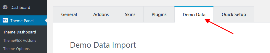
On the page that showed up set the required parameters.
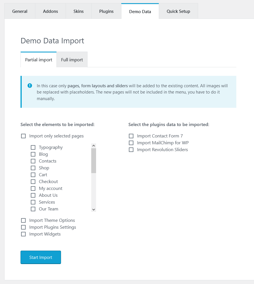
Partial Import
When choosing the partial demo data import, the new content will be added to your existing data.
Although this will not overwrite your existing content, we still recommend backing up your website before doing this.
Note, that the pages are imported without the original images. Instead, the image placeholders are used. This is done to keep your existing content intact.
Import separate pages means that you receive the page structured like on our demo, just widgets set that requires further customization: you should replace demo categories/post ids with your own ones.
Full Import
When choosing this option, all the existing content of your website will be lost and replaced with the new data. We recommend using this option for new WordPress installations only.
Use the full import option if you want to have an exact copy of the theme demo. It enables you to import all media files, pages, theme options, and plug-in settings.
Some plug-ins increase the memory consumption. For example, BuddyPress and bbPress (not included into the theme's package) require additional 60-80Mb. If you are having trouble installing the demo data, deactivate massive plug-ins and try again.
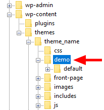
In case demo data installation is stuck and you see "Error load data from the file ... " error message, you can manually install it by downloading the default.zip archive with demo data from our server. The archive should be unzipped. Then create demo/ folder in wp-content/themes/proguards/ directory and copy /default folder to wp-content/themes/proguards/demo.
Treat the screenshot below as an example only. The list of folders inside a theme package may vary.
If the issue persists, please contact your hosting service provider to make sure that your server configuration meets the Theme Requirements. Otherwise, please refer your request to our support department.
Installation FAQs
- Contact your web hosting service provider to increase your
upload_max_filesizeto80M. - Upload the extracted theme package via an FTP client to
wp-content/themesdirectory.
memory_limit. You can increase memory_limit on your server in several ways, namely by editing:
- wp-config.php file:
define('WP_MEMORY_LIMIT', '128M'); - php.ini:
memory_limit = 128M; - .htaccess file:
php_value memory_limit 128M;
mbstring PHP function in server settings. The function is needed for some languages, such as Japanese, Chinese etc. In case you can not enable the settings, please contact the support team to get assistance with disabling the function in the theme.
wp-config.php file and add the following lines after database information:
define( 'FS_METHOD', 'direct' );define('FS_CHMOD_DIR', 0770);define('FS_CHMOD_FILE', 0660);
max_execution_time 600memory_limit 128Mpost_max_size 32Mupload_max_filesize 32M
Then re-import demo data - it will be successful. In case you still have any issues, please contact our support team.
Theme Update
This step is required if you received the notification that a new version of the theme is available. You can see this information in Changelog section at the bottom of the item's details page.
Before you go ahead with the update make sure to backup your old theme's folder. Download it to your computer locally.
Update your version to 2.0.0 (for versions 1.6.0 and lower ONLY!)
IMPORTANT! Theme version 2.0.0 is built using NEW page builder, that is why all old shortcodes ([trx_section], [trx_chat], [trx_columns], etc.) WILL NOT work any more. You should reassemble all existing content through Elementor page builder. In case you prefer WPBakery Page Builder, the set of shortcodes will be limited to default WPBakery Page Builder's shortcodes.
Please follow the steps below in order to update your version properly:
- Make FULL BACKUP of your website database. You can also export your content as an
xmlfile. Navigate to Tools (WP Database) > Export, choose "All content" and click on "Download Export file" button. - Deactivate "ProGuards Utilities" plug-in before deactivating the theme or uploading a new theme version!
- Create the backup of the theme folder
wp-content/themes/proguards. You may download it to your desktop or simply rename the folder. - Proceed to Appearance > Themes, deactivate the old theme version, delete it, upload the new one (version 2.0.0) and activate it.
Please check the website after the theme activation. As you can see all the content should be setup again. In case you decide to revert to the previous theme version, just upload your old theme version. All content, shortcodes and theme settings will remain the same. - Install and activate ThemeREX Addons plug-in.
-
Enter your Purchase Code or Envato Elements Token and some personal information. Theme activation allows you to get access to plug-ins, demo content, support and updates.
To get the purchase code, please navigate to your ThemeForest "Downloads" page and click on the theme download link. Check this guide for more details.
In case you have downloaded the theme from Envato Elements, please view our guide to find out how to generate Envato Elements token.
-
Install and activate recommented plug-ins in Appearance > Install Plugins or just click on the Begin installing plugins link.
- Import demo content by navigating to Theme Panel (WP Dashboard) > Theme Dashboard > Demo Data.
In case you want to preserve your previous content, we recommend you using "Partial import" option. In this case the new content will be added to your existing data.
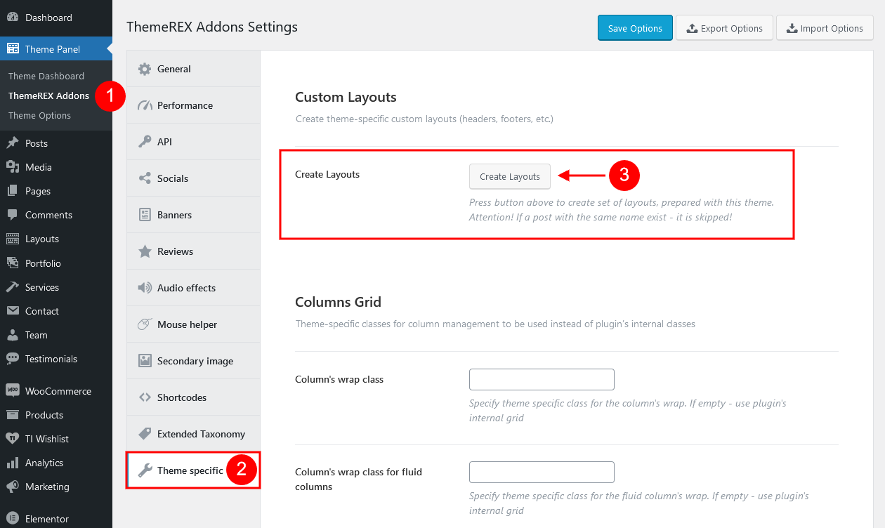
You can generate pre-built header/footer layouts in Theme Panel > ThemeREX Addons > Theme Specific > Create Layouts.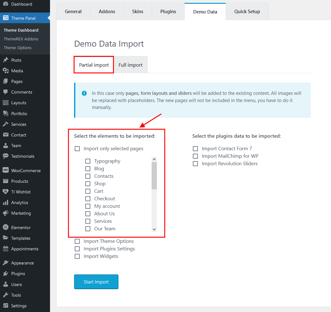
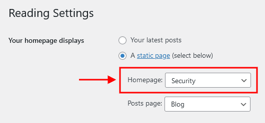
- Proceed to the Settings (WP Dashboard) > Reading section to set new page as a homepage.
- Please insert all page content (images, text, etc.) through Elementor page builder.
Update Option 1. Update using the ThemeREX Updater plug-in
- Please make sure the ThemeREX Updater plug-in is installed and activated. This plug-in is provided with the theme.
-
Optional! If you have activated your theme copy (entered the purchase code or Envato Elements token in the Theme Panel (WP Dashboard) > Theme Dashboard > General tab) you can omit this step.
Otherwise, navigate to Appearance > ThemeREX Updater and enter your purchase code to get the latest versions of bundled plug-ins and theme updates through the WordPress admin panel. To get the code, please navigate to your ThemeForest "Downloads" page and click on the theme download link. Check this guide for more details.
Please note, this section requires a purchase code ONLY! Envato Elements token will not work here!
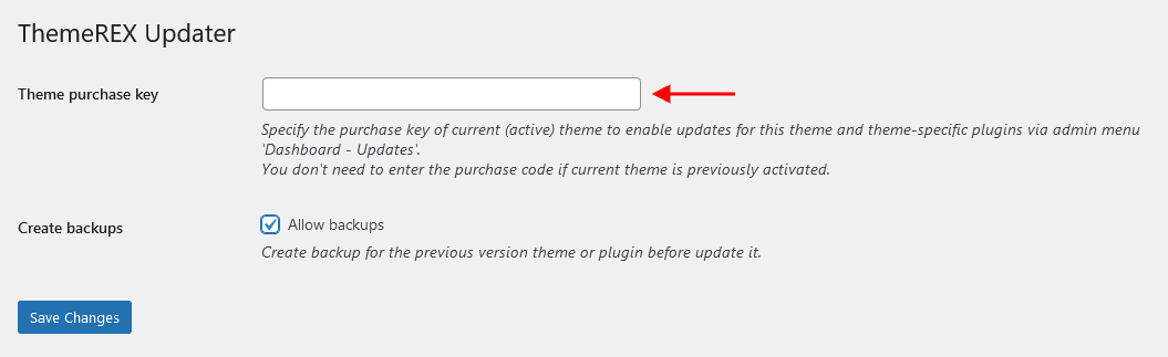
- We recommend you checking the "Create backups" option (Appearance > ThemeREX Updater tab) to allow the system create backups for plug-ins versions and the theme automatically.
-
Proceed to WP Dashboard > Updates and check if any updates are available.
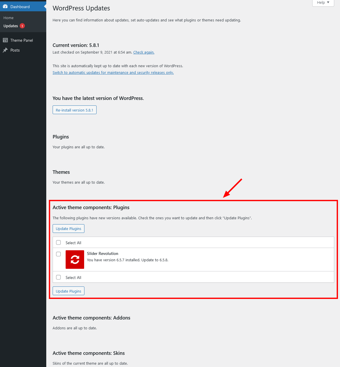
- Choose the options for an update (plug-in, theme, etc.) and click on Update button.
-
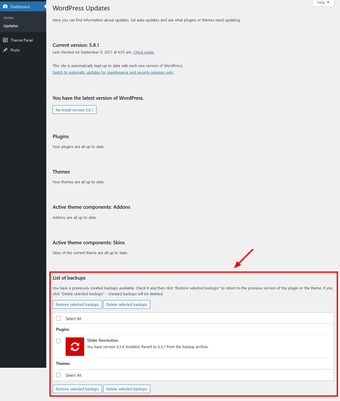
You can restore the backups created by the system in WP Dashboard > Updates or in Appearance > ThemeREX Updater (if the "Create backups" option was checked before the update).
Update Option 2. Update using WordPress uploader
-
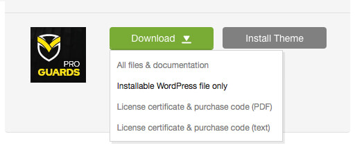
Log into your ThemeForest account and navigate to Downloads tab. Find the theme and download Installable WordPress file only.
- Log into your WordPress website and go to Appearance > Themes.
- Activate a default WordPress theme. Delete the older version of your theme and re-upload the new WordPress Installable files that you have downloaded from ThemeForest during the 1st step.
-
Once it is uploaded, activate the theme.
IMPORTANT! If you're using a child theme, do not activate the newly uploaded parent theme. Activate your old child theme instead. Otherwise, all the child theme customizations will be lost. -
Update (if necessary!) the included plug-ins, if you see a notification message prompting about a newer version.
- Navigate to WP Dashboard > Plugins > Installed Plugins.
- Update ThemeREX Addons plug-in. You can click on "Update" button (if available in a particular theme) or deactivate and delete this plug-in. Then follow the prompt to install it again. This will load a new plug-in version on the site.
- Deactivate and delete the rest plug-in(s) of old version.
- Go to Appearance > Install Plugins and install the plug-in(s) like it was described in the Plugins Installation section of this documentation.
Update Option 3. Update using FTP client
- Log into your ThemeForest account and get the last version of the theme as described above.
- Connect to your server using desktop client software (we recommend Filezilla and CyberDuck).
-
Change directory to
/wp-content/themes. - Remove/rename existing folder with old theme files.
-
Unpack theme installable files downloaded from ThemeForest and upload them to the
themesfolder. - Update (if necessary!) the included plug-ins in the way described above, if you see a notification message prompting about a newer version.
Theme Customizer
Now let's navigate to Appearance (WP Dashboard) > Customize to flexibly control the appearance and behavior of the whole website as well as individual types of posts, pages and categories.
IMPORTANT! Please be aware that our theme provides a special inheritance hierarchy system for "Theme Options" settings. It means that individual settings of each page may override global settings made with Customizer Panel.
Settings of "Blog", "WooCommerce", "Plugins settings" (such as Portfolio, Services, Team and Testimonials) and other groups may also override default/general settings available through Customizer.
Moreover, you can see the changes of the front-end right after the alterations - when the needed parameter is selected, without switching from admin to front-end each time. When you are done with the changes, you should click on Publish button at the top of the Customizer's side menu.
IMPORTANT! Please be aware that all the Customizer's settings are also available for editing through Theme Panel (WordPress Dashboard Menu) > Theme Options section.
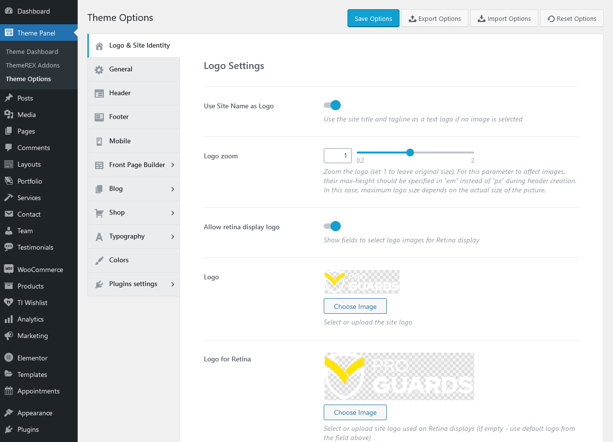
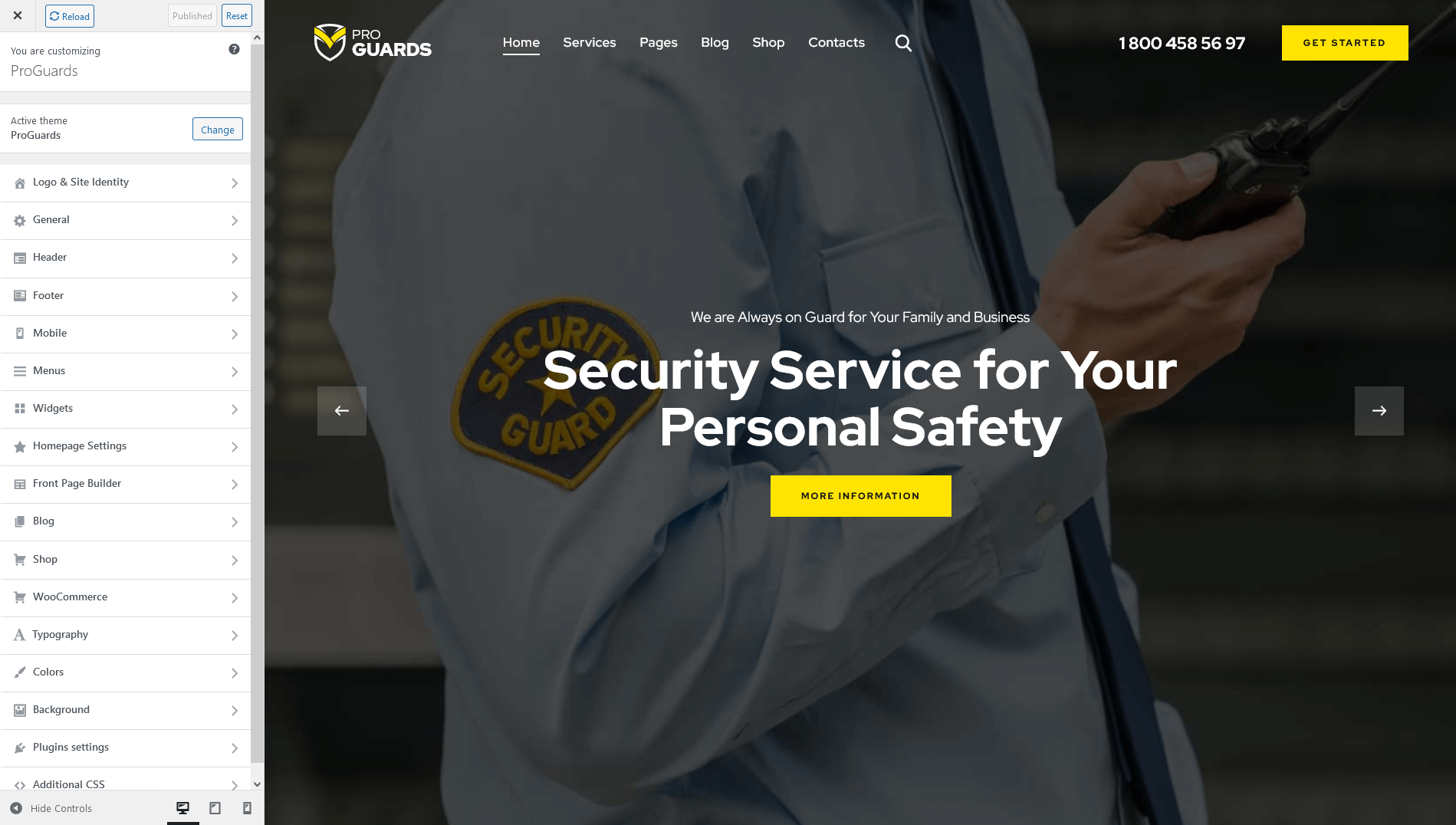
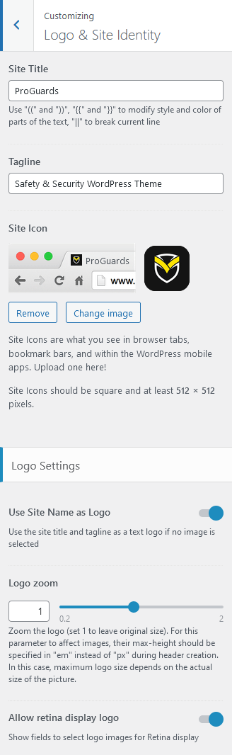
Logo & Site Identity
Settings of this group are responsible for managing site identity features. This is the initial place where you should upload your logo.
Site Title
The text entered into this field appears as the logo title (if the image logo is not uploaded and "Use Site Name as Logo" option is enabled) and as the website's title in your browser tab.
Tagline
The text entered into this field appears as the website slogan under the logo. By default, the tagline is used if no image logo is selected and "Use Site Name as Logo" option is enabled.
You can modify the site title and tagline appearance by inserting special characters, e.g.:
||- line break;{{...}}- modifies style and color of parts of the text;[[...]]- makes the text bold;
Site Icon (Favicon)
The site icon (favicon) is used as a browser and app icon for your site. Icons must be square, and at least 512 pixels wide and tall.
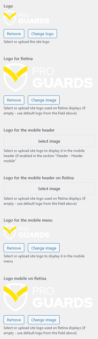
Logo-related settings
These settings allow managing your logo images (main, for mobile header and mobile menu), as well as their Retina versions (if "Allow retina display logo" option is checked). As a rule, the retina logo should be twice as big as the regular logo in order to be displayed properly.
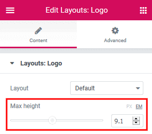
Here you can also zoom the logo. 1 - original size. Please note, that the maximum size of the logo depends on the actual size of the image. This option works if max height of the logo is set in em in Elementor "Layouts: Logo" widget.
"Use Site Name as Logo" option displays the site title and tagline as a text logo if no image is selected.
Uploading Logo via Layouts
The logo uploaded in the Customizer can be overwritten by the logo image selected in the Header layout. This allows you to upload a different logo image for each page.
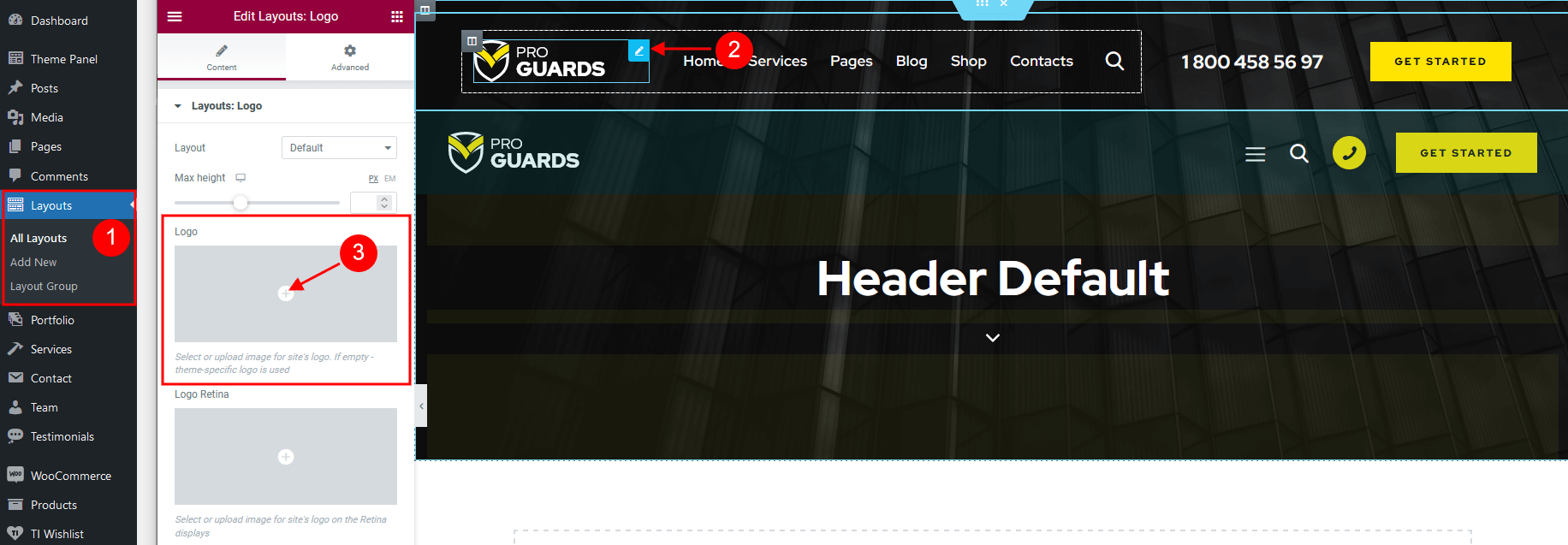
- Check what header style is selected in the Appearance > Customize > Header > Header style. (You can choose a different header style for a particular page in its Theme Options.)
- Navigate to the Layouts > All Layouts and open this header layout.
- Locate the Elementor Layouts: Logo widget (ThemeREX Addons Layouts group) and click on the Edit button.
- Upload a new logo in the panel > Content tab and save the changes.
General
Settings of this group are responsible for managing an overall look of the site.
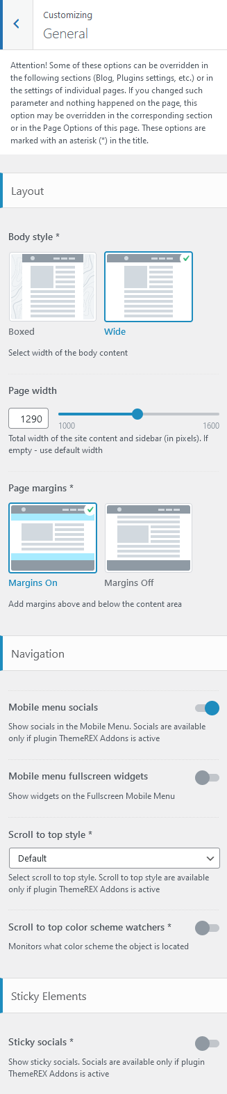
Layout settings:
Here you can choose the body style, page margins, the page width (site content + sidebar) in pixels as well as apply a background image and page extra spaces for "Boxed" body style.
- Boxed - the page's body is in the area of limited screen width, and the background image is visible.
- Wide - the page's body occupies an entire screen width (background image is behind it and is not visible), and the content occupies the fixed width area in the center of the screen.
PLEASE NOTE! In the Theme Options section of a particular page additional body styles are available: fullwidth and fullscreen.
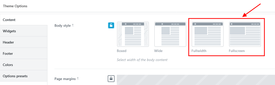
- Fullwidth - the page's body occupies almost all screen width.
- Fullscreen - the page's body occupies an entire screen width.
Navigation settings
These settings allow specifing the behavior of the widgets area on Fullscreen Mobile Menu and selecting the style of scroll to top button.
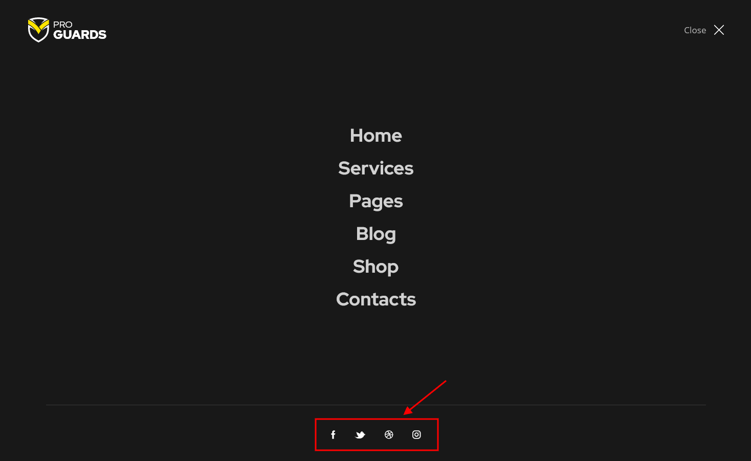
- "Mobile menu socials" option enables social icons. The social icons inherit the links (URLs) to your social profiles specified in the Theme Panel (WP Dashboard) > ThemeREX Addons > Socials tab.
- "Mobile menu fullscreen widgets" option enables area with widgets on mobile menu. Please treat the code for mobile widgets as an example only!
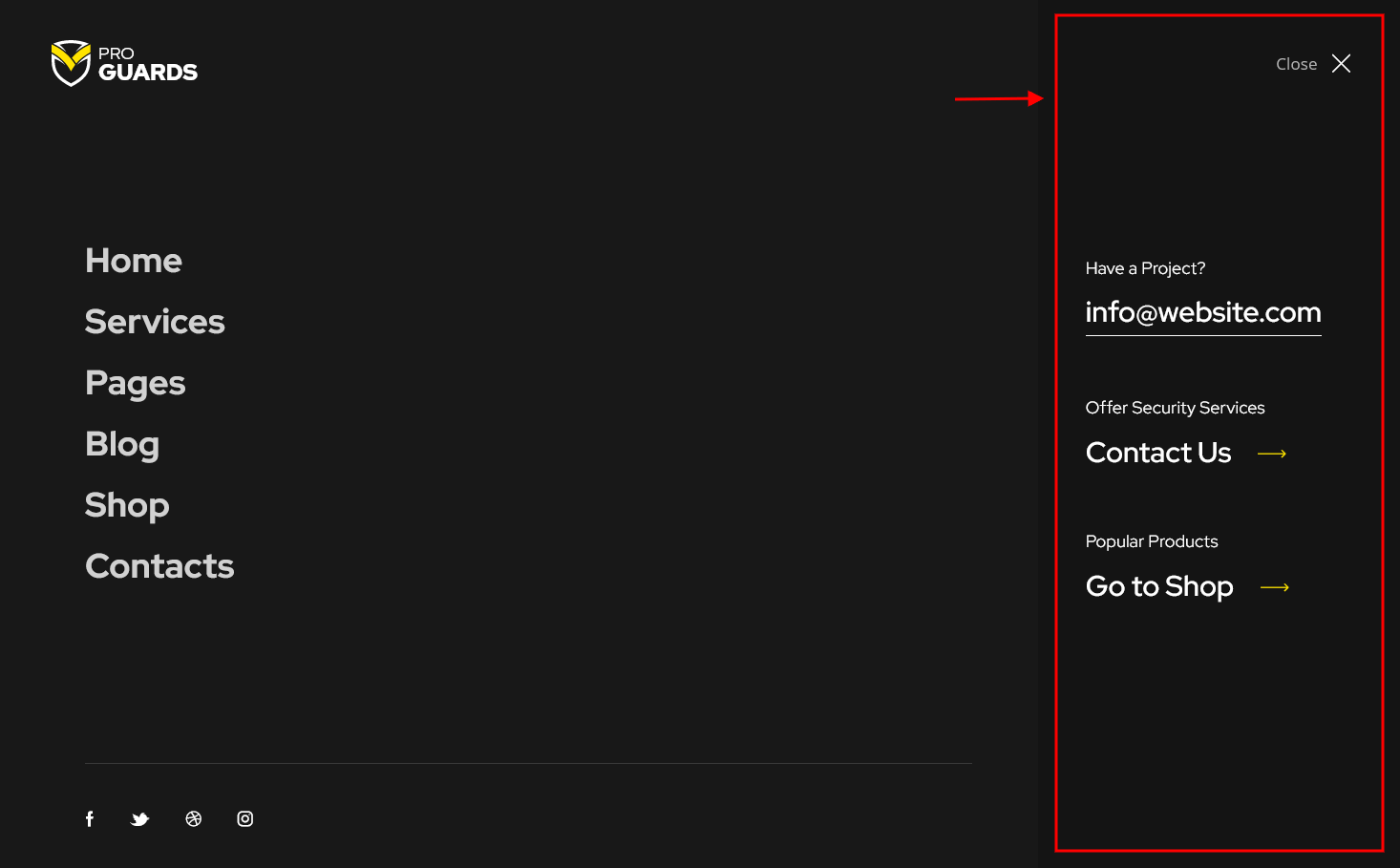
<div class="extra_item">
<h6>Have a Project?</h6>
<a href="mailto:[email protected]">[email protected]</a>
</div>

<div class="extra_item">
<h6>Offer Security Services</h6>
<a href="/contact/">Contact Us</a>
</div>

<div class="extra_item">
<h6>Popular Products</h6>
<a href="/shop/">Go to Shop</a>
</div>
- Select mobile menu widgets - specify which widget set to show on Fullscreen Mobile Menu. The widgets can be managed in Appearance > Widgets.
-
Scroll to top style - choose one of available styles of scroll to top button. This option requires the ThemeREX Addons plug-in to be installed and active.
For "Modern" style the following option is available:
-
Scroll to top color scheme watchers - regulate the color scheme of the scroll to top button depending on the color scheme of page sections.
-
Scroll to top color scheme watchers - regulate the color scheme of the scroll to top button depending on the color scheme of page sections.
Sticky Elements
Here you can control page elements with fixed position in the middle of the screen, when you scroll down the page.
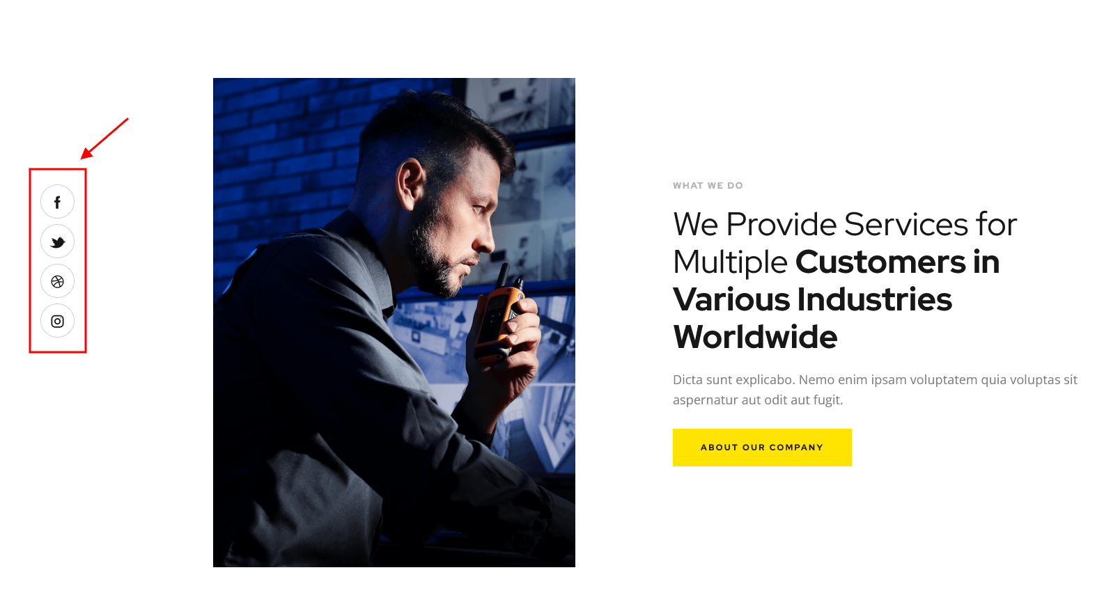
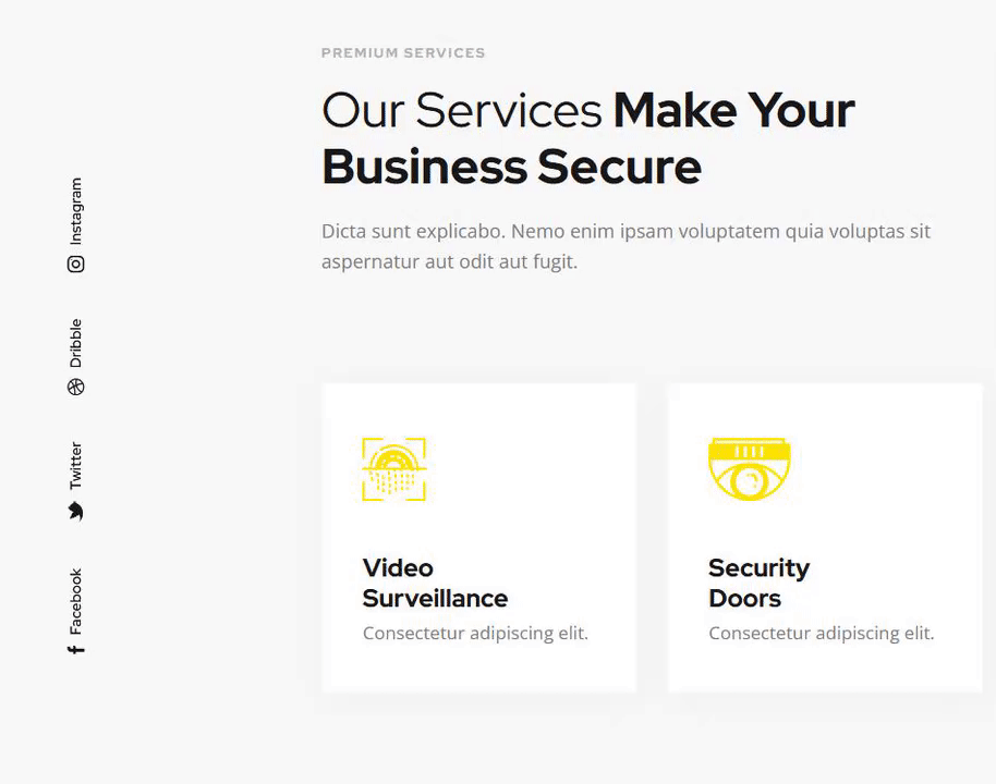
Sticky socials - this option enables the social icons on the left side of the page. The social icons inherit the links (URLs) to your social profiles specified in the Theme Panel > ThemeREX Addons > Socials tab. Please also check our video tutorial.
-
Sticky socials style - choose one of available styles of social icons. This option requires the ThemeREX Addons plug-in to be installed and active.
For "Modern" style the following option is available:
-
Sticky socials color scheme watchers - regulates the color scheme of the social icons depending on the color scheme of page sections.
-
Sticky socials color scheme watchers - regulates the color scheme of the social icons depending on the color scheme of page sections.
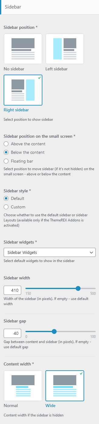
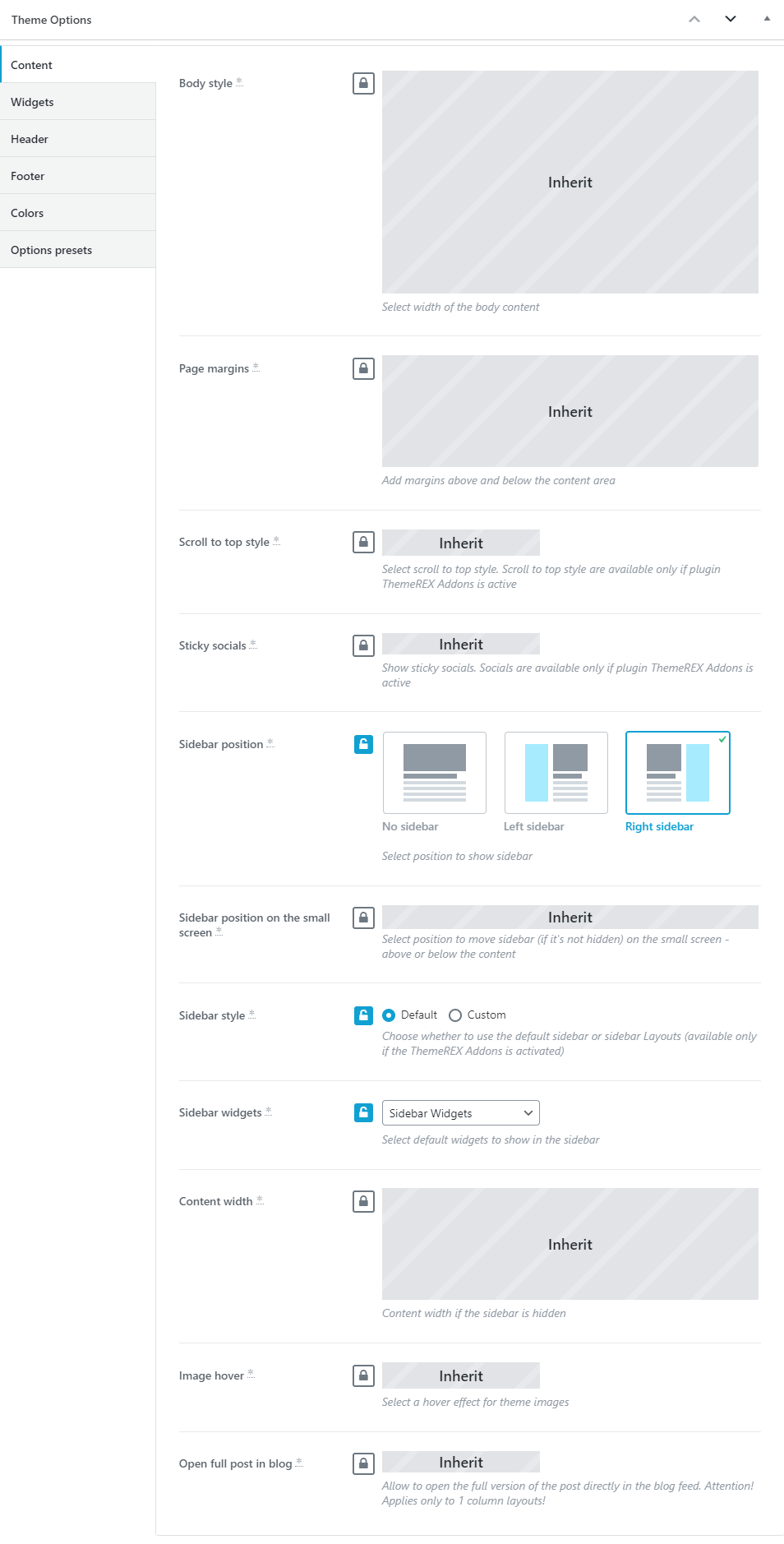
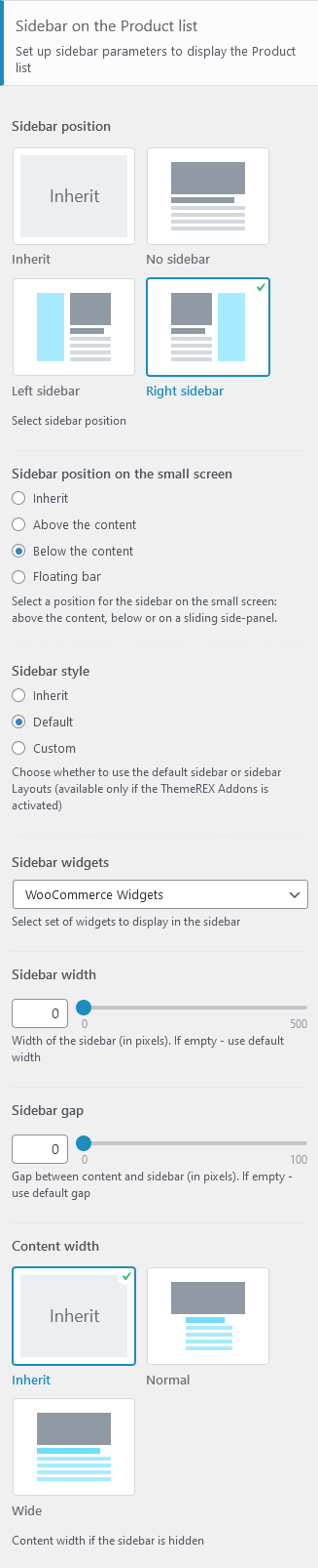
Sidebar-related settings
- Sidebar position - moves sidebar to the right or left hand side of the page, or hides it.
Additional options for "Left/Right" sidebar position:
- Sidebar position on the small screen - select the position of the sidebar on devices with small screen (except for mobile devices): above/below the content area or as a floating bar.
- Sidebar style - choose whether to use the default sidebar or custom sidebar layout (available only if the ThemeREX Addons is activated).
For "Default" sidebar style:
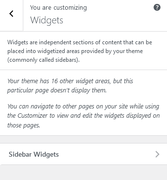
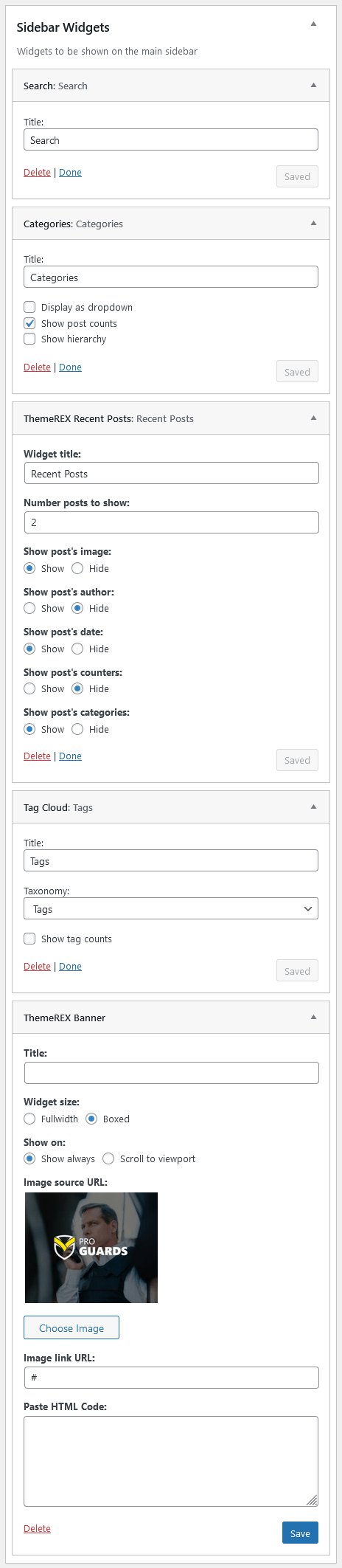
- Sidebar widgets - specify which widget set to show in the sidebar area. The widgets are available in Appearance (WP Dashboard) > Widgets.
- Select custom layout - select already built sidebar layout. You can create new sidebar layouts or customize the existing ones in the Dashboard > Layouts tab, using a user-friendly Elementor. Check the Layouts section for more information.
- Sidebar width - specify the width of the sidebar (in pixels).
- Sidebar gap - specify the gap between content and sidebar (in pixels).
- Content width - choose the content width if the sidebar is hidden.
Widgets-related settings
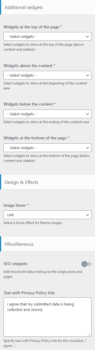
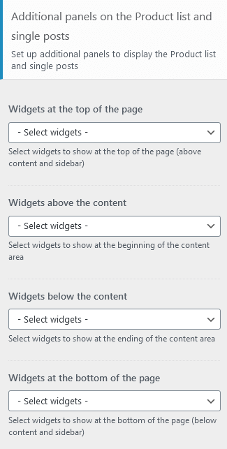
Here you can specify widget sets for such locations as top page, above content, below content and bottom page. Check the Widgets section for more information.
Design & Effects-related settings
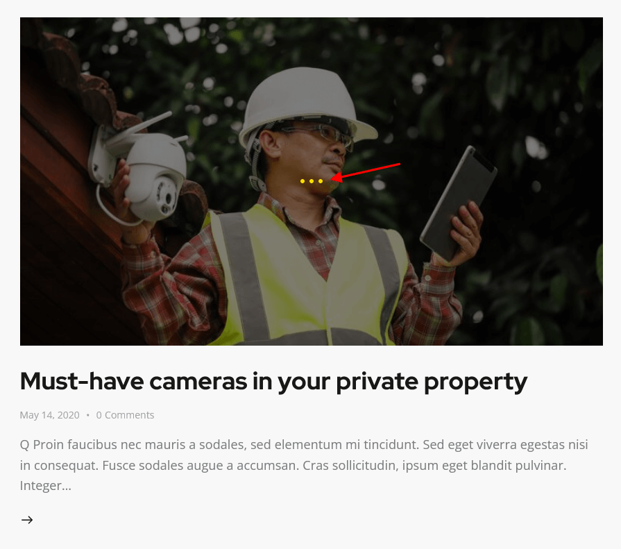
Here you can specify image's hovers.
Below you can find an example of image's hover effect with the option set to "Dots".
Miscellaneous setting
This setting is responsible for specifying SEO-related parameters.
Text with Privacy Policy link
Specify the text for the checkbox in a default form (Elementor "Form" widget) and in registration form ("Layouts: Login Link" widget). This text will be displayed before the Privacy Policy link.
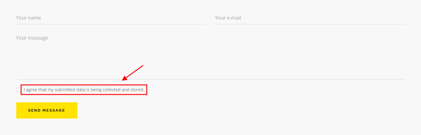
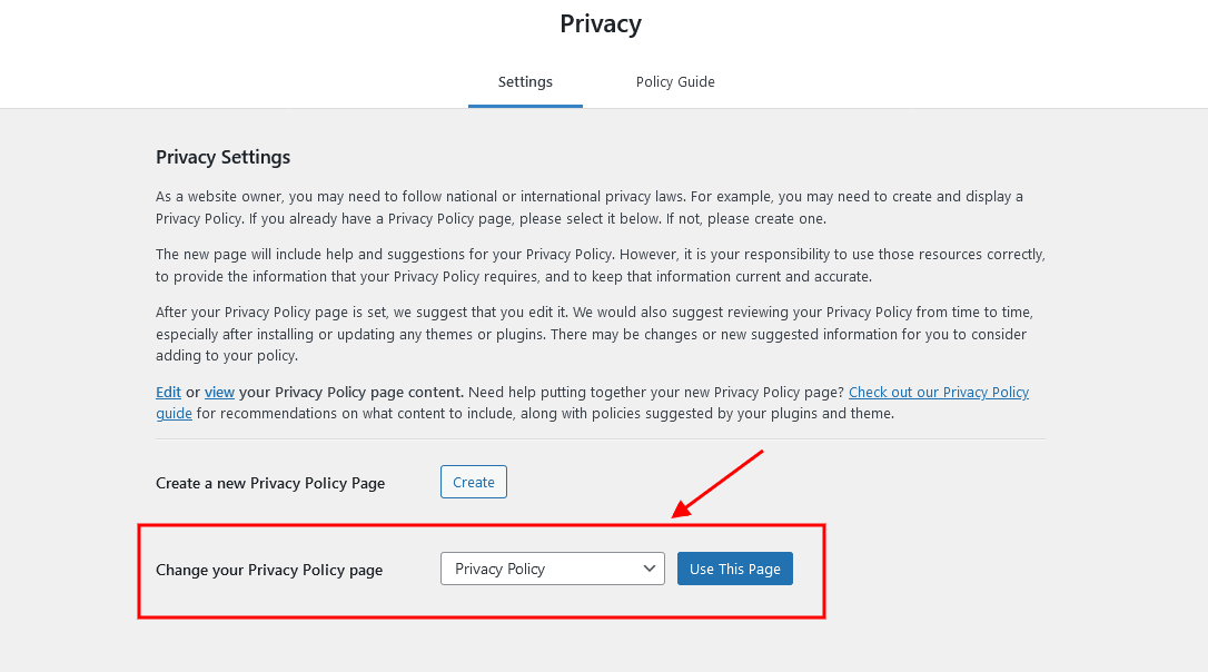
In order to add/customize the Privacy Policy link, navigate to Settings (WP Dashboard) > Privacy and specify the page that will be used as a Privacy Policy one. If you do not want to display "For further details on handling user data, see our Privacy Policy" text, just leave this setting empty.
PLEASE NOTE! In case you are planning to use default forms without consent checkboxes, just leave the "Text with Privacy Policy link" option empty!
Header
Settings of this group allow you to manage an overall look and behavior of the header elements.
You can set up header settings for a specific page in the Theme Options > Header section of that page.
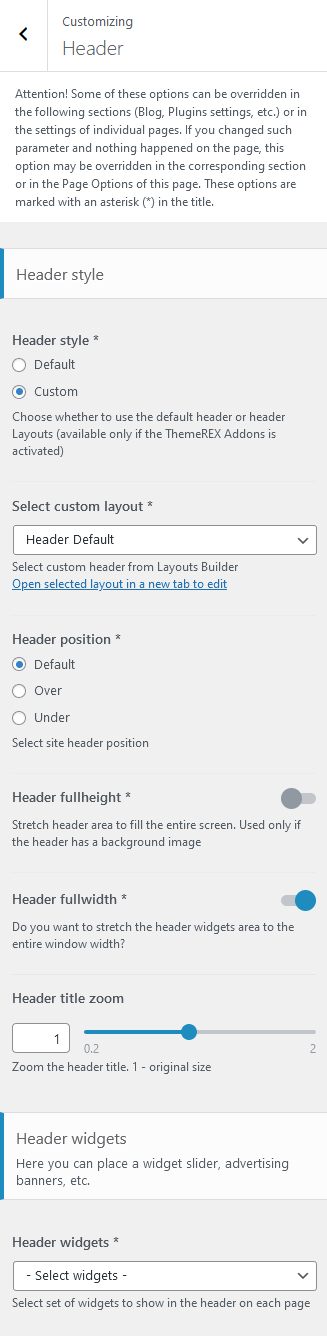
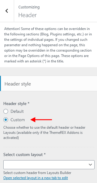
Style-related settings
These settings allow managing the style ("Default" or "Custom") and position of the header area as well as zooming the header title. For custom header style you can specify the header layout (available only if the ThemeREX Addons plug-in is activated).
Available Custom Header Layouts:
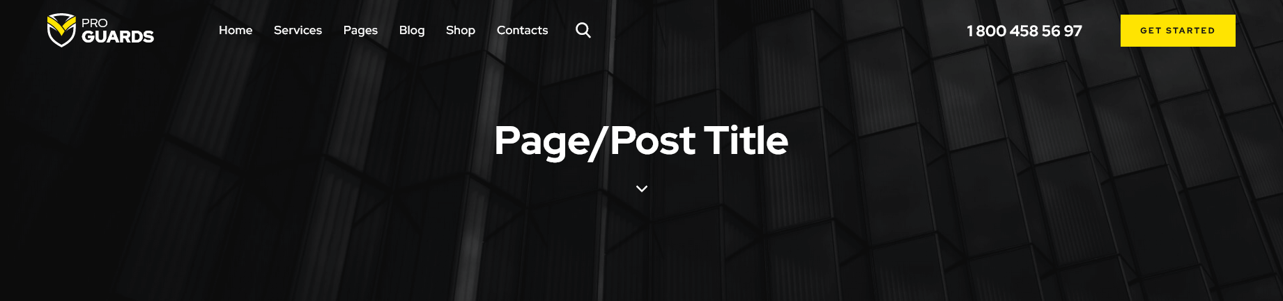
- Header Default
- Header Shop Single
(with "Shop" page title)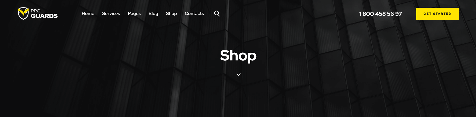
- Header Simple Dark

- Header Simple Fullwidth

- Header Simple Light

Please also see header-related layouts section of this documentation file. All elements of pre-built custom header areas can be edited in the Dashboard > Layouts tab, using a user-friendly Elementor. Check the Layouts section and this video tutorial for more information.
To avoid "Sticky Menu" behavior select "Don't fix" option in the Edit Section > panel > Custom Layout > Fix this row when scroll (for the section with the menu element). Check also the Layouts description.
You can also watch this video tutorial on how to enable sticky header:
Available Default Header Style:
The header area in "Default" style is created via the Global Customize settings (Appearance > Customize). You can also navigate to the .../wp-content/themes/proguards/skins/default/templates/ folder and edit the corresponding template file header-default.php.
Header Position
The Header position setting controls the way your header behaves in regards to the main body area.
- Default - the default header position. The header occupies a separate section and does not collide with other website elements.
- Over - ideally is used for pages with sliders. The header elements overflow the section that follows next, and the header background becomes transparent.
- Under - sets the header area stuck behind the content area when scrolling down the page.
"Header fullheight" option enlarges the header area to fill the whole screen. It is used only if the header contains a background image.
"Header fullwidth" option stretches the header widgets area to the entire window width.
Widgets-related settings
Here you can specify the widgets set for the header area. You can customize the widgets in Appearance > Widgets section.
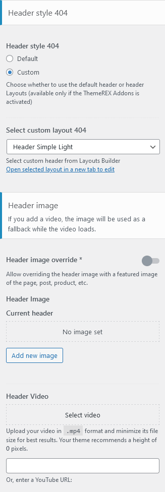
Header Style 404
This section is responsible for customizing the header area on Error 404 page. You can choose between "Default" or "Custom" header styles. For custom header style please specify the header layout (Dashboard > Layouts tab).
Header Background Image-related settings
These settings allow selecting a header background image or background video as well as choosing whether to override the header image with the post's/page's featured image or not.
Mobile header settings (for Default Header style)
Here you can enable the mobile header. It lets you show/hide such elements as logo, search form, login link, and shopping cart. You can also use the Additional Info section, a text block where you can add information about your business, such as telephone number, open hours, etc.
Header FAQs
 "Default" header style is created via the Global Customize settings (Appearance > Customize). You can also navigate to the
 .../wp-content/themes/proguards/skins/default/templates/ folder and edit the corresponding template file header-default.php.
For"Custom" header style
- Check which custom header Layout you are currently using in Appearance > Customize > Header in the Select custom layout option.
- In the WordPress admin panel, go to Layouts > All Layouts, and open the currently active header layout.
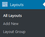 If you do not see the Layouts menu item - activate the ThemeREX Addons plug-in first.
- Make the required changes and save it.
However, you can specify the logo in your header Layout using the Elementor Layouts: Logo widget (ThemeREX Addons Layouts group).
IMPORTANT! The logo specified in your header Layout overwrites the logo set in the Customizer.
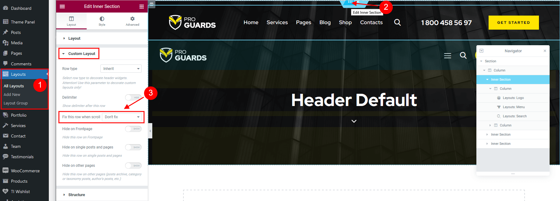
- Open the header Layout you are currently using in Layouts > All Layouts.
- Locate the section that contains the menu element (or any other section that should have the sticky behavior) and click on the Edit section button:
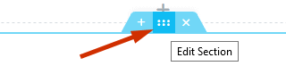
- Go to the panel > Custom Layout > Fix this row when scroll, choose the needed option from the drop-down list (depending on whether you want to enable or disable the sticky menu).
- Save the changes.
- via header Layouts - navigate to Layouts (WP Dashboard) > All Layouts; Please see elementor video tutorial or article.
We recommend you to create separate custom header layout for mobile devices and specify it in the Appearance > Customize > Mobile section. This will increase the load speed of your website on mobile devices. - in the Customizer - enable it in the Mobile Header section in Appearance > Customize > Header (works for Default Header style only!).
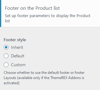
Footer
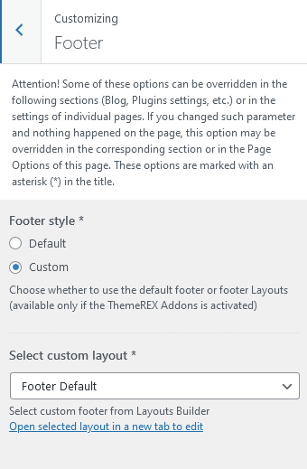
Setting of this group is responsible for choosing the style of the footer area.
Style-related settings
These settings allow choosing a footer style: "Default" or "Custom". Please note that custom footer layouts are available only if the ThemeREX Addons plug-in is activated.
Available Custom Footer Layouts:
- Footer Default
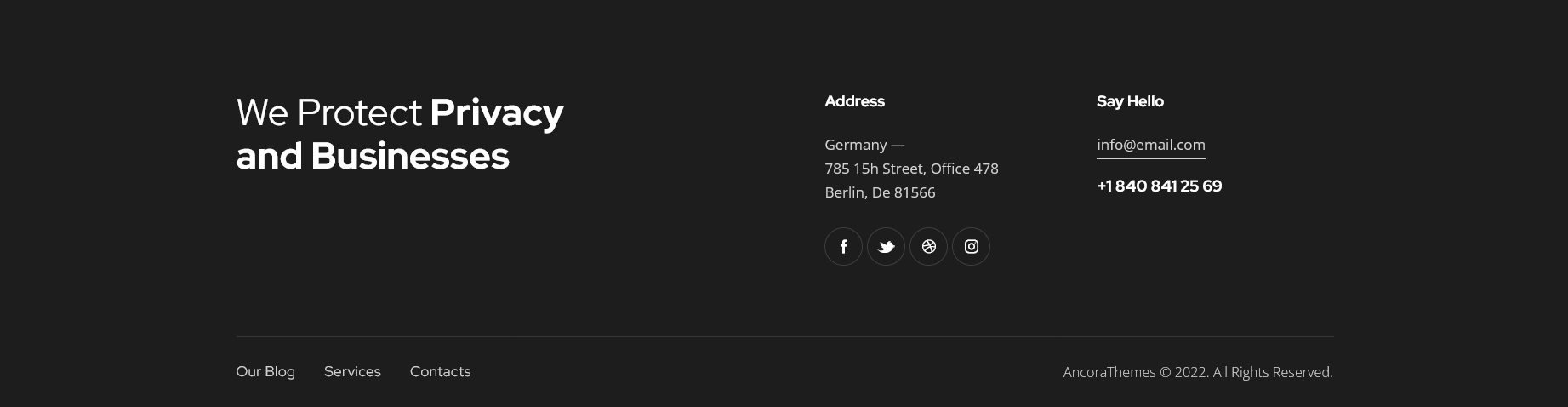
- Footer Main
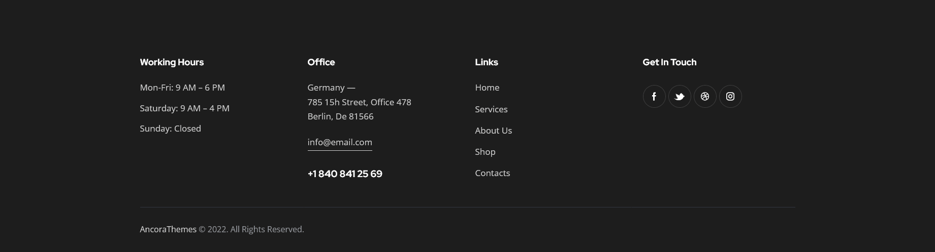
- Footer Main 2
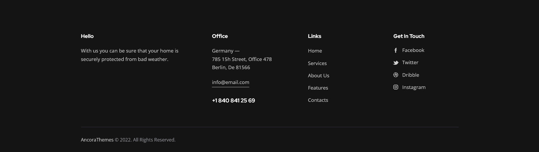
Please also see footer-related layouts section of this documentation file. All elements of custom footer areas can be edited in Dashboard - Layouts tab. Check the Layouts section and this video tutorial for more information.
Available Default Footer Style (without footer widgets):

The footer area in "Default" style is created via the Global Customize settings (Appearance > Customize). You can also navigate to the .../wp-content/themes/proguards/skins/default/templates/ folder and edit the corresponding template file footer-default.php in any text editor.
Additional options for Default Footer style:
- Footer widgets - select a preferred footer widget set. Check the Widgets section for more information.
- Footer columns - set the necessary columns quantity to display the widgets in. Choose
0to autodetect the number of columns based on how many widgets you have got in the set. - Footer fullwidth - expands the footer for the whole width of the page.
- Copyright - enter the copyright message. Use the
{Y}symbol to indicate the current year.
Mobile
In case you care about the page speed optimization and want your website to load faster on mobile devices, this section is just for you. The settings of this group allow you to set separate header and footer layouts as well as specify a sidebar to be displayed on mobile devices only.
We recommend you to create alternative custom header and footer layouts for mobile devices (without any hidden elements for other screen resolutions), as these hidden elements still take time while loading your website.
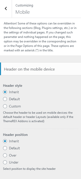
Header-related settings
These settings allow selecting header style and position. For custom header style you can specify the header layout, that is available for customizing in WP Dashboard > Layouts.
The Header position setting controls the way your header behaves in regards to the main body area.
- Inherit - the value is inherited from the Appearance > Customize > Header section.
- Default - the header occupies a separate section and does not collide with other website elements.
- Over - ideally is used for pages with sliders. The header elements overflow the section that follows next, and the header background becomes transparent.
- Under - sets the header area stuck behind the content area when scrolling down the page.
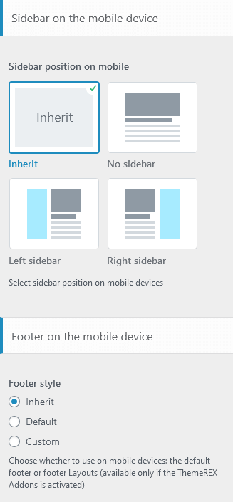
Sidebar-related settings
- Sidebar position on mobile - moves sidebar to the right or left hand side of the page, or hides it. The Inherit option inherits the value specified in the Appearance > Customize > General panel.
Additional options for "Left/Right" sidebar position:
Sidebar style - choose whether to use the default sidebar or custom sidebar layout (available only if the ThemeREX Addons is activated).
For "Default" sidebar style:
- Sidebar widgets - specify which widget set to show in the sidebar area. The widgets are available in Appearance (WP Dashboard) > Widgets.
- Select custom layout - select already built sidebar layout. You can create new sidebar layouts or customize the existing ones in the Dashboard > Layouts tab, using a user-friendly Elementor. Check the Layouts section for more information.
- Content width - choose the content width if the sidebar is hidden.
Footer-related settings
These settings allow selecting a footer style. The Inherit option inherits the value specified in the Appearance > Customize > Footer section. For "Default" footer style you can also specify widgets sets and columns quantity. For "Custom" footer style "Select custom layout" option is available. You can manage these footer layouts in the WP Dashboard > Layouts tab.
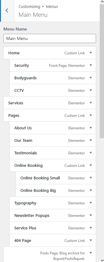
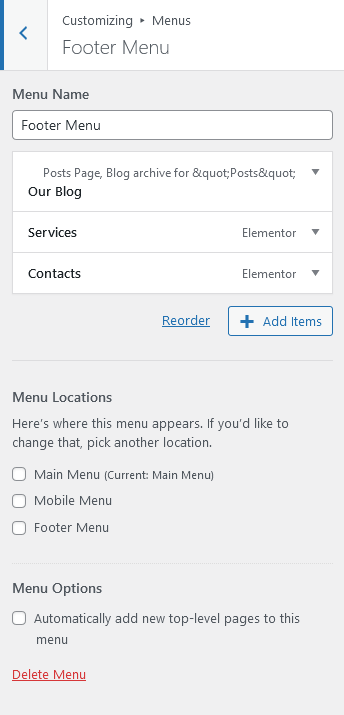
Menus
Settings of this group are responsible for managing Menus. Each menu location is available for filling with any of the predefined menu sets.
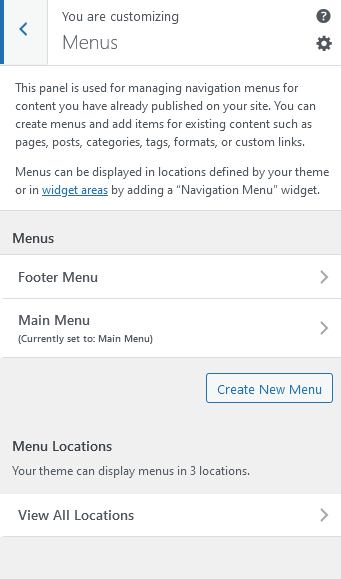
Menus are also available for editing through the "Appearance > Menus" options.
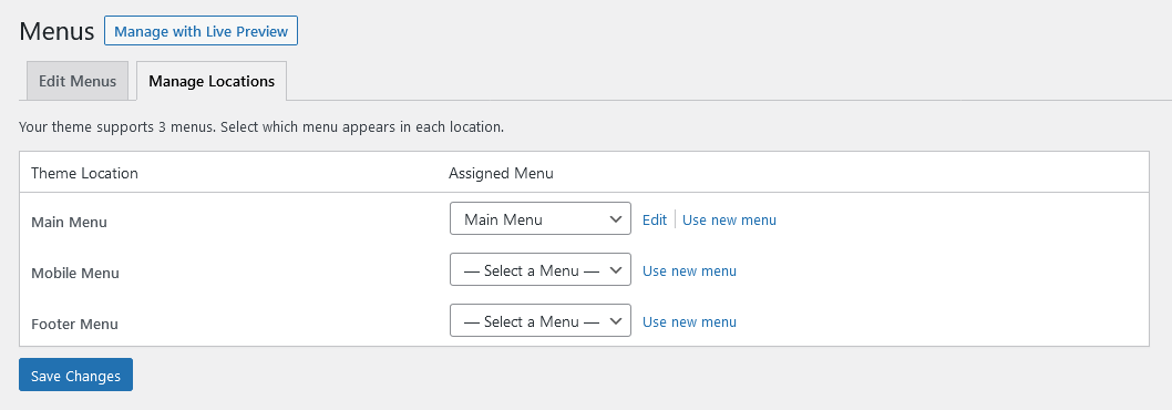
Below are predefined Menu locations:
- Main Menu - displays the main menu.
- Mobile Menu - displays the menu on mobile devices.
- Footer Menu - displays the menu in the footer area.
Predefined Menu sets:
Within custom header & footer layouts, you can add menus using the Elementor Layouts: Menu widget.
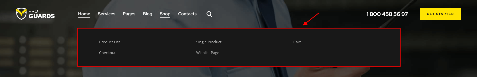
We have added the following custom CSS classes to stretch the drop-down menu items. The class names should be assigned to the menu items of the first level, like on our demo:
.trx_addons_stretch_window_boxed- stretches the background of the drop-down menu to the whole window width, though the content stays in the area of limited screen width.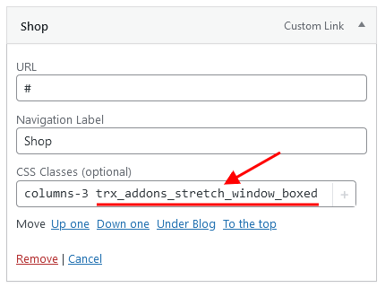
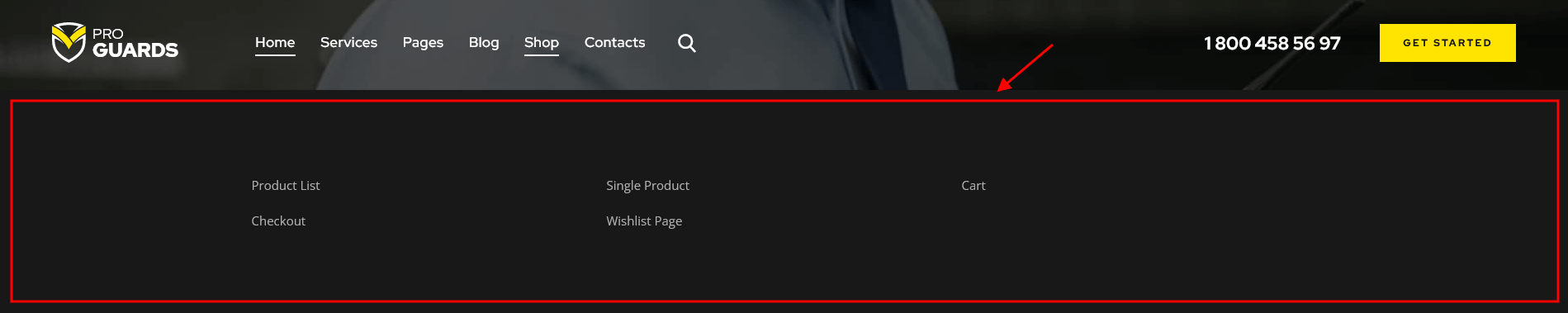
.trx_addons_stretch_window- stretches the drop-down menu to the whole screen width.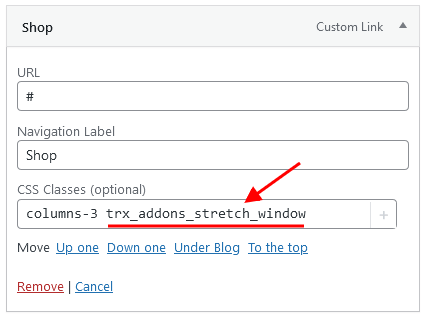
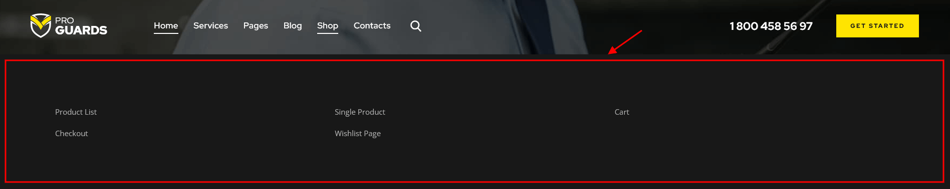
.columns-X- "X" is for the number of columns to split your menu items into.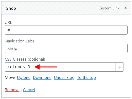
You can enable or disable the CSS Classes option in the Screen Options in the top right corner of the WordPress admin.
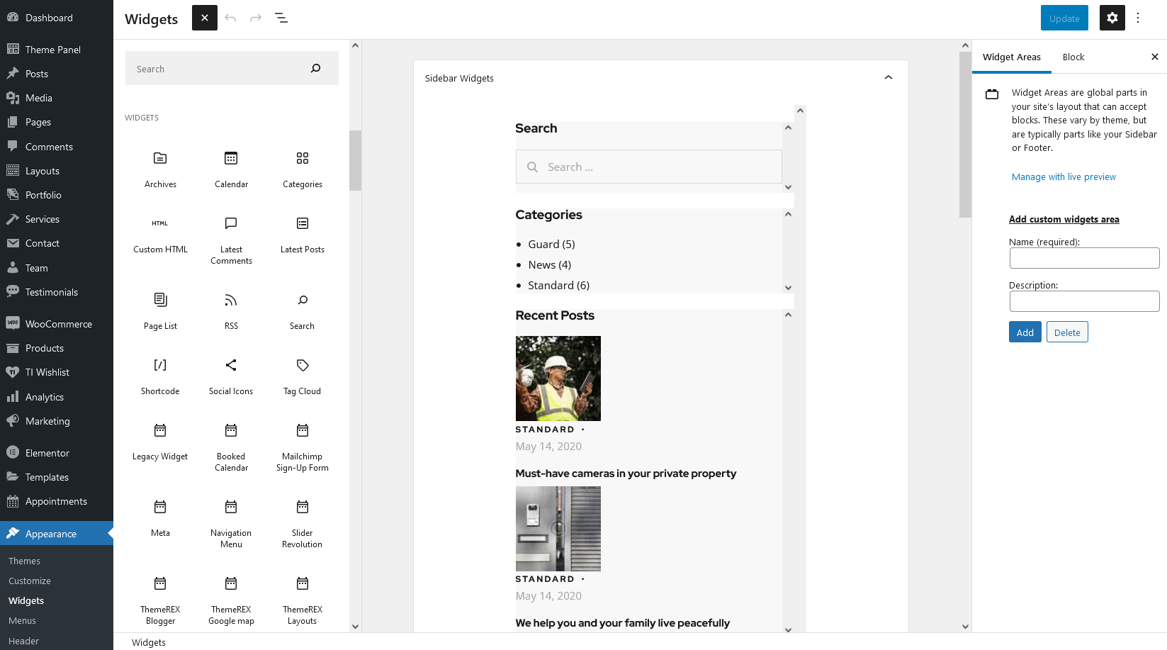
Widgets
Widgets are the blocks of content that can be placed into specifically designed widget areas.
You can find the list of available widgets and widget areas under Appearance (WP Dashboard) > Widgets. Here it is possible to create additional widget sets, that can be assigned to available default widget areas. This is useful when you have different widget sets for different pages.
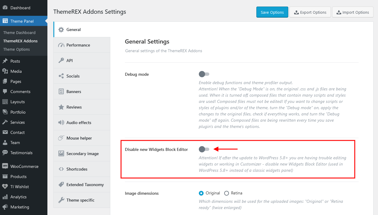
IMPORTANT! Our theme supports both Classic Widgets Editor and New Block Widgets Editor (WordPress 5.8+). You can easily switch between the editors using the "Disable new Widgets Block Editor" option in Theme Panel (WP Dashboard) > ThemeREX Addons > General section.
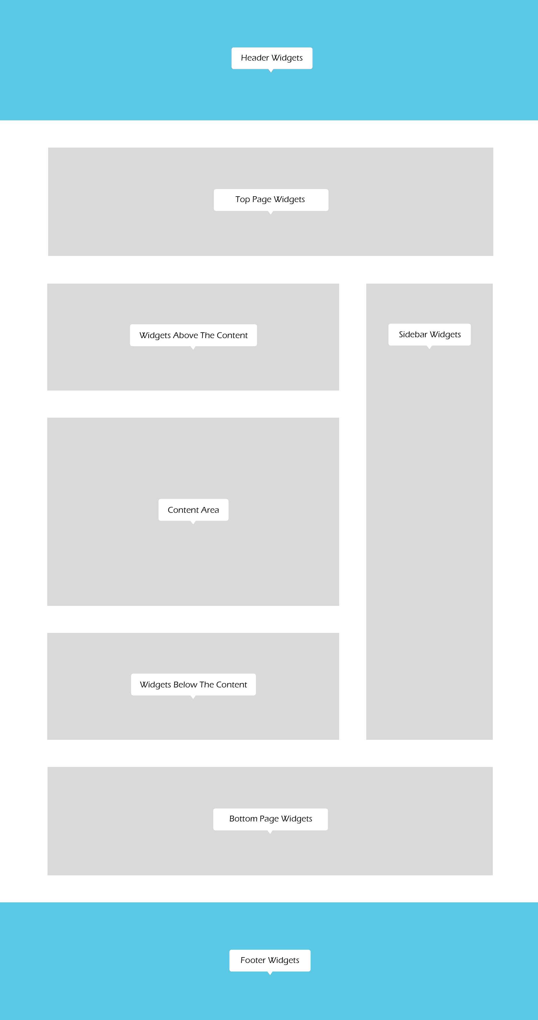
By default our theme supports 7 widget areas:
- Header
- Sidebar
- Top of the page
- Above the content
- Below the content
- Bottom of the page
- Footer
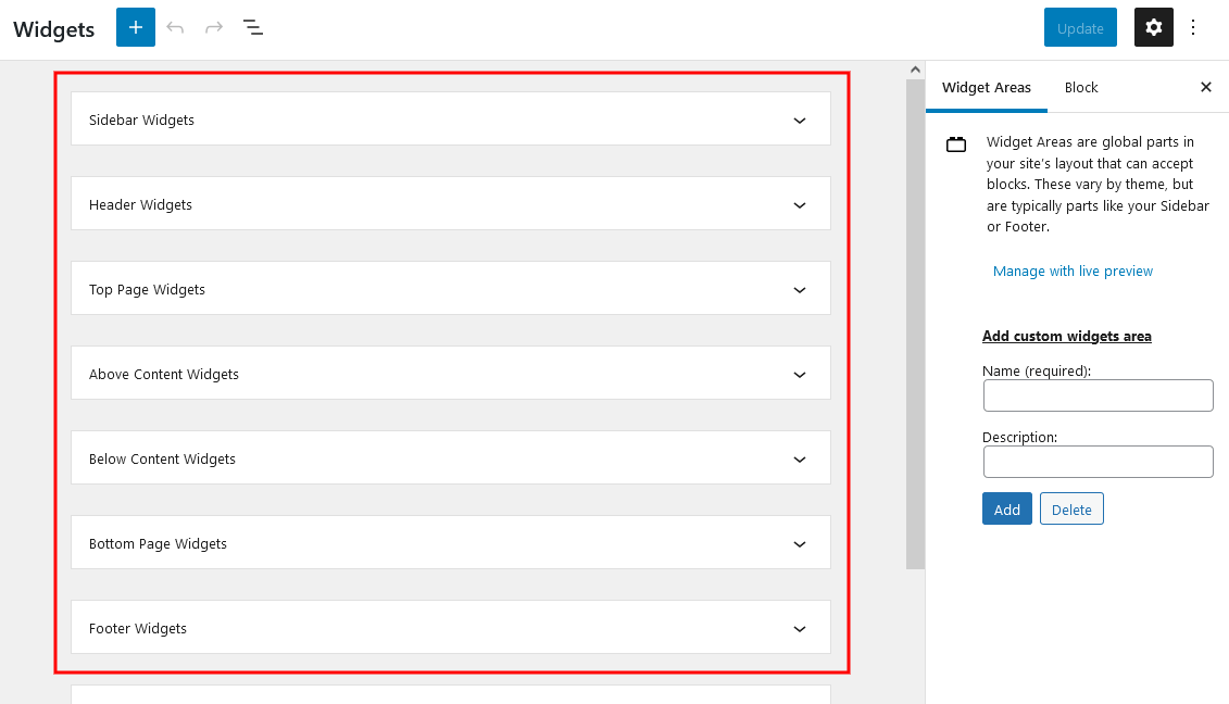
You can add widgets into widget areas by simply dragging and dropping.
But in order to see them on your website, you need to make sure you have a particular widget set assigned to a particular default widget area. You can assign widget sets either for the whole website (in Appearance > Customize), or for a specific page (single Page > Theme Options > Content/Widgets/Header/Footer).
IMPORTANT! The Sidebar/Footer widgets are available for "Default" sidebar/footer styles ONLY!
In order to manage custom sidebar or custom footer styles, proceed to Dashboard > Layouts tab and update the corresponding sidebar/footer layout.
Widget Sets Assignment for the Whole Site
Header widgets can be assigned in Appearance > Customize > Header section.
Body widgets (for sidebar, top of the page, above the content, below the content and bottom of the page) are accessible in Appearance > Customize > General section.
The sidebar widgets work for Default Sidebar Style only! Otherwise, navigate to the WP Dashboard > Layouts tab to manage the sidebar layout.
Footer widgets are available for managing in Appearance > Customize > Footer section. The footer widgets work for Default Footer Style only! Otherwise, you need to customize the corresponding footer Layout in WP Dashboard > Layouts.
Widget Sets Assignment for a Specific Page
If you want to specify a widget set for a separate page, open that page in your WordPress admin and in the Theme Options section choose the required widgets. The widgets assigned in Theme Options would be applicable only for that particular page.
Customizing Widget Sets that are already enabled on a Specific Page
Depending on the selected page that is available for editing with Customizer's tools, you can notice a different kind of widgets sets included to a particular page. The same can be done through Appearance (WP Dashboard) > Widgets.
Below are options responsible for managing widgets/blocks.
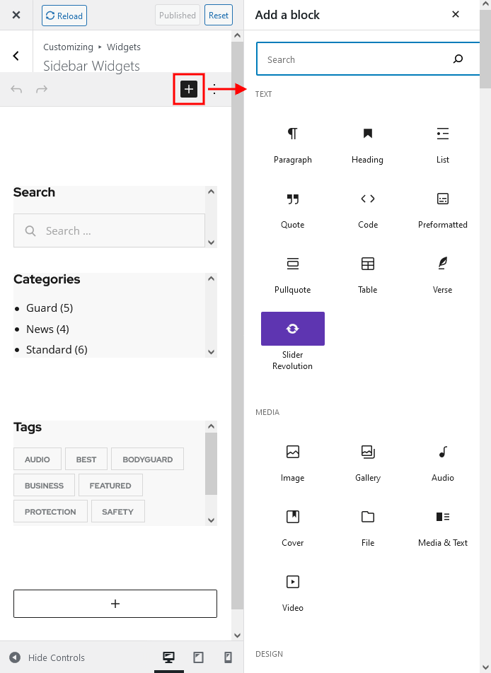
- Add a Widget (for Classic Widgets Editor) or Add a Block (for New Block Widgets Editor): just click on "Add a Widget/Block" button to see the available widgets, then choose the one you want to use:
 Click on the block itself to open its settings (for New Block Widgets Editor):
- Reorder the position of widgets using three icons:
- Move - moves the widget to another sidebar.
- Down - moves the widget down.
- Up - moves the widget upwards.
After you reorder the position of the widgets/blocks in the sidebar, save your changes.
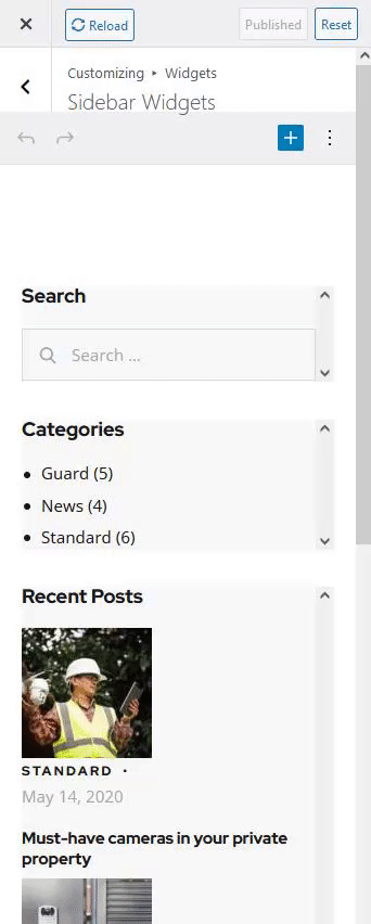
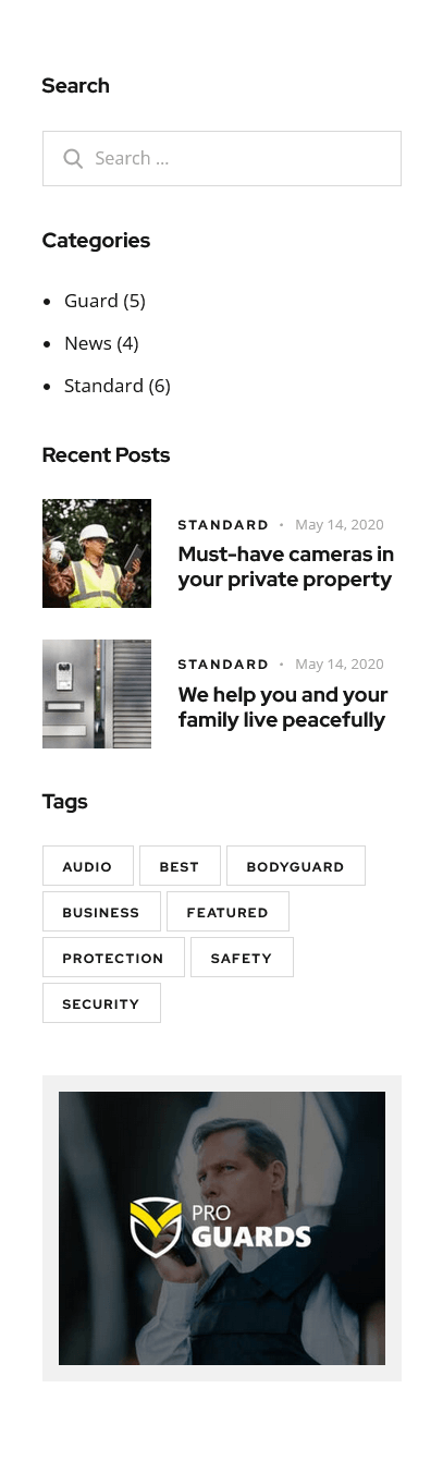
See the example of how the Sidebar Widgets Set may look like ("Default" sidebar style):
Custom Widgets
Moreover, our theme provides a few Custom Widgets that are available in Appearance > Widgets section (for New Block Widgets Editor - under "Widgets" group).
- ThemeREX About Me: Displays a photo and description of the website's owner or any other person. If you leave the options empty they will inherit data from the following options on the admin's profile page: "Profile Picture" (for photo), "Username" (for name) and "Biographical Info" (for description). You can hide any option by inserting
#sign in the corresponding field in the widget's settings. - ThemeREX Audio Player: Shows an audio player to play an audio file uploaded locally (from your Media library) or an external one (through embed html code). The system ignores the "Audio caption" and "Author name" options, if the embed code is used.
- ThemeREX Banner: Displays a regular banner image linked or not as well as any object inserted using html code (banner, iFrame for video, audio, etc.).
- ThemeREX Blogger: Shows posts, pages or custom post types from a specified category or group. By default, the widget outputs single posts.
You can create additional layouts to output the posts in WP Dashboard > Layouts using Blog layout's type (Item Options section). Please see Creating Layouts section of this documentation file for more information. - ThemeREX Calendar: Displays a regular WP calendar. This widget allows you to choose the way of shortening the weekday names: to one (first) letter or to three letters.
- ThemeREX Categories list: Shows a list of post or products categories/tags/formats, layouts or CPT groups. By default, it inserts post categories. In this case the images are inherited from Posts (WP Dashboard) > Categories > single category (if this function is available for a particular theme).
- ThemeREX Contacts: Displays your Logo, short description, contact information and social links. The links for your social profiles are taken from Theme Panel > ThemeREX Addons > Socials tab. If you want to add a map, make sure there is a valid API key in the Theme Panel > ThemeREX Addons > API tab.
- ThemeREX Custom Links: Inserts custom links with icon, title and some description.
- ThemeREX Google map: Shows Google map with specified address. To make the google map function properly, please make sure there is a valid API key in the "Google API key" field in the Theme Panel (WP Dashboard) > ThemeREX Addons > API tab.
- ThemeREX Instagram Feed: Shows the latest photos from your Instagram account or demo photos in a form of a feed on your WordPress website. You can connect to your Instagram account in the Theme Panel (WP Dashboard) > ThemeREX Addons > API section (you need a valid Instagram Access Token).
Demo mode means that the images will be taken from your demo folder (/wp-content/uploads/).
Alternatively, you can use photos from Instagram without connecting to your account: by using a hashtag#...or by specifying an Instagram username (WITHOUT a hash symbol). - ThemeREX Layouts: Displays already built custom layout from the Layouts (WP Dashboard) > All Layouts menu.
- ThemeREX OpenStreet map: Shows OpenStreet map with specified address. You can specify the OpenStreetMap API script and styles for the map in the Theme Panel (WP Dashboard) > ThemeREX Addons > API tab.
- ThemeREX Product Filters: Displays advanced search form for products. This widget requires the WooCommerce plug-in to be active. Please note, that the widget in "Inline" style works on all pages. The rest available styles work on shop list page only!
- ThemeREX Recent Posts: Displays the most recent posts.
- ThemeREX Services: Shows posts/pages/custom posts types. By default, it inserts available services from Services (WP Dashboard) > All Services.
- ThemeREX Slider: Displays the slides via Posts (Swiper) Slider or Revolution Slider.
- ThemeREX Socials: Shows the links to social network profiles. The social icons inherit the links (URLs) to your social profiles specified in the Theme Panel (WP Dashboard) > ThemeREX Addons > Socials tab.
- ThemeREX Team Members: Displays the team members from Team (WP Dashboard) > All Team.
- ThemeREX Testimonials: Shows testimonials posts from Testimonials (WP Dashboard) > All Testimonials.
- ThemeREX Universal Posts Listing: Displays posts from any post type.
- ThemeREX Video List: Shows a video list with videos from posts of "Video" post format type. A url or embed code for the video should be specified in the single post's settings, Item Options > Video > Video List section.
- ThemeREX Video Player: Displays a video player. The widget supports direct links from Youtube, Vimeo or locally downloaded video files. You can also insert a video through html code from any video hosting platform.
- ThemeREX WooCommerce Title: Displays a page title, breadcrumbs and a description of a products category on shop-related pages (shop list pages and single products). This widget works if a header layout does NOT contain the page title and breadcrumbs. The description inherits content from the back-end settings of a definite products category. The description becomes visible on product category pages ONLY! This widget requires the WooCommerce plug-in to be active.
- ThemeREX Yandex map: Shows Yandex map with specified address. Please make sure there is a valid API key in the "Yandex API key" field in the Theme Panel (WP Dashboard) > ThemeREX Addons > API tab (for paid version).
PLEASE NOTE! Please be aware that this theme does not provide any examples of custom sidebar layouts. Feel free to create your own ones, using a user-friendly Elementor. Check the Layouts section for more information.
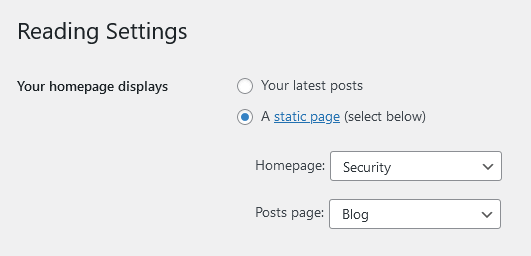
Homepage Settings
Settings of this group are responsible for selecting the way to display the homepage (front page), as a blog stream or a static one and specifying the pages to be set as a static homepage and as posts page.
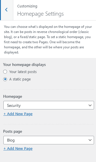
IMPORTANT! Please be aware that these settings are also available for editing through Settings > Reading section.
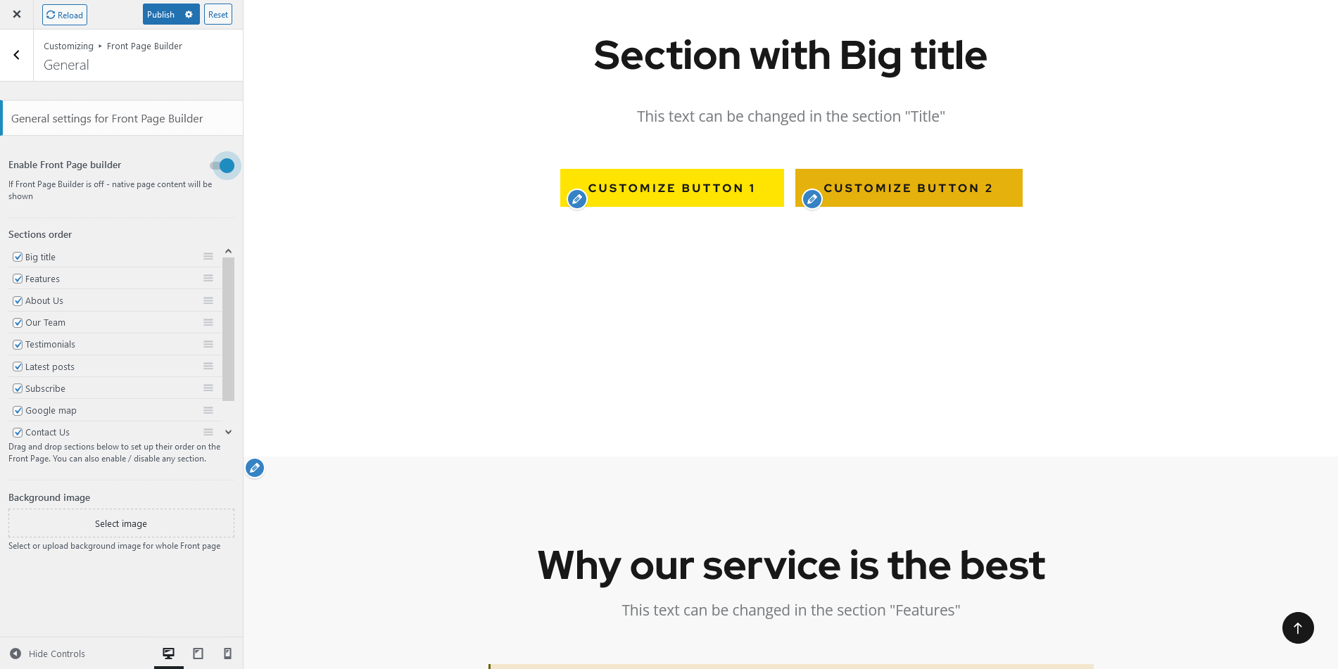
Front Page Builder
As a free addition to this theme we provide it with The Front Page Builder. A special tool that helps you manage entire content of your website in just few clicks without using external page builders, like Elementor or Gutenberg. You can enable the Front Page builder in the General tab.
The Page Builder provides a few different areas for customization. Feel free to discover them and make any changes to the content you want.
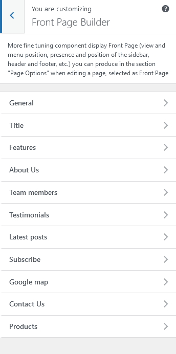
Check the video below for more information on how to properly use The Front Page Builder.
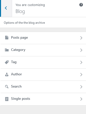
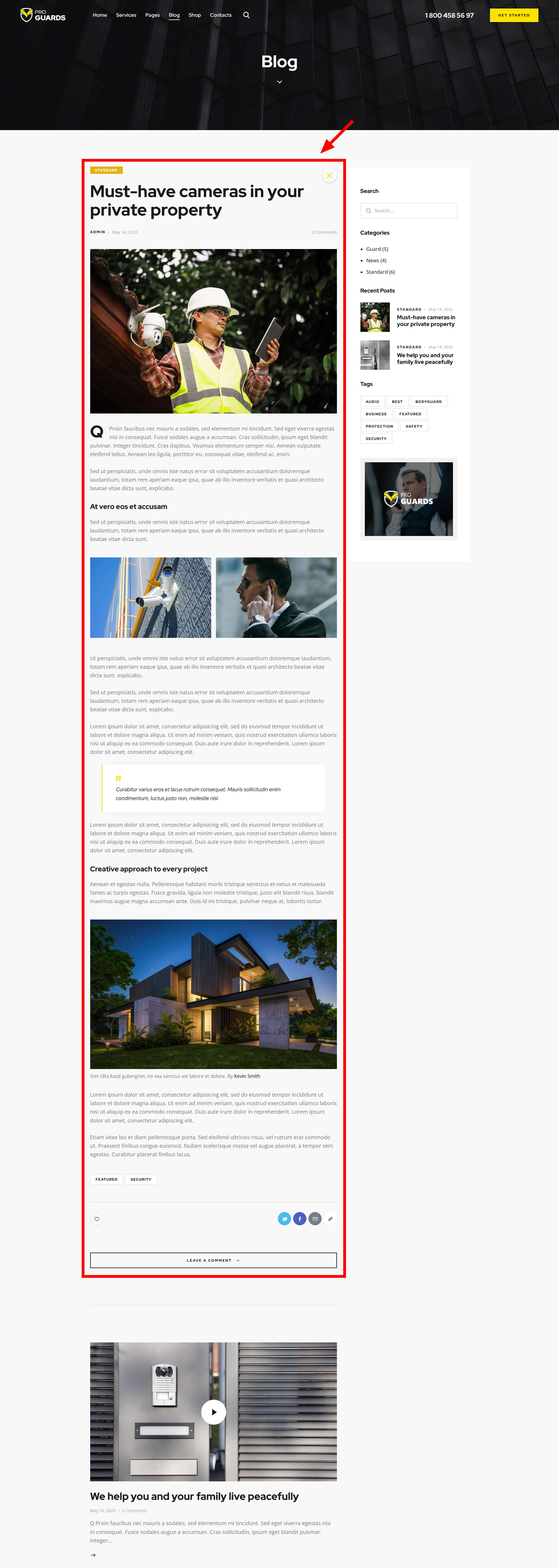
Blog
These settings are responsible for customizing blog-related pages.
Blog > Posts page
Settings of this group allow you to manage an overall look and behavior of posts pages.
These settings are applied to all types of blog pages, including Posts pages defined in the WordPress settings (Posts, available post types: Testimonials), as well as pages created via the Blog Archive template (unless no custom settings are specified in the Theme Options panel of a particular page/post).
Please check our article or visit this video tutorial for more information on how to add/customize the Posts pages.
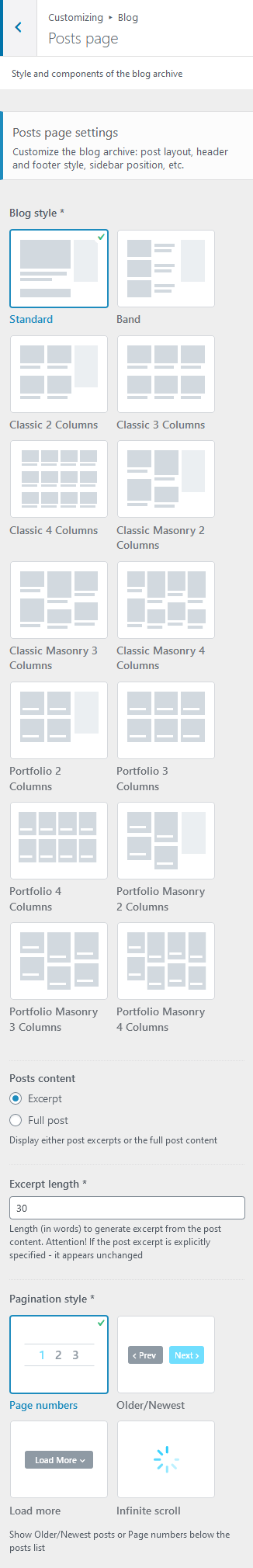
Posts page settings
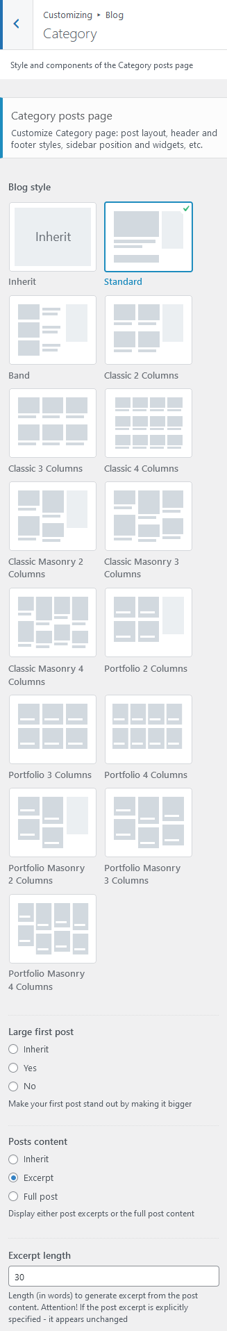
- Blog style - choose the style to output blog posts.
You can create additional layouts to output the posts in WP Dashboard > Layouts using Blog layout's type (Item Options section). Please see Creating Layouts section of this documentation file for more information. - Posts content - displays either the full post length or a post excerpt (for "Standard" blog style).
- Excerpt length - regulates the length of the post excerpt (in words). If the post excerpt is explicitly specified - it appears unchanged. This option appears if "Posts content" is set to "Excerpt".
- Large first post - enlarges the first post to make it stand out form the rest (for "Classic" blog styles).
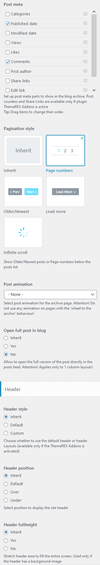
- Pagination style - select between page numbers, older/newest posts links, load more button, or infinite scroll.
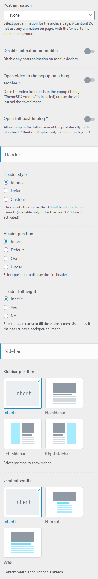
- Post animation - choose one of the post animation styles. Do not use any animation for pages with a full-screen scrolling behavior, such as Chess 2 columns.
- Disable animation on mobile - disable any posts animation and hover-animation for metadata in custom layouts that are viewed on mobile devices.
- Open video in the popup on a blog archive - open the video from posts in the popup window (if plugin "ThemeREX Addons" is installed) or play the video instead the cover image on a blog stream page.
- Open full post in blog - displays the full version of a single post if you click on a single post link on a blog stream page (for 1 column layout only!).
- Hide author bio - enable/disable the author bio after the post content.
- Hide related posts - enable/disable related posts after post content.
Header-related settings
These settings allow selecting header style and position. For custom header style you can specify the header layout, that are available for managing in WP Dashboard > Layouts.
- "Header fullheight" option stretches the header area to fill the whole screen. Used only if header has a background image.
- "Header fullwidth" option stretches the header widgets area to the entire window width (please check "Default header style" to make this option appear).
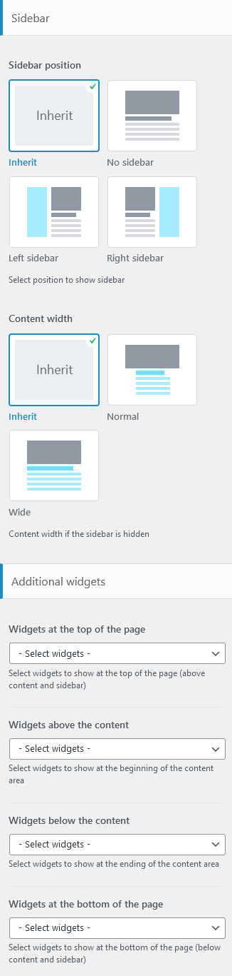
Sidebar-related settings
- Sidebar position - moves sidebar to the right or left hand side of the page, or hides it. The Inherit option inherits the value specified in the Appearance > Customize > General panel.
Additional options for "Left/Right" sidebar position:
- Sidebar position on the small screen - select the position of the sidebar on devices with small screen (except for mobile devices): above/below the content area or as a floating bar. The Inherit option inherits the value specified in the Appearance > Customize > General panel.
- Sidebar style - choose whether to use the default sidebar or custom sidebar layout (available only if the ThemeREX Addons is activated).
For "Default" sidebar style:
- Sidebar widgets - specify which widget set to show in the sidebar area. The widgets are available in Appearance (WP Dashboard) > Widgets.
- Select custom layout - select already built sidebar layout. You can create new sidebar layouts or customize the existing ones in the Dashboard > Layouts tab, using a user-friendly Elementor. Check the Layouts section for more information.
- Content width - choose the content width if the sidebar is hidden.
Widgets-related settings
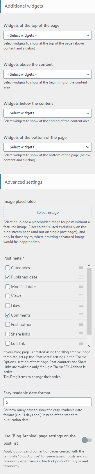
Here you can specify widget sets for such locations as top page, above content, below content and bottom page. Check the Widgets section for more information.
Advanced settings
- Image placeholder - if a post has no featured image, this image will be used instead.
- Post meta - choose which post meta elements to display. Views and Likes are available only if the ThemeREX Addons plug-in is active.
- Easy Readable Date Format - specify for how many days to show the human-friendly date format (e.g. 2 days ago) instead of the regular publication date.
- Use "Blog Archive" page settings on the post list - if checked, this option allows all posts (post lists) from subcategories inherit page settings from its parent category and not the general ones.
If the page is created using the Blog Archive template, the post meta settings should be specified in the Theme Options > Content section of that page.
Blog > Category/Tag/Author/Search
Here you can set the overall view of single category/tag/author/search posts page.
Category/Tag/Author/Search posts page settings
- Blog style - choose the style to output single category/tag/author/search posts.
You can create additional layouts to output the category/tag/author/search posts in WP Dashboard > Layouts using Blog layout's type (Item Options section). Please see Creating Layouts section of this documentation file for more information. - Large first post - enlarges the first post to make it stand out form the rest.
- Posts content - displays either the full post length or a post excerpt (for "Standard" blog style).
- Excerpt length - regulates the length of the post excerpt (in words). If the post excerpt is explicitly specified - it appears unchanged. This option appears if "Posts content" is set to "Excerpt".
- Post meta - enable/disable the additional post information, such as date, author, comments, etc. You can also change their order by dragging and dropping.
- Pagination style - select between page numbers, older/newest posts links, load more button, or infinite scroll.
- Post animation - choose one of the post animation styles. Do not use any animation for pages with a full-screen scrolling behavior, such as Chess 2 columns.
- Open full post in blog - displays the full version of a single post if you click on a single post link on a blog stream page (for 1 column layout only!).
Header-related settings
These settings allow selecting header style and position. For custom header style you can specify the header layout, that are available for managing in WP Dashboard > Layouts.
- "Header fullheight" option stretches the header area to fill the whole screen. Used only if header has a background image.
- "Header fullwidth" option stretches the header widgets area to the entire window width (please check "Default header style" to make this option appear).
Sidebar-related settings
- Sidebar position - moves sidebar to the right or left hand side of the page, or hides it. The Inherit option inherits the value specified in the Appearance > Customize > Blog > Posts page panel.
Additional options for "Left/Right" sidebar position:
- Sidebar style - choose whether to use the default sidebar or custom sidebar layout (available only if the ThemeREX Addons is activated).
For "Default" sidebar style:
- Sidebar widgets - specify which widget set to show in the sidebar area. The widgets are available in Appearance (WP Dashboard) > Widgets.
- Select custom layout - select already built sidebar layout. You can create new sidebar layouts or customize the existing ones in the Dashboard > Layouts tab, using a user-friendly Elementor. Check the Layouts section for more information.
- Sidebar style - choose whether to use the default sidebar or custom sidebar layout (available only if the ThemeREX Addons is activated).
- Content width - choose the content width if the sidebar is hidden.
Widgets-related settings
Here you can specify widget sets for such locations as top page, above content, below content and bottom page. Check the Widgets section for more information.
Blog > Single posts
Settings of this group are responsible for managing an overall look and behavior of single posts' pages.
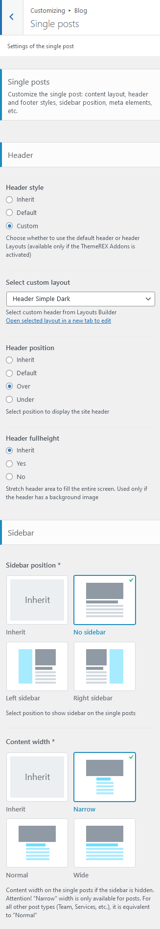
Header-related settings
These settings allow selecting header style and position. For custom header style you can specify the header layout, that is available for customizing in WP Dashboard > Layouts.
- Header fullheight - stretches the header area to fill the whole screen. Used only if header has a background image.
- Header fullwidth - stretches the header widgets area to the entire window width (please check "Default header style" to make this option appear).
Sidebar-related settings
- Sidebar position - moves sidebar to the right or left hand side of the page, or hides it. The Inherit option inherits the value specified in the Appearance > Customize > Blog > Posts page panel.
Additional options for "Left/Right" sidebar position:
- Sidebar position on the small screen - select the position of the sidebar on devices with small screen (except for mobile devices): above/below the content area or as a floating bar. The Inherit option inherits the value specified in the Appearance > Customize > Blog > Posts page panel.
- Sidebar style - choose whether to use the default sidebar or custom sidebar layout (available only if the ThemeREX Addons is activated).
For "Default" sidebar style:
- Sidebar widgets - specify which widget set to show in the sidebar area. The widgets are available in Appearance (WP Dashboard) > Widgets.
- Select custom layout - select already built sidebar layout. You can create new sidebar layouts or customize the existing ones in the Dashboard > Layouts tab, using a user-friendly Elementor. Check the Layouts section for more information.
- Content width - choose the content width if the sidebar is hidden.
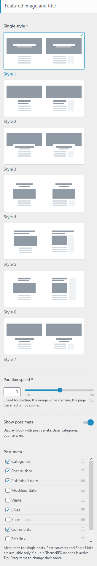
Featured image and title
- Single style - choose the style to output the featured image and the title on a single post;
The position of the featured image, post title and meta can be overridden by the settings of "Layouts: Title and Breadcrumbs" and Elementor "Layouts: Featured Image" widgets in a custom header layout!
- Parallax speed - specify the speed for shifting the image while scrolling the page. If
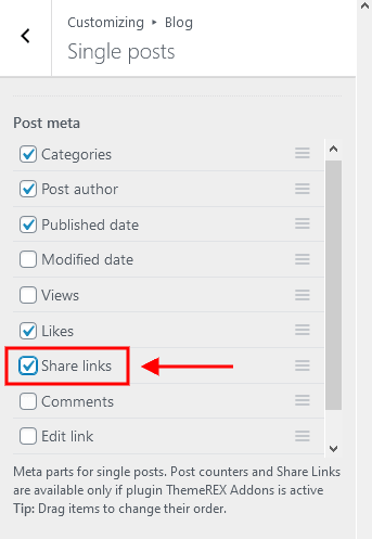
0, the effect is not applied. - Show post meta - enable/disable the additional post information, such as date, author, comments, etc. If this option is enabled, choose which post meta elements to display. You can also change their order by dragging and dropping.
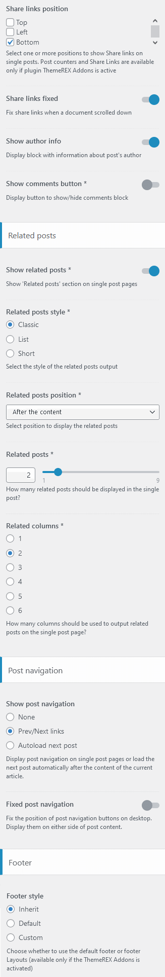
- Share links position - specify the position of social media sharing buttons on single posts (top/left/bottom);
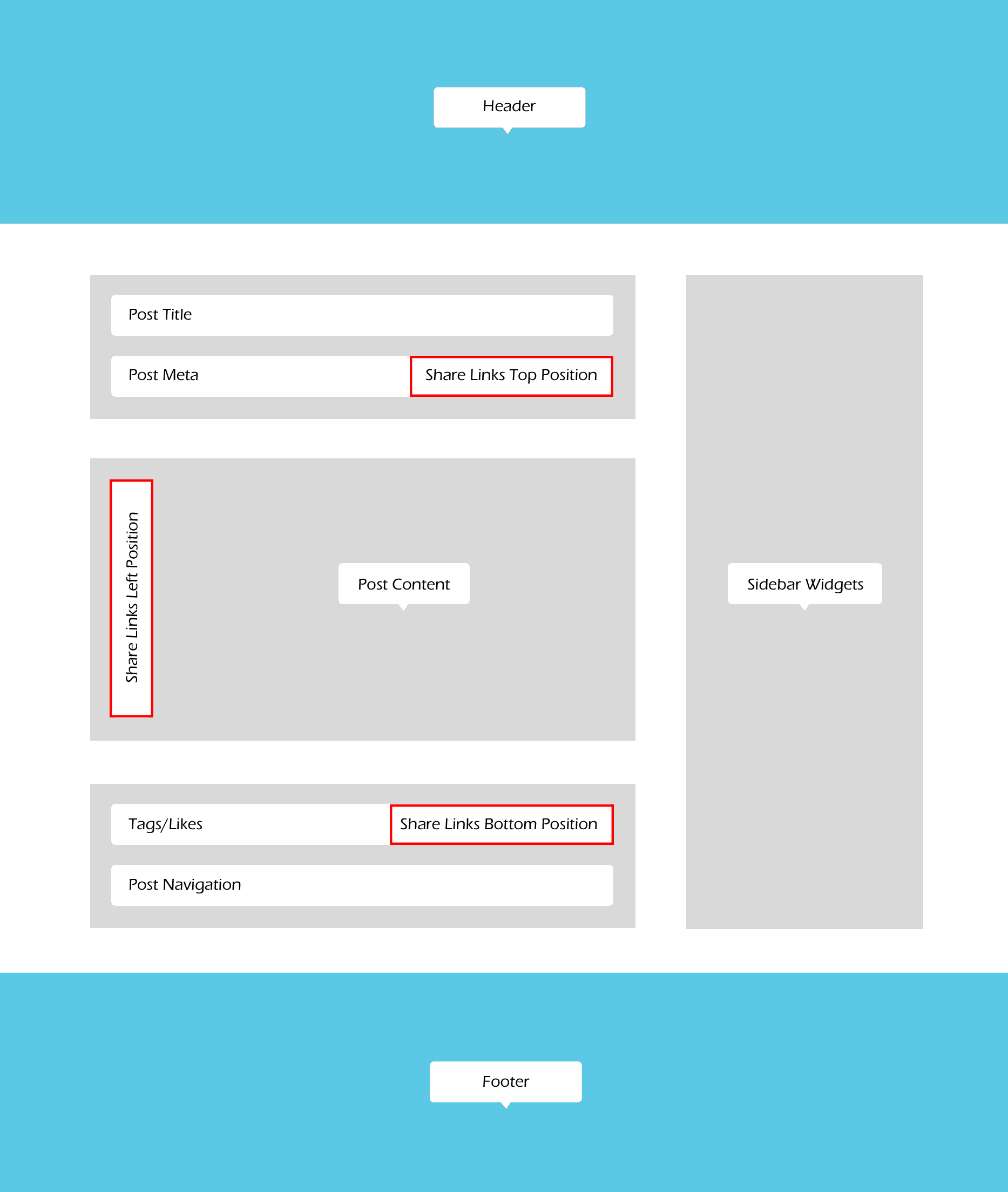 In order to output the social links in the "Top position" (above the content area), please make sure the social links are enabled in the post meta section (Appearance > Customize > Blog > Single Posts).
- Share links fixed - fix share links when you scroll down the post (for "Left" share links position ONLY!);
- Show author info - show/hide the author bio section;
- Show comments button - enables comments button;
- Comments block - specify the initial state of the comments block: fully displayed or hidden under a button;
Related Posts settings
Here you can enable related posts on a single post's page ("Show related posts" option).
- Related posts style - select the related posts style;
- Related posts position - specify the position to display the related posts;
- Related posts - select the quantity of related posts to show;
- Related columns - set the number of columns the section should be divided into (from 1 to 4);
Posts navigation
This option enables/disables posts navigation on a single post's page. The following styles of the post's navigation are available:
- None - without navigation;
- Prev/Next links - displays thumbs and links for prev/next posts below the post's content. "Fixed posts navigation" fixes the Prev/Next links to the sides of the screen below the post's content.
- Autoload next post - inserts the next posts inside the content area of a viewed post, just under the content of the viewed post itself. Here you can specify whether to load only the content or full post as well as show or hide author bio/related posts/comments of next posts.
Footer-related settings
These settings are responsible for selecting footer style. For "Custom" footer style "Select custom layout" option is available. You can manage these custom footer layouts in the WP Dashboard > Layouts tab. The Inherit option inherits the value specified in the Appearance > Customize > Footer panel.
Shop
These settings are responsible for customizing shop-related pages (works only if the WooCommerce plug-in is installed).
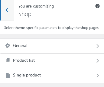
Shop > General
Here you can specify common settings for both product list and single product pages: color scheme, the width of the content area and additional widgets panels.
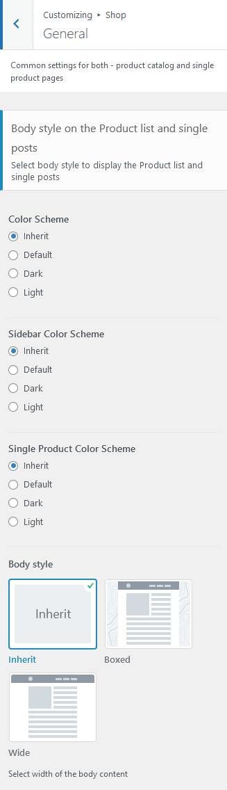
Body style settings
- Color Scheme - specify the color scheme for shop list page.
- Sidebar Color Scheme - sets the color scheme for a sidebar on shop list page and single products.
- Single Product Color Scheme - choose the color scheme for single products.
- Body style - choose tthe width of the body content (for shop list page and single products). For "Boxed" body style here you can upload a background image. The Inherit option inherits the value specified in the Appearance > Customize > General panel.
Additional Panels settings
Here you can specify widget sets for such locations as top page, above content, below content and bottom page. Check the Widgets section for more information.
Shop > Product list
These settings are responsible for managing the overall view of product list page.
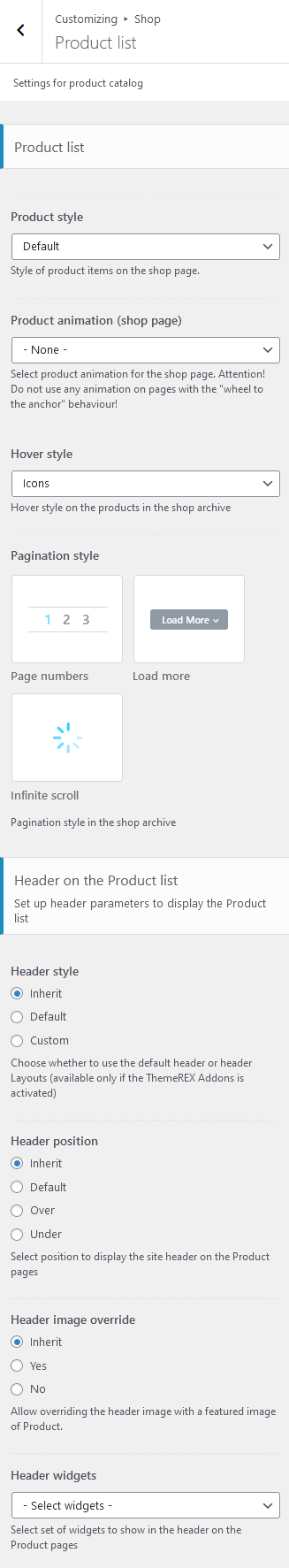
Product List settings
- Product style - choose the style to output products on the shop archive page.
- Product animation (shop page) - select product animation for the shop archive page. Do not use any animation on pages with the "wheel to the anchor" behaviour!
- Hover style - choose the hover style of the products on the shop archive page.
- Pagination style - select between page numbers, load more button or infinite scroll.
Header-related settings
These settings allow selecting header style, position, specifying its widgets and choosing whether to override the header image with the post's featured image or not. For custom header style you can specify the header layout, that is available for customizing in WP Dashboard > Layouts.
Sidebar-related settings
These settings are responsible for specifying a sidebar style and the position of the sidebar area on Shop List page as well as its version for devices with small screen resolution.
- Sidebar position - moves the sidebar to the right or left hand side of the page, or hides it.
Additional options for "Left/Right" sidebar position:
- Sidebar position on the small screen - select the position of the sidebar on devices with small screen: above/below the content area or as a floating bar.
- Sidebar style - choose whether to use a default sidebar or custom sidebar layout (available only if the ThemeREX Addons is activated).
For "Default" sidebar style:
- Sidebar widgets - specify which widget set to show in the sidebar area. The widgets are available in Appearance (WP Dashboard) > Widgets.
- Select custom layout - select already built sidebar layout. You can create new sidebar layouts or customize the existing ones in the Dashboard > Layouts tab, using a user-friendly Elementor. Check the Layouts section for more information.
- Sidebar width - specify the width of the sidebar (in pixels).
- Sidebar gap - specify the gap between content and sidebar (in pixels).
- Content width - select the content width if the sidebar is hidden.
Footer-related settings
These settings allow you to manage a footer style. For "Default" footer style specify widgets sets and widgets' columns quantity as well as choosing whether to expand the footer for the whole width of the page ("Footer fullwidth" option). For "Custom" footer style "Select custom layout" option is available. You can manage these footer layouts in the WP Dashboard > Layouts tab.
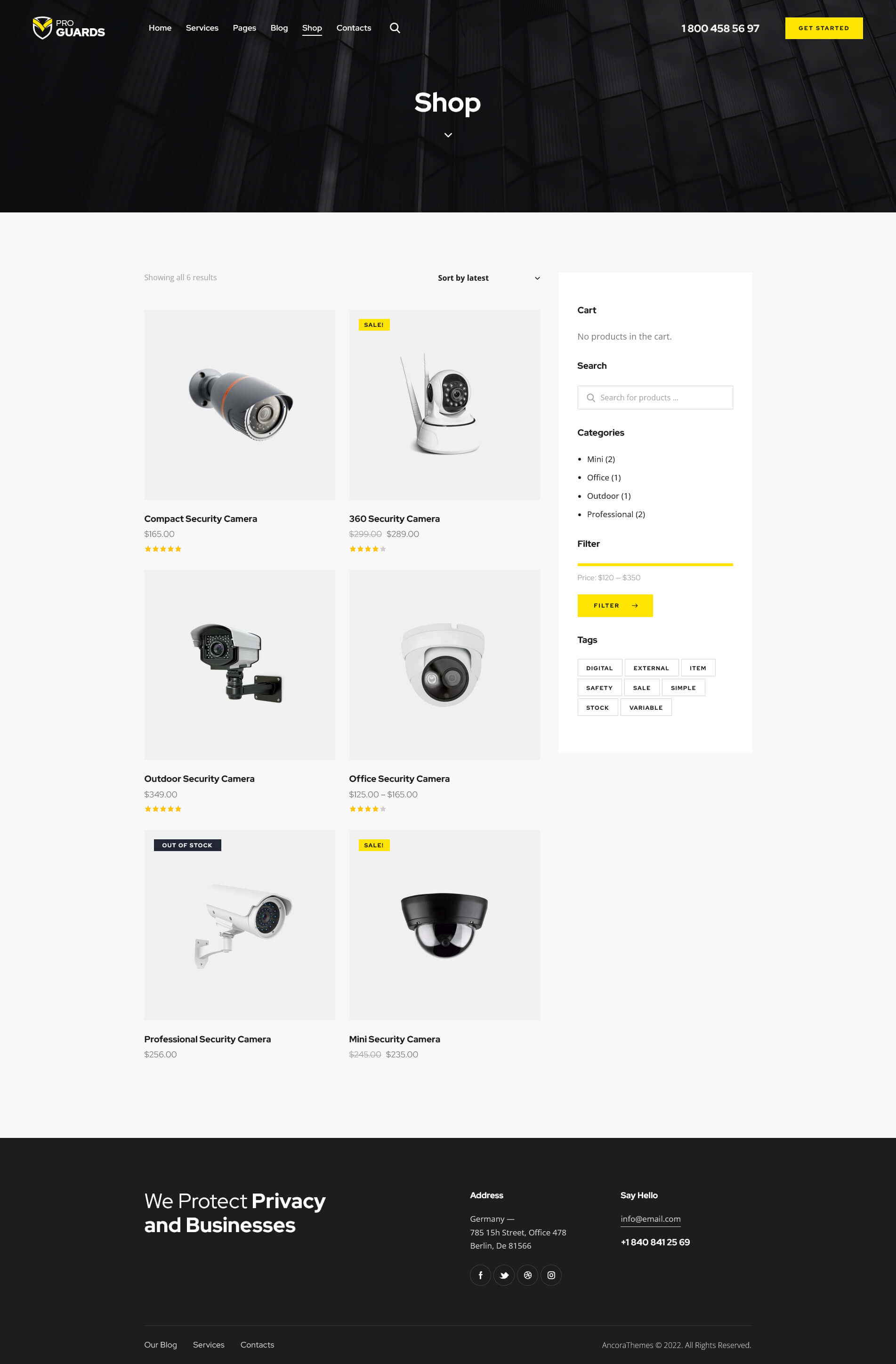
This is how the default Shop page looks like with the current settings.
Shop > Single product
Settings of this group are responsible for managing an overall look and behavior of single product pages.
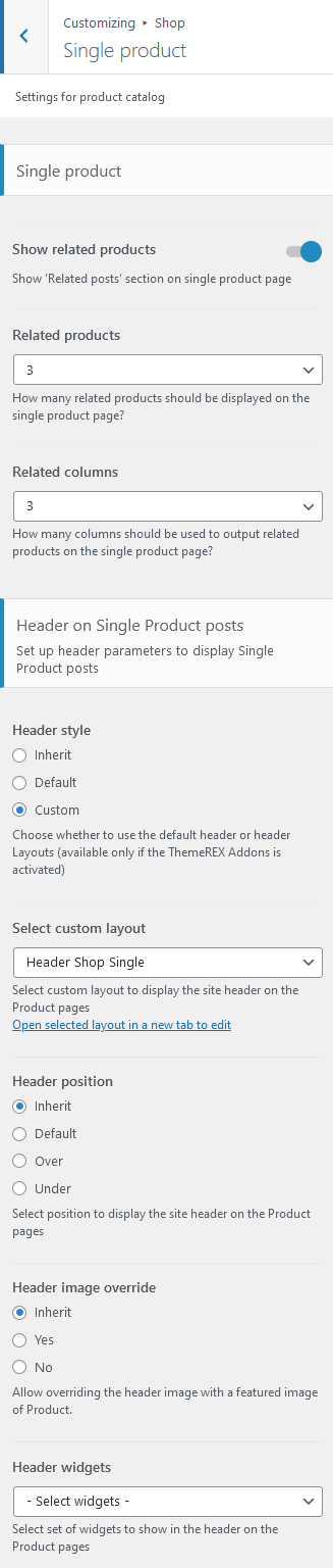
Single Product settings
- Show related products - enable/disable "Related Products" section on a single product page.
- Related products - specify the quantity of related products to be displayed on a single product page.
- Related columns - specify the columns quantity to divide the related products in on a single product page.
Header-related settings
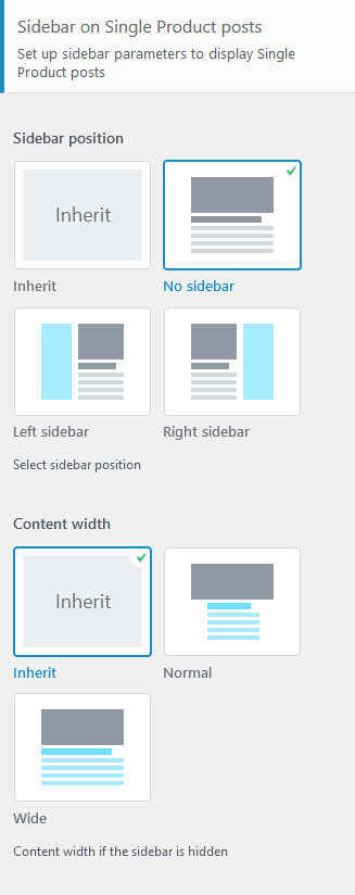
These settings allow selecting header style, position, specifying its widgets and choosing whether to override the header image with the post's featured image or not. For custom header style you can specify the header layout, that is available for customizing in WP Dashboard > Layouts.
Sidebar-related settings
These settings are responsible for specifying a sidebar style and the position of the sidebar area on Shop List page and single product posts as well as their versions for devices with small screen resolution.
- Sidebar position - moves the sidebar to the right or left hand side of the page, or hides it.
Additional options for "Left/Right" sidebar position:
- Sidebar position on the small screen - select the position of the sidebar on devices with small screen: above/below the content area or as a floating bar.
- Sidebar style - choose whether to use a default sidebar or custom sidebar layout (available only if the ThemeREX Addons is activated).
For "Default" sidebar style:
- Sidebar widgets - specify which widget set to show in the sidebar area. The widgets are available in Appearance (WP Dashboard) > Widgets.
- Select custom layout - select already built sidebar layout. You can create new sidebar layouts or customize the existing ones in the Dashboard > Layouts tab, using a user-friendly Elementor. Check the Layouts section for more information.
- Content width - select the content width if the sidebar is hidden.
Footer-related settings
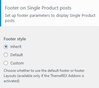
These settings allow specifying footer style. For "Default" footer style specify widgets sets and widgets' columns quantity as well as choosing whether to expand the footer for the whole width of the page ("Footer fullwidth" option). For "Custom" footer style "Select custom layout" option is available. You can manage these footer layouts in the WP Dashboard > Layouts tab.
WooCommerce
Settings of this group allow managing the overall look of the WooCommerce elements (works only if the WooCommerce plug-in is installed). The single products can be added/customized in WordPress Dashboard Menu > Products.
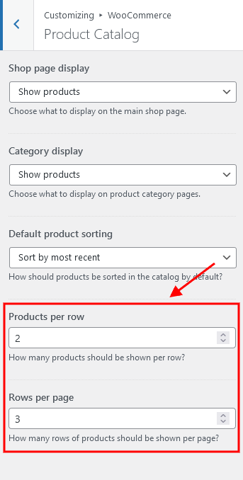
The quantity of products displayed on shop page is inherited from the Appearance > Customize > WooCommerce > Product Catalog section.
Typography
Here you can upload fonts and adjust font settings for specific typography elements.
Check this article or video tutorial for more information on how to add new Google Fonts and Custom Fonts.
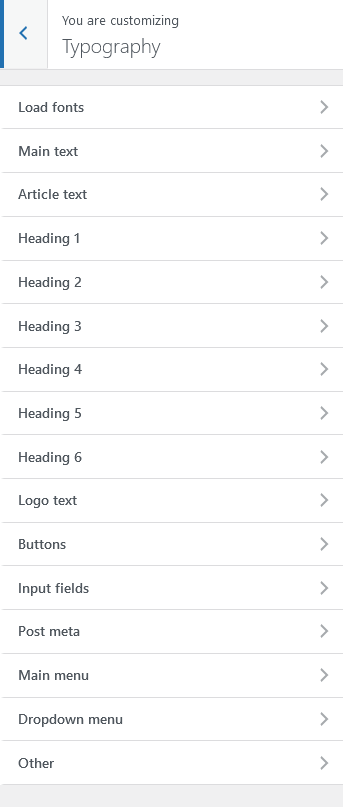
The theme enables you to use both Google Fonts and custom fonts in your design. You can load up to 5 different font families, including different styles and weights for each typeface.
IMPORTANT! To manage fonts quantity available for upload, edit 'max_load_fonts' => 5 variable in theme-specific/theme.setup.php file.
The Other font is used for the following elements:
- Content of the testimonials, displayed using the Elementor "Testimonials" widget (ThemeREX Addons Extensions group) in "Bred", "Decoration", "Alter 2", "Alter", "Fashion", "Creative", "Accent 2", "Accent", "Hover", "Common", "List", "Light", "Extra", "Plain", "Simple" and "Default" styles;
Colors
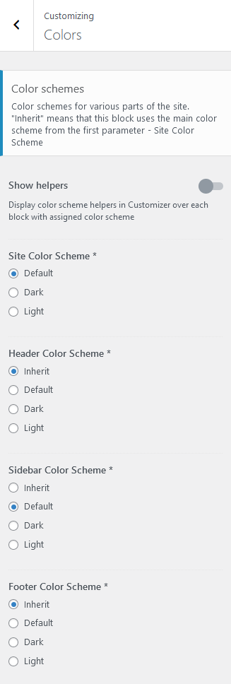
The theme allows you to assign color schemes to specific parts of your website. This is useful for highlighting certain areas and giving them a distinctive look.
The theme supports 3 color schemes - default (light), dark and alter light.
Check this video tutorial for more information on how to customize color schemes.
IMPORTANT! Due to specifics of CSS rules, you are unable to assign a light color scheme to any website part, if the dark color scheme is enabled.
Here are the website parts to which you can assign color schemes:
- Show Helpers - enables a colored border arround a block in the Customizer with an element's name and color scheme applied to this particular element. The helper can be useful for editing the theme's color schemes. It helps you understand the colors of what elements you are customizing.
- Site Color Scheme - defines the main color scheme of your website. If no other part of website has a color scheme specified explicitly, affects the whole website. Otherwise, affects the body background color, body typography and pretty much anything that is located below the header and above the footer areas (except sidebar).
- Header Color Scheme - modifies the color scheme of the header.
- Sidebar Color Scheme - affects the color of the sidebar. The Inherit option inherits the value specified in the Site Color Scheme setting.
- Footer Color Scheme - specifies the color of your footer.
You can also assign color schemes for individual pages in the Theme Options > Colors panel of those pages.
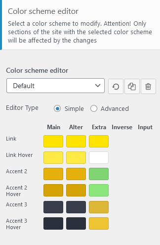
Color Scheme Editor
Here you can customize the color schemes of your website.
Three additional buttons are available:
- Reset - removes the current changes, made after your last saving.
- Copy - creates a new color scheme by duplicating the default one. Thus, it is possible to set different color schemes for particular pages and their parts.
- Delete - removes the current color scheme. You can delete only newly created color schemes. All default ones will remain.
Select the color scheme you want to customize and choose one of 2 modes (editor types) - simple or advanced.
In a simple mode, you can customize the accent colors (link colors) of a theme. If you want to dig deeper, switch to the advanced mode. You can entirely change the theme colors.
Both modes contain the following groups of settings:
MAIN
The main color group of a website. Here you can find the following elements:
- Background color - the main background color of a website; (for advanced mode only)
- Border color - color used for elements with a border and for content delimiters; (for advanced mode only)
- Text - color for the main body text; (for advanced mode only)
- Text dark - color mainly applied for headings and page/post titles; (for advanced mode only)
- Text light - color used for additional meta elements, such as post author, date, comments, etc. (for advanced mode only)
- Link - the main accent color of a website. The color can be used as links color, a background color for buttons and the color for minor elements, like list item markers, etc. By default, this setting sets the Link hover color for the Alter color group.
- Link hover - the hover color of the elements with the main accent color and the hover color for links. It can also be used as the main accent color for the Alter color group.
- Accent 2 - the second accent color;
- Accent 2 hover - the hover color of the elements with second accent colors;
- Accent 3 - the third accent color;
- Accent 3 hover - the hover color of the elements with third accent colors;
ALTER
Alter means alternative color group, mostly applied for sidebar and footer, if a color scheme is assigned to them and it coincides with the site color scheme (NOT inherited). This group of colors can also be applied to page widgets or blocks that are output on some background by default (the background is NOT added through the page builders). Alter colors include the same elements as the Main color group, plus two additional hover colors for border and background.
EXTRA
An additional color group for extra elements such as dropdowns, price blocks, table headers, blockquotes, etc.
As a rule, the text and background colors from the Extra group should contrast against the respective colors from the Main color group.
INVERSE (for advanced mode only)
Inverse elements are the elements that use the theme accent color (usually the main one) ("Link", "Accent 2", "Accent 3" options) as a background color. In this way, they get distinctive look and stand out from the rest of the content. You can apply these settings for buttons, blockquotes, dropdowns, etc.
- Border color;
- Border hover;
- Text color - the main body text color;
- Text dark - used for headings or other elements that need a darker color;
- Text light - used for meta elements that provide additional information;
- Link color - since the main accent color (i.e. the link color) sets the background color, you need to specify a different link color;
- Link hover - the hover color of the link;
INPUT (for advanced mode only)
Colors for form fields: input fields, text areas, select fields, etc.
- Background - background color of an input field;
- Background hover - background color when an input field is active;
- Border color;
- Border hover - border color when a field is active;
- Text - a regular text color;
- Text dark - the color of the text when a field is active (as you type in);
- Text light - used for the placeholder text when a field is not active, before you type in;
In case the changes of the color schemes are not applied, please enable Debug mode (in Theme Panel > ThemeREX Addons > General tab) and save ThemeREX Addons settings.
Background
Settings of this group allow editing the background color/image (the one behind the body's content when "Boxed" body style is on).
Just click on Select image button to upload the image from the Media Library or your computer. Right after this step, additional options appear, such as "Preset", "Image Position", "Image Size" and a few other.
Plugins settings > Portfolio
Settings of this group are responsible for managing an overall look and behavior of portfolio-related pages (all portfolio items page and single portfolio posts).
IMPORTANT! The number of portfolio posts displayed on all portfolio items page is inherited from the Settings > Reading > Blog pages show at most option. The portfolio posts can be added/customized in WordPress Dashboard Menu > Portfolio section.
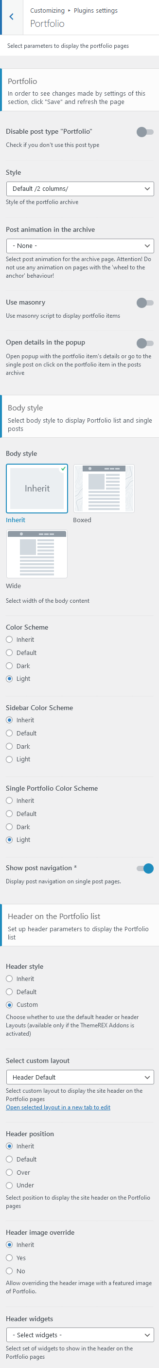
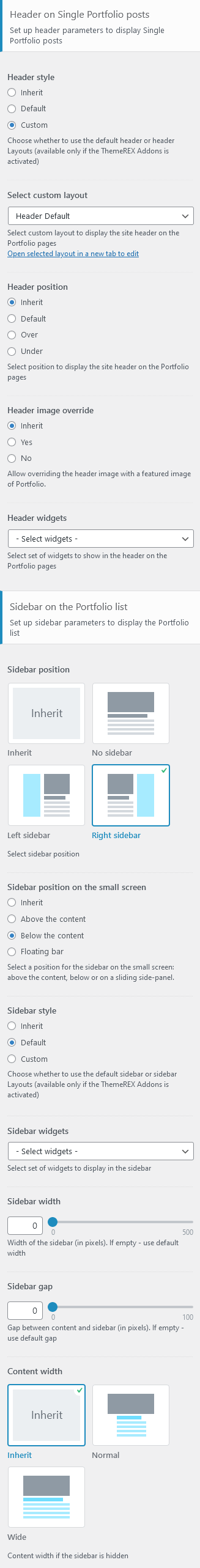
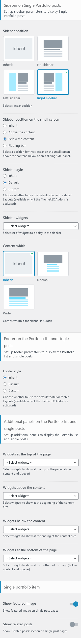
Style-related settings
Here you can enable/disable portfolio post type and specify the style of the portfolio archive.
Please check "Disable post type Portfolio" option only if you do not want to use this post type.
Apply "Style" option only after you save the other options!
- Post animation in the archive - select the animation to show posts in the archive. Attention! Do not use any animation on pages with the "wheel to the anchor" behaviour!
- Use masonry - use masonry script to display portfolio items.
- Open details in the popup - select the behavior of the portfolio item on click in the posts archive: open popup with the portfolio item's details or go to the single post.
Body Style & Color Scheme settings
- Body style - choose the width of the body content. For "Boxed" body style here you can upload a background image.
- Color Scheme - specify the color scheme for portfolio list page.
- Sidebar Color Scheme - sets the color scheme for a sidebar on portfolio list page and single portfolio item posts.
- Single Portfolio Color Scheme - choose the color scheme for single portfolio items.
- Show post navigation - enables/disables posts navigation on single portfolio item posts.
Header-related settings
These settings allow selecting header style, position, specifying its widgets and choosing whether to override the header image with the post's featured image or not. For custom header style you can specify the header layout, that is available for customizing in WP Dashboard > Layouts.
Sidebar-related settings
These settings are responsible for specifying widget set for a sidebar and its position for All Portfolio Items page and single portfolio posts as well as their versions for devices with small screen resolution.
- Sidebar position - moves sidebar to the right or left hand side of the page, or hides it.
Additional options for "Left/Right" sidebar position:
- Sidebar position on the small screen - select the position of the sidebar on devices with small screen (except for mobile devices): above/below the content area or as a floating bar.
- Sidebar style - choose whether to use the default sidebar or custom sidebar layout (available only if the ThemeREX Addons is activated).
For "Default" sidebar style:
- Sidebar widgets - specify which widget set to show in the sidebar area. The widgets are available in Appearance (WP Dashboard) > Widgets.
- Select custom layout - select already built sidebar layout. You can create new sidebar layouts or customize the existing ones in the Dashboard > Layouts tab, using a user-friendly Elementor. Check the Layouts section for more information.
- Sidebar width - specify the width of the sidebar (in pixels).
- Sidebar gap - specify the gap between content and sidebar (in pixels).
- Content width - choose the content width if the sidebar is hidden.
Footer-related settings
These settings allow selecting footer style. For "Default" footer style you can also specify widgets sets and columns quantity as well as choosing whether to expand the footer for the whole width of the page ("Footer fullwidth" option). For "Custom" footer style "Select custom layout" option is available. You can manage these footer layouts in the WP Dashboard > Layouts tab.
Additional panels settings
Here you can specify widget sets for such locations as top page, above content, below content and bottom page. Check the Widgets section for more information.
Single portfolio item settings
Here you can choose whether to show or hide featured image and related posts on a single portfolio page; specify related portfolio items and their columns quantity (if "Show related posts" option is checked).
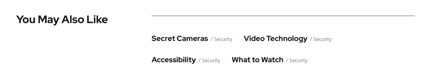
PLEASE NOTE! The hover effects for related posts require the Mouse Helper Add-on to be active.
Plugins settings > Services
Settings of this group are responsible for managing an overall look and behavior of services-related pages (all services page and single service posts).
IMPORTANT! The number of services posts displayed on all services page is inherited from the Settings > Reading > Blog pages show at most option. The services posts can be added/customized in WordPress Dashboard Menu > Services section.
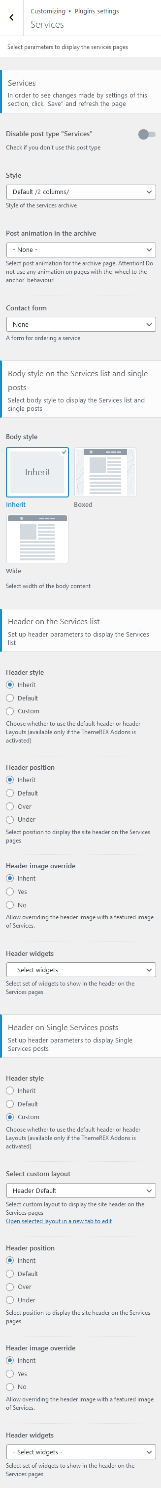
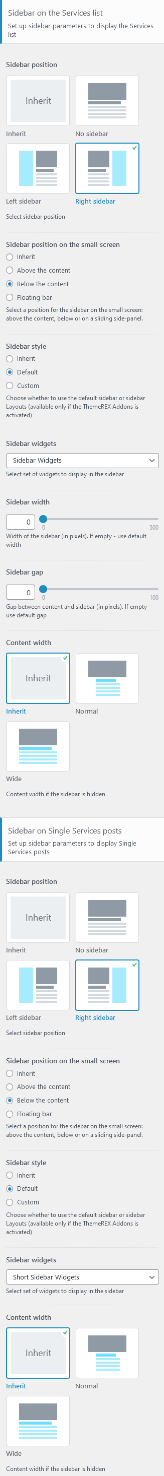
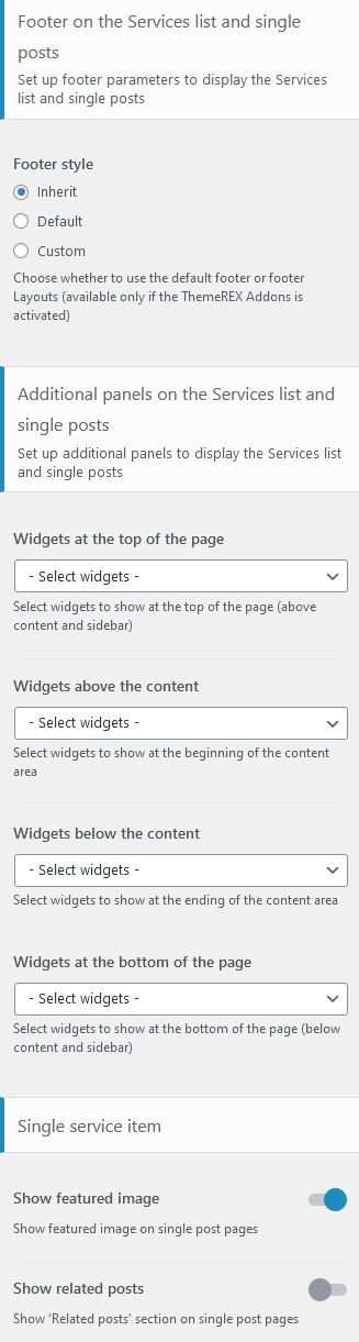
Style-related settings
Here you can enable/disable services post type, specify the style of the services archive as well as add a contact form to a single service post.
Please check "Disable post type Services" option only if you do not want to use this post type.
Apply "Style" option only after you save the other options!
Post animation in the archive - select the animation to show posts in the archive. Attention! Do not use any animation on pages with the "wheel to the anchor" behaviour!
Contact form option:
- None - hides a form on a single service post;
- Default - adds default contact form that is built using Elementor Form widget.
- "Contact form (main)", "Contact form (style 3)", etc. - inserts already built contact form (available if Contact Form 7 plug-in is installed and active). The contact forms are pre-built and come with the theme. They can be customized in Contact (WP Dashboard) > Contact Forms.
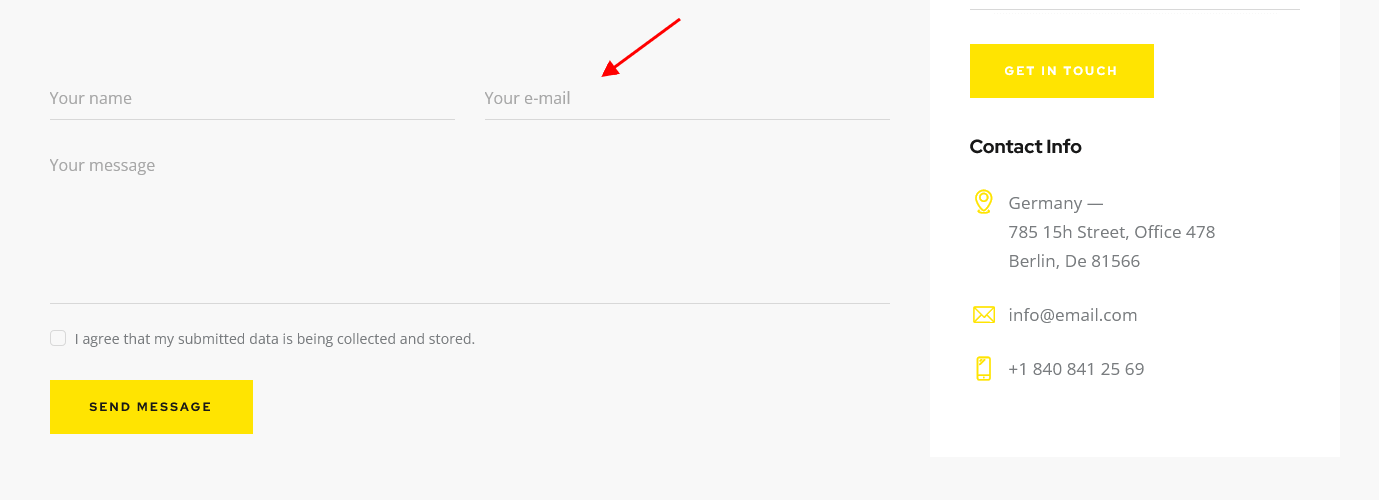
Body style setting
This setting is responsible for choosing the body style of the services posts. For "Boxed" body style here you can upload the background image.
Header-related settings
These settings allow selecting header style, position, specifying its widgets and choosing whether to override the header image with the post's featured image or not. For custom header style you can specify the header layout, that is available for customizing in WP Dashboard > Layouts.
Sidebar-related settings
These settings are responsible for specifying widgets set for a sidebar and its position for All Services page and single service posts as well as their versions for devices with small screen resolution.
- Sidebar position - moves sidebar to the right or left hand side of the page, or hides it.
Additional options for "Left/Right" sidebar position:
- Sidebar position on the small screen - select the position of the sidebar on devices with small screen: above/below the content area or as a floating bar.
- Sidebar style - choose whether to use the default sidebar or custom sidebar layout (available only if the ThemeREX Addons is activated).
For "Default" sidebar style:
- Sidebar widgets - specify which widget set to show in the sidebar area. The widgets are available in Appearance (WP Dashboard) > Widgets.
- Select custom layout - select already built sidebar layout. You can create new sidebar layouts or customize the existing ones in the Dashboard > Layouts tab, using a user-friendly Elementor. Check the Layouts section for more information.
- Sidebar width - specify the width of the sidebar (in pixels).
- Sidebar gap - specify the gap between content and sidebar (in pixels).
- Content width - choose the content width if the sidebar is hidden.
Footer-related settings
These settings allow selecting footer style. For "Default" footer style you can also specify widgets sets and columns quantity as well as choosing whether to expand the footer for the whole width of the page ("Footer fullwidth" option). For "Custom" footer style "Select custom layout" option is available. You can manage these footer layouts in the WP Dashboard > Layouts tab.
Additional panels settings
Here you can specify widget sets for such locations as top page, above content, below content and bottom page. Check the Widgets section for more information.
Single service item settings
Here you can choose whether to show or hide a featured image and related posts on a single service page; specify related services and their columns quantity (if "Show related posts" option is checked).
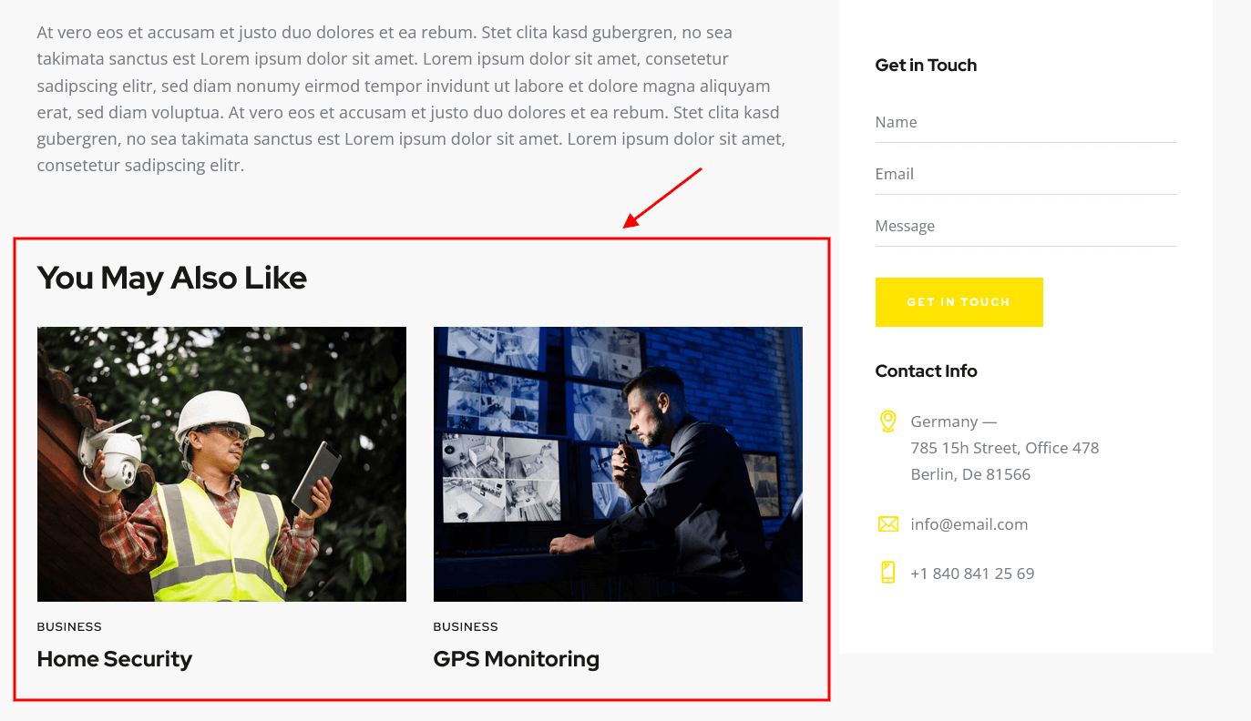
Plugins settings > Team
Settings of this group are responsible for managing an overall look and behavior of team-related pages (all team members page and single team member posts).
IMPORTANT! The number of team posts displayed on all team members page is inherited from the Settings > Reading > Blog pages show at most option. The team posts can be added in WordPress Dashboard Menu > Team section.
Style-related settings
Here you can enable/disable team post type, specify the style of the team archive as well as add a contact form to a single team member post.
Please check "Disable post type Team" option only if you do not want to use this post type.
Apply "Style" option only after you save the other options!
Post animation in the archive - select the animation to show posts in the archive. Attention! Do not use any animation on pages with the "wheel to the anchor" behavior!
Contact form option:
- None - hides a form on a single team member post;
- Default - adds default contact form that is built using Elementor Form widget.
- "Contact form (main)", "Contact form (style 3)", etc. - inserts already built contact form (available if Contact Form 7 plug-in is installed). The contact forms are pre-built and come with the theme. They can be customized in Contact (WP Dashboard) > Contact Forms.
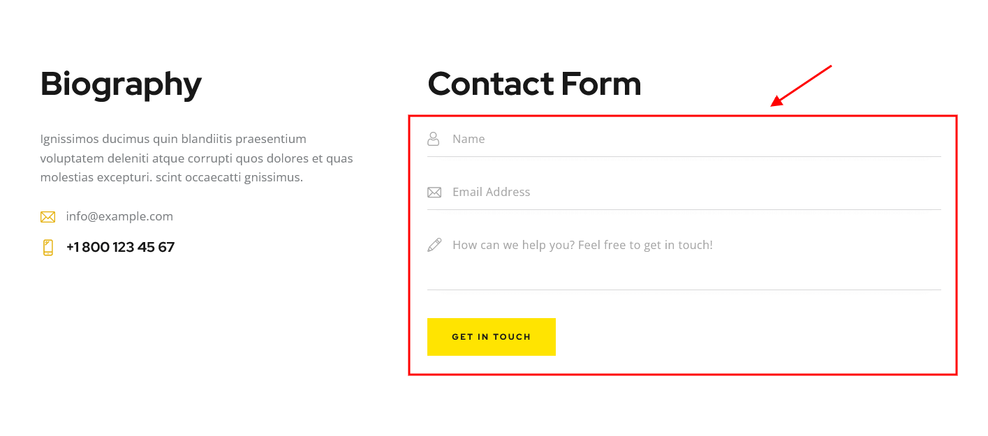
Body style setting
This setting is responsible for choosing the body style of the team posts. For "Boxed" body style here you can upload the background image.
Header-related settings
These settings allow selecting header style, position, specifying its widgets and choosing whether to override the header image with the post's featured image or not. For custom header style you can specify the header layout, that is available for customizing in WP Dashboard > Layouts.
Sidebar-related settings
These settings are responsible for specifying widgets set for a sidebar and its position for All Team Members page and single team posts as well as their versions for devices with small screen resolution.
- Sidebar position - moves sidebar to the right or left hand side of the page, or hides it.
Additional options for "Left/Right" sidebar position:
- Sidebar position on the small screen - select the position of the sidebar on devices with small screen (except for mobile devices): above/below the content area or as a floating bar.
- Sidebar style - choose whether to use the default sidebar or custom sidebar layout (available only if the ThemeREX Addons is activated).
For "Default" sidebar style:
- Sidebar widgets - specify which widget set to show in the sidebar area. The widgets are available in Appearance (WP Dashboard) > Widgets.
- Select custom layout - select already built sidebar layout. You can create new sidebar layouts or customize the existing ones in the WP Dashboard > Layouts tab, using a user-friendly Elementor. Check the Layouts section for more information.
- Sidebar width - specify the width of the sidebar (in pixels).
- Sidebar gap - specify the gap between content and sidebar (in pixels).
- Content width - choose the content width if the sidebar is hidden.
Footer-related settings
These settings allow selecting footer style. For "Default" footer style you can also specify widgets sets and columns quantity as well as choosing whether to expand the footer for the whole width of the page ("Footer fullwidth" option). For "Custom" footer style "Select custom layout" option is available. You can manage these footer layouts in the WP Dashboard > Layouts tab.
Additional panels settings
Here you can specify widget sets for such locations as top page, above content, below content and bottom page. Check the Widgets section for more information.
Team member single page settings
Here you can choose whether to show or hide the posts, written by a team member, on a single team member page; specify the quantity of the posts to be displayed (if "Show related posts" option is checked).
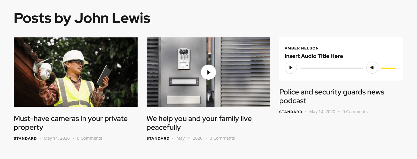
PLEASE NOTE! In order to make the system identify a team member as an author of a post, you should open a particular team member post and in Item Options > Link to WordPress user option choose a WordPress user. Now login under a definite WordPress user and create the posts you need.
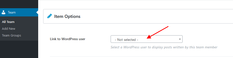
Plugins settings > Testimonials
This section allows enabling/disabling "Testimonials" post type. The single testimonials can be managed in Testimonials (WP Dashboard) > All Testimonials.
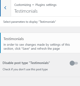
Additional CSS
Settings of this group allow you to specify additional custom styles.
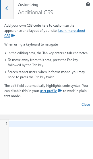
Homepages
This section covers the information about Pages in your website: included page templates, how to edit existing pages and add new ones.
You can import required pages, along with the page settings, using the Importer tool. Learn more about it in the Demo Content chapter.
New Page Creation
To create a new page navigate to "Pages" dashboard menu item in your WordPress admin panel and click on Add new button.
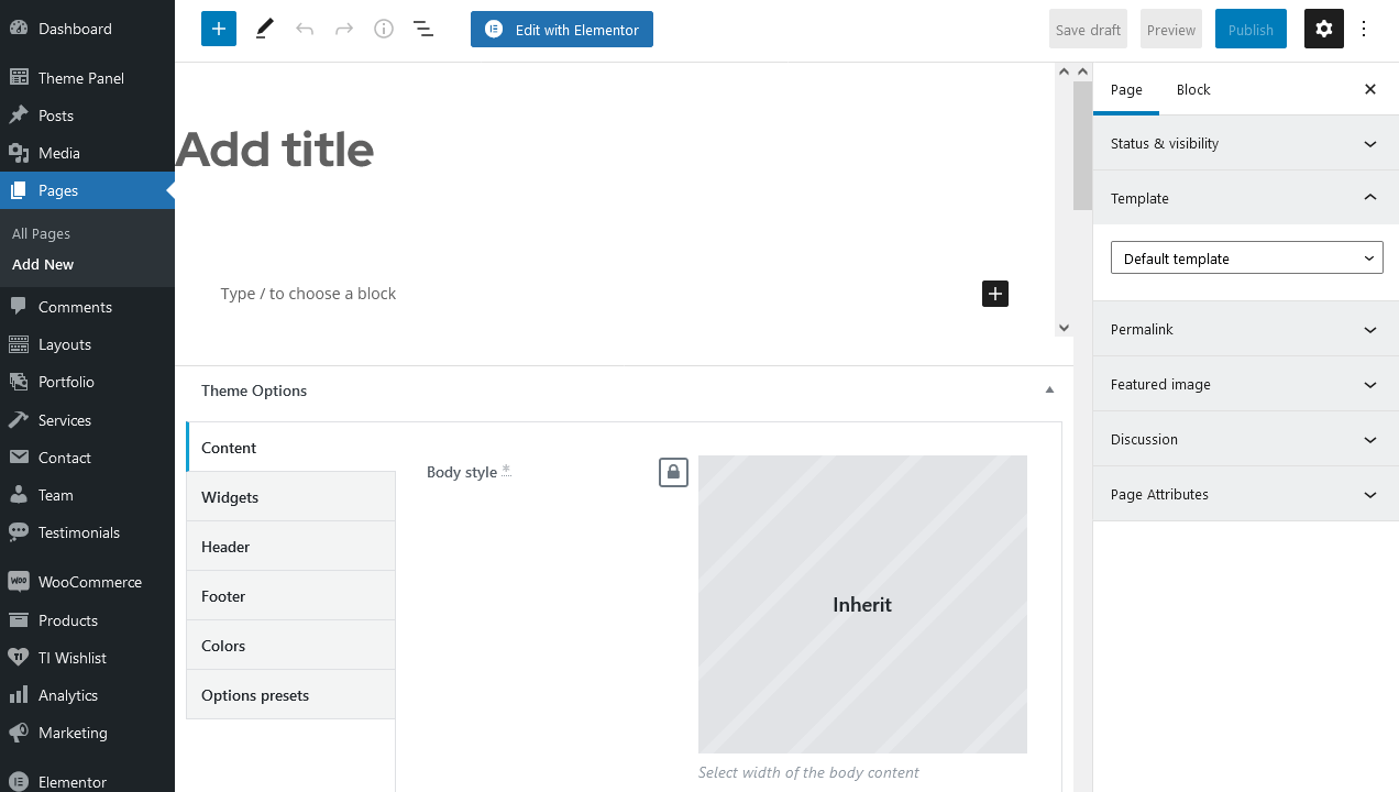
Page Templates
Choose either "Blog Archive" (blog page) or "Default Template" (regular page) option in the Template sidebar. Check Posts pages article to find out more information on how to customize them.
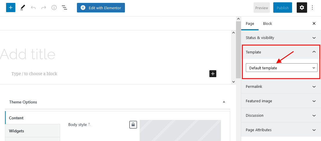
Elementor Page Builder-related tutorials
Usually, the page consists of Sections, Columns, Widgets and some other elements that can be edited via Elementor. Before you start, please check the following tutorials:
- Official Elementor Tips page
- Getting Started With Elementor
- Official Documentation for Elementor page builder
- Official Elementor Video Tutorials
Custom Page Settings
Each page has a Theme Options panel, where you can specify custom page parameters.
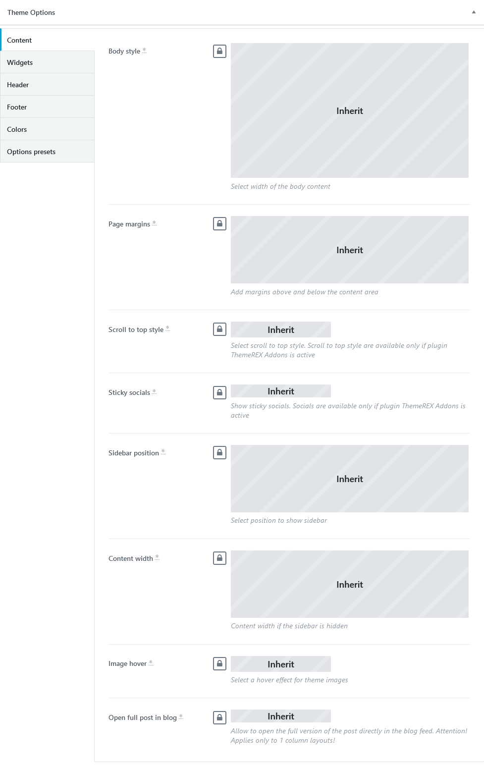
In Theme Options, you can assign a different header/footer style, widgets set, body style, as well as many other options for each individual page.
These settings are applied to the page you are editing, and will overwrite the global settings specified in the Customizer.
Options Presets Group
Here you can save the page settings (for header, widgets, footer, etc.) as a preset template and duplicate these settings on a new page without checking the required options in each section of Theme Options panel (Content/Widgets/Header/Footer/Colors). All you need to do is to apply the already created preset template on a new page by using control icons ("Apply selected preset"/"Create a new preset"/"Delete selected preset"). The tooltips for the icons will help you.
You can enable or disable the Theme Options panel in the Preferences > Panels in the top right corner of the WordPress admin.
Assigning a Page as a Homepage
Once you finished with building your page, assign it as a Homepage:
- Navigate to Settings > Reading menu item in the WordPress dashboard menu.
-
In Your homepage displays section select A static page (select below) option and choose the necessary page from the Homepage drop-down list.
- Save the changes.
Alternatively, you can assign a page as a homepage in Appearance > Customize > Homepage Settings.
PLEASE NOTE! Default skin comes with the following Homepages.
Security
Below you can find the screenshots of "Security" front-end with hotspots describing where you can customize content for a particular section and the "Theme Options" settings.
The background color/image for the page blocks can be set or managed in the Edit Section/Column > Style > "Background'/"Background Overlay" tabs in the Elementor widgets panel.
"Edit Section/Column > Advanced > Position" settings in the Elementor widgets panel let page blocks overlap each other, the following parameters are available:
- "Shift block" options - change position of the selected block only, the rest blocks on the page remain unmoved.
- "Push block"/"Pull next block" options - move blocks by setting margins, all nearby blocks shift accordingly.
You can also set the entrance animation for page elements in Edit Section/any element > Advanced > Motion Effects.
The main additional CSS classes used in the theme are described in the Custom CSS Classes chapter of this documentation file.
Popup banners
Default popup banners are created using the "Advanced Popups" plug-in. You can customize the popup banners in WP Dashboard > Settings > Popups tab.
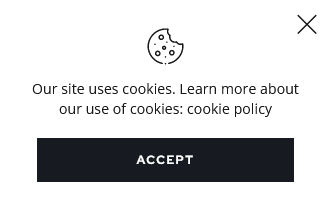
Mouse Helper or Custom Cursor Styles
You can enable/disable the mouse helper globally or replace the image in the Theme Panel (WP Dashboard) > ThemeREX Addons > Mouse helper section. Please also see "Mouse Helper Add-on" section of this documentation file for more information.
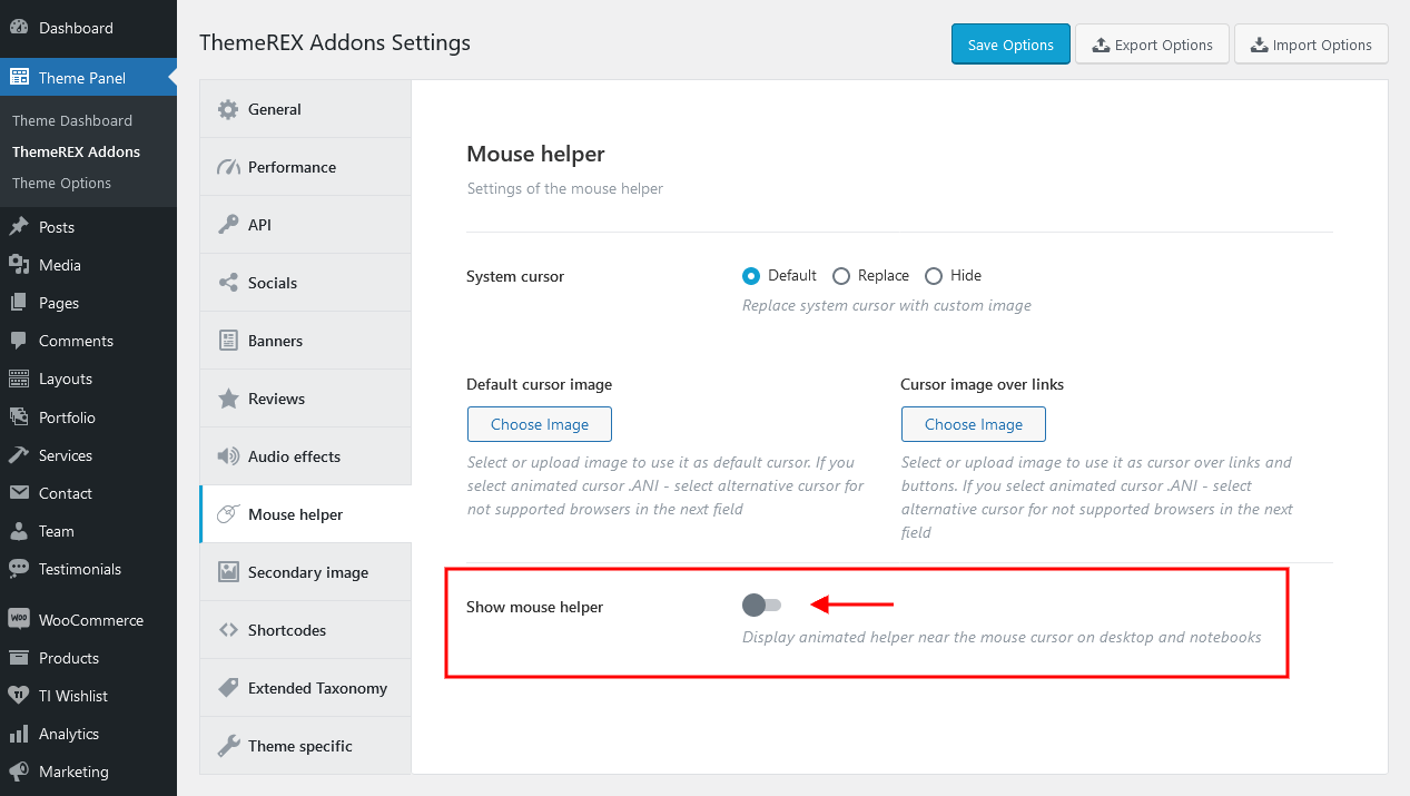
You can also make the mouse helper display some special information for a definite page section or just change the cursor style over a specific section/element. In this case, proceed to the Elementor widgets panel, enable the mouse helper for a particular section/column/widget and specify additional settings (text, background image, icon, etc.).
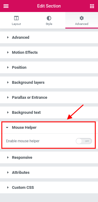
Theme Options settings (Security):
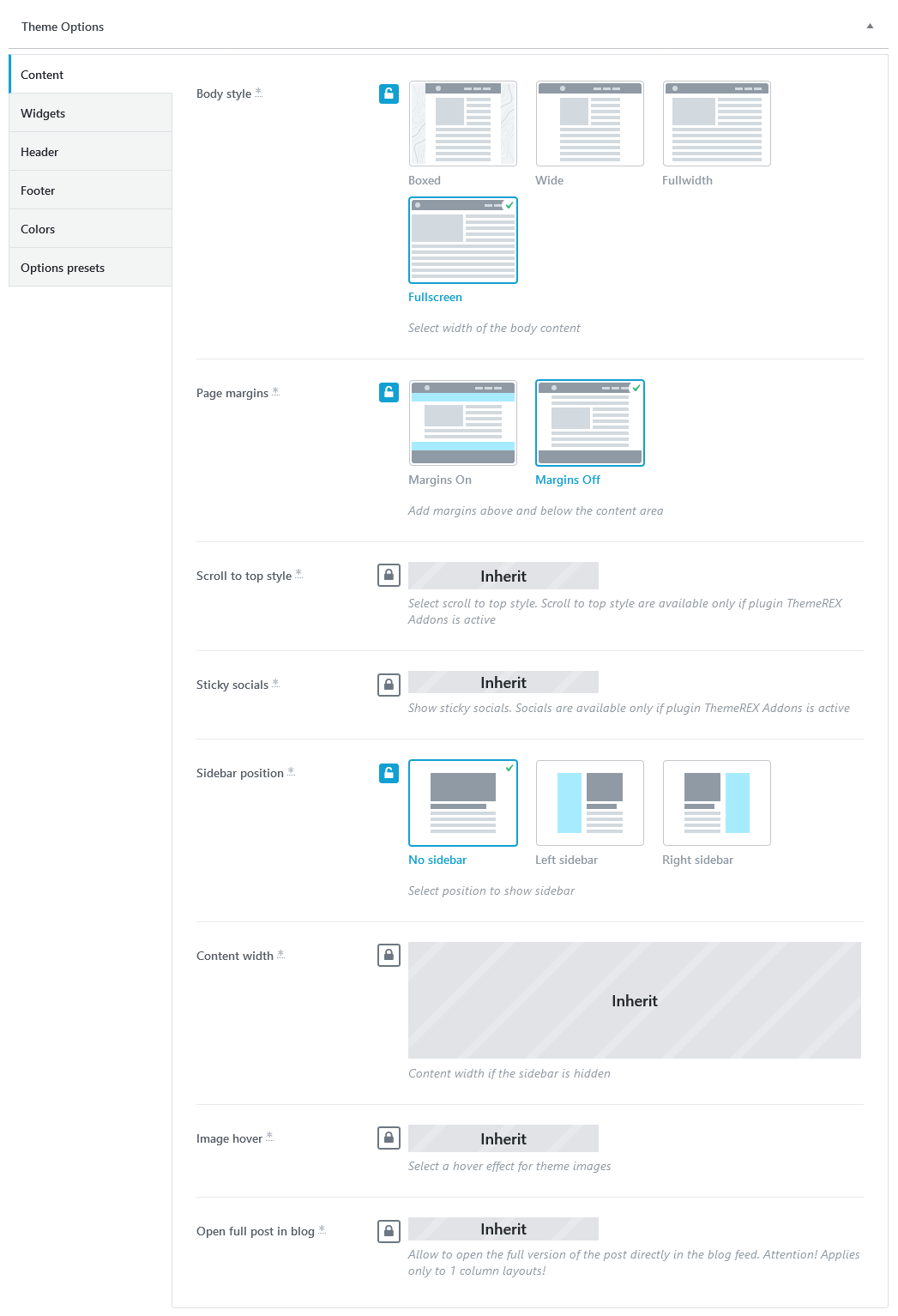
Bodyguards
This is how the second homepage looks like.
A burger icon triggers a mobile menu with social icons and widgets area (disabled on our demo). The social icons inherit the links (URLs) to your social profiles specified in the Theme Panel (WP Dashboard) > ThemeREX Addons > Socials tab. The widgets area and social icons can be enabled in Appearance (WP Dashboard) > Customize > General > Navigation section. You can manage the widgets in Appearance (WP Dashboard) > Widgets.
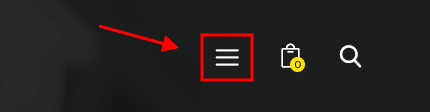
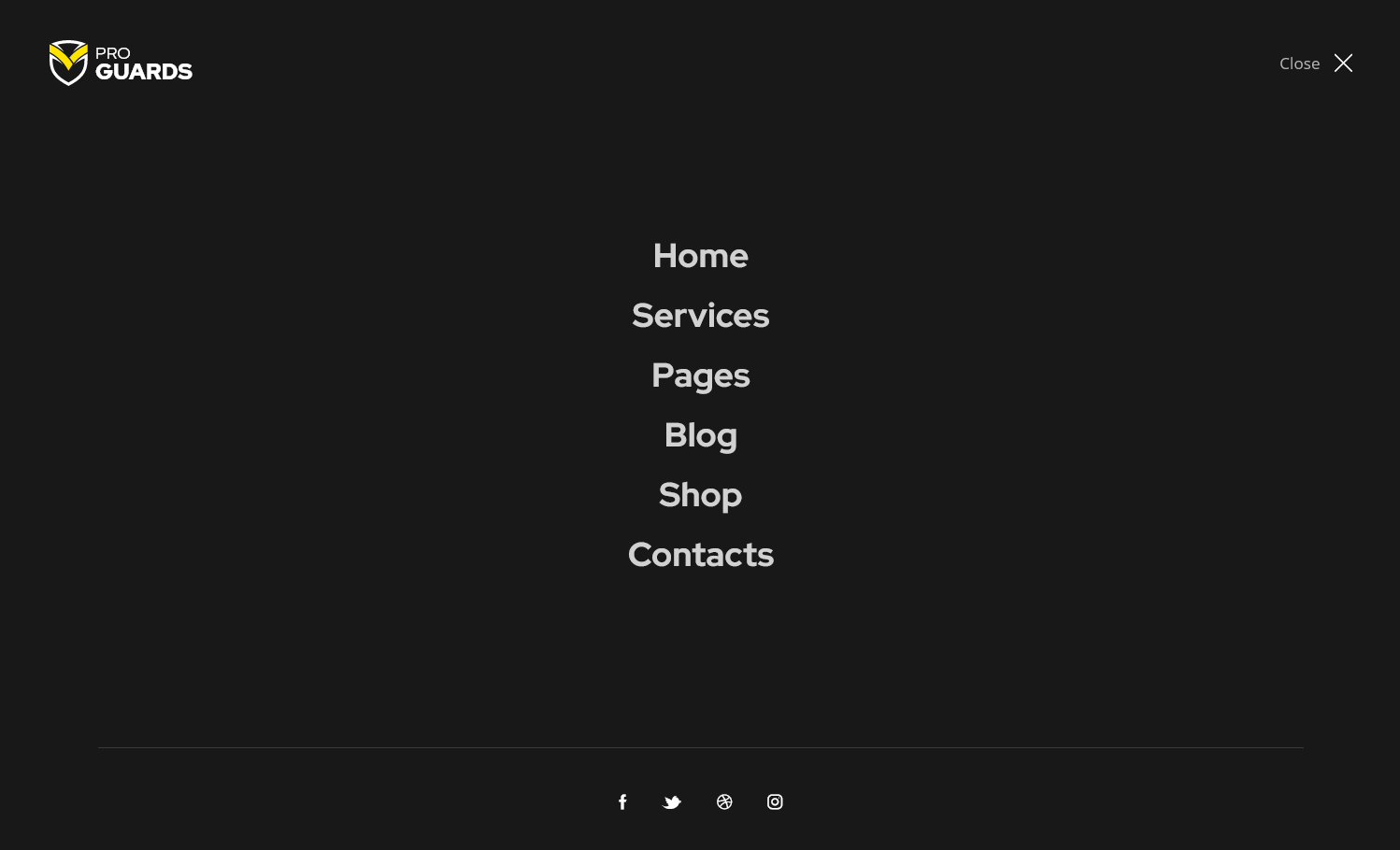
Theme Options settings (Bodyguards):
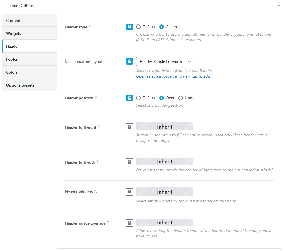
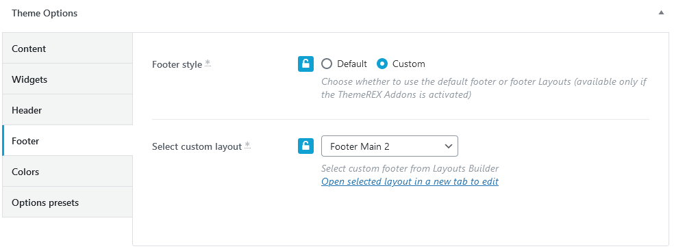
CCTV
This is how the third version looks like.
Theme Options settings (CCTV):
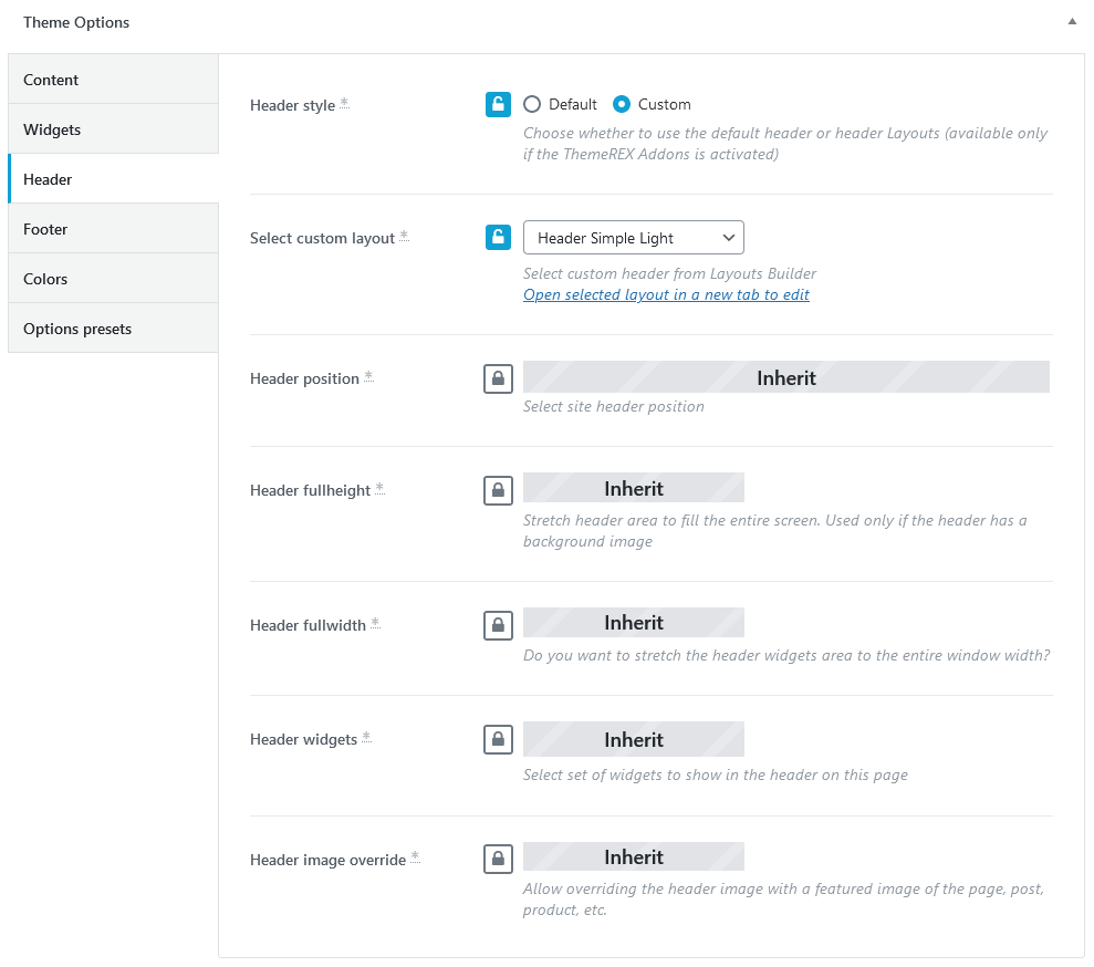
Scroll to Content Functionality
In this chapter you will see how to set a scroll to content functionality on single pages/posts.
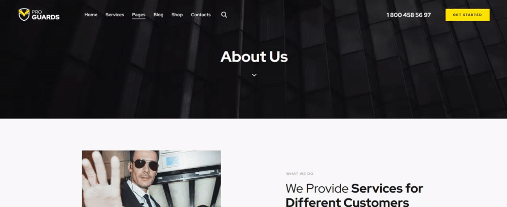
An ID content_skip_link_anchor is implemented by default to the page and post templates and is assigned to the content area.
If you want to add a scroll to content functionality, like on our demo, you need to open a header layout, insert an icon or a button according to your design and specify #content_skip_link_anchor as a link for it. Safe your changes.
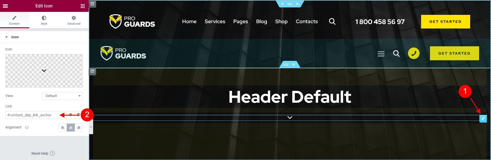
The link will work automatically. The corresponding anchor is added to the theme core files. No further alterations are necessary.
Alternatively you can use Elementor Anchor widget (ThemeREX Addons Elements group) and place this anchor wherever you want on a page with your own links and IDs.
Custom CSS Classes
PLEASE NOTE! We have used additional CSS classes to make the page blocks look like on our demo.
-
.up-translateZ,.up-translateZ-wrap,up-translateZ-elemand.up-translateZ-elem-front- reposition page elementts along the z-axis in 3D space.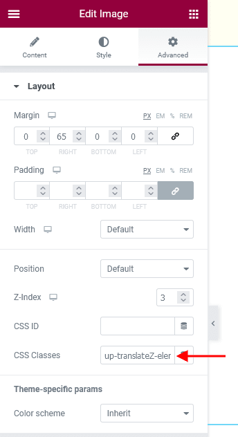
-
.aspect_ratio_extra- controlls bottom padding of a section on devices with different screen sizes. Please see CCTV page for more information.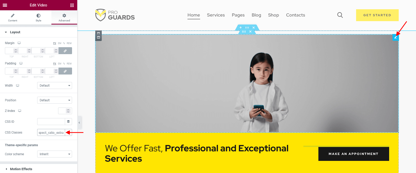
-
.line-height-0- resets the line-height to0(for Icon widget).
-
.play_center- centers a black arrow inside a play icon (for Icon widget). -
.no-title- makes image title invisible when you hover over an image on the front-end (for Image widget).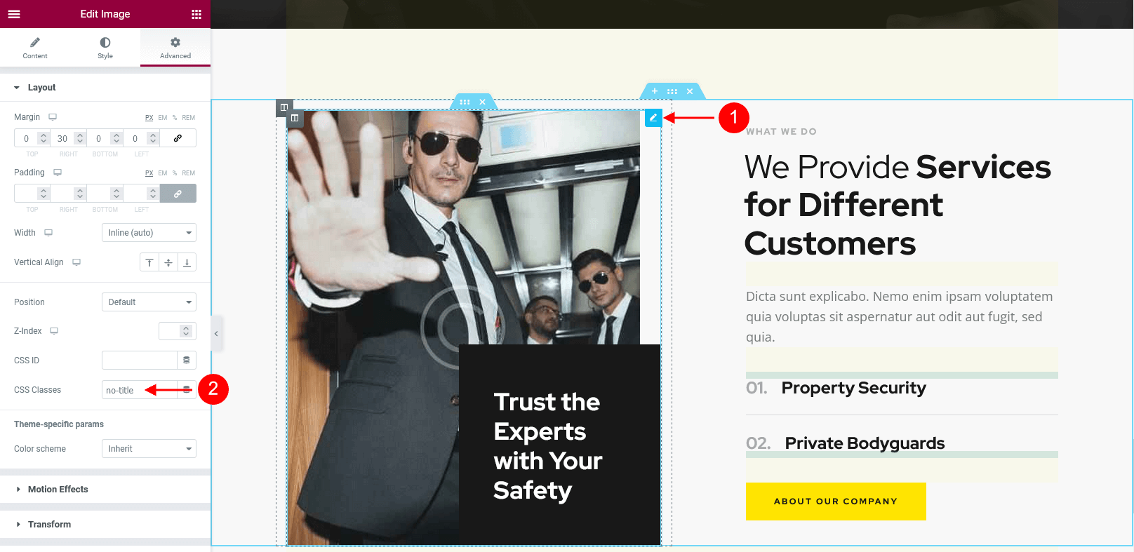
-
.underline_anim- adds underlining effect to a link (for Elementor "Text Editor" widget). Please see pre-built footer layouts for more information.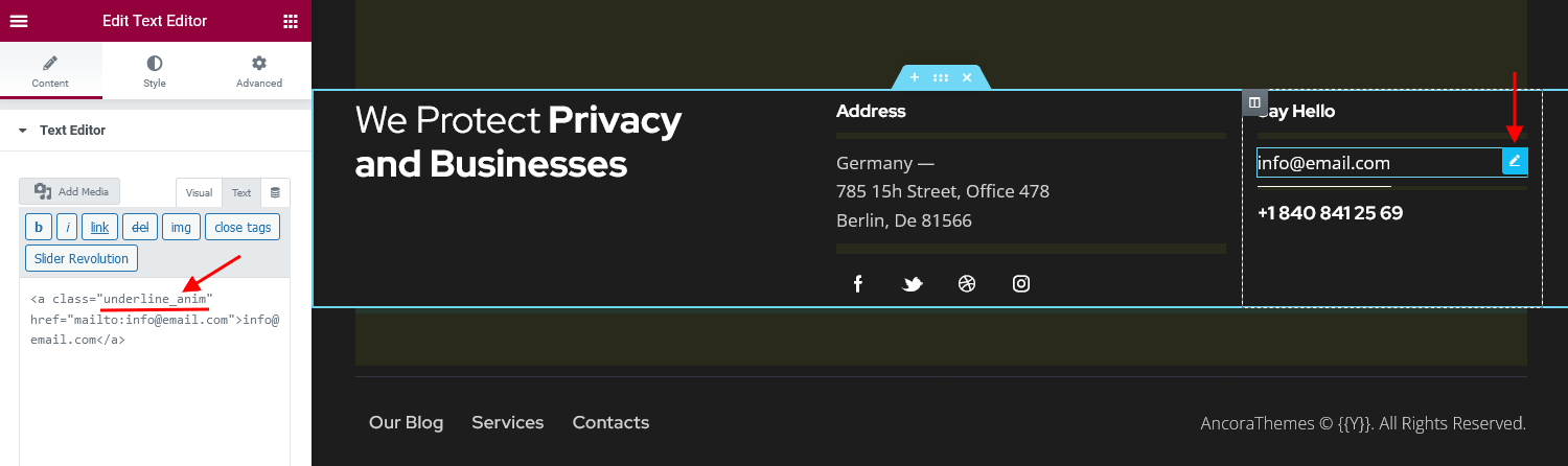
<a class="underline_anim" href="mailto:[email protected]">[email protected]</a>
-
.top_index- stylizes uppercase (reduces the font size to70%and alligns digits top). It is designed to display decimal numbers, like prices. This class name can be applied to any text field (even titles, subtitles, description, etc.) in any Elementor widget.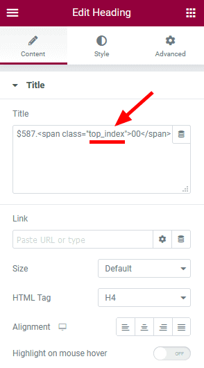
$587.<span class="top_index">00</span>
-
.form-position-abs- places an inner section above the main section. Please treat the screenshot below as an example only, the styles of the elements may vary from the ones provided with the theme.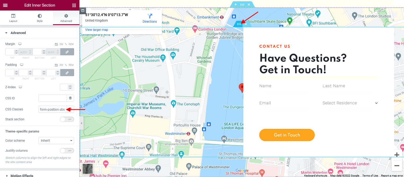
-
.left_shift- stretches the width of the column by160pxto the left on a single team member post.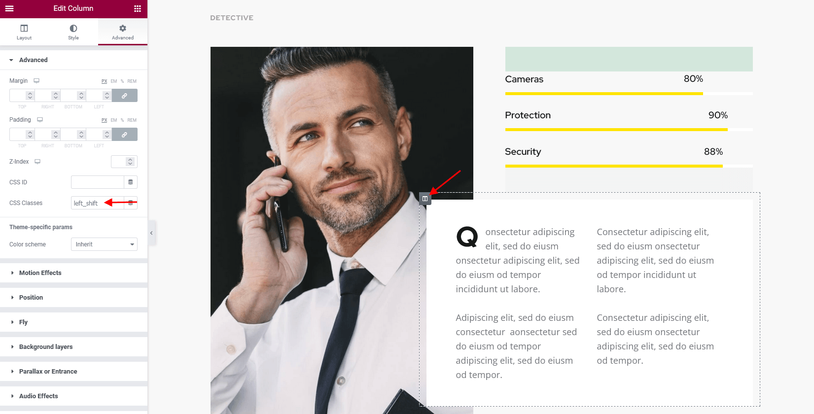
-
.simple_text_linkin combination with.underline_animor.underline_hover_reverse- stylizes linked text, inserted to the page using the Elementor "Text Editor" widget, like on demo "CCTV" page.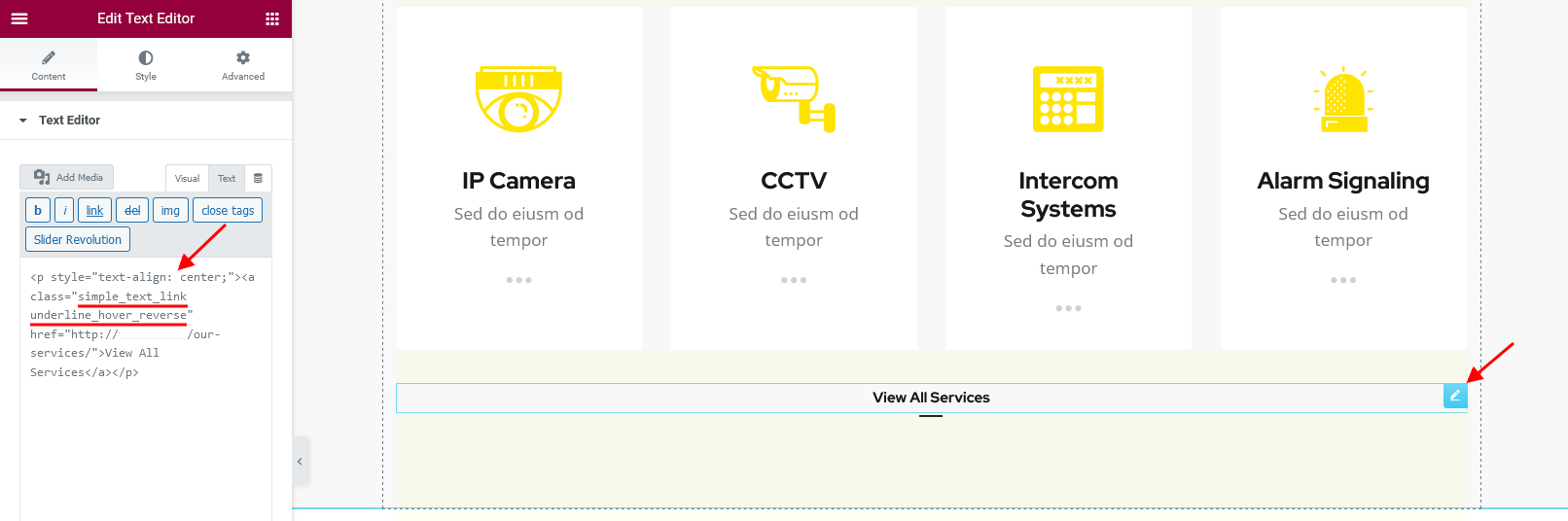
<p style="text-align: center;"><a class="simple_text_link underline_hover_reverse" href="/our-services/">View All Services</a></p>
-
.alter_clients- changes the background color for slides to white and the opacity level for images (for Elementor "Slider - Swiper" widget).
-
.round-square- makes a default Elementor button round (if you specified border radius) or square (for default Elementor Button widget), like on demo Security page. The button becomes101pxwide and101pxtall.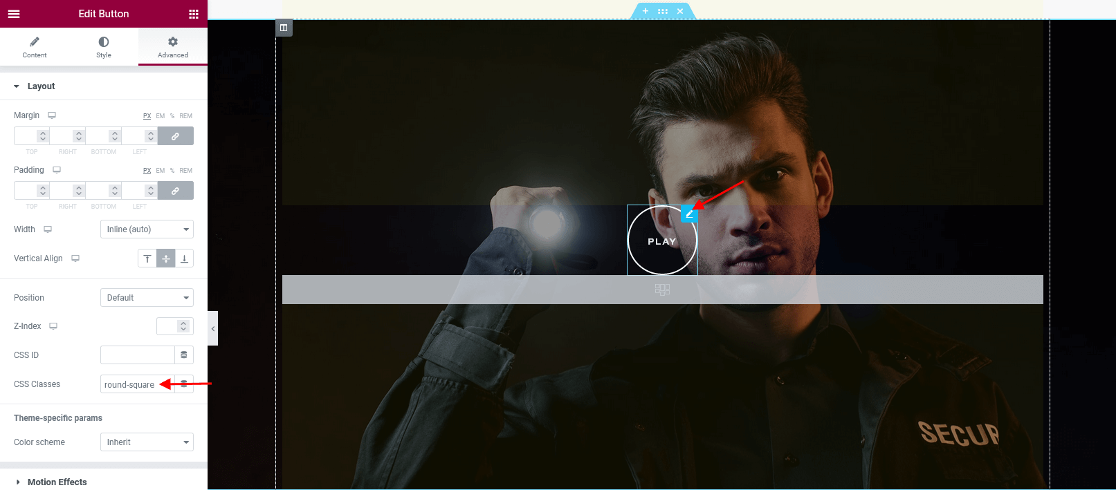
.round-square-2- makes a default Elementor button round (if you specified border radius) or square. The button becomes193pxwide and193pxtall. -
.remove_padding- removes default padding between slides in a Swiper Slider. -
.no-inner-padding- removes paddings (for Elementor "Slider" widget, Swiper slider engine).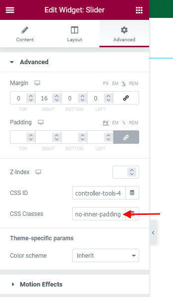
-
.bordered- adds a delimiter between accordion items (for default Elementor Accordion widget).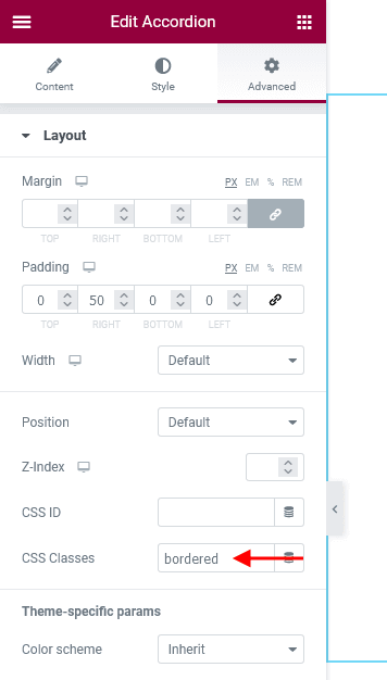
For Gutenberg Page Builder :
-
.small_gap- replaces default margins between images with custom ones (8px). This class name should be applied to a Gallery block.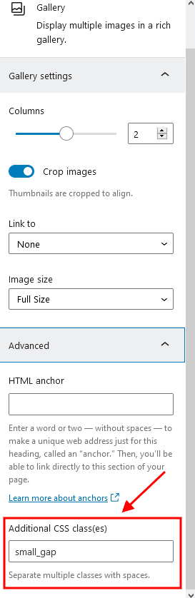
-
.medium_gap- replaces default margins between images with custom ones (30px). This class name should be applied to a Gallery block.
Layouts
Introduction to Layouts
Layouts is a tool that lets you create custom headers, footers, and other website sections, and is based on the Elementor Page Builder.
Layouts are available after you activate the ThemeREX Addons plug-in. After the activation, a new menu item appears in your WordPress admin panel.
Your theme comes with a number of pre-built Layouts. If you've imported the full content, they will be available for you from the start. Otherwise, you would need to generate them in Theme Panel > ThemeREX Addons > Theme Specific > Create Layouts.
Creating Layouts
In order to create a layout, navigate to Layouts (WP Dashboard) > Add New.
Layouts are built in a similar way you build regular pages with Elementor Page Builder. The difference is that Layouts expand the default list of widgets by adding layout-specific widgets and provide you with additional section settings.
Please check this article for detailed information regarding layouts customization.
You can also view our video tutorials about header and footer layouts customization.
When creating a Layout, first you need to specify the correct Layout type in the Item Options panel:
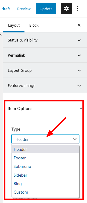
- Header - the layout is applied only to output in the header area. It appears in the list of available headers in Appearance > Customize > Header > Header Style > Custom.
-
Footer - the layout is applied only to output in the footer area. It appears in the list of available footers in Appearance > Customize > Footer > Footer Style > Custom.
You can also choose a different Header/Footer Layout for a specific page. Simply open that page in the WordPress admin, and in the Theme Options > Header/Footer panel edit the Header Style and Footer Style settings.
-
Submenu - the layout is used to create custom dropdown menu without installing Uber Menu/Mega Menu plug-ins. You can apply the submenu layout in the Appearance > Menus > Layout of submenu (optional) field.
"Layout of submenu" field appears only when at least one submenu layout is created.
Please view this article for more information about submenu layouts.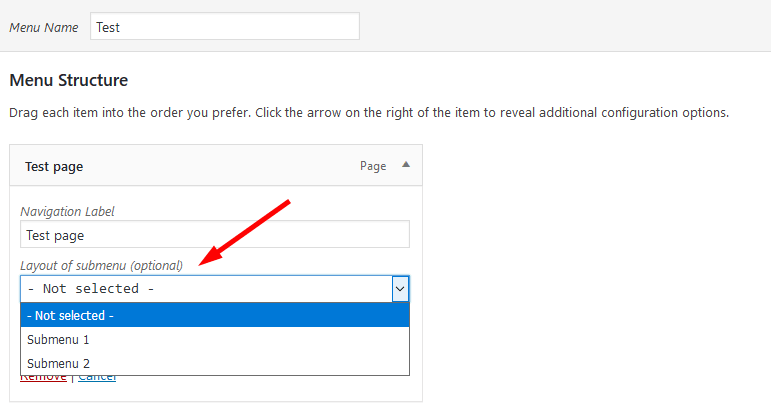
- Sidebar - the layout is applied only to output in the sidebar area. It helps create custom sidebars using Elementor page builder. Thus, you are not limited to standard widgets and can use any elements available in the page builder. It appears in the list of available sidebars in the Appearance > Customize > General/Mobile/Blog/Shop/Plugin Settings sections or in page > Theme Options > Content > Sidebar style > Custom.
- Blog - custom style or template to output the Blog Stream page or posts elements in Elementor "Blogger" widget, thus creating a blog stream page or page blocks with unique overall look. Use it in combination with Blog Item Parts widget, that lets you insert any post parts (featured image, title, meta data, content, custom fields) to page in any combination and in any quantity.
- Custom - the standard layout fragment that can be added into a web page using an Elementor Page Builder Layouts widget.
Custom Layouts can be especially useful when you need to use the same section in different places on your website. Instead of building it from scratch on every new page, you can save it as a custom Layout and insert using a Layouts widget.
In order to add a custom Layout to a web page:
- Add a new Elementor Page Builder section in the website editing screen.
- In the left panel with elementor elements open "ThemeREX Addons Layouts" group, drag and drop the Layouts widget from the panel into your section.
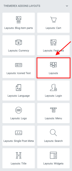
- Choose the desired custom Layout or Elementor's template from the dropdown list ("Type" option should be set to "Default").
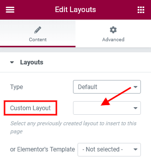
Blog Layout is just a scheme showing the position of post elements like featured image, post title, meta data, excerpt, etc. Use Blog Item Parts widget to output each element, like in the example below.
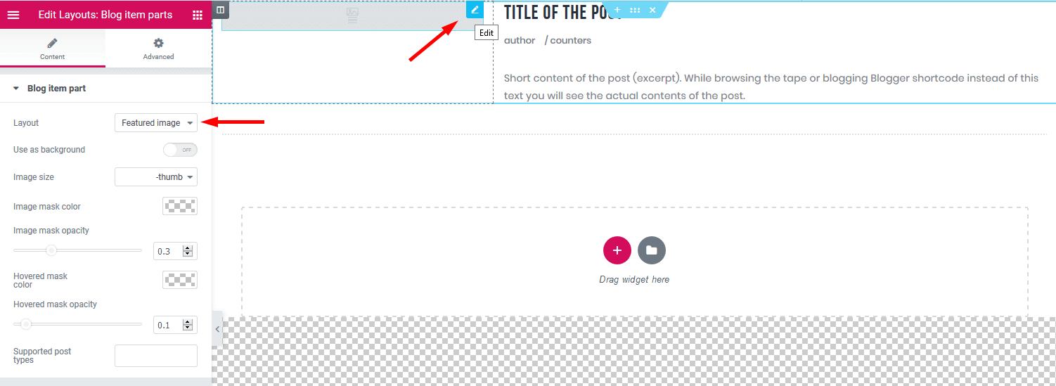
You can apply the blog layouts to:
-
Blog Stream Page - create a page, choose "Blog Archive" template and in the Theme Options > Content > Blog style option find your blog layout. Treat the screenshot below just as an example.
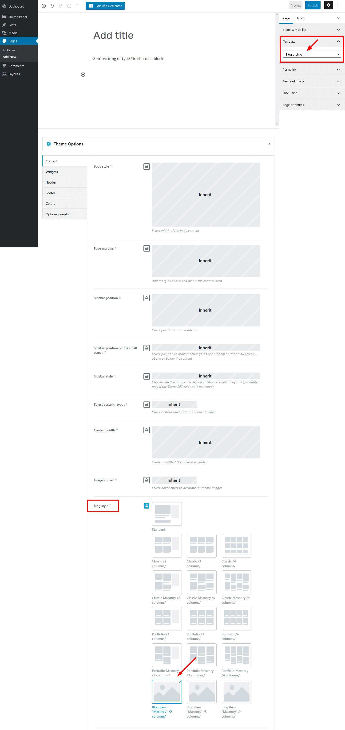
-
Blogger Widget - open a page/post, in the Elementor widget panel navigate to "ThemeREX Addons Elements group" and insert Blogger widget to the content area.
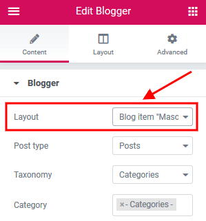
Layout Templates
In case there are some page fragments with more or less identical structure, you can create one layout using the Elementor Page Builder, save it as a template and use it as a foundation for your new Layout. Thus, there is no need to create a new layout or block each time. Please see this article for more information.
Open a Layout and click on the Add Template button from the editing screen (Elementor Page Builder's backend editor). Scroll down to view the available templates:
Creating a Mobile Header in Layouts
Layouts is a preferred way of creating a mobile header since it gives you flexibility and control over your elements. Creating a mobile header is similar to creating a standard header, except there are several features you should know about in order to use Layouts more efficiently. Please see the official elementor video tutorial or article for more information.
We recommend you to create separate custom header layout for mobile devices and specify it in the Appearance > Customize > Mobile section. This will improve the website loading speed on mobile devices.
Layouts Widgets
Layout-specific widgets are additional widgets available for editing/creating layouts. They are especially useful for building headers and footers. You can find layout-specific widgets under the ThemeREX Addons Layouts group in the Elementor widgets panel.
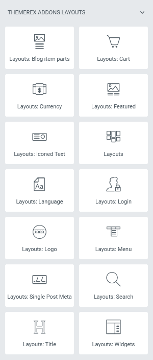
Layouts: Blog Item Parts
Inserts any post parts (featured image, title, meta data, content, custom fields) to your custom page fragment. This widget outputs 1 post part at a time. If you want to create a page block with unique structure, just use as many "Blog Item Parts" widgets as you need and output post parts in any combination and in any quantity.
Layouts: Cart
Displays a shopping cart icon (in case the WooCommerce plug-in is active). When clicked, the icon triggers a window with additional shopping details.
For narrow and normal row types, the cart displays the number of products in the cart, the sum total, and an icon label. The compact row type has a shopping cart with a product counter badge only.
Layouts: Currency
Displays a currency button, in case the WooCommerce and WooCommerce Currency Switcher plug-ins are active.
Layouts: Featured Image
Should be used for headers only. Displays a featured image of the current post/page. Often used in combination with the Title and Breadcrumbs widget.
The widget has to contain at least one element, otherwise the featured image would be hidden.
Layouts: Iconed Text
Inserts an icon and two text lines. It is possible to add a URL to the icon.
Layouts
Inserts content in different ways, depending on the type of the layout:
- Default - displays one of the custom layouts available in WP Dashboard > Layouts post type. Please click here to view the list of available custom layouts.
- Popup - creates popup notifications that appear whenever a user clicks on a link or a button.
- Panel - creates a panel with some content/menu that appears whenever a user clicks on a link or a button.
- Panel Menu - creates a panel with some content/menu that appears whenever a user clicks on a link or a button. You can specify the panel menu style (fullscreen or narrow) and vertical menu style (default or extra).
Select which type of the layout to use in the layouts widget's content settings.
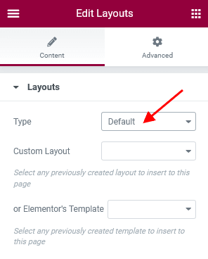
The algorithm of building a popup notification or panel:
- Create a custom layout with required content that will be displayed in the popup window or panel. If you want to use simple text/image or shortcode (like grid gallery, mailchimp form, etc.), just omit this step.
- Add a new Elementor Page Builder section to the page. In the left panel with elementor elements open "ThemeREX Addons Layouts" group, drag and drop the Layouts widget from the panel into your section. Select the desired widget's type (popup/panel) and custom Layout from the dropdown list (Layout field) or enter simple text/shortcode/image from the Media Library in the Content field (if "Layout" option is set to "Use content").
You may navigate to Edit Layouts > Advanced tab to enclose the elements with paddings or set the background image/color. - In the widget's settings under the Content tab, Popup (panel) ID field, assign the ID to your popup/panel, e.g.
example_popup.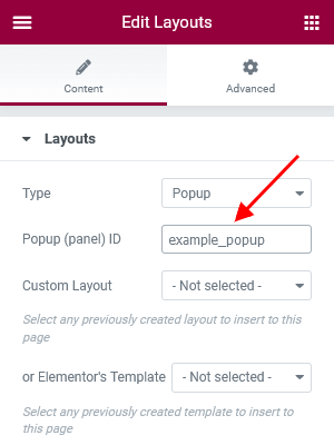
- Use the popup/panel ID, preceded by a pound sign (
#), as an address for the link or button that should trigger the popup/panel.
Layouts: Language
In case the WPML plug-in is active, the widget displays button (drop-down list) that allows choosing the necessary language for the current page.
Layouts: Login
Displays a login/logout link with an icon.
The text for the checkbox "I agree..." (registration form) is set in Appearance > Customize > General > Text with Privacy Policy link.
In order to add/customize the Privacy Policy link, navigate to Settings (WP Dashboard) > Privacy and specify the page that will be used as a Privacy Policy one.
PLEASE NOTE! In case you are planning to use the registration form without consent checkbox, just leave the "Text with Privacy Policy link" option empty in the Appearance > Customize > General section!
Layouts: Logo
Inserts a logo (any image). In case there is no logo (both in layouts and in the Customizer), the theme displays the website title and description specified in Appearance > Customize > Logo & Site Identity.
Uploading Logo
The algorithm of our actions would be as follows:
- Select the Layout where you want to place the new logo by going to Layouts > All Layouts.
- Locate the Elementor Layouts: Logo widget (ThemeREX Addons Layouts group) and click on the Edit button.
- Upload a new logo in the panel > Content tab and save the changes.
IMPORTANT! Logo is available for editing for each particular layout. If no logo is selected in the Layouts: Logo widget, the initial logo from the Appearance > Customize > Logo & Site Identity will be used.
Layouts: Menu
Displays one of available menus. Specify a preferred menu in the Menu field by its name, like on the screenshot below.
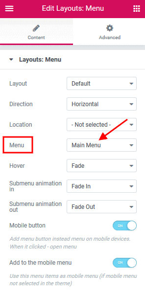
The Layout parameter allows selecting the Menu Layout:
- Default - standard menu with links.
- Burger - just a button that opens Mobile menu.
Direction of the menu items: Horizontal or Vertical.
Specify default behavior for a responsive menu in the Content tab:
- Mobile button - choose whether to replace the menu with a menu button when switching to the mobile version.
- Add to the mobile menu - use this menu as a mobile menu only.
Layouts: Single Post Meta
Displays elements from meta data of the current post (categories, post author, post date, post counters, share links, edit link).
Layouts: Search
Adds a search button/input field. There are 3 styles available:
- Normal - a standard search field.
- Expand - displays a search button that expands a search field on click.
- Fullscreen - displays a search button that expands the search field to the entire screen.
Layouts: Title
Displays a title and breadcrumbs of the currently opened page/post.
Layouts: Widgets
Displays one of the available widget sets (sidebars). You can choose the number of widget columns. In case 0 is chosen, the number of columns equals to the number of widgets in the selected widget set.
Elementor Section Settings
Layouts have an extended number of settings for Section, default Elementor element.
Choose which section you want to edit, click on the Edit Section button and go to the panel > Edit Section > Custom Layout.
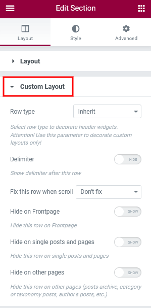
- Row type - defines a row type. It accepts the following values:
- Inherit - a default row with no layout-specific styles applied.
- Narrow - the smallest type of row. The Elementor widgets feature a small font size and small icons. The Layouts: Iconed Text widget places text in 1 line (even for two-line option).
- Compact - a smaller variation of the normal row type. The Elementor widgets have a standard font size and small icons. The Iconed Text widget puts text in 1 line (even for the two-line option).
- Normal - a row of a normal height. The Elementor widgets inserted into this type of row have a standard font size, and medium-sized icons. The Layouts: Iconed Text widget features text divided into 2 lines.
- Delimiter - adds a border to the row's bottom.
-
Fix this row when scroll - 'fixes' the row to the top of the page (or to the last 'fixed row'). Useful for creating sticky navigation.
To avoid "Sticky Menu" behavior select "Don't fix" option.
- Delay before fix this row - the row goes beyond the edge of the window, then "returns" animatedly and sticks.
- Hide this row on unfix - hides the row until scrolling down.
- Hide on the Frontpage - hides the row on the page assigned as the Homepage (Frontpage) in Settings > Reading. In case the Blog Feed page is assigned as the Homepage, the row stays visible.
- Hide on single posts and pages - hides the row on single pages and posts.
-
Hide on other pages - hides the row on pages that are not single ones (other than
is_singular()).
Default Layouts
In this section you can find the examples of layouts that come with the theme. If you have imported the full demo content, they will be available for you from the start. Otherwise, you would need to generate them in Theme Panel > ThemeREX Addons > Theme Specific > Create Layouts. Feel free to create your own layouts.
You can view the list of available Layouts in Layouts (WP Dashboard) > All Layouts.
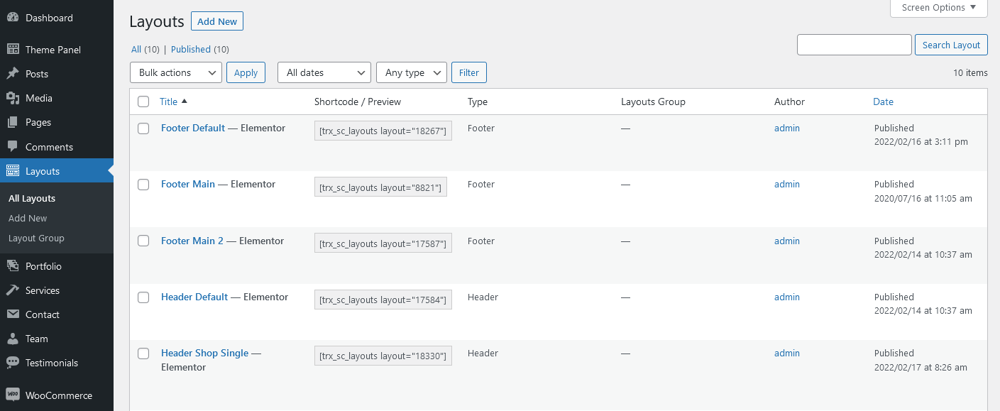
All layouts are divided into six types. For more information on how to add each type of layouts to the page, please view Creating Layouts section of this documentation file.
- Header Layouts - displays layouts in the header area.
- Footer Layouts - inserts layouts in the footer area.
- Submenu Layouts - displays submenu layouts. Thus, it is possible to create custom dropdown menu via Elementor Page Builder without installing Uber Menu/Mega Menu plug-ins.
- Sidebar Layouts - displays layouts in the sidebar area.
- Blog Layouts - creates a template to output the Blog Stream page or post parts in Elementor "Blogger" widget.
- Custom Layouts - pastes layouts in any area of the website, except header and footer.
Important! Please be aware that this theme does not provide any examples of sidebar, submenu and blog layouts. Feel free to create your own ones.
Header Layouts
Header menu can be customized in Appearance > Menus > Edit Menus or Appearance > Customize > Menus.
In case no logo is selected in the Elementor "Layouts: Logo" widget, the initial logo from the Appearance > Customize > Logo & Site Identity will be used.
The background color/image for the header sections can be set or managed in Edit Section/Column > Style > Background in the Elementor editor.
-
Header Default
-
Header Shop Single
(with "Shop" page title)
-
Header Simple Dark
The background color for the header area is inherited from "Dark" color scheme, specified in Edit Section > Advanced > Advanced > Theme-specific params. The color scheme is set in the Appearance > Customize > Colors section (with Advanced mode).
-
Header Simple Fullwidth
The background color for the header area is inherited from "Dark" color scheme, specified in Edit Section > Advanced > Advanced > Theme-specific params. The color scheme is set in the Appearance > Customize > Colors section (with Advanced mode).
A burger icon triggers a mobile menu with social icons and widgets area (disabled on our demo). The social icons inherit the links (URLs) to your social profiles specified in the Theme Panel (WP Dashboard) > ThemeREX Addons > Socials tab. The widgets area and social icons can be enabled in Appearance (WP Dashboard) > Customize > General > Navigation section. You can manage the widgets in Appearance (WP Dashboard) > Widgets.
-
Header Simple Light
Footer Layouts
The footer menu can be customized in Appearance > Menus > Edit Menus or Appearance > Customize > Menus.
In case no logo is selected in the Elementor "Layouts: Logo" widget, the initial logo from the Appearance > Customize > Logo & Site Identity will be used.
In order to make the current year change automatically in the copyright area, just paste {Y} or {{Y}} instead of the year.
The social icons inherit the links (URLs) to your social profiles specified in the Theme Panel (WP Dashboard) > ThemeREX Addons > Socials tab.
The background color for the footer area is inherited from Appearance > Customize > Colors. You can also set your own settings in the Edit Section/Column > Style > Background/Background Overlay tabs in the Elementor widgets panel.
We have used additional CSS class .underline_anim to add underlining effect to a link (for Elementor "Text Editor" widget).
<a class="underline_anim" href="mailto:[email protected]">[email protected]</a>
-
Footer Default
-
Footer Main
-
Footer Main 2
Custom Layouts
Pre-built custom layouts are designed to be displayed in a popup window. Please view the description of Layouts Widget for more information about the popup notifications.
You can customize the subscription form in MC4WP (WP Dashboard) > Form. The form is used with ID style-11.
[mc4wp_form id="461" element_id="style-11"]
The background color/image for the page sections can be set or customized in the Edit Section/Column > Style > Background tab in the Elementor widgets panel.
-
MailChimp Popup
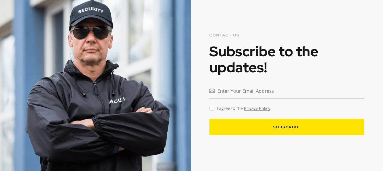
-
MailChimp Popup 2
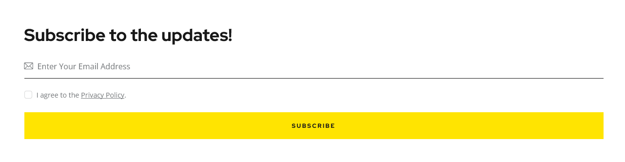
Custom Post Types
A custom post type is an additional type of posts that is tailored for a specific kind of content. Custom post types are a part of the ThemeREX Addons plug-in, and you can use them after the plug-in activation.
Custom Post Types support icons from standard Fontello icons set. You can expand the list of available icons by adding new ones from the fontello website. In order to add new icons proceed to wp-content/themes/your-theme/skins/default/css/font-icons/config.json. Watch this video guide for more information.
Please note, the location of config.json file and website page builder with available set of widgets/shortcodes in your theme may vary from the video provided!
Portfolio
If you want to add a portfolio section to your web page, you need to create the portfolio posts and display them using the Elementor Portfolio widget (ThemeREX Addons Extensions group).
In order to create a new portfolio post, click on Portfolio > Add New in your WordPress dashboard.
Below is an example of the back-end view of a single portfolio post.
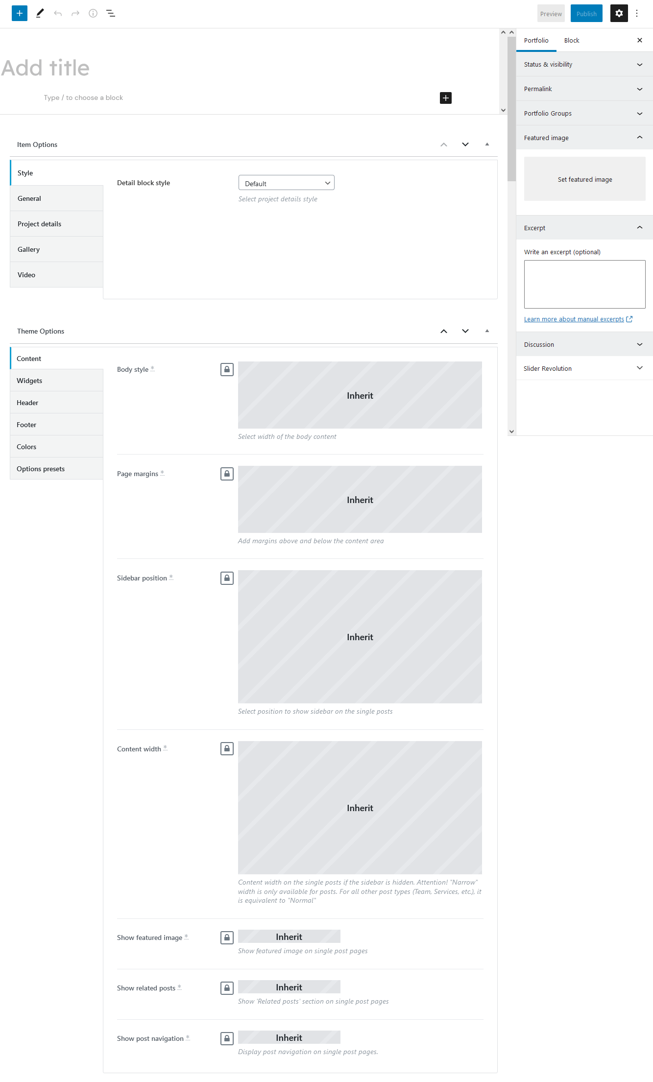
Apart from the standard fields, such as title, description, portfolio group, excerpt, and featured image, you can use additional fields in the Item Options panel:
- Style - select project details style.
- General - specify project's subtitle, alternative external link and project's author. Available authors are accessible through the Team post type.
- Project Details - additional information about the project. Add as many items as needed. Clone items by clicking a clone button in the top right corner, or rearrange them using the drag button in the top left corner. Here you can also choose the position of the block with project's details displayed on single portfolio posts.
- Gallery - create a gallery for a single page of this project.
Once you choose the images for the gallery, the following new options will appear.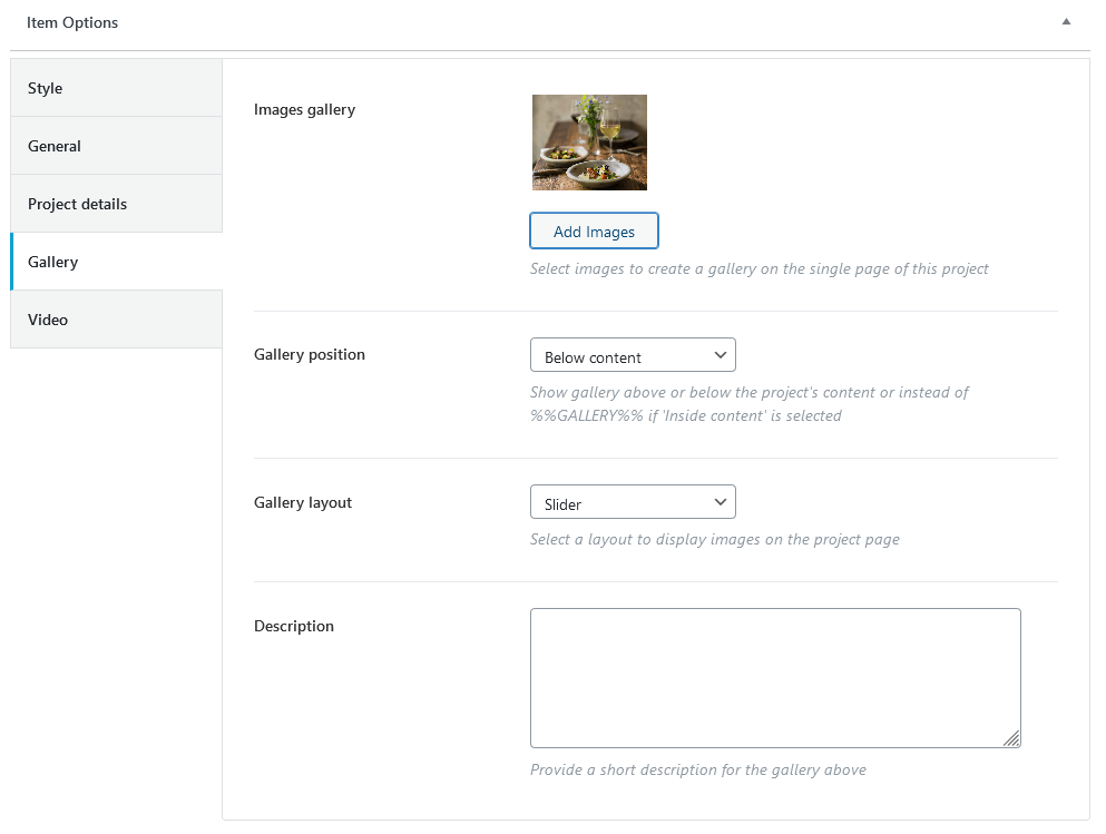
- Gallery position - You can output the gallery above/below or inside content of a single portfolio post. In order to place a gallery inside the content area, just paste the
%%GALLERY%%tag to the content of the post (preferably using Gutenberg page builder), where you want your gallery to appear, and choose "Inside content" for the Item Options > Gallery > Gallery position option.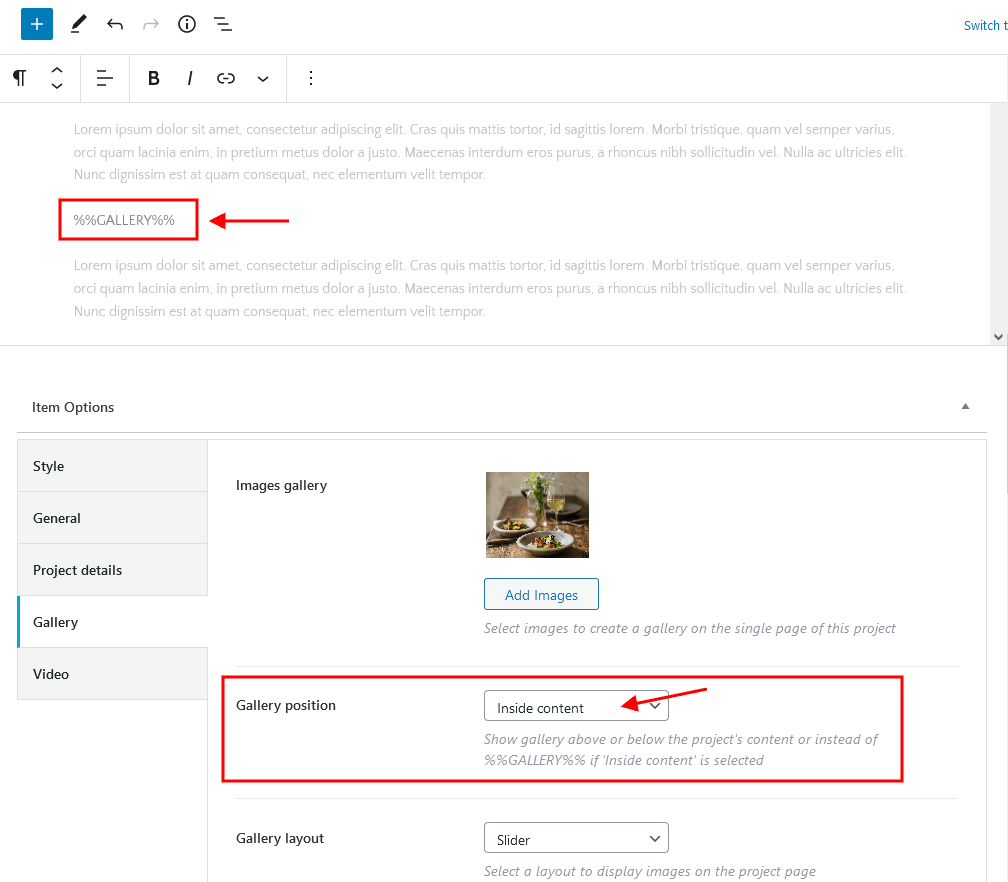
- Gallery layout - select a layout to display images on the project's page.
- Description - specify short description of the gallery. The desription can be displayed below the gallery.
- Gallery position - You can output the gallery above/below or inside content of a single portfolio post. In order to place a gallery inside the content area, just paste the
- Video - specify a URL with a video from popular video hosting (Youtube, Vimeo).
Once you specified the URL for the video, the following new options will appear.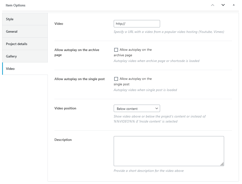
- Allow autoplay on the archive page/single post - enable video autoplay.
- Video position - You can output the video above/below/in the page header or inside content of a single portfolio post.
If you want to display a video inside the content area of a post, please use%%VIDEO%%tag (preferably using Gutenberg page builder), where you want your video to appear, and choose "Inside content" for the Item Options > Video > Video position option.
In order to insert the video inside the header area (instead of the featured image), select "In the page header" video position and enable autoplay on a single post.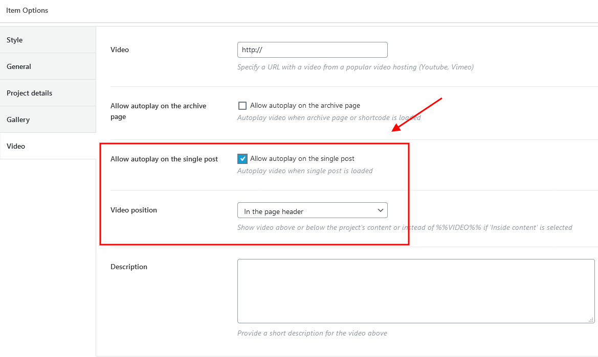 In addition (for the video inside the header area), please make sure the "Layouts: Title" widget is used to output the post title on some background in the corresponding custom header layout. You should also enable "Replace with featured image" option, like on the screenshot below:
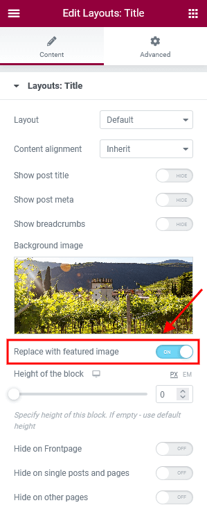
- Description - specify short description of the video. The description can be displayed below the video.
The single portfolio page as well as all portfolio items page inherit the general settings (for header, footer, etc.) specified in Appearance > Customize > Plugins Settings > Portfolio.
The global settings for a single portfolio page can also be overridden in the Theme Options section of a particular portfolio post. Here you can assign a different header/footer style, widget set, body style, etc.
Portfolio Widget (ThemeREX Addons Extensions group)
After creating the required number of portfolio posts, you need to output them on your page using an Elementor widget. Add a new Elementor Page Builder section to your page and in the ThemeREX Addons Extensions group of elements, select the Portfolio widget.
You can also use one of generic Elementor widgets like Blogger widget (ThemeREX Addons Elements group) and Services widget (ThemeREX Addons Extensions group) to output portfolio posts.
Services
If you want to add a services section to your web page, you need to create the services posts and output them using Elementor "Services" widget (ThemeREX Addons Extensions group) or "Blogger" widget (ThemeREX Addons Elements group).
In order to create a new service, click on Services (WP Dashboard) > Add New.
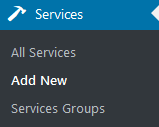
The back-end view of a single service post:
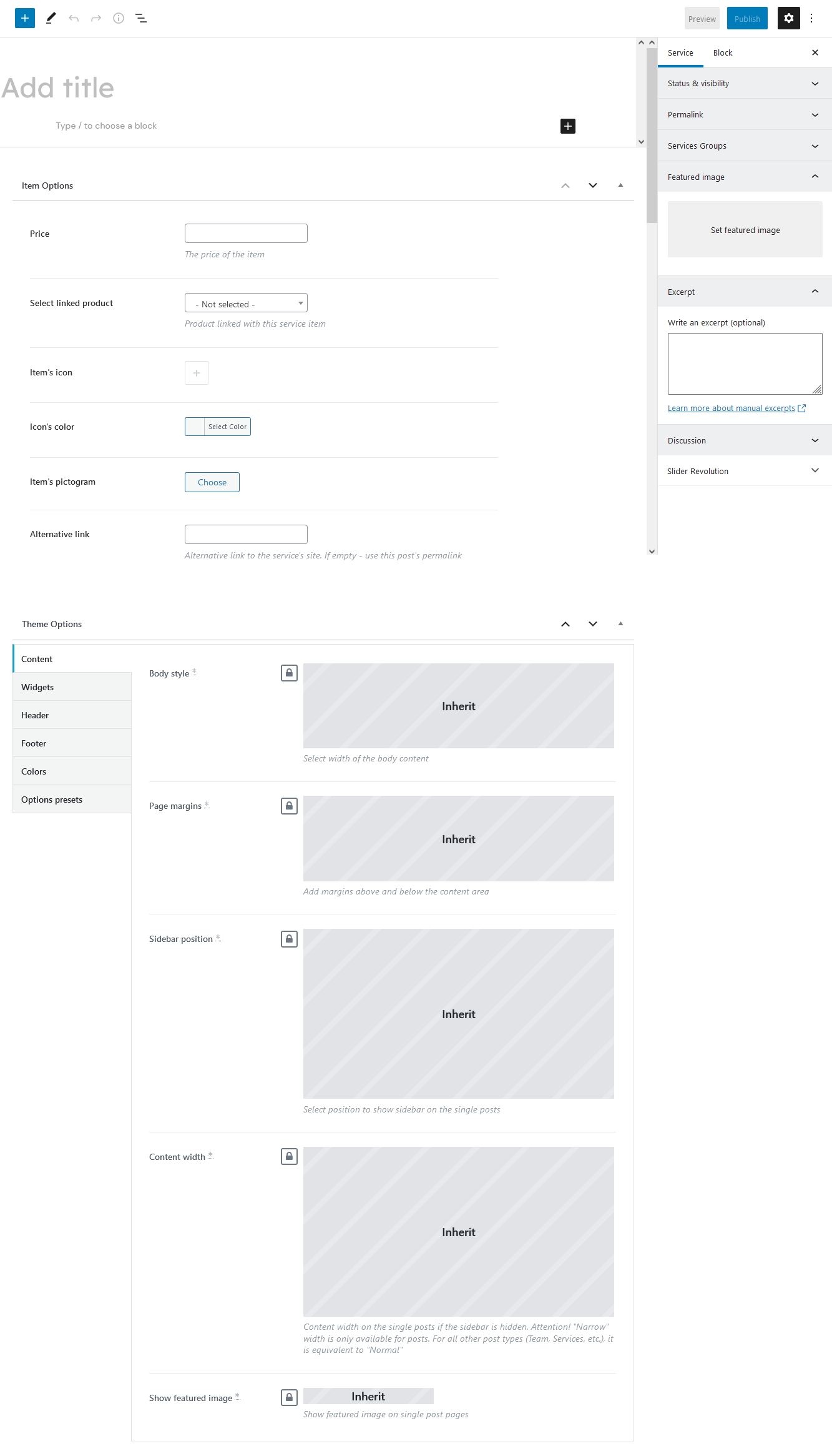
Apart from the standard fields, such as title, description, services group, excerpt, and featured image, you can use additional fields in the Item Options panel:
- Price
- Select linked product - link the service to one of your WooCommerce products (if the WooCommerce plug-in is enabled).
- Item's icon - the icon you want to associate with your service.
- Icon's color
- Item's pictogram - the pictogram you want to associate with your service.
- Alternative link - external link to the service's website.
The single service pages as well as all services page inherit the general settings (for header, footer, etc.) specified in Appearance > Customize > Plugins Settings > Services.
The global settings for a single service page can also be overridden in the Theme Options section of a particular service post. Here you can assign a different header/footer style, widget set, body style, etc.
Services Widget (ThemeREX Addons Extensions group)
After creating the required number of service posts, you need to display them on your page using an Elementor widget. Add a new Elementor Page Builder section to your page, and under the ThemeREX Addons Extensions group of elements, select the Services or Blogger widget (ThemeREX Addons Elements group).
The Services widget provides you with a large number of options, including the layout style, featured element, featured element position, number of posts to show, and many more.
Team
To display team members on your page, you need to create team posts first and then output them using an Elementor widget. Add a new team member post by clicking Team > Add New.
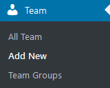
Please find the screenshot below with the back-end view of a team post.
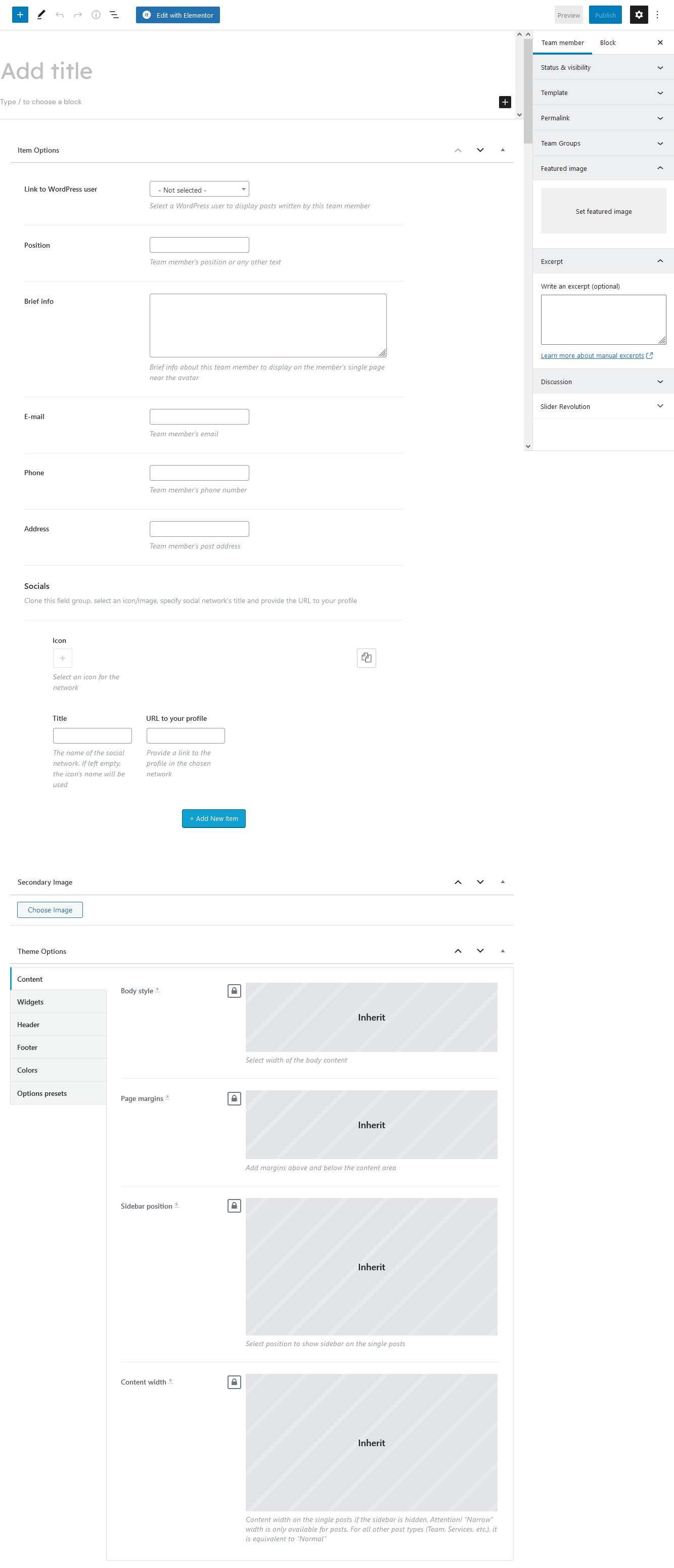
On a team member page, you can enter the team member's name, description, featured image, excerpt, and elements in the Item Options panel, which include:
- Link to WordPress user - select a WordPress user to display posts written by this team member.
- Position - a person's position, or any other subtitle text.
- Brief info - a short summary that is displayed on a single team member page.
- Email/Phone/Address - specify the required contact information;
- Socials - links to social media profiles. Add as many links as needed. Clone items by clicking a clone button in the top right corner, or rearrange them using the drag button in the top left corner.
"Secondary Image" section appears if the Secondary Image Add-on is active and this functionality is enabled for a definite post type in Theme Panel (WP Dashboard) > ThemeREX Addons > Secondary image. "Secondary Image" add-on allows you to upload a separate hover image for a single post that can be viewed on post type archive pages and in page sections that are built using the Elementor widgets, like Blogger, Services, Team, ect.
The single team member posts as well as all team page inherit the general settings (for header, footer, etc.) specified in Appearance > Customize > Plugins Settings > Team.
The global settings for a single team member page can also be overridden in the Theme Options section of a particular team post. Here you can assign a different header/footer style, widget set, body style, etc.
Additional CSS class .left_shift moves a column left on a single team member post (sets margin-left: -160px).
Team Widget (ThemeREX Addons Extensions group)
Display the team member section on the front-end using the Team widget (Elementor Page Builder > ThemeREX Addons Extensions group), Blogger widget (ThemeREX Addons Elements group) or Services widget (ThemeREX Addons Extensions group). The Team widget provides you with a number of display options that let you customize the section in detail.
Testimonials
Add a new testimonial by clicking Testimonials (WP Dashboard) > Add New.
Here, you can add a person's name, item's subtitle and testimonial author's rating (Item Options section), picture and insert the testimonial content. The published date sets automatically after the post is saved. Please see the screenshot below with the back-end view of a testimonial post:
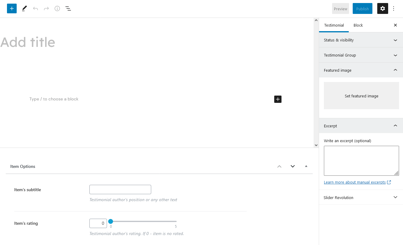
The single testimonial page inherits the global settings (for header, footer, etc.) specified in Appearance > Customize. The sidebar and additional widgets set can be added in Appearance > Customize > Posts Page > Sidebar/Additional Widgets.
"Item's rating" option displays testimonial author's rating if the testimonial is inserted to the page using the Testimonials widget (Elementor Page Builder > ThemeREX Addons Extensions group) and if the rating is enabled in the widget's settings.
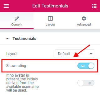
Testimonials Widget (ThemeREX Addons Extensions group)
Insert the testimonials on your page using the Testimonials widget (Elementor Page Builder > ThemeREX Addons Extensions group), Blogger widget (ThemeREX Addons Elements group) or Services widget (ThemeREX Addons Extensions group).
Specify the Testimonials widget settings, including the layout, the number of columns, title, subtitle and other. You can also display them in a form of a slider by enabling this option under the Slider tab.
Elementor Widgets
Elementor Widgets in WordPress let you add different kinds of functionality to your website without writing a single line of code.
Our theme comes with a number of custom Elementor widgets allowing you to add the information in a simple way.
Custom Elementor widgets (with icon functionality) support icons from standard Fontello icons set. You can expand the list of available icons by adding new ones from the fontello website. In order to add new icons proceed to wp-content/themes/your-theme/skins/default/css/font-icons/config.json. Watch this video guide for more information.
Please note, the location of config.json file and website page builder with available set of widgets/shortcodes in your theme may vary from the video provided!
All custom Elementor widgets are divided into the following groups of elements in the Elementor Editor:
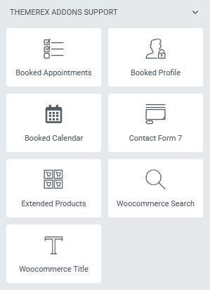
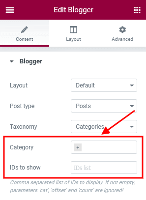
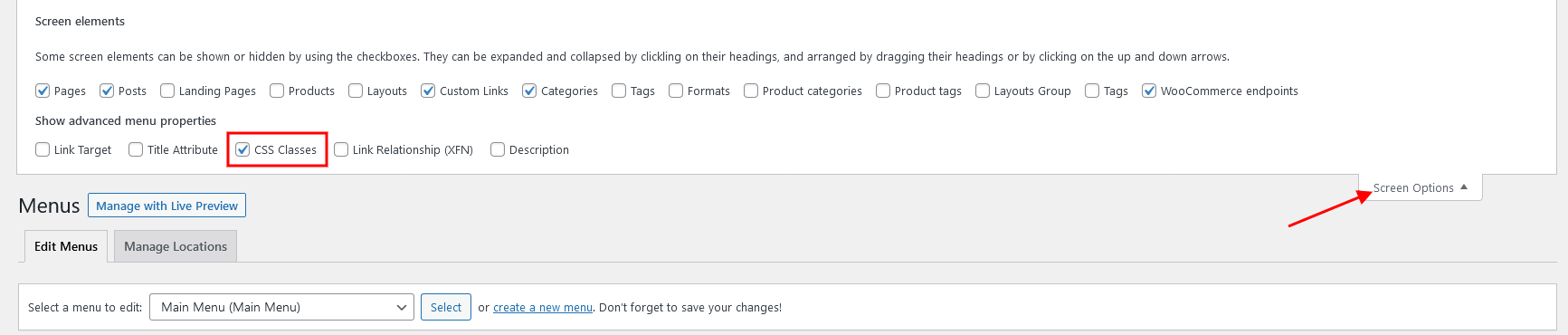
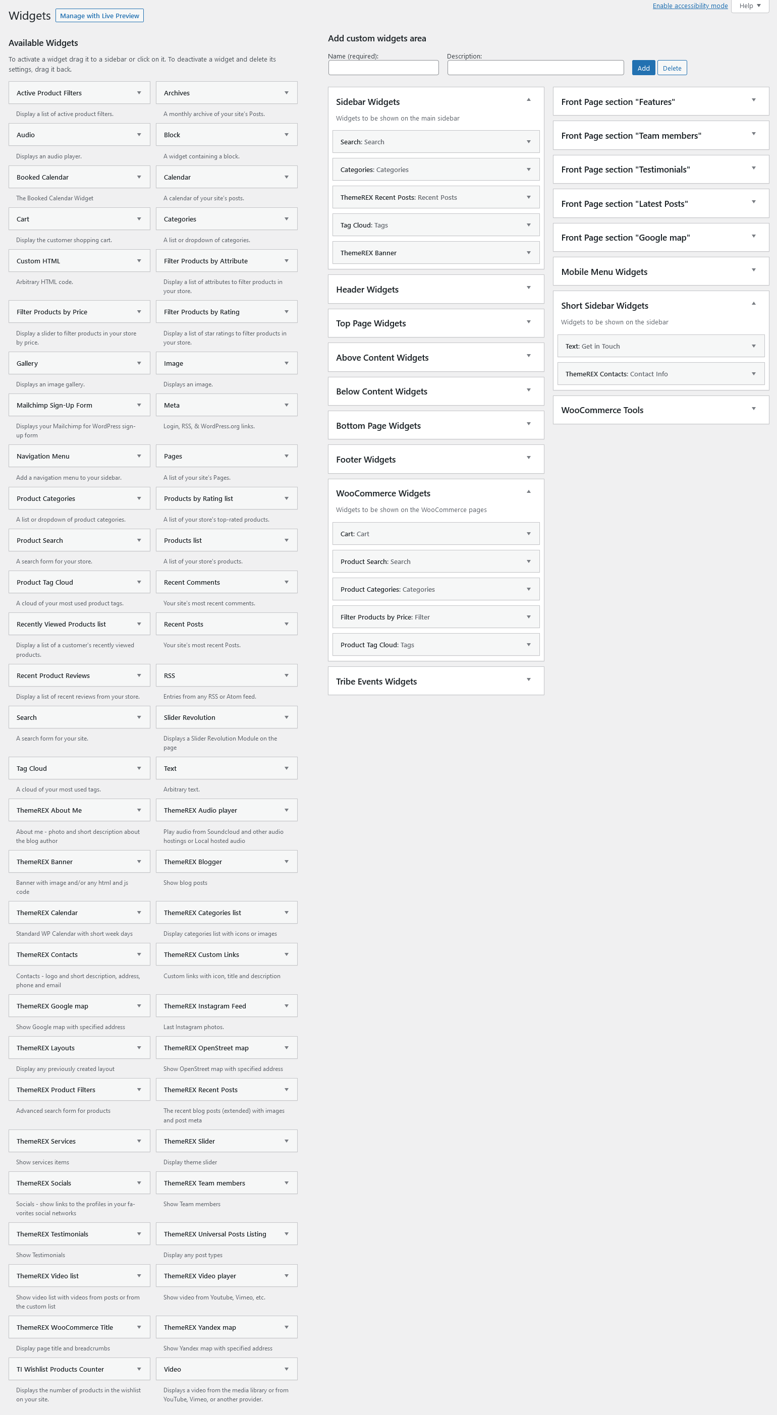
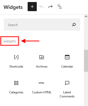
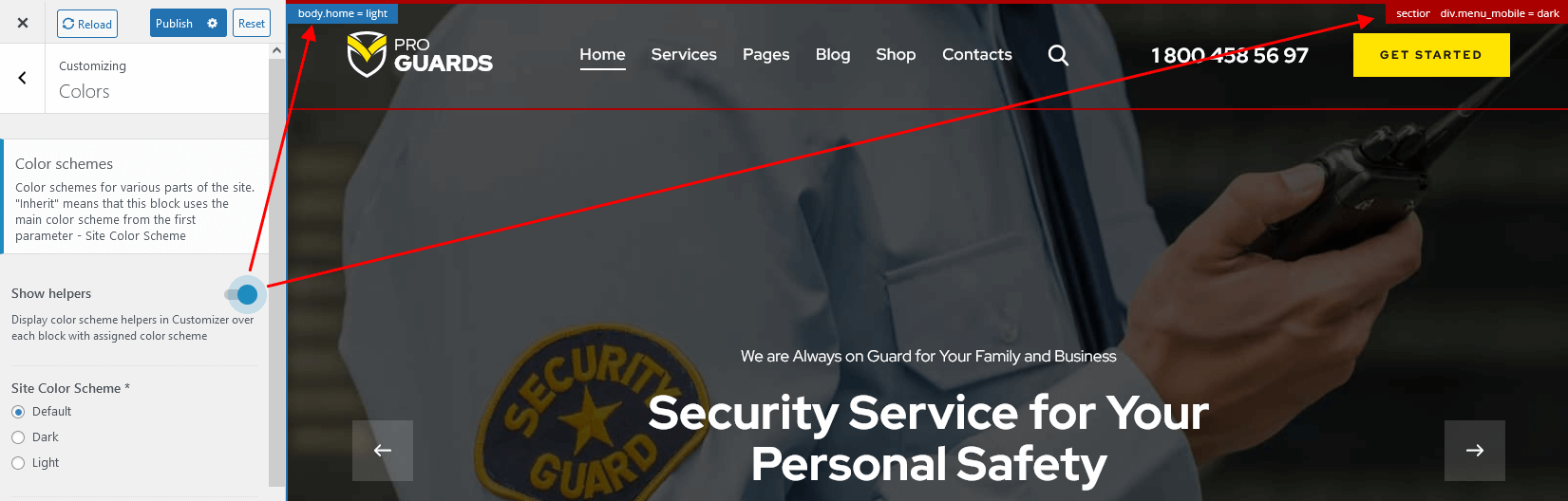
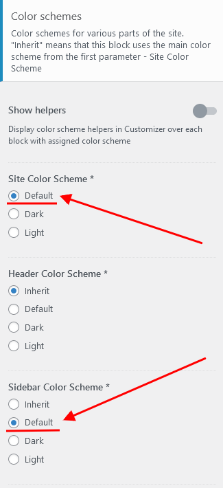
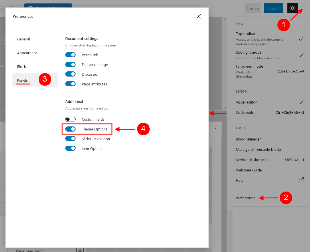
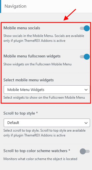
ThemeREX Addons Elements group
Actions
This Elementor widget inserts "Call to action" or columns layout.
Example:
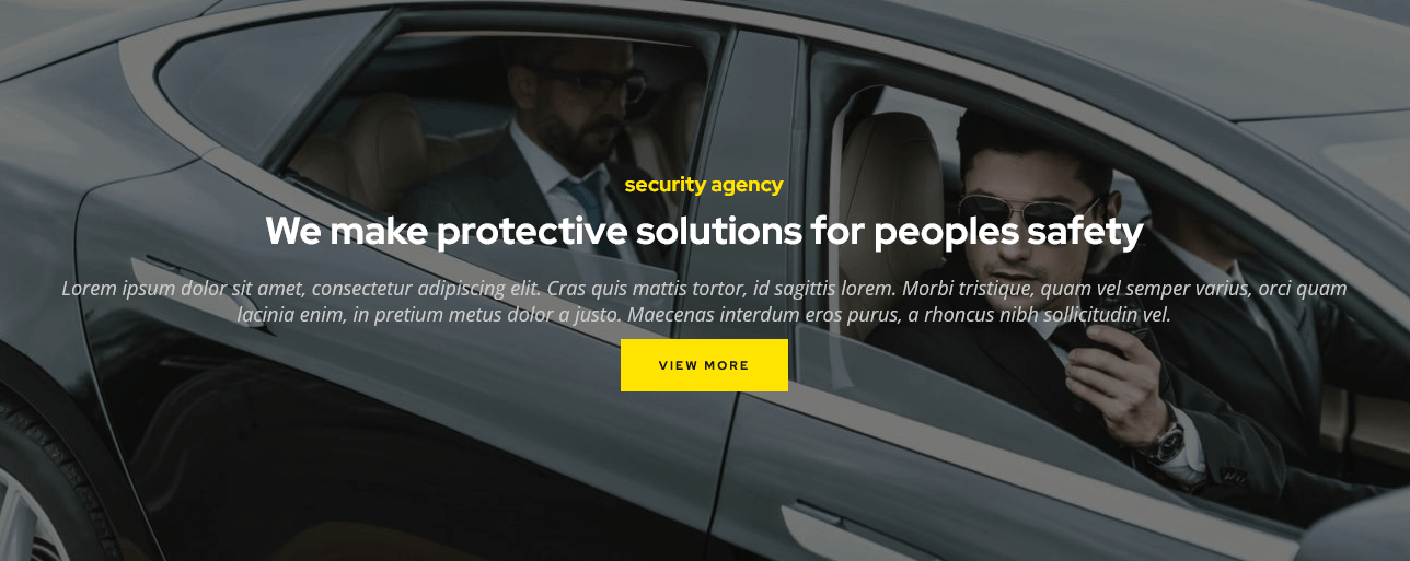
Anchor
The Elementor "Anchor" widget inserts an anchor element that lets you link to specific parts of your page (or to other pages).
If you want to add smooth navigation between your anchors, check the Scroll to Anchor box in Theme Panel > ThemeREX Addons > Shortcodes > Anchor section.
Audio Effects
This Elementor widget allows you to add an equalizer (sound) icon to your page, so your customers can turn on/off the sounds on the page themselves. This works only if the Audio Effects Add-on is installed.

The following statuses of the indicator are available:
- Static enabled - sounds effects only (hover, click), without background music;
- Animated - all sounds are turned on;
- Static disabled - all sounds are turned off;
PLEASE NOTE! The sounds indicator controlls only advanced sounds effects. Its actions do not apply to video and audio sounds that are created using video/audio widgets or external plug-ins.
Blogger
This widget displays posts, pages or custom post types from a specified category or group. Just specify the post type to show the posts from in the Edit Blogger > Content > Post type field in the Elementor panel. By default, the widget outputs single posts.
You can create additional layouts to output the posts in the WP Dashboard > Layouts using Blog layout's type (Item Options section). Please see Creating Layouts section of this documentation file for more information.
Example:
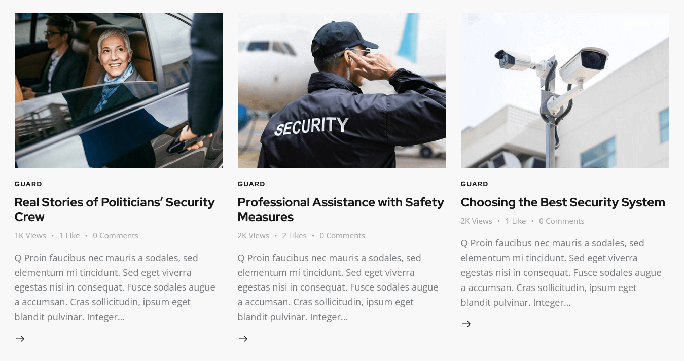
You can edit the post excerpt text by opening the corresponding blog post, and adjusting text in the Excerpt field.

Enable the Excerpt field in the Preferences > Panels panel in the top right corner of the post.
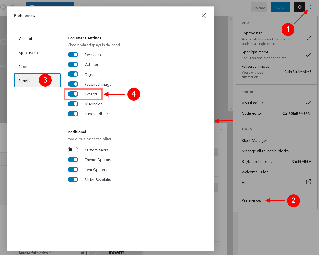
The length (in words) of the post excerpt text is inherited from the global setting in Appearance > Customize > Blog > Posts Page > Posts Page Settings.
You can enable additional taxonomy attributes (text color, text hover color and icon) for definite groups/categories of posts/post types in Theme Panel (WP Dashboard) > ThemeREX Addons > Extended Taxonomy tab. Then navigate to a particular category/group of posts/post types in WP Dashboard and set the required attributes.
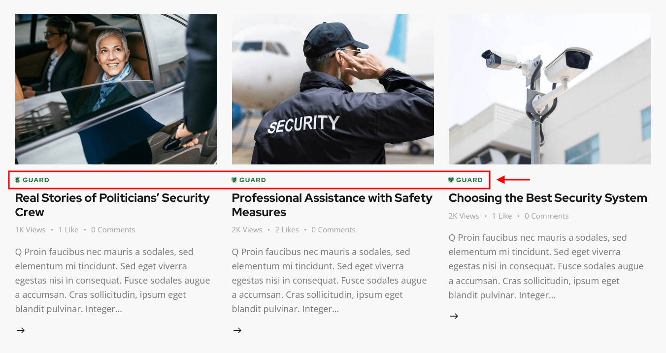
IMPORTANT! The layout of the block depends on the combination of 2 main options: "Blogger layout" and "Template". Please feel free to play around with these options.
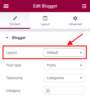
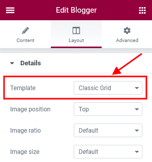
PLEASE NOTE! Some non-standard hover effects of blogger widget require the Mouse Helper Add-on to be active. Such hover effects are imbedded into the widget's style: Layout "List", Template "Simple (hover)". The image on hover is a featured image of a particular post.
PLEASE NOTE! The hover effects highlighted on the screenshot below require the Image Effects Add-on to be active.
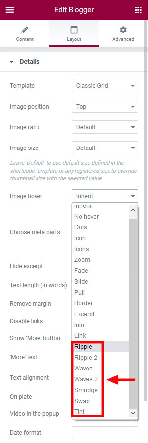
Button
This Elementor widget displays buttons.
Examples:
Countdown
This Elementor widget displays time counter of two types:
- time left before an event starts;
- time passed since the begining of the event;
Example:
Cover Link
This widget allows you to build unique linked banners, assembled through Elementor page builder.
This Elementor widget inserts a link with absolute position, that will overlap a parent section or column. This makes the whole section/column clickable. This widget stays invisible itself, so the section or column should contain any other element.
Form
This Elementor widget displays a contact form. The text for the checkbox "I agree..." is set in Appearance > Customize > General > Text with Privacy Policy link.
In order to add/customize the Privacy Policy link, navigate to Settings (WP Dashboard) > Privacy and specify the page that will be used as a Privacy Policy one.
PLEASE NOTE! In case you are planning to use default form without consent checkbox, just leave the "Text with Privacy Policy link" option empty in the Appearance > Customize > General section!
Example:
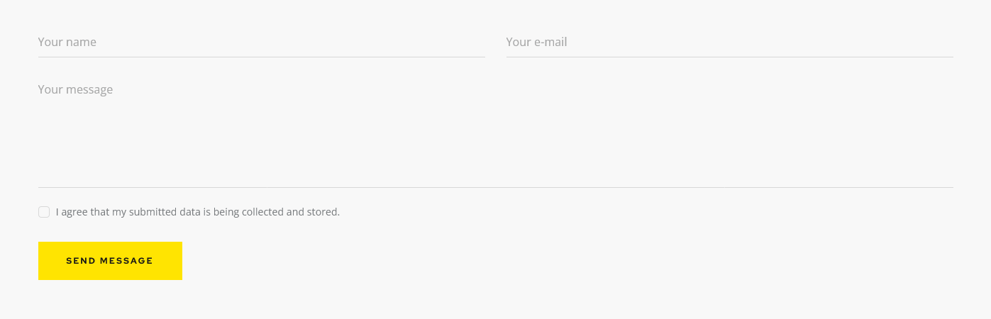
Check the following directory .../wp-content/plugins/trx_addons/сomponents/shortcodes/form for the form-related files such as tpl.default.php, tpl.detailed.php and others. Each of these files is responsible for displaying the form in different styles. Choose the necessary file, open it with any text editor (for example Sublime or Atom), and modify the code according to your needs.
To translate the form fields edit .pot file in the following directory .../wp-content/plugins/trx_addons/languages/.... See the Theme Translation section for more information.
Google Map
This Elementor widget displays a Googlemap. Make sure there is a valid API key in the "Google API key" field on the Theme Panel > ThemeREX Addons > API tab.
Example:
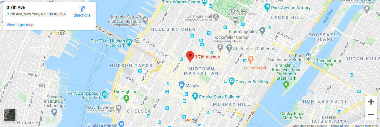
Icons
This Elementor widget displays fontello icon(s), SVG-icon(s) or image(s) with title and description.
You can expand the list of available fontello icons by adding new ones from the fontello website. In order to add new icons proceed to wp-content/themes/your-theme/skins/default/css/font-icons/config.json. Watch this video guide for more information.
PLEASE NOTE! Please note, the location of config.json file and website page builder with available set of widgets/shortcodes in your theme may vary from the video provided!
Example:
OpenStreet Map
This widget shows OpenStreet map with specified address. You can set the OpenStreetMap API script and styles for the map in the Theme Panel (WP Dashboard) > ThemeREX Addons > API tab.
Price
This Elementor widget inserts a price table divided by blocks.
Example:
Promo
This Elementor widget inserts a promo block. It also allows you to use custom images, icons and apply different color schemes.
Example:
Skills
This Elementor widget displays skills counters and pie charts.
Example:
Slider
This Elementor widget lets you insert the following type of sliders, namely:
- Swiper Slider (Posts Slider);
- ElastiStack (Posts Slider);
- Slider Revolution;
Select which type of the slider to show in the Slider Engine option under content tab.
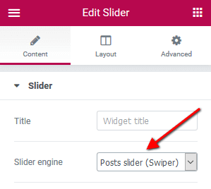
Example (Swiper Slider):
The Swiper Slider lets you display your posts, pages, or custom post types in a form of a slider. Enhance the slider by adding preview image thumbnails using Slider Controller, and navigation arrows using the Slider Controls or via the Slider widgets' settings under Layout > Controls tab.
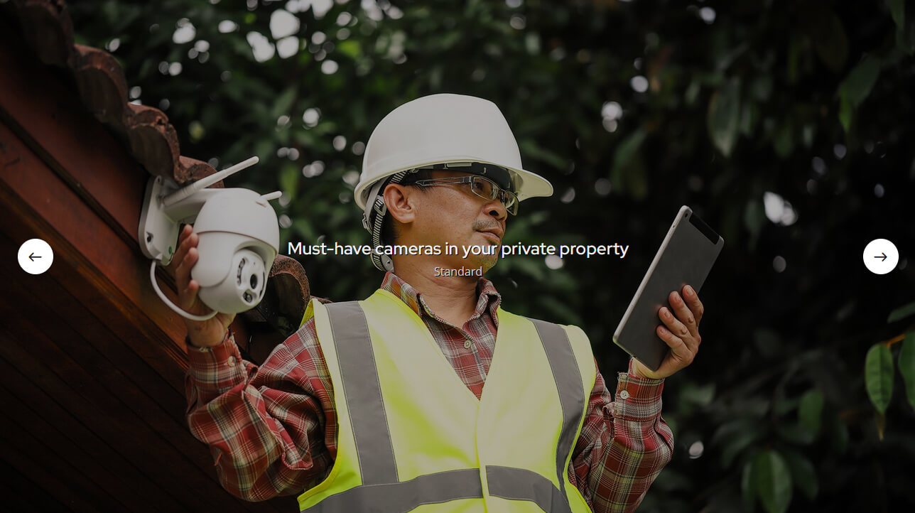
Example (ElastiStack Slider):
ElastiStack is a type of slider that allows you to navigate through a stack of slides by dragging away the first item.
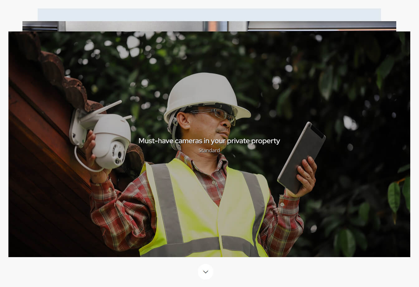
Example (Revolution Slider):
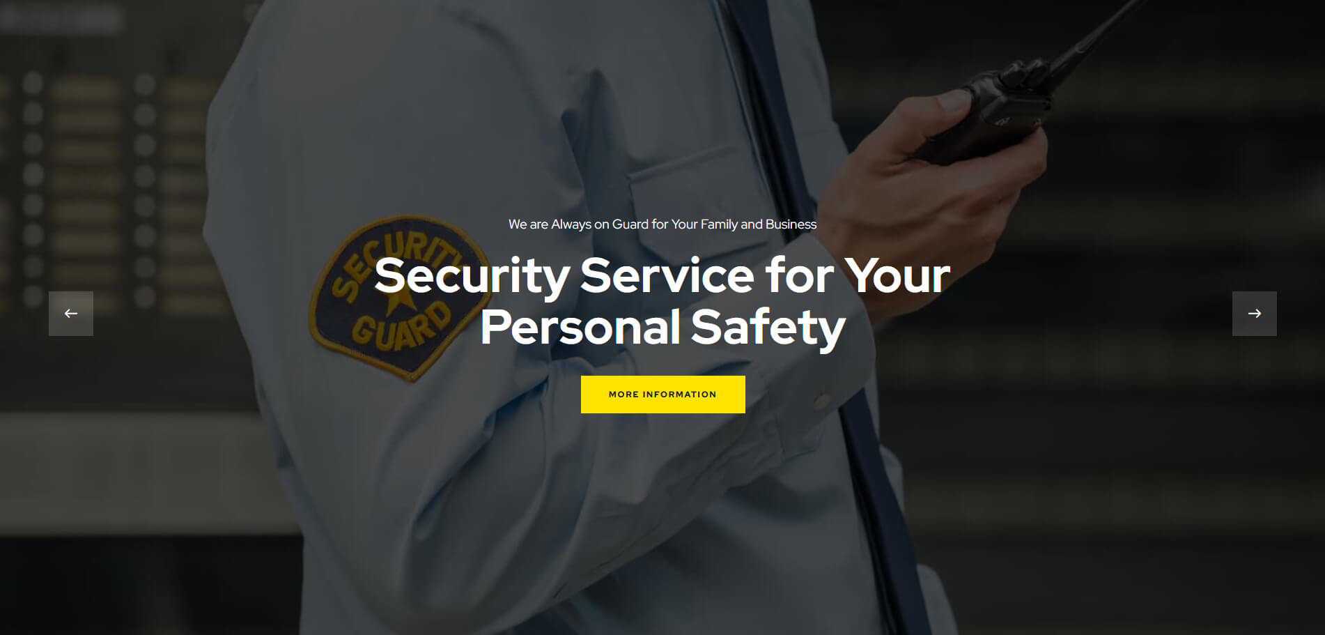
Slider Controller + Slider Controls
Slider Controller displays image thumbnails and navigation arrows for the Swiper Slider engine in the Slider widget.
Slider Controls adds navigation pointers for the Swiper Slider engine in the Slider widget.
Make sure to enter the ID of the Slider widget you want to control. Enter the ID first into the Slider widget settings (under the Advanced > CSS ID), and then copy it into the Slider Controller/Slider Controls settings into the Content > Slave slider ID field.
Example:
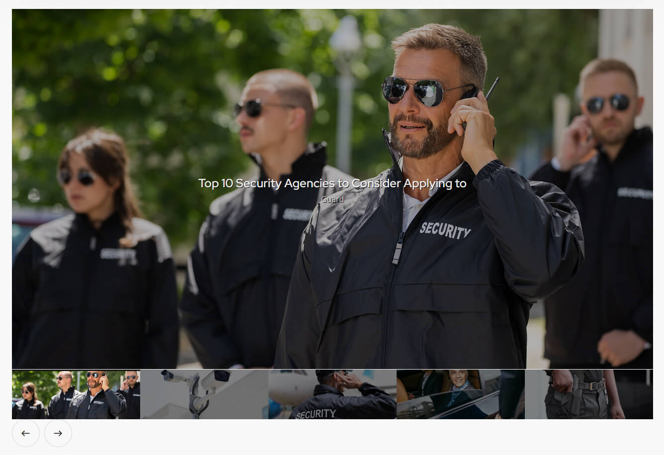
Socials
This Elementor widget displays social icons. You can specify the necessary links (URLs) to your social profiles in the widget's settings under the content tab as well as expand the list of available icons by adding new ones from the fontello website. In order to add new icons proceed to wp-content/themes/your-theme/skins/default/css/font-icons/config.json. Watch this video guide for more information.
PLEASE NOTE! Please note, the location of config.json file and website page builder with available set of widgets/shortcodes in your theme may vary from the video provided!
If empty, the social icons will inherit the links (URLs) to your social profiles specified in the Theme Panel > ThemeREX Addons > Socials tab.
Examples:

Table
This Elementor widget inserts a regular table, created using any table-generator, like http://www.impressivewebs.com/html-table-code-generator/.
Example:
Title
This Elementor widget inserts a regular title with subtitle, some description and a button.
Example:
The following additional CSS classes change the color of some words in a title. The class names can be specified in the "Title" field using <span> or <u> tag.
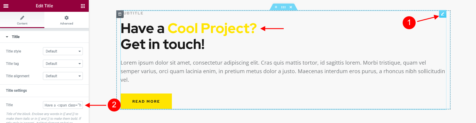
Have a <span class="has-text-link-color">Cool Project?</span> ||Get in touch!
-
.has-text-link-coloror.accent1- the text color is inherited from Appearance > Customize > Colors > Color Scheme > Main > Link.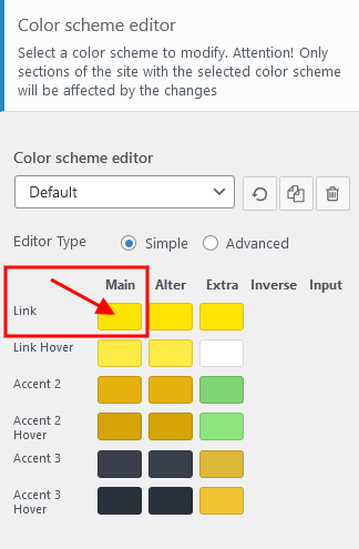
-
.has-text-link-2-coloror.accent2- the text color is inherited from Appearance > Customize > Colors > Color Scheme > Main > Accent 2.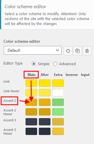
-
.has-text-link-3-coloror.accent3- the text color is inherited from Appearance > Customize > Colors > Color Scheme > Main > Accent 3.
Yandex Map
This widget displays Yandex Map. Make sure there is a valid API key in the "Yandex API Key" field in the Theme Panel > ThemeREX Addons > API tab (for paid version).
ThemeREX Addons Widgets group
Widget: About Me
This widget displays an "About Me" block with some personal information of the website's owner or any other person. If you leave the options empty they will inherit data from the following options on the admin's profile page: "Profile Picture" (for photo), "Username" (for name) and "Biographical Info" (for description). You can hide any option by inserting # sign in the corresponding field in the widget's settings.
The widget is designed to be used in a sidebar.
Example:
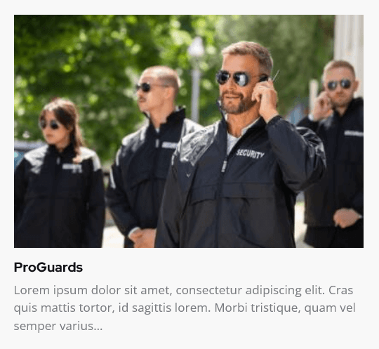
Widget: Audio Player
This Elementor widget inserts a block with an Audio Player. You can use a locally uploaded audio file (from your Media library) or an external one (through embed html code). The system ignores the "Audio caption" and "Author name" options, if the embed code is used.
Examples:
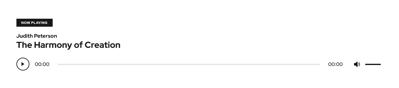
Widget: Banner
This Elementor widget displays a regular banner image linked or not as well as any object inserted using html code (banner, iFrame for video, audio, etc.).
Example:
Widget: Calendar
This Elementor widget displays a regular WP calendar. You can choose the way of shortening the weekday names: to one (first) letter or to three letters.
Example:
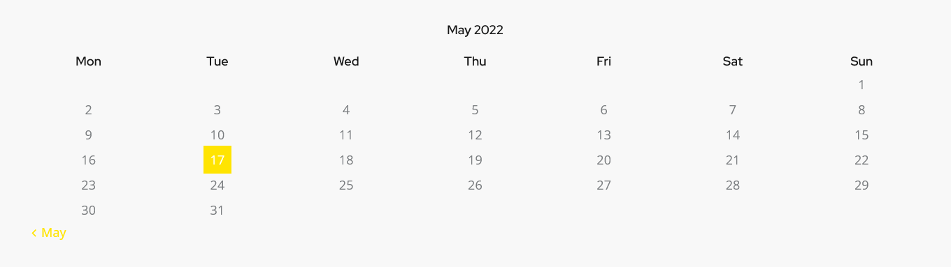
Widget: Categories List
This Elementor widget displays a list of post or products categories/tags/formats, layouts or CPT groups. By default, it inserts post categories. You can choose the post type to show the categories/tags/groups from in the Edit Widget: Categories List > Content > Post type field.
Example:
In case you want to display thumbs with the titles, you should check "Large Image" or "Small Image" attribute options and enable these attributes for the needed category/group of posts/post types in Theme Panel (WP Dashboard) > ThemeREX Addons > Extended Taxonomy tab. Then navigate to a particular category/group of posts/post types in WP Dashboard and upload the images (if this option is available for a definite group of posts).
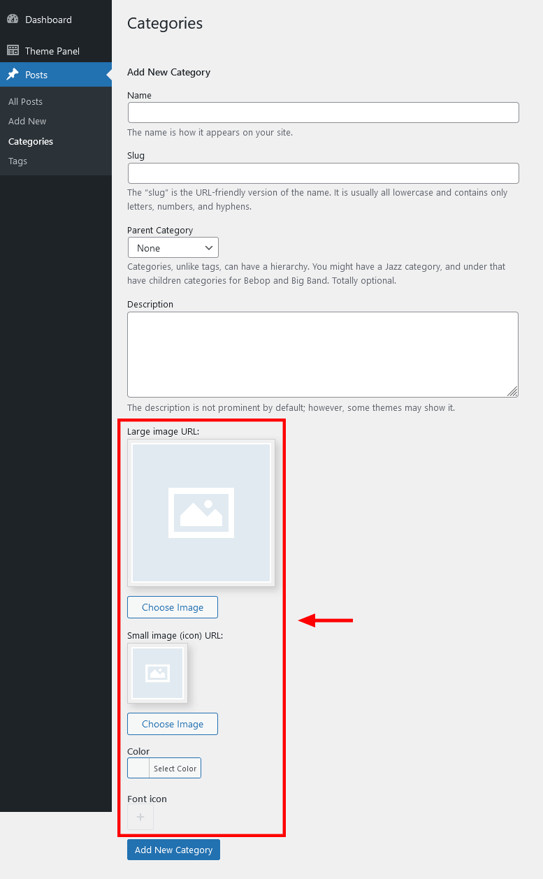
Widget: Contacts
This Elementor widget inserts a block with a logo, short description, contact information and social links. Please specify the necessary links (URLs) to your social profiles in the Theme Panel > ThemeREX Addons > Socials tab. If you want to add a map, make sure there is a valid API key in the Theme Panel > ThemeREX Addons > API tab.
Example:
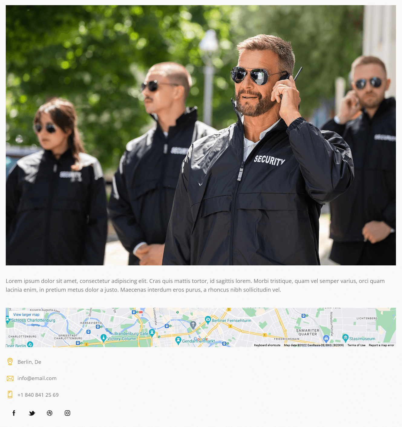
Widget: Custom Links
Custom Links widget inserts custom links with icon, title and description. You can also create a list with links or a menu, using this widget.
Example:
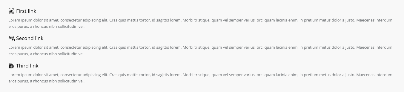
Widget: Instagram
This Elementor widget displays the latest photos from your Instagram account or demo photos in a form of a feed on your WordPress website. You can connect to your Instagram account in the Theme Panel (WP Dashboard) > ThemeREX Addons > API section (you need a valid Instagram Access Token).
Demo mode means that the images will be taken from your demo folder (/wp-content/uploads/).
Alternatively, you can use photos from Instagram without connecting to your account: by using a hashtag #... or by specifying an Instagram username (WITHOUT a hash symbol).
Example:
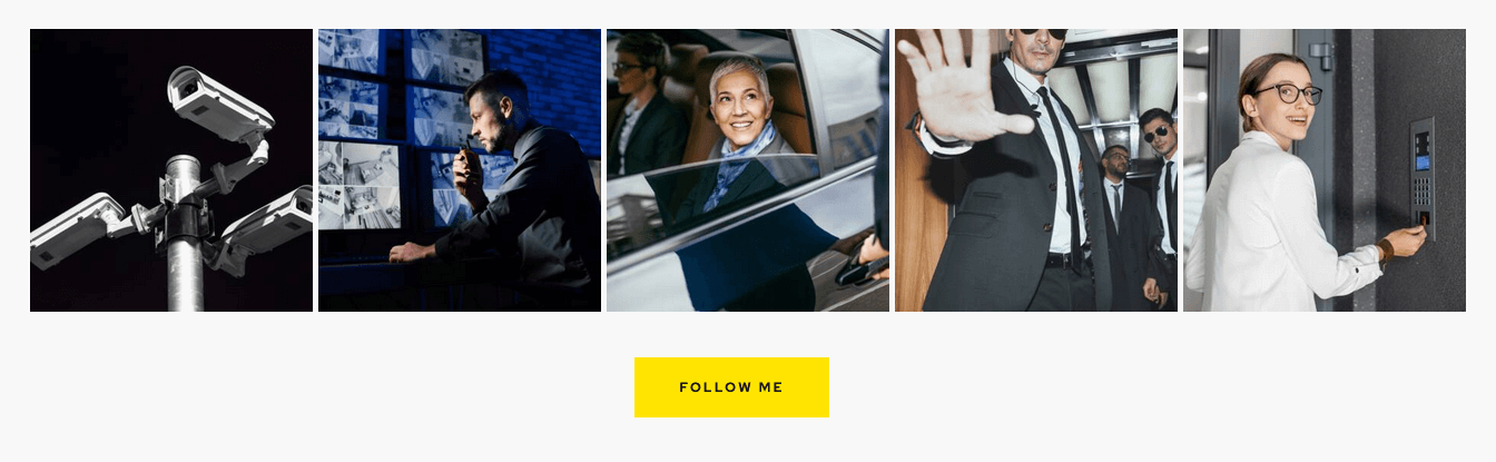
Widget: Popular Posts
This Elementor widget inserts popular posts. The titles for tabs can be managed in Edit Widget: Popular Posts > Layout > Tabs. This widget is designed to be used in a sidebar.
Example:
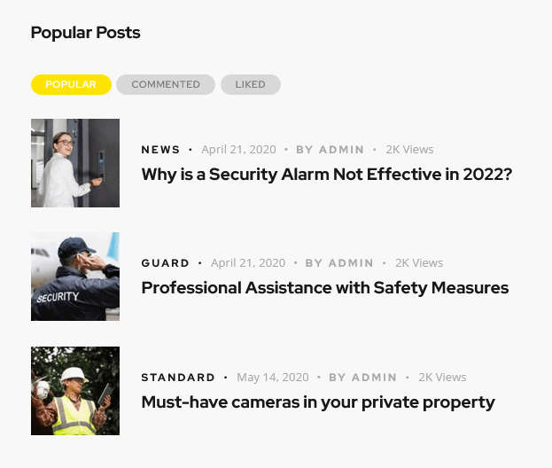
You can enable additional taxonomy attributes (text color, text hover color and icon) for definite categories of posts in Theme Panel (WP Dashboard) > ThemeREX Addons > Extended Taxonomy tab. Then navigate to a particular post category in WP Dashboard > Posts > Categories and set the required attributes.
Widget: Recent Posts
This Elementor widget displays the most recent posts. You can set additional options in the "Details" section in the element's settings window. This widget is designed to be used in a sidebar.
Example:
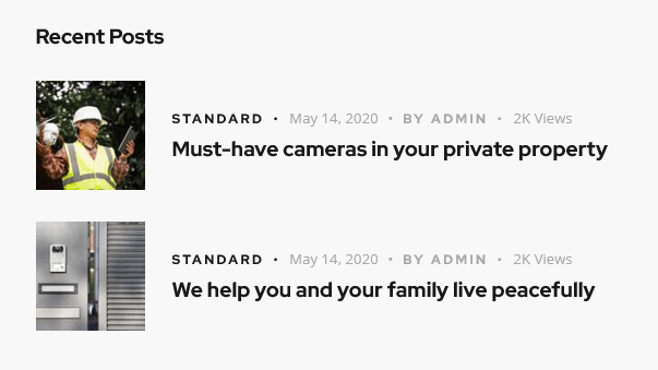
You can enable additional taxonomy attributes (text color, text hover color and icon) for definite categories of posts in Theme Panel (WP Dashboard) > ThemeREX Addons > Extended Taxonomy tab. Then navigate to a particular post category in WP Dashboard > Posts > Categories and set the required attributes.
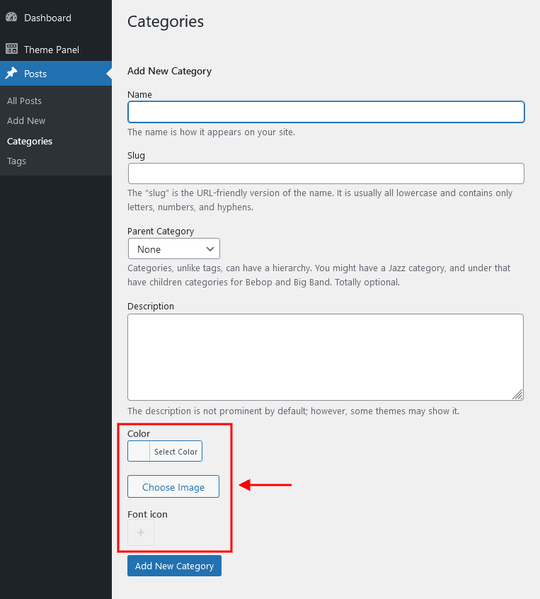
Widget: Socials
This Elementor widget displays social icons of the social networks you are subscribed to. Please specify the necessary links (URLs) to your social profiles in the Theme Panel > ThemeREX Addons > Socials tab. Works in a sidebar (as a widget) as well.
Example:
Widget: Video Player
This Elementor widget displays a video file. The widget supports direct links from Youtube, Vimeo or locally downloaded video files. You can also insert a video through html code from any video hosting platform.
Example:

Widget: Video List
This Elementor widget shows a list of videos:
- taken from posts of "Video" post format type.
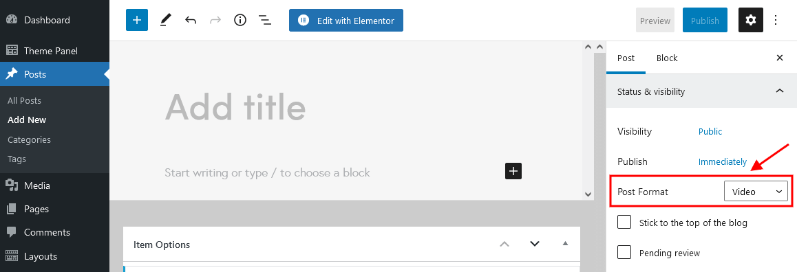 A url or embed code for the video should be specified in the single post's settings, Item Options > Video > Video List section.
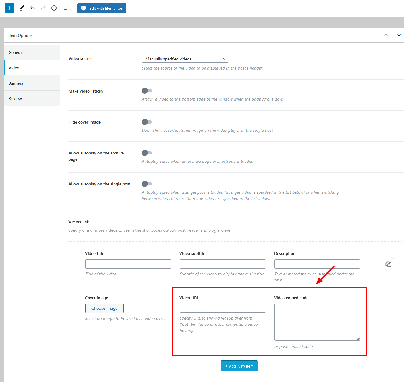
- custom video list, created through the widget's settings (Edit Widget: Video List > Content > Widget: Video List). Add as many items as you want. Clone items by clicking a clone button to the right of the item's number, or rearrange them by dragging and dropping.
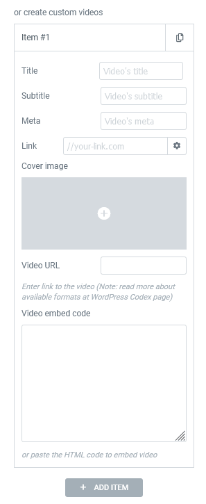
Example:
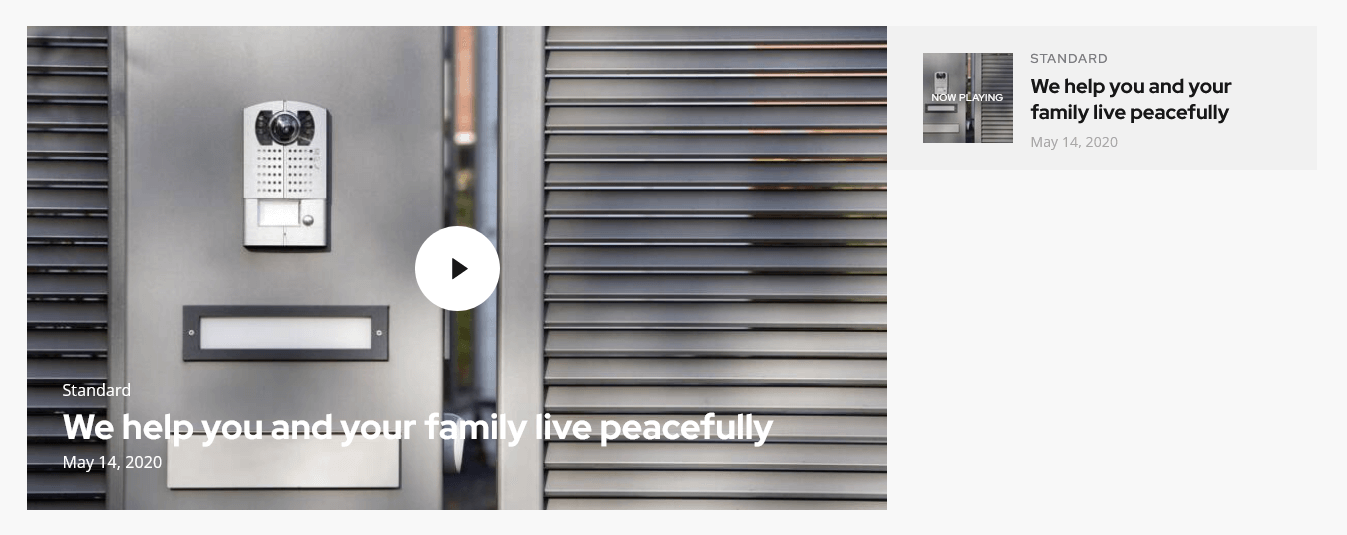
You can enable additional taxonomy attributes (text color, text hover color and icon) for definite categories of posts in Theme Panel (WP Dashboard) > ThemeREX Addons > Extended Taxonomy tab. Then navigate to a particular post category in WP Dashboard > Posts > Categories and set the required attributes.
ThemeREX Addons Extensions group
Portfolio
This Elementor widget displays portfolio posts. To manage "Portfolio" proceed to the WordPress Dashboard Menu > Portfolio post type. Update "Portfolio Groups", "Featured Image" (for an image), "Excerpt" (for the summary) settings and the general content section (if the "Excerpt" section is empty) of a single post. The content or excerpt settings work for "Band" widget's style.
Example (the first post is shown on hover):
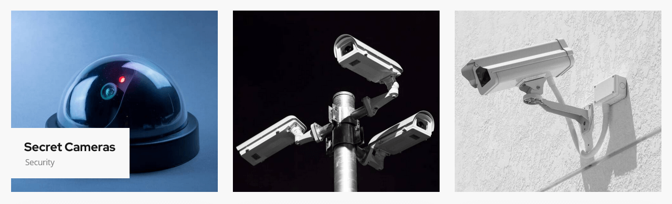
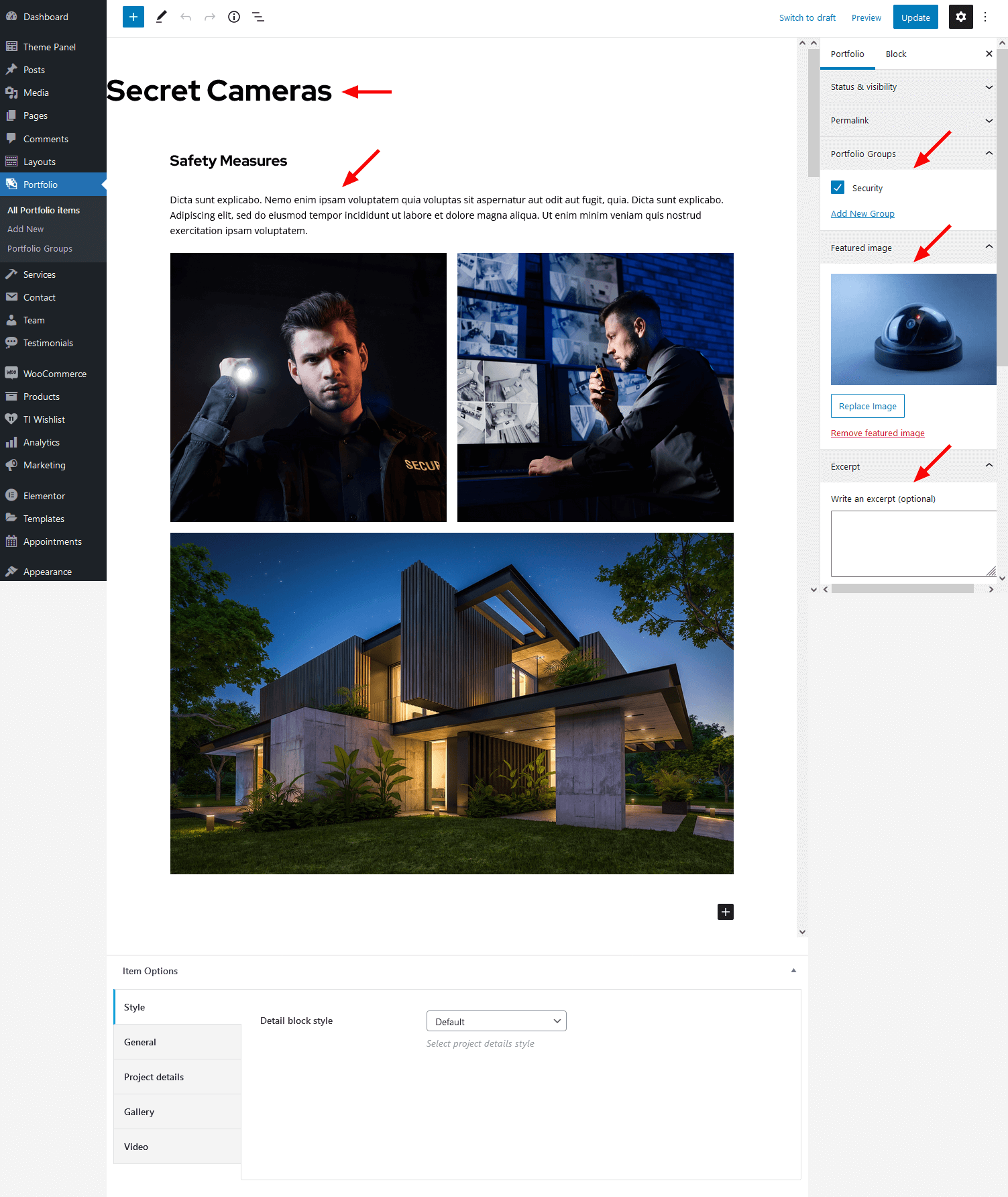
You can enable additional taxonomy attributes (text color, text hover color and icon) for definite groups of portfolio post type in Theme Panel (WP Dashboard) > ThemeREX Addons > Extended Taxonomy tab. Then navigate to a particular group of portfolio post type in WP Dashboard > Portfolio > Portfolio Groups and set the required attributes.
PLEASE NOTE! The Portfolio widget in "Band" style is stylized to use the waves hover effect. This hover effect requires the Image Effects Add-on to be active.
PLEASE NOTE! The hover effects for Portfolio widget in "Simple" style require the Mouse Helper Add-on to be active.
Services
This Elementor widget displays posts/pages/custom posts types from a specified category or group. By default, it inserts available services.
To manage "Services" proceed to the WordPress Dashboard Menu > Services post type. Use "Services Groups", "Item Options" (for the icon/pictogram and price), "Featured Image" (for the image), "Excerpt" (for the summary) settings and the general content section (if the "Excerpt" section is empty) to customize the post.
Example:
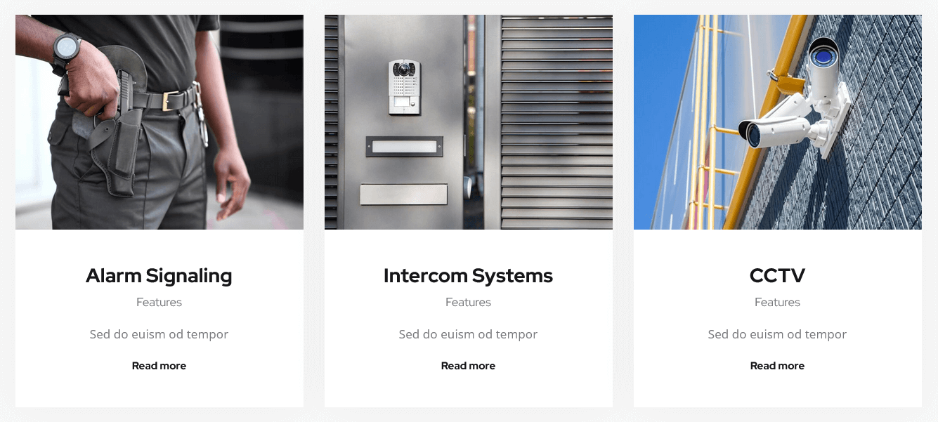
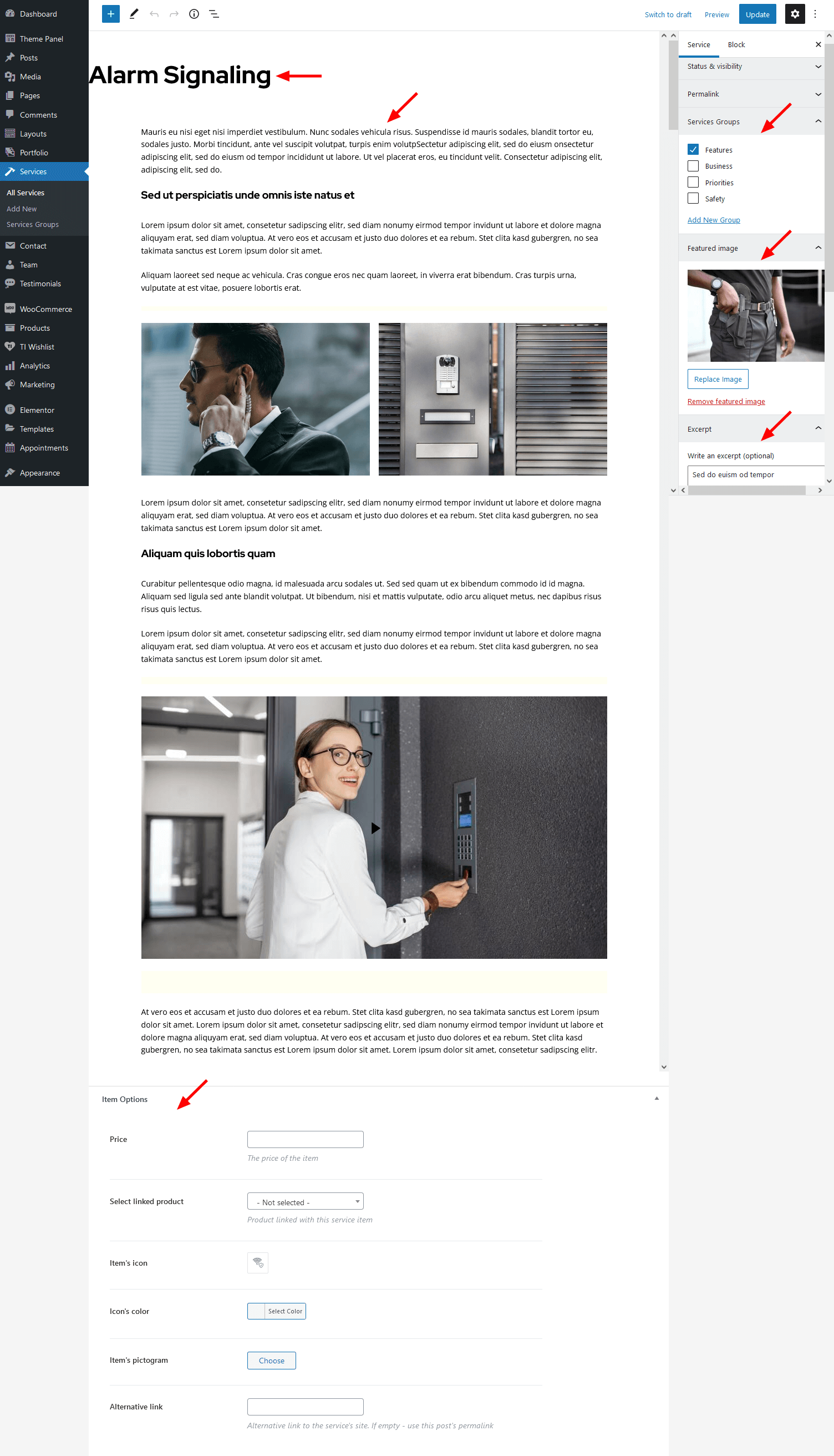
You can choose whether to display image/pictogram/icon/number in the services widget's content settings.
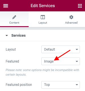
The icon and pictogram are set in the "Item Options" section on single service post.
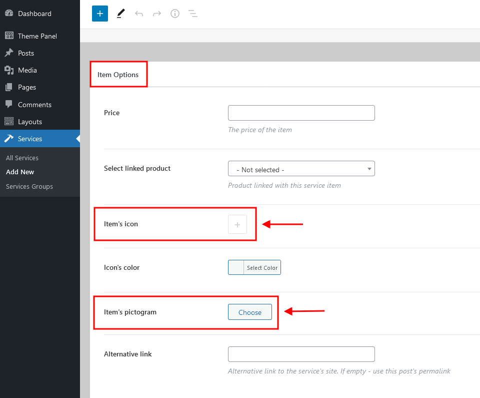
The excerpt section can be hidden in the Layout tab.
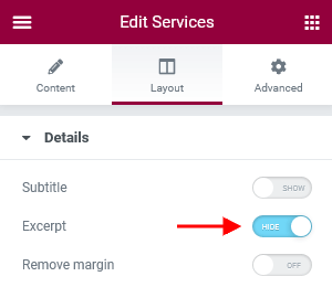
In the Edit Services > Content > Post type field you can select another type of posts for output: posts/pages/custom posts types.
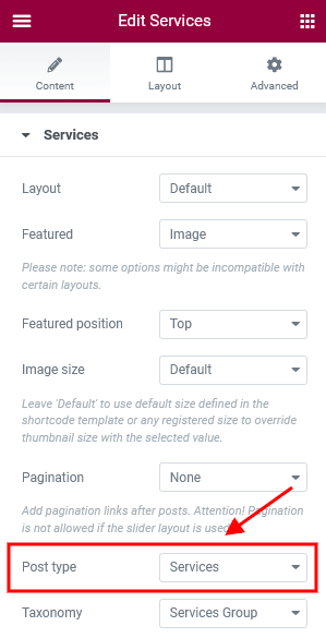
You can enable additional taxonomy attributes (text color, text hover color and icon) for definite groups of services post type in Theme Panel (WP Dashboard) > ThemeREX Addons > Extended Taxonomy tab. Then navigate to a particular group of services post type in WP Dashboard > Services > Services Groups and set the required attributes.
Team
This Elementor widget displays team members. To manage "Teams" proceed to the WordPress Dashboard Menu > Team post type. Use "Team Groups", "Item Options" (for the position and social links), "Featured Image" and "Excerpt" (for the summary) settings to customize the post.
The summary is available for "Alter", "List", "Metro" widget's layouts ONLY!
Example:
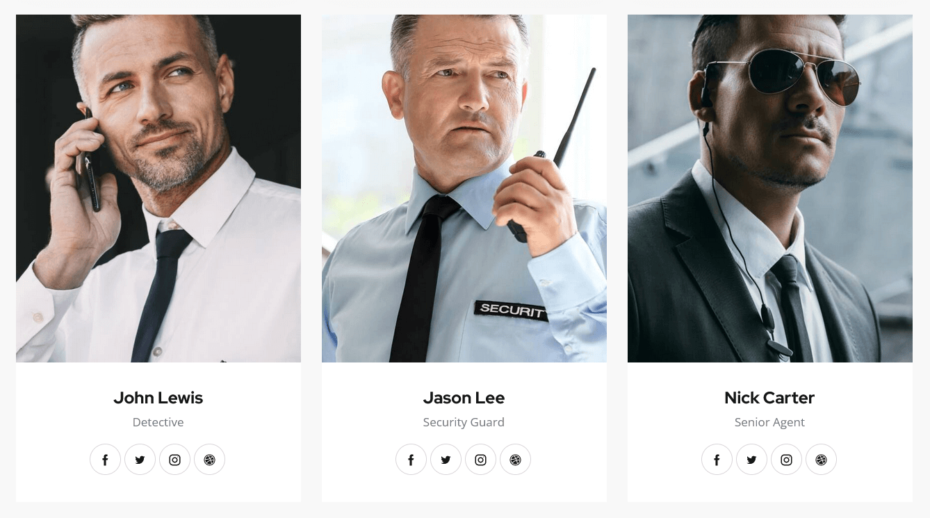
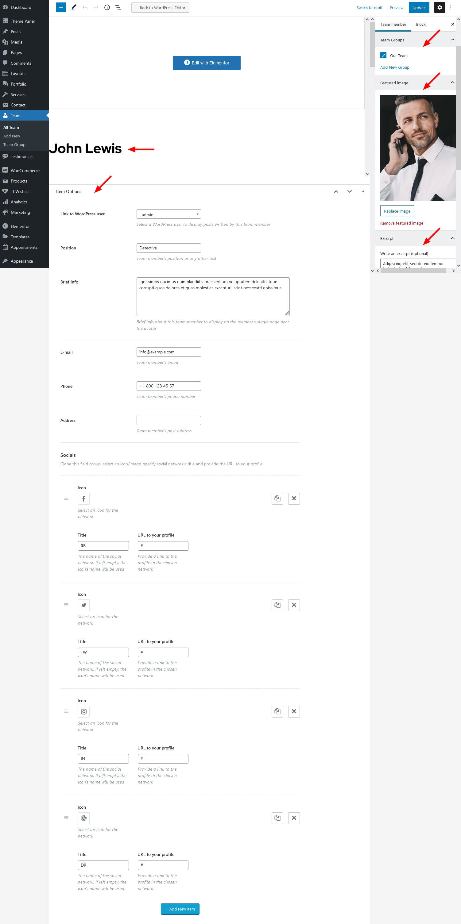
Testimonials
This Elementor widget displays testimonials block. To manage "Testimonials" proceed to the WordPress Dashboard Menu > Testimonials post type. Use "Testimonial Groups", "Item Options" (for the position or any other text and author's rating), "Featured Image", "Excerpt" (for the summary) settings and content section (in case the "Excerpt" section is empty) to customize the post.
Example:
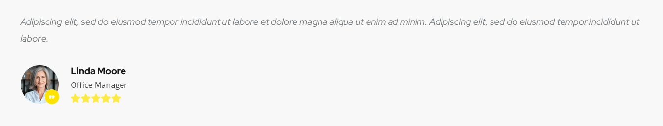
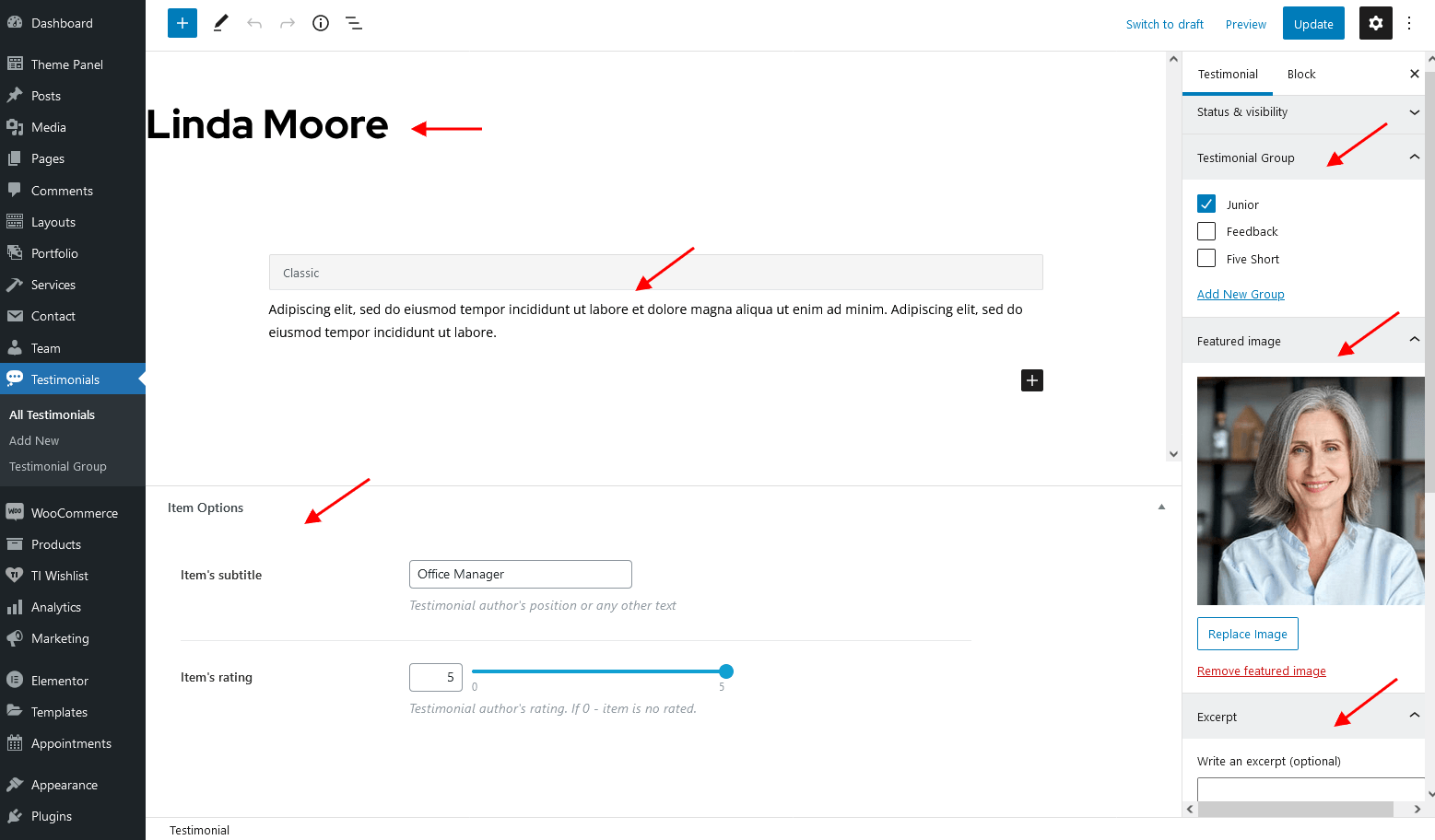
ThemeREX Addons Support group
Booked Appointments
This Elementor widget displays available upcoming appointments. It works only if the Booked plug-in is installed.
Upcoming Appointments appear only if you have booked appointments beforehand.
Example:
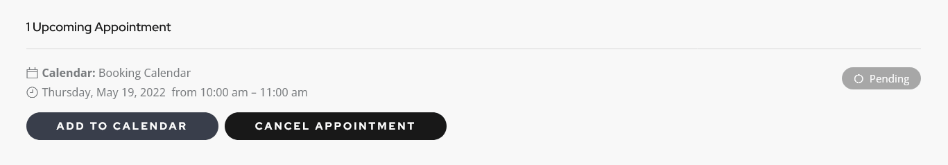
Booked Profile
This Elementor widget displays profile with appointments. It works only if the Booked plug-in is installed.
Upcoming Appointments appear only if you have booked appointments beforehand.
Example:
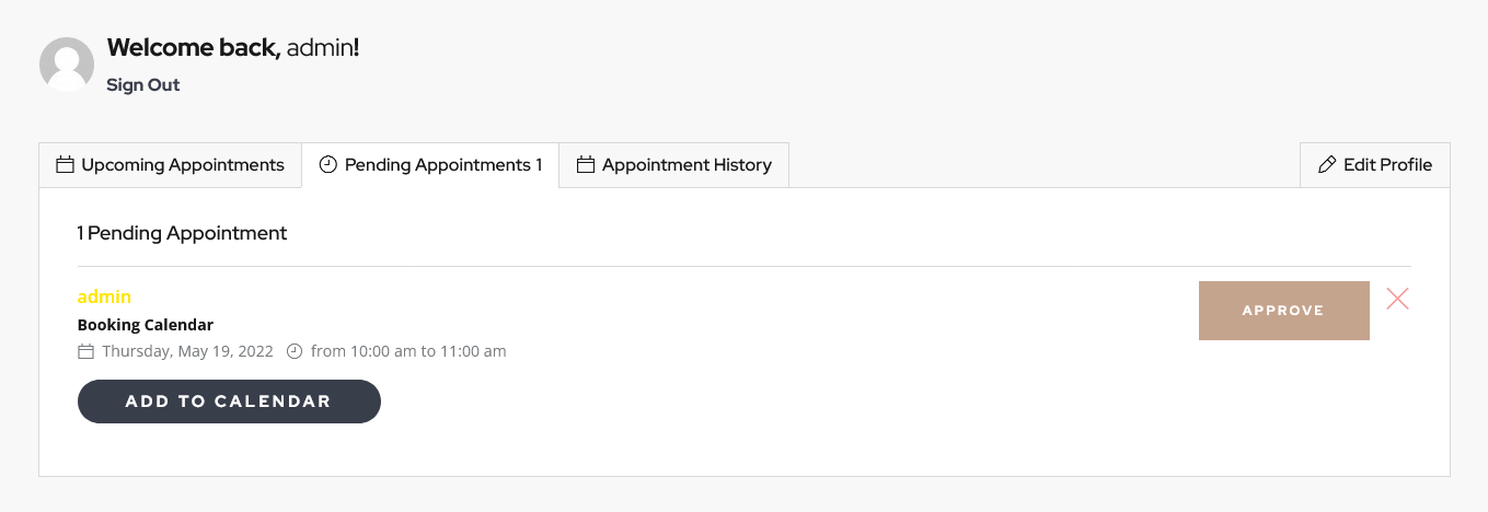
Booked Calendar
This Elementor widget displays a booked calendar. It works only if the Booked plug-in is installed.
Example:
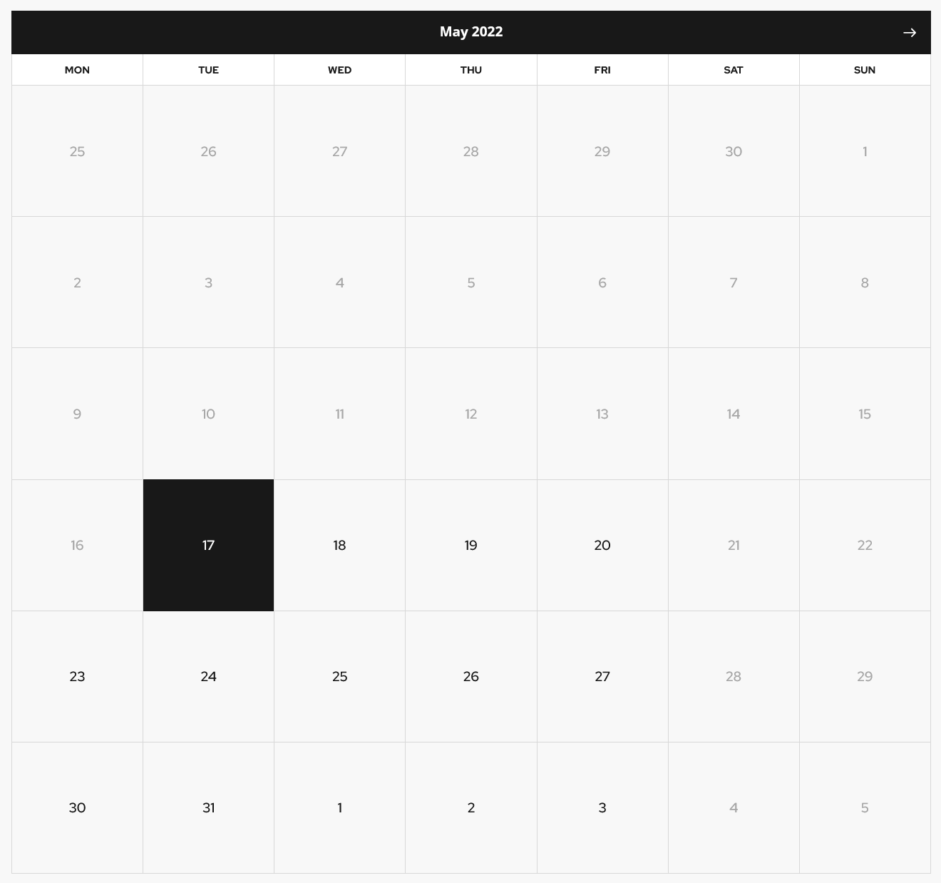
Contact Form 7
This Elementor widget displays pre-built contact forms. The forms can be managed in Contact (WP Dashboard) > Contact Forms section.
Example:
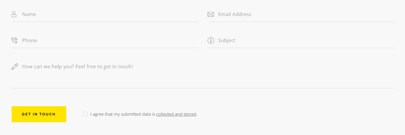
Extended Products
This Elementor widget outputs products. You can customize the single products in the Products (WP Dashboard) > All Products section. This widget is available, if the WooCommerce plug-in is installed and active.
Example:
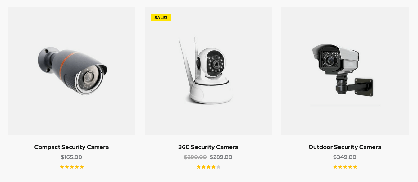
WooCommerce Search
This Elementor widget inserts advanced search form for products (requires the WooCommerce plug-in). Please note, that the widget in "Inline" style works on all pages. The rest available styles work on shop list page only!
Example:

WooCommerce Title
This Elementor widget displays a page title, breadcrumbs and a description of a products category on shop-related pages. You can use this widget for creating separate custom header layouts for shop-related pages ONLY! The description inherits content from the back-end settings of a definite products category. The description becomes visible on product category pages ONLY!
This widget requires the WooCommerce plug-in to be active.
ThemeREX Addons Layouts group
Layouts
Inserts content in different ways, depending on the type of the layout:
- Default - displays one of the custom layouts available in WP Dashboard > Layouts post type. Please click here to view the list of available custom layouts.
- Popup - creates popup notifications that appear whenever a user clicks on a link or a button.
- Panel - creates a panel with some content/menu that appears whenever a user clicks on a link or a button.
- Panel Menu - creates a panel with some content/menu that appears whenever a user clicks on a link or a button. You can specify the panel menu style (fullscreen or narrow) and vertical menu style (default or extra).
Select which type of the layout to use in the layouts widget's content settings.
The algorithm of building a popup notification or panel:
- Create a custom layout with required content that will be displayed in the popup window or panel. If you want to use simple text/image or shortcode (like grid gallery, mailchimp form, etc.), just omit this step.
- Add a new Elementor Page Builder section to the page. In the left panel with elementor elements open "ThemeREX Addons Layouts" group, drag and drop the Layouts widget from the panel into your section. Select the desired widget's type (popup/panel) and custom Layout from the dropdown list (Layout field) or enter simple text/shortcode/image from the Media Library in the Content field (if "Layout" option is set to "Use content").
You may navigate to Edit Layouts > Advanced tab to enclose the elements with paddings or set the background image/color. - In the widget's settings under the Content tab, Popup (panel) ID field, assign the ID to your popup/panel, e.g.
example_popup.
- Use the popup/panel ID, preceded by a pound sign (
#), as an address for the link or button that should trigger the popup/panel.
Example (Default layout):
Example (Popup layout):
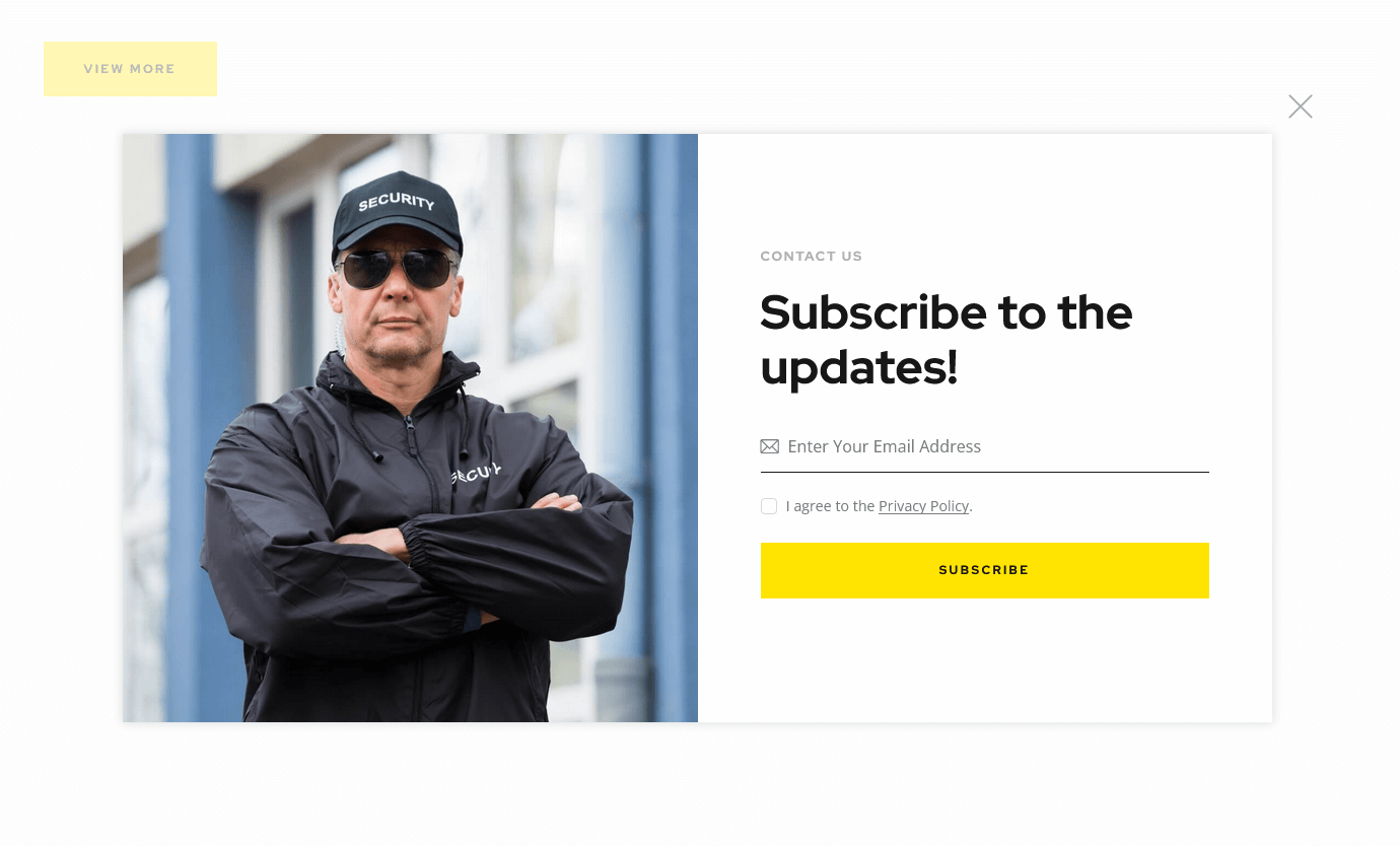
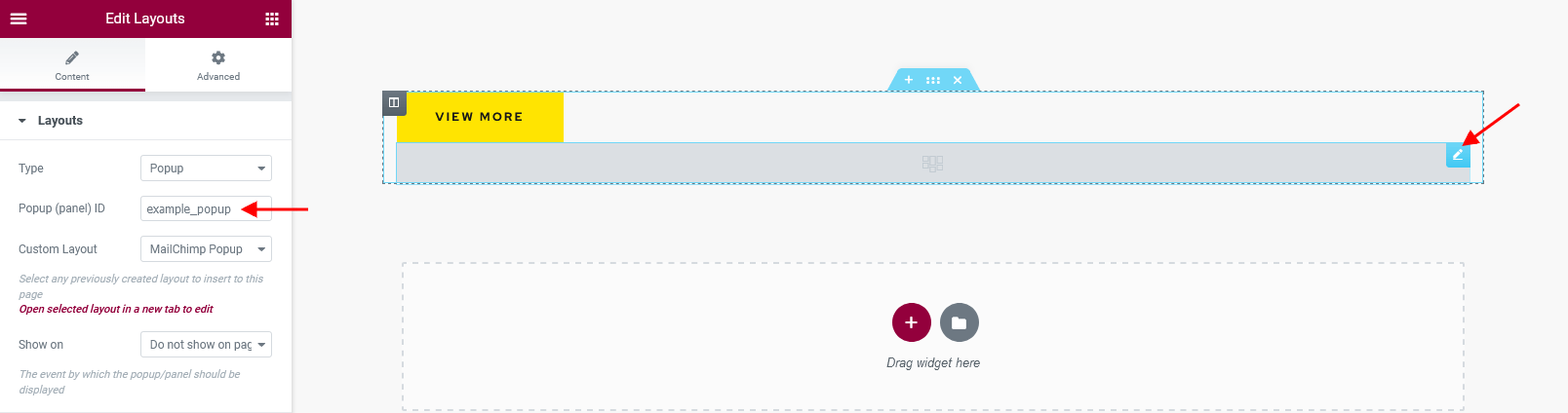
Example (Panel layout):
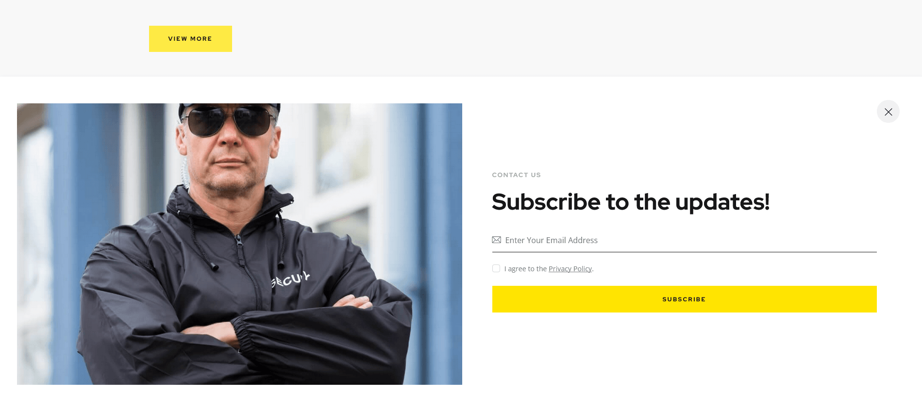
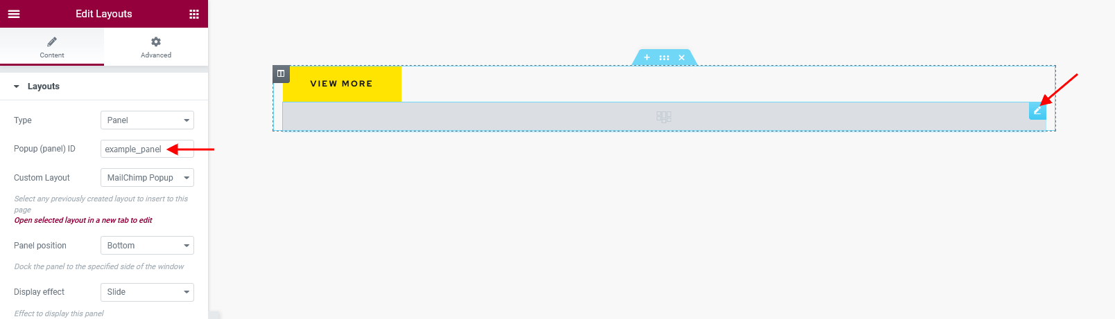
The rest widgets from this group are described in the Layouts Widgets section of this documentation file.
ThemeREX Addons
As a free addition to this theme, we have included a unique ThemeREX Addons plug-in. Once activated, it allows expanding the options of the theme noticeably. These add-ons allow you to use custom widget sets and custom Elementor widgets, show custom post types, set links to your social profiles as well as some advanced theme-specific settings.
After plug-in's installation, the "ThemeREX Addons" menu item should appear in the "Theme Panel" tab in WordPress dashboard menu panel.
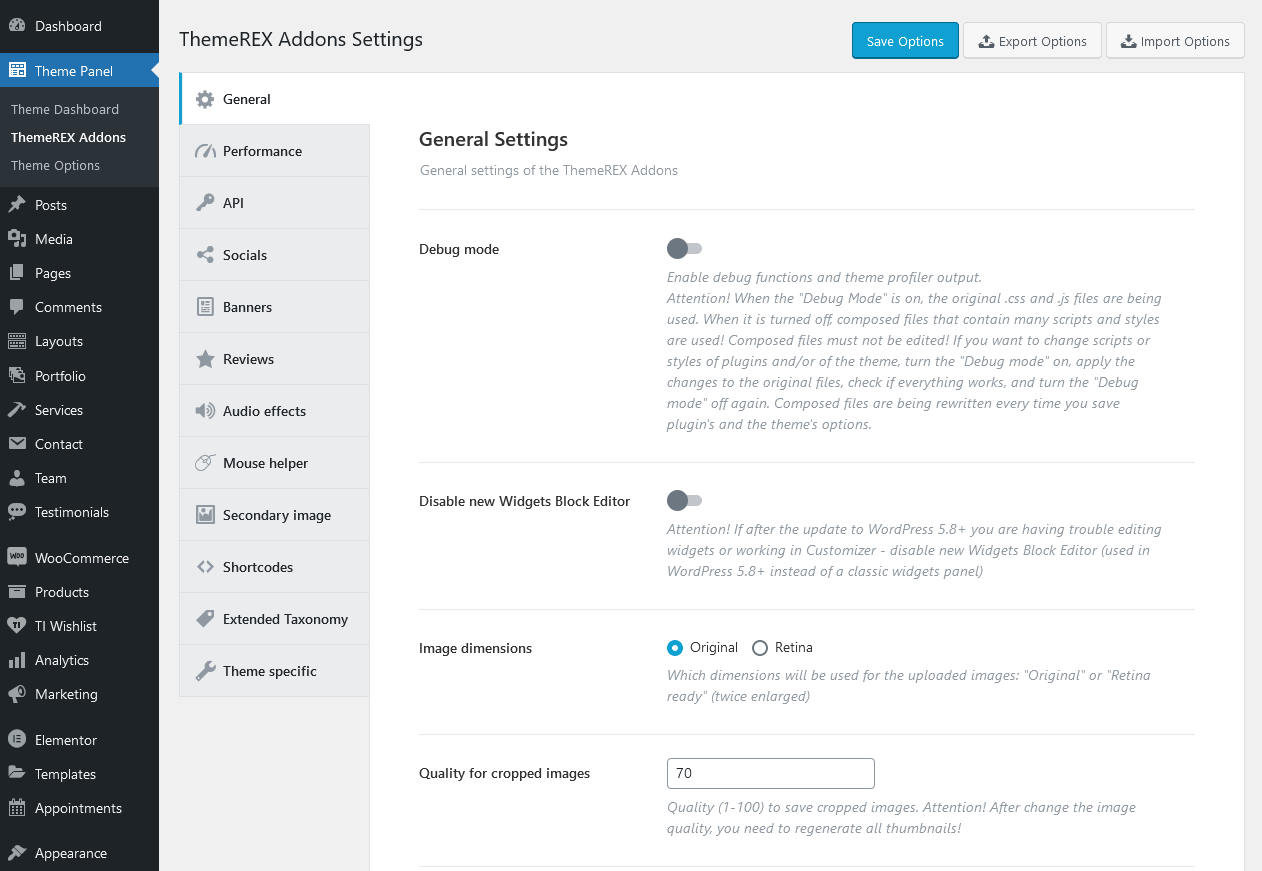
Below is a brief description of all the available settings.
General
Settings of this tab define the general behavior of your theme.
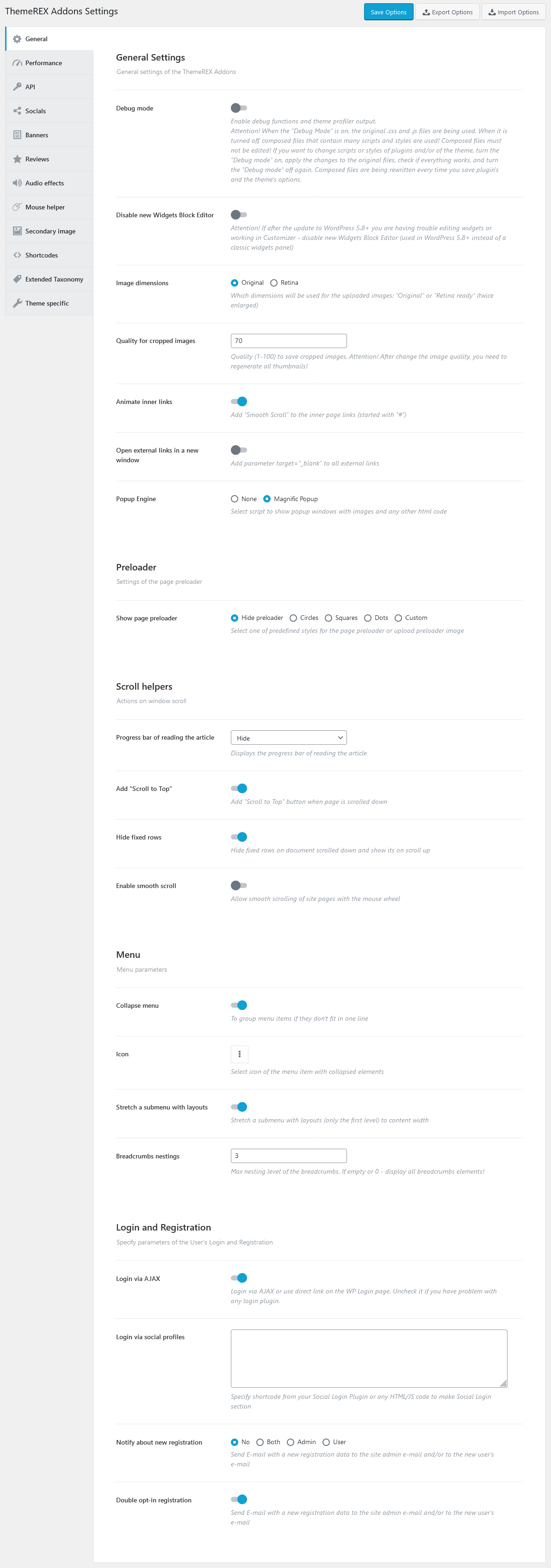
General Settings
-
Debug Mode - Enable debug functions and theme profiler output.
IMPORTANT! There is a separate file for each script snippet.jsand style related.cssdata. For better theme performance the system automatically re-compiles/re-merges these files into a single.js/.cssrelated one after every "Save Options" button click in Customizer (Appearance > Customize) and ThemeREX Addons settings (Theme Panel > ThemeREX Addons).
In case the "Debug Mode" is on, the theme does not run the re-compile/re-merge mode, so each and every file loads separately. That is why we do recommend to turn this mode on only if you need to edit/customize the source script and style related files. Please do not edit the following (re-merged) files:trx_addons.css,trx_addons.js,__colors.css,__style.css,__scripts.js. - Disable new Widgets Block Editor - disable new Widgets Block Editor, if after the update to WordPress 5.8+ you are having trouble with editing widgets or working in Customizer. New Widgets Block Editor is used in WordPress 5.8+ instead of classic widgets panel.
- Image dimensions - Which dimensions will be used for the uploaded images: "Original" or "Retina ready" (twice enlarged).
-
Quality for cropped images - Specify range of quality (1-100) to save cropped images.
PLEASE NOTE If you change the images quality, do not forget to regenerate the thumbnails again.
- Animate inner links - This setting adds "smooth scroll" effect to the inner page links.
- Open external links in a new window - If checked, this setting adds parameter
target="_blank"to all external links. - Popup Engine - Choose one of two scripts to display your popup images.
Preloader
-
Show page preloader - Select or upload page preloader image for your site.
- Page preloader bg color - Specify background color for the page preloader. If empty - no preloader is used.
- Page preloader image - Select or upload page preloader image. If empty - no preloader is used. This option is available for "Custom" preloader style only.
Scroll helpers
- Progress bar of reading the article - Enable/disable the progress bar of reading the article.
- Add "Scroll to Top" - Add "Scroll to Top" button when page is scrolled.
- Hide fixed rows - Hide fixed rows when the page is scrolled down and show them on scroll up.
- Enable smooth scroll - Allow smooth scrolling of site pages with the mouse wheel.
Menu
- Collapse menu - Whether you need to group menu items or not, if they don't fit in one line.
- Icon - Select icon of the menu item with collapsed elements.
- Stretch a submenu with layouts - Stretch a submenu with layouts (only the first level) to content width.
- Breadcrumbs nestings - Specify the necessary nesting level for breadcrumbs.
Login and Registration
- Login via AJAX - Define whether to use AJAX Login or direct link on the WP Login Page.
- Login via social profiles - Add the necessary code snippet/shortcode from the Social Login Plugin.
- Notify about new registration - Define the person who receives a registration notification message.
- Double opt-in registration - Send confirmation E-mail with a new registration data to the site admin e-mail and/or to a new user's e-mail. The link to confirm the registration expires within 24 hours. Once the link in followed a new user will be registered.
Performance
Settings of this tab allow you to improve page loading speed.
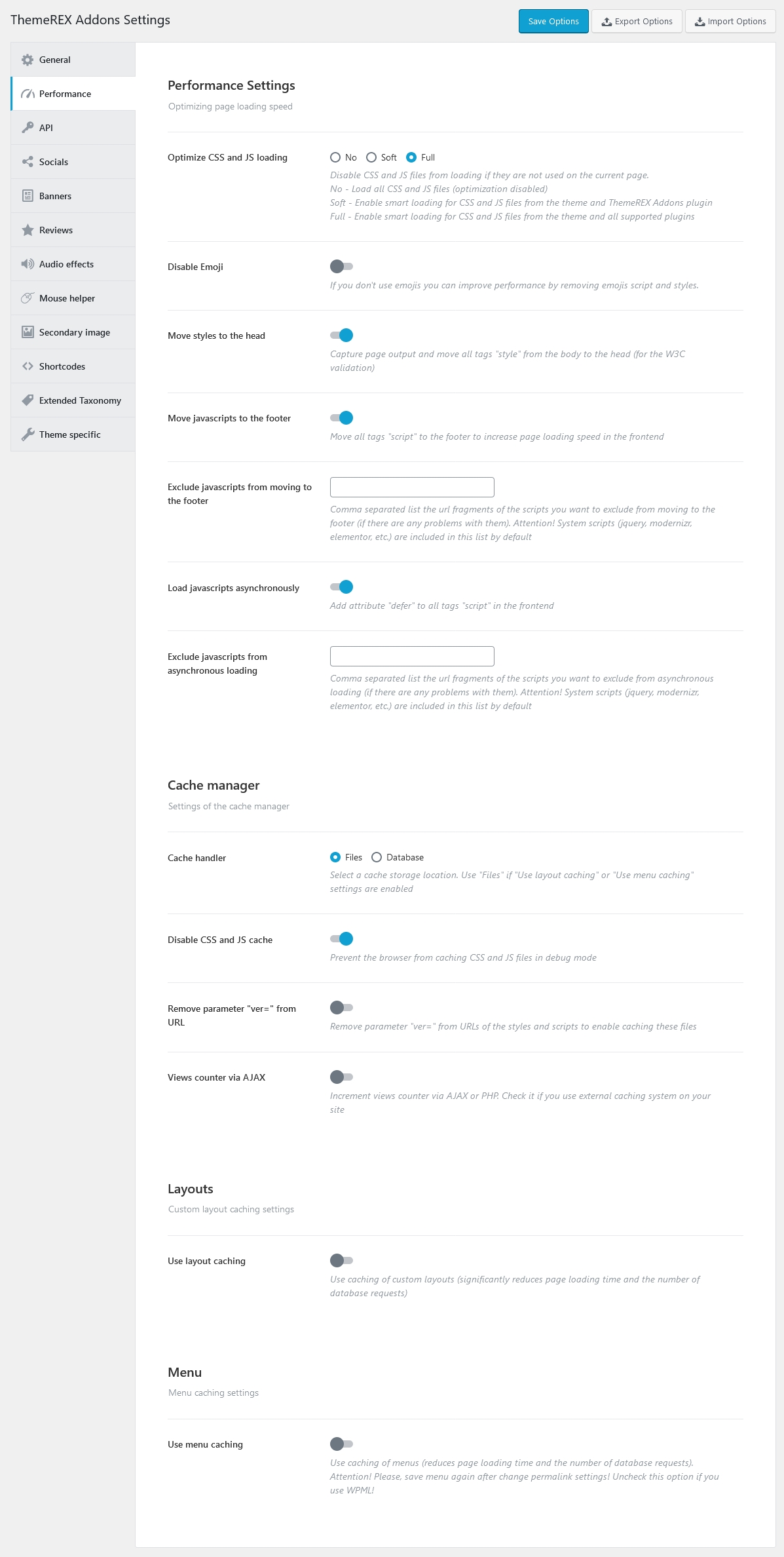
Performance Settings
-
Optimize CSS and JS loading - Disable CSS and JS files from loading if they are not used on the current page.
- No - Load all CSS and JS files (optimization disabled);
- Soft - Load CSS and JS files from the theme and ThemeREX Addons plug-in on the pages where they are used. The loading of styles and scripts of external plug-ins is regulated by the rules of those plug-ins.
- Full - Load CSS and JS files on the pages where they are used (for theme styles, ThemeREX Addons plug-in and all supported plug-ins).
- Disable Emoji - Remove Emojis scripts and styles if you don't use them.
- Move styles to the head - This is a W3C validation setting. It captures page's output and moves all the "style" tags from the body into the head. We suggest leaving it intact.
- Move javascripts to the footer - This setting moves all tags "script" to the footer to increase page loading speed.
- Exclude javascripts from moving to the footer - Specify the url fragments of the scripts you want to exclude from moving to the footer (if there are any problems with them). The system scripts (jquery, modernizr, elementor, etc.) are included into this list by default.
- Load javascripts asynchronously - This setting adds attribute "defer" to all tags "script" in the frontend.
- Exclude javascripts from asynchronous loading - Specify the url fragments of the scripts you want to exclude from asynchronous loading (if there are any problems with them). The system scripts (jquery, modernizr, elementor, etc.) are included into this list by default.
Cache manager
-
Cache handler - Select a cache storage location.
-
Files - data is stored as sepparate files in
/uploads/trx_addons/cachefolder. - Database - data is stored in WordPress cache in your database.
-
Files - data is stored as sepparate files in
- Disable CSS and JS cache - Prevent the browser from caching CSS and JS files in debug mode.
- Remove parameter "ver=" from URL - This setting removes parameter "ver=" from URLs of the styles and scripts to enable caching these files.
- Views counter via AJAX - This setting allows managing the views counter. We recommend leaving it intact.
Layouts
-
Use layout caching - Use caching of custom layouts (significantly reduces page loading time and the number of database requests, but increases the size of the database). If enabled, we recommend using "Files" as cache storage location.
- Select the types of layouts to caching - Use caching only for the specified types of layouts.
- Cache only on the popular pages - Cache the layouts only for the most visited pages.
Menu
- Use menu caching - The menu caching option is responsible for increasing the overall theme's performance.
API
Insert generated API keys to make your maps function properly. You can choose between Google, Yandex or OpenStreet maps. Follow the links for more information about Yandex Maps and how to properly obtain Google API key. You can set the OpenStreet map API script and styles for the map. Specify Facebook App ID, if needed.
Here you can also connect to your Instagram account. Use the "ThemeREX Instagram Feed" widget (Appearance > Widgets) or Elementor "Widget: Instagram" widget (ThemeREX Addons Widgets group) to output the Instagram photos.
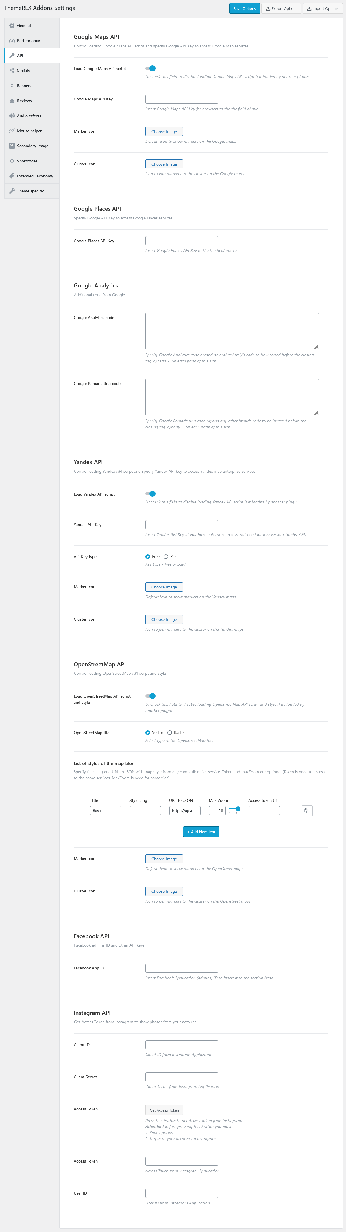
How to get Access Token from Instagram:
- Log into your Instagram account with photos you want to display on your website.
- Visit the Facebook Developer Page, click My Apps to create and set a Facebook application. Please click here to view an official tutorial.
- Fill in the form. For "valid redirect URLs" option use the following link
https://your_website_name/wp-json/trx_addons/v1/widget_instagram/get_access/. - Get your "Client ID" and "Client Secret".
- Navigate to Theme Panel (WP Dashboard) > ThemeREX Addons > API section and paste "Client ID" and "Client Secret" into the corresponding fields. Click on "Get Access Token" button.
- Approve that you want to grant the application access to your Instagram account.
Socials
Here you can specify all the necessary links (URLs) to your social profiles. Just paste the permanent URL addresses into the needed fields and click "Save."
"Allow extended emotions" option allows you to enable extended emotions set. It gives the users an opportunity to mark single posts with one nontypical emotion. Just specify the emotion names, upload the necessary icons and click on "Save" button.
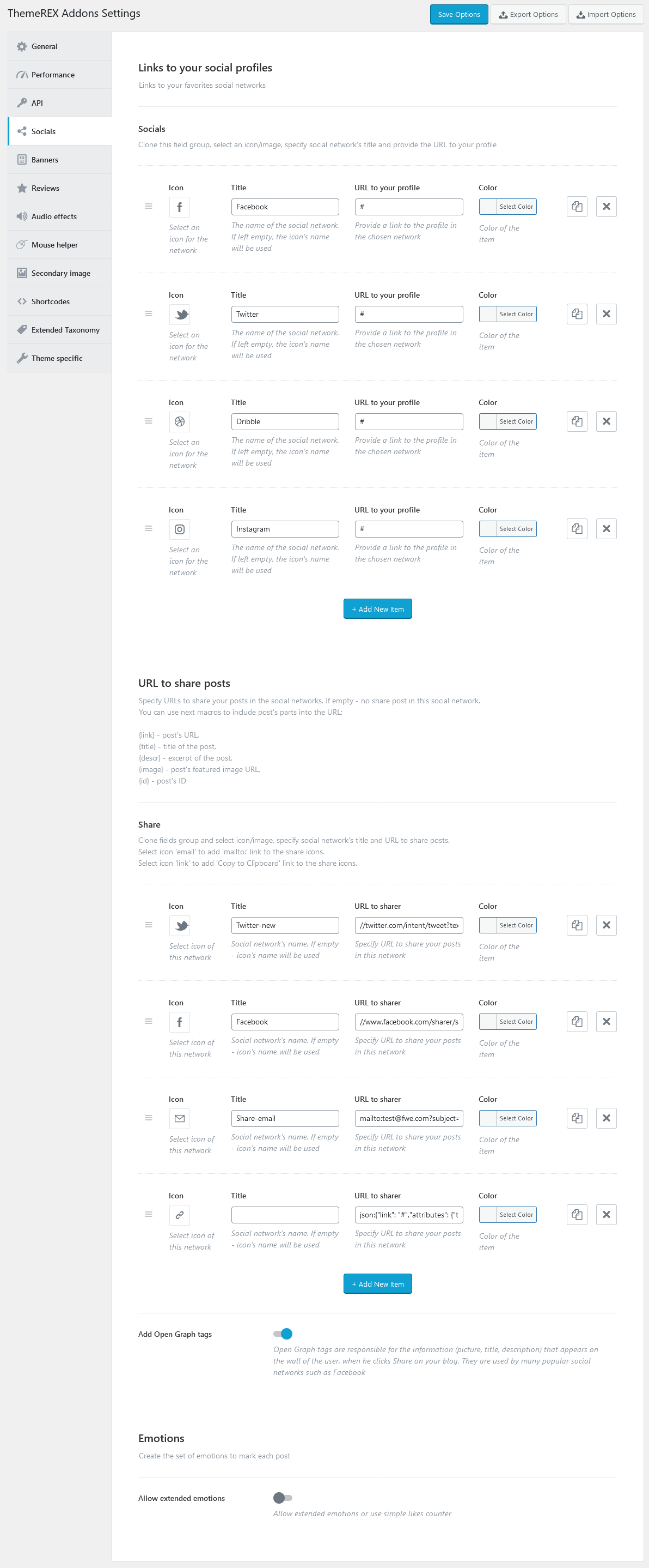
The icons are used from standard Fontello icons set. You can expand the list of available icons by adding new ones from the fontello website. In order to add new icons proceed to wp-content/themes/your-theme/skins/default/css/font-icons/config.json. Watch this video guide for more information.
PLEASE NOTE! Please note, the location of config.json file and website page builder with available set of widgets/shortcodes in your theme may vary from the video provided!
Banners
These settings allow you to enable banners on single posts and specify parameters for banners.
PLEASE NOTE!"Banner code" option allows using html code only!
Reviews
Here you can enable reviews section for posts/pages/post types and specify rating settings.
Once you have enabled the reviews section globally, you should enable reviews on a single post/page/post type. Please open a post/page/post type and check the "Enable review" option in the Item Options > Review section.
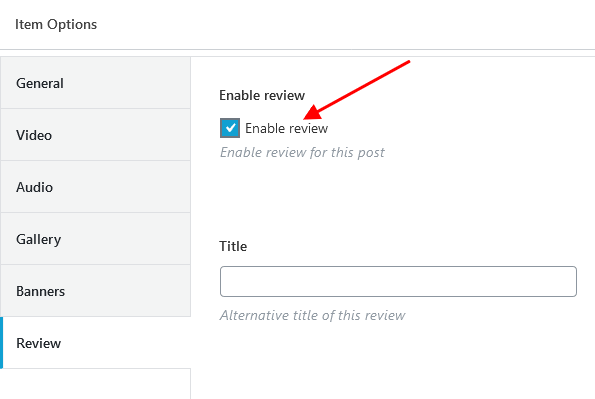
If you want to display rating above the comment form, please navigate to a particular post/page/post type in WP Dashboard and allow comments section, like on the screenshot below:
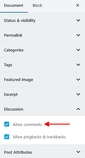
Audio Effects (available if Audio Effects Add-on is active)
In this section you can add background music and sound effects on mouse events (click, hover, etc.) to your website.
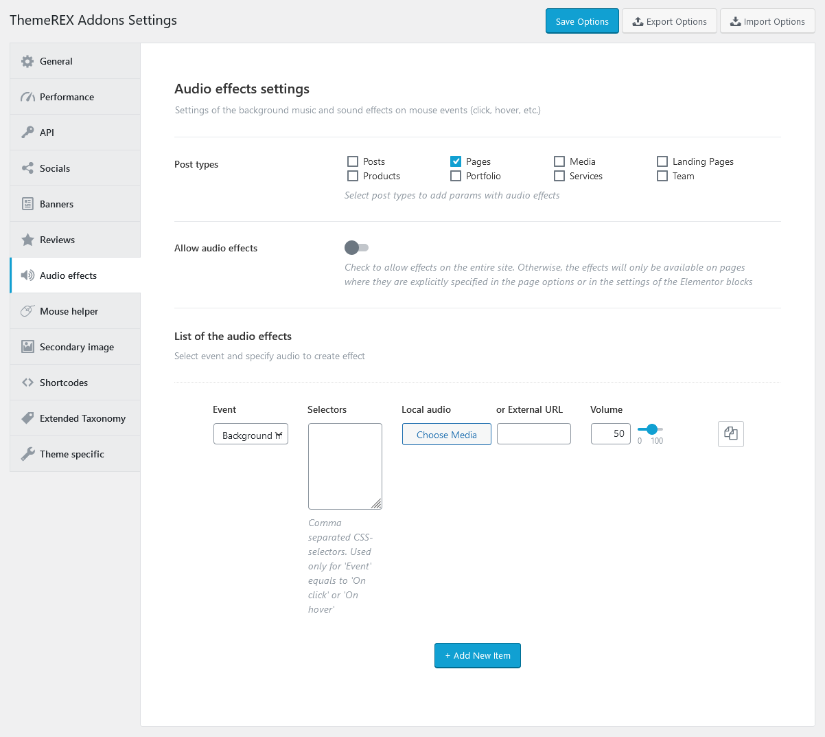
- Post types - Select post types to add params with audio effects. The individual settings for a particular post/page may override the global settings.
- Allow audio effects - Enable the sound effects for the entire site. Otherwise, the effects will only be available on pages where they are explicitly specified in the page options or in the settings of the Elementor blocks.
-
List of the audio effects - Specify the behavior of each default sound effect.
- On load page - Sounds are played once.
- Background music - Plays continuously. If you want to set several melodies, they will play alternately.
- On hover - Sounds are reproduced once.
- On click - Plays once.
Mouse Helper (available if Mouse Helper Add-on is active)
Settings of this section define the behavior of mouse helper.
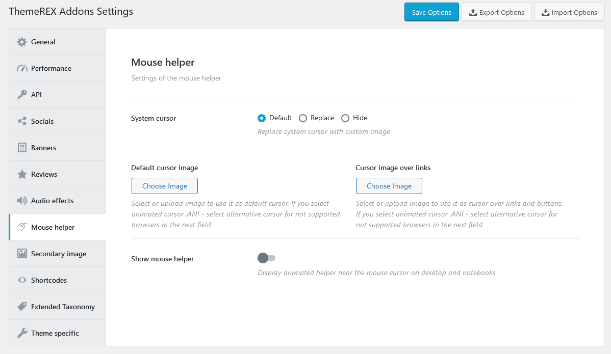
-
System cursor - This options allows you to replace system cursor with a custom image or hide it.
- Default cursor image - Select or upload image to use it as default cursor.
- Cursor image over links - Select or upload image to use it as cursor over links and buttons.
-
Show mouse helper - Display animated helper near the mouse cursor on desktop and notebooks.
- Always visible - Display the mouse helper permanently or only when hovering over the corresponding object.
- Centered - Place the center of the helper in the cursor position.
- Delay - Specify the coefficient of lag between the helper and the cursor (1 - the helper moves with the cursor).
Secondary Image (available if Secondary Image Add-on is active)
This section is responsible for applying secondary image functionality to a definite post type. Secondary image is a separate hover image for a single post that can be viewed on post type archive pages and in page sections that are built using the Elementor widgets, like Blogger, Services, Team, ect.
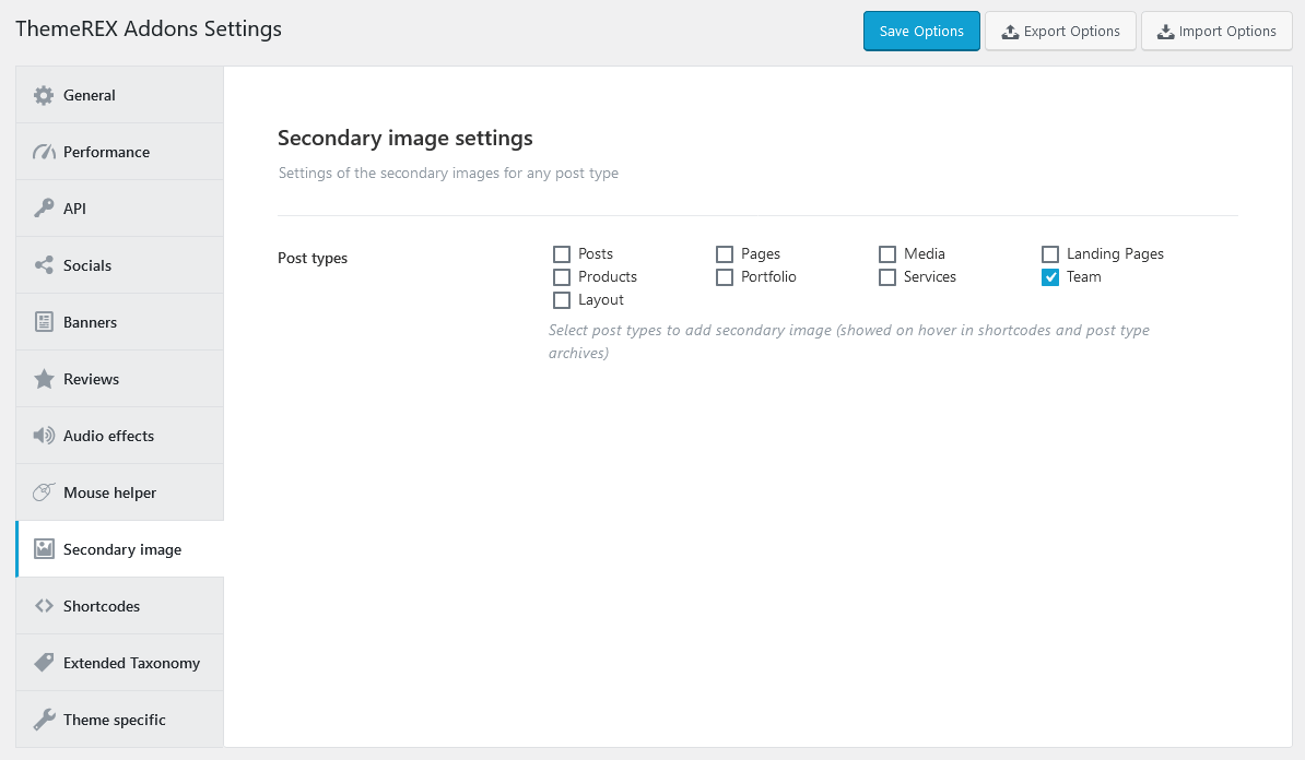
In order to add such hover effect to a single post, open the back-end view of the post and upload the image in the "Secondary Image" section.
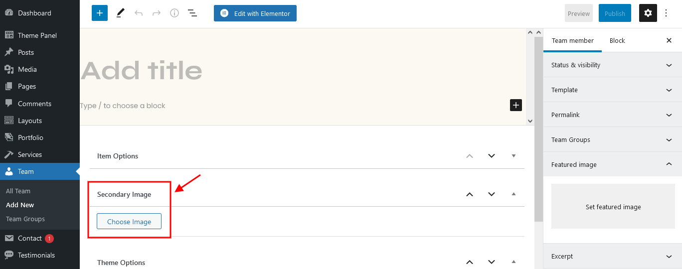
Shortcodes
Here you can define whether you want to use the Anchor widget or not, specify hover effects for form fields, choose the type of posts selector for some widgets like Blogger, Services, Team and also allow to use custom layouts and saved templates inside tabs (for Elementor ONLY!).
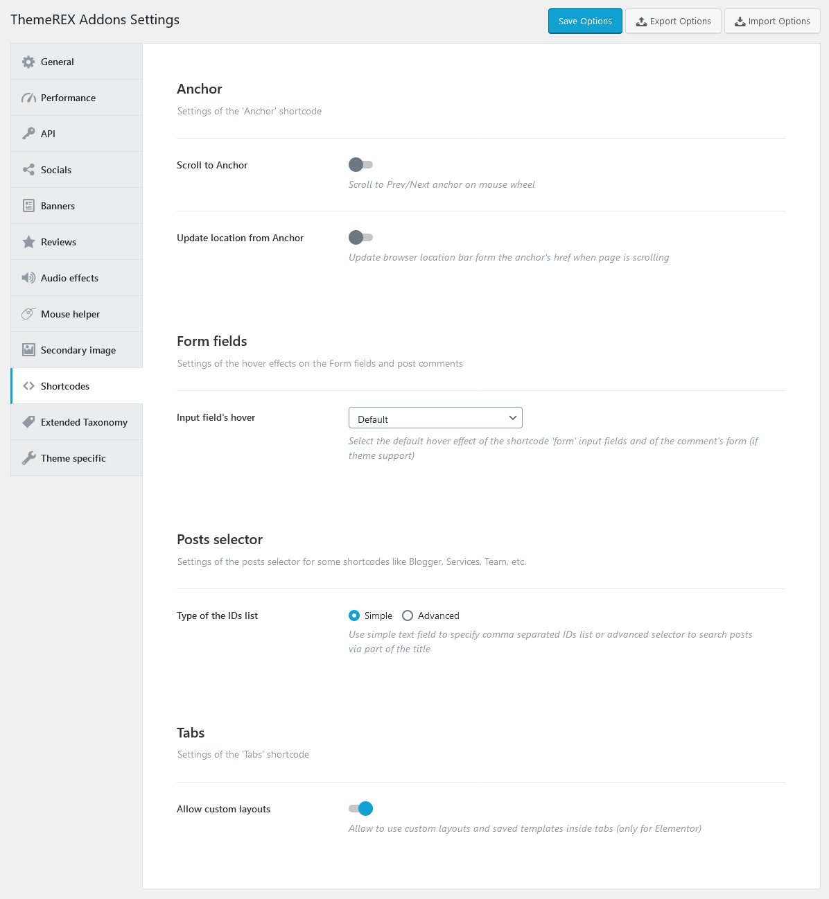
Example of advanced posts selector:
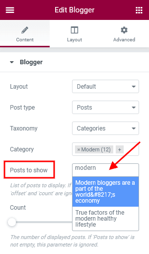
"Allow custom layouts" option adds "Content type" dropdown to Elementor Tabs widget, allowing you to use custom layouts and saved templates inside tabs. We recommend you to leave this option disabled if you are not planning to insert layouts/templates inside tabs.
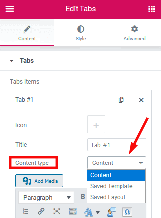
Extended Taxonomy
Here you can enable some extended taxonomy attributes for a particular group/category of posts/post types. You can output the large/small image using the Categories List widget (ThemeREX Addons Widgets group). The rest attributes can be displayed on a blog-stream page or using the Elementor "Blogger"/"Slider (Swiper)" widgets (ThemeREX Addons Elements group), "Popular Posts"/"Recent Posts"/"Video List" widgets (ThemeREX Addons Widgets group), "Services"/"Portfolio" widgets (ThemeREX Addons Extensions group).
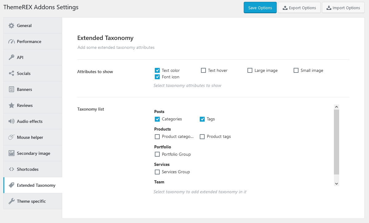
Navigate to a particular category/group of posts/post types in WP Dashboard and set the required attributes.
Theme Specific
Settings of this section override the default theme's grid classes, page wrap class and recreate layouts. We recommend leaving these settings intact.
Create Layouts setting is responsible for recreating the set of predefined layouts. It might become useful in case there are no layouts available after theme installation.
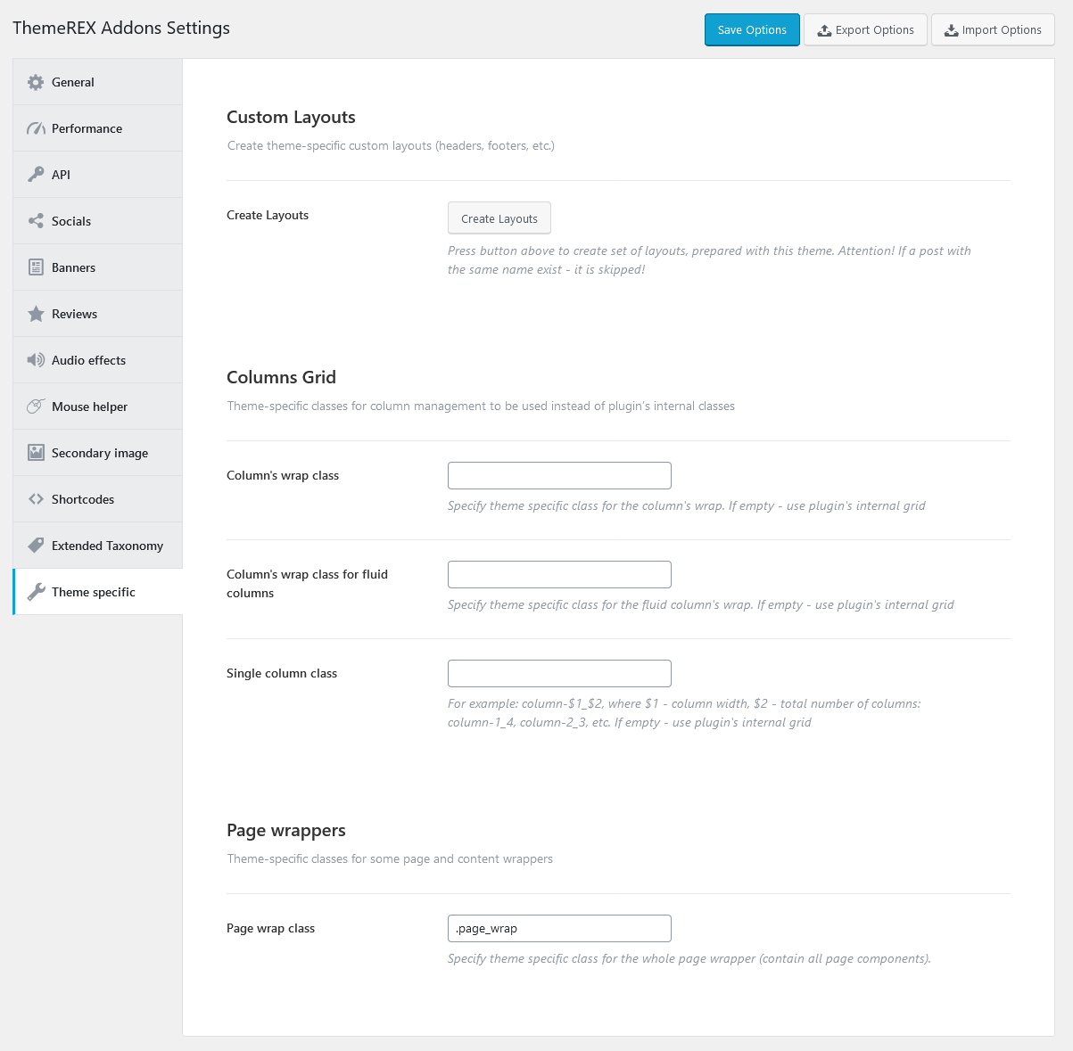
Advanced Theme Add-ons
Advanced theme add-ons enhance the functionality of a WordPress theme. They come prepacked with the theme and require ThemeREX Addons plug-in to be active.
Once you have activated your theme (entered your purchase code), please navigate to the Theme Panel (WP Dashboard) > Theme Dashboard > Addons tab and make sure that all advanced add-ons, provided with the theme, are active. Now you can proceed with demo data installation and further theme customization. Here you can activate/deactivate, download or update add-ons if needed.
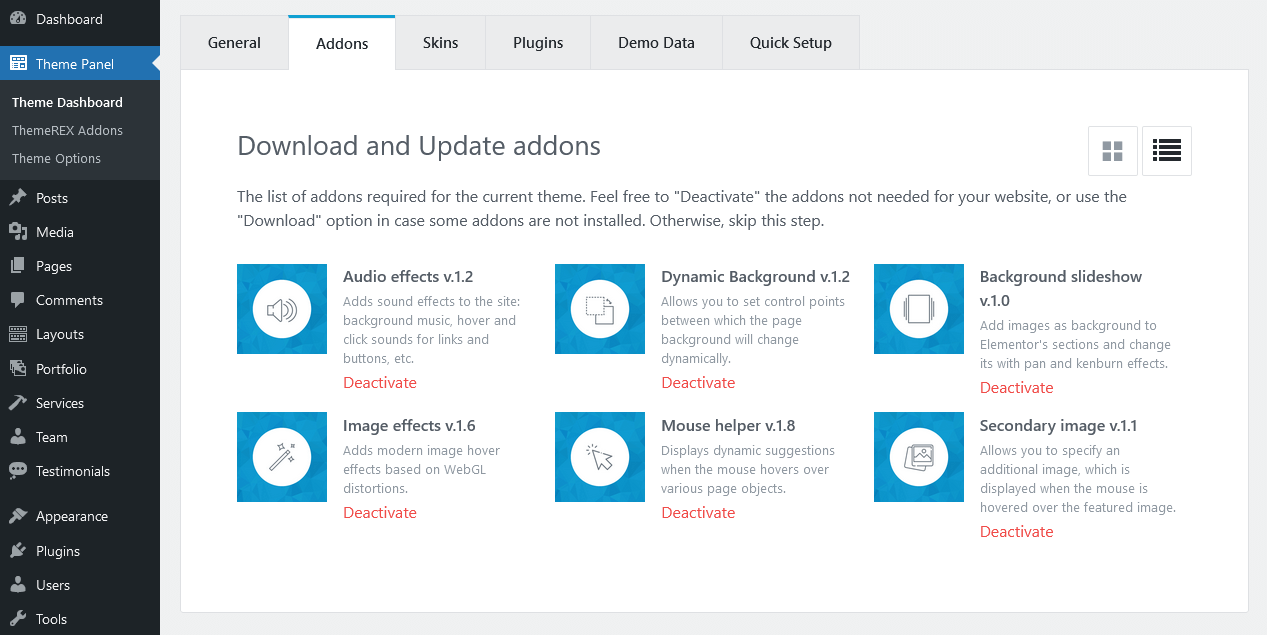
PLEASE NOTE! The following advanced theme add-ons come with the theme.
Audio Effects Add-on
With the help of Audio Effects Add-on you can easily set music on page loading, background music, sound effects on mouse events (click, hover, etc.) on your website.
Once the add-on is active, "Audio Effects" section will appear in Theme Panel (WP Dashboard) > ThemeREX Addons. These are the global settings. Here you can select the post types for adding params with audio effects, enable audio effects for the entire site and set the behavior of each default sound effect globally.
If you have enabled the audio effects for a definite post type, you will gain control over the sound effects on single posts/pages from this post type in their Item Options settings. These individual settings of each page/post may override global settings made with "Theme Panel (WP Dashboard) > ThemeREX Addons".
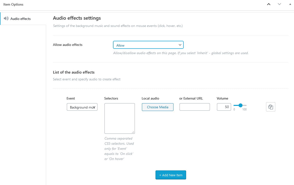
Moreover, the sounds on hover can be added individually to any page element through Elementor settings of a definite widget. Open the widget, proceed to Advanced tab and in the "Audio Effects" section specify the needed parameters.
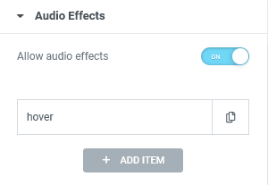
In order to let your customers turn on/off the sounds on a single page/post themselves, please use the Elementor "Audio Effects" widget, that adds an equalizer (sound) icon to your page.
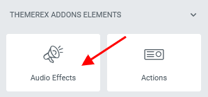
The following statuses of the indicator are available:
- Static enabled - sounds effects only (hover, click), without background music;
- Animated - all sounds are turned on;
- Static disabled - all sounds are turned off;
PLEASE NOTE! The sounds indicator controlls only advanced sounds effects. Its actions do not apply to video and audio sounds that are created using video/audio widgets or external plug-ins.
Background Slideshow Add-on
This add-on helps you create unique background slideshows for the sections as well as add masks to your images.
Background Slideshow
You can build background slideshows for the page rows by adding an unlimited number of background images to Elementor section (row) and display them in a form of a slideshow. The animation duration for the whole slideshow is fully customizable.
We have combined two effects: "Pan" (panoramming, slow zooming) and "KenBurn" (one image appeares through another).
Unlike the default Elementor "Background - Slideshow" widget, we are using easing effect, as well as provide a posibility for our customers to choose a slide effect, its direction and change the point of application of the effect for each image separately. Thus, you can create more dynamic and varied image interchanges.
In order to create a background slideshow, navigate to Edit Section > Advanced > Background slideshow & mask in the Elementor widgets panel and set the required parameters.
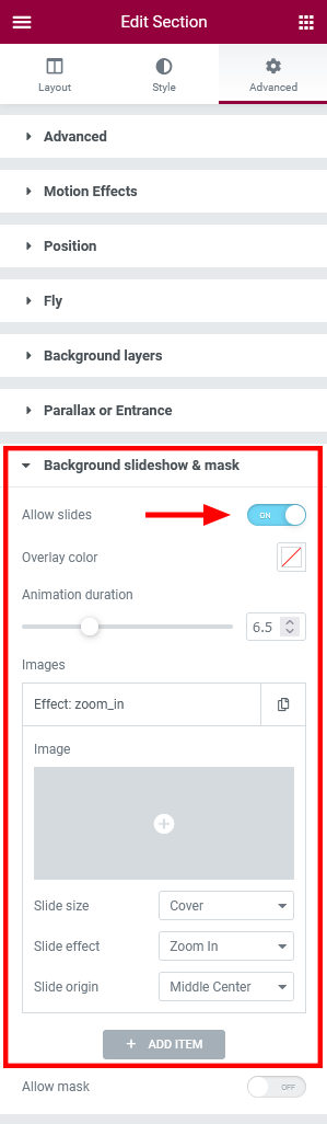
Slideshow general settings:
- Overlay color - Add transparent color layer, that tints the created slideshow.
- Animation duration - Regulate the duration of slides interchange.
The settings for each image (slide):
- Slide size - Select the size of the slide: cover, contain or fill.
-
Slide effect - Specify the appearance effect.
- None - static slide (without any appearance effect);
- Fade;
- Zoom in/out;
- Infinite in/out - alternate continuous zooming in/out (for single slides, without transition to the next slide);
- Slide origin - Choose the point of application of the effect (the exact location at which the effect is applied to the image). This option is available for "Zoom" and "Infinite" slide effects ONLY!
Image Mask
This functionality allows you to use any transparent image (.png, .svg) as a mask for Elementor sections in order to create composite shapes of objects, both from edges and inside.
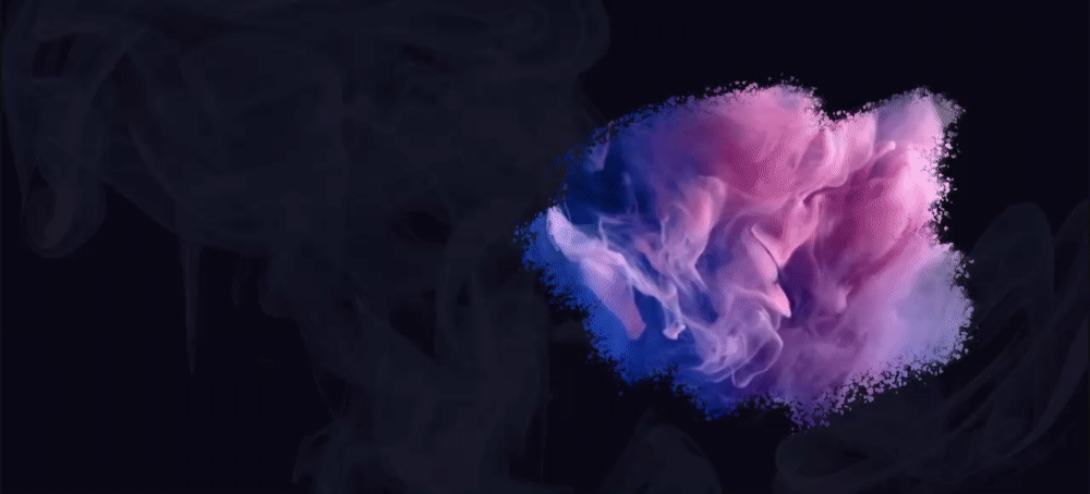
Please pay attention to the opacity color of the image that is used as a mask. The more transparent color is used in a deffinite part of the image, the more transparent masked object will be in that part. Thus, by making gradient transparency, you can build gradually disappearing objects.
In order to add a background image mask to your Elementor section (row), navigate to the Elementor widgets panel and find the Edit Section > Advanced > Background slideshow & mask section. Additional options appear once the image itself has been uploaded.
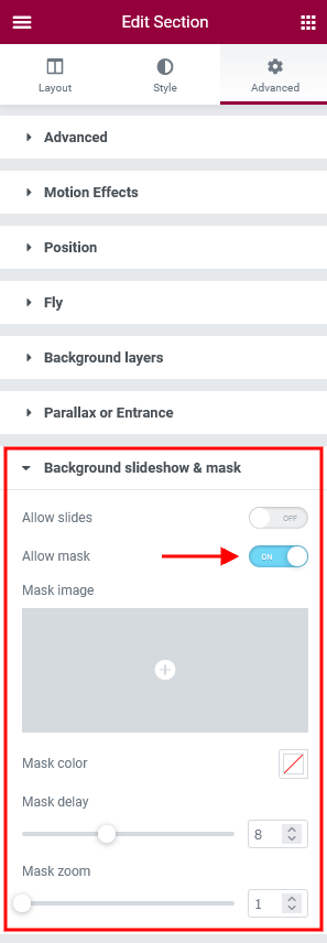
Background Text Add-on
This add-on is imbedded into the theme and can not be deactivated. The add-on enhances the Elementor functionality by adding "Background Text" parameters to Elementor sections (rows) helping you create background text lines and animate them, when they enter the visible area of the window. You can also make this text "scroll", like in a news ticker. In this case after the entrance animation the background text starts scrolling continuously.
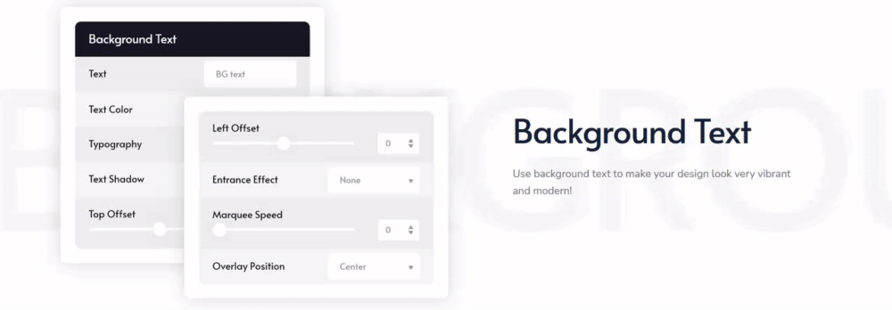
In order to decorate your theme, open your page through the Elementor page builder, find the page row (Elementor section) to which the "background text" functionality you would like to apply and proceed to Edit Section > Advanced > Background text in the Elementor widgets panel. Here you can specify the text, text color, font family, font size, text shadow and other parameters for your background line.
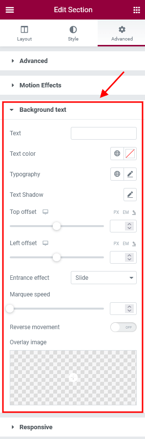
Below you can find some clarifications of the basic options:
- Top offset and Left offset - Shift the text. The shift point is the top left corner of a section.
-
Entrance effect - Choose appearance effect.
- Slide - symbols appear one by one from left to right;
- Rotate - symbols rotate one by one from top to bottom;

-
Marquee speed - Set the scrolling speed. If the option is set to
0, it means without scrolling. - Reverse movement - Make the text scroll in the opposite direction: for regular text - from right to left, for RTL text - from left to right.
-
Overlay image and Overlay position - Place an image (
.png) over a background text line to add a "texture" effect to it.
Dynamic Background Add-on
The Dynamic Background Add-on allows you to create unusual background effects for some page elements. It fills the page section with background color gradually in a form of a circle or with fade effect, while you are scrolling down the page.
Once the add-on is active, a "Dynamic Background" section will appear in the Elementor widgets' settings, under "Advanced" tab. These settings are available for page elements (icon, title, text, image, etc.) and NOT for sections and columns.
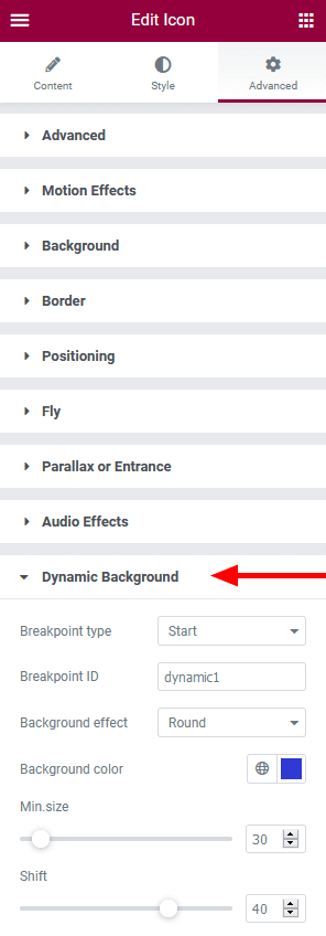
In order to add such effect to your page, please choose a page element (icon, title, text, image, etc.) and in the widget's settings identify this page element as a Starting point. Specify the rest parameters, like ID, background effect, background color, delay, etс. Now you need to find another page element and identify it as an End point.
The effect begins when your starting breakpoint becomes visible in the window and lasts till the end breakpoint reaches the visible area of the window. The starting and end breakpoints should have the same ID to make a "pair".
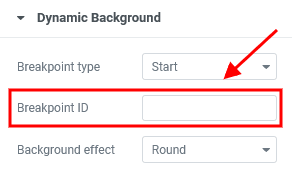
The "Shift" option indicates the shift in percentage (from -100% to 100% of the screen height) of the start/end point of the effect from the bottom of the window, which is the default point of moving.
The negative shift means that the start/end point of the effect will not reach the bottom of the window.
The positive shift means that the effect will start/end when the point reaches the bottom of the window and moves set distance downward (in percentage from the window height).
The sections with dynamic background effects can intersect.
PLEASE NOTE!Please also view this video tutorial on how to customize/create the dynamic background.
Image Effects Add-on
This add-on adds modern image hover effects, based on OpenGL and curtains.js library. The image hover effects work for screen resolutions 1280px and above.
After add-on's activation, the "Image effects" section will appear in the Elementor widgets panel for Elementor "Image" widget under Content tab. Here you can select the image hover effect from the drop-down list and specify the needed parameters.
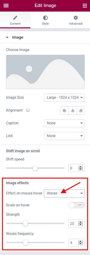
New hover effects are added to the Elementor widgets that deal with post images, like Elementor Blogger widget (ThemeREX Addons Elements group).
By default, the waves hover effect is imbedded to the Elementor Portfolio widget (ThemeREX Addons Extensions group) in "Band" style and requires the Image Effects Add-on to be active.
Mouse Helper Add-on
This add-on displays dynamic suggestions when the mouse hovers over various page objects.
Once the add-on is active, the "Mouse helper" section should appear in the Theme Panel > ThemeREX Addons > Mouse helper tab in WordPress dashboard menu panel. Here you can set the behavior of the mouse helper globally.
-
System cursor - This options allows you to replace system cursor with a custom image or hide it.
- Default cursor image - Select or upload image to use it as default cursor.
- Cursor image over links - Select or upload image to use it as cursor over links and buttons.
-
Show mouse helper - Display animated helper near the mouse cursor on desktop and notebooks.
- Always visible - Display the mouse helper permanently or only when hovering over the corresponding object.
- Centered - Place the center of the helper in the cursor position.
- Delay - Specify the coefficient of lag between the helper and the cursor (1 - the helper moves with the cursor).
PLEASE NOTE! By default, the mouse helper inherits the theme colors. You can also override these color settings by the individual ones for a particular page section/object.
In case you want the mouse helper to display some special information for a definite page section or just change the cursor style over a specific section/element, you can proceed to the Elementor widgets panel, enable the mouse helper for a particular section/column/widget and specify additional settings (text, background image, icon, etc.) in the Advanced > Mouse Helper section.
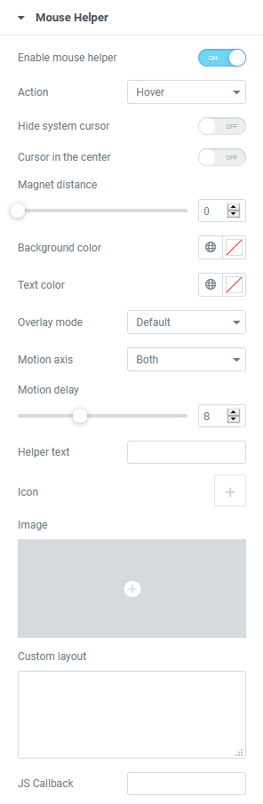
Below you can find some clarifications of the basic options:
- Cursor in the center - Place the center of the helper in the cursor position. By default, the helper is shifted to the right and down from the mouse cursor.
-
Magnet distance - Apply the effect of "sticking" or "anchoring" the page element (icon, button, etc.) to cursor, while the cursor is approaching a certain distance to this page element. Set the distance in
px. - Overlay module - Select one of multiply and screen blend modules. This option uses standard CSS blending mode properties.
- Motion axis - Specify the direction of helper's motion: vertical, horizontal or both.
- Motion delay - Specify the coefficient of lag between the helper and the cursor (1 - the helper moves with the cursor).
- Rotate text - Arrange the text in a circle inside a helper and rotate it.
- Custom layout - Paste a shortcode of a prebuilt template (created using Elementor page builder) to display a compound helper.
Moreover, the Mouse Helper Add-on enhance some Elementor widgets (Title, Promo, etc.) with "Highlight on mouse hover" function, allowing you to make your titles unique.
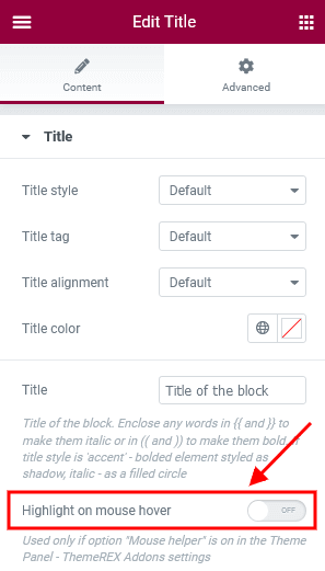 View on Hover
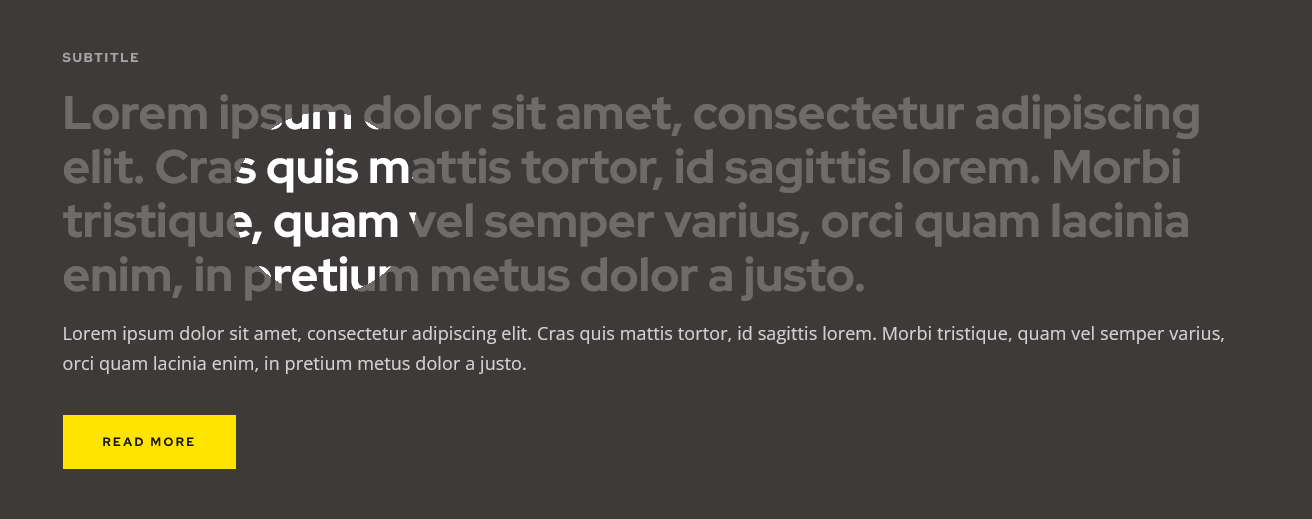
By default, an "image on hover" effect is imbedded into the following Elementor widgets. The image on hover is a featured image of a particular post.
- Portfolio widget (ThemeREX Addons Extensions group) in "Simple" style;
- Blogger widget (ThemeREX Addons Elements group) in Layout "List", Template "Simple (hover)";
PLEASE NOTE!Please also view our video tutorial about creating mouse helpers.
Secondary Image Add-on
This add-on is responsible for providing a possibility to upload a separate image that will be used as a hover for the existing image of a single post. Such hovers can be viewed on post type archive pages and in page sections that are built using the Elementor widgets, like Blogger, Services, Team, ect.
First of all you should specify the post types to which the secondary image functionality will be applied in the Theme Panel (WP Dashboard) > ThemeREX Addons > Secondary Image section.
Once this is done, open the back-end view of a single post from the selected post type and upload a hover image in the "Secondary Image" section. Please note, that this section is draggable.
Plug-ins
This section contains a brief description, as well as references, to some plug-ins available with this theme.
Advanced Popups
This plug-in allows you to insert newsletter popups, a cookie notice or a notification onto your website. Please click here for more information about this plug-in.
The demo popup can be customized in WP Dashboard > Settings > Popups tab:
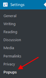
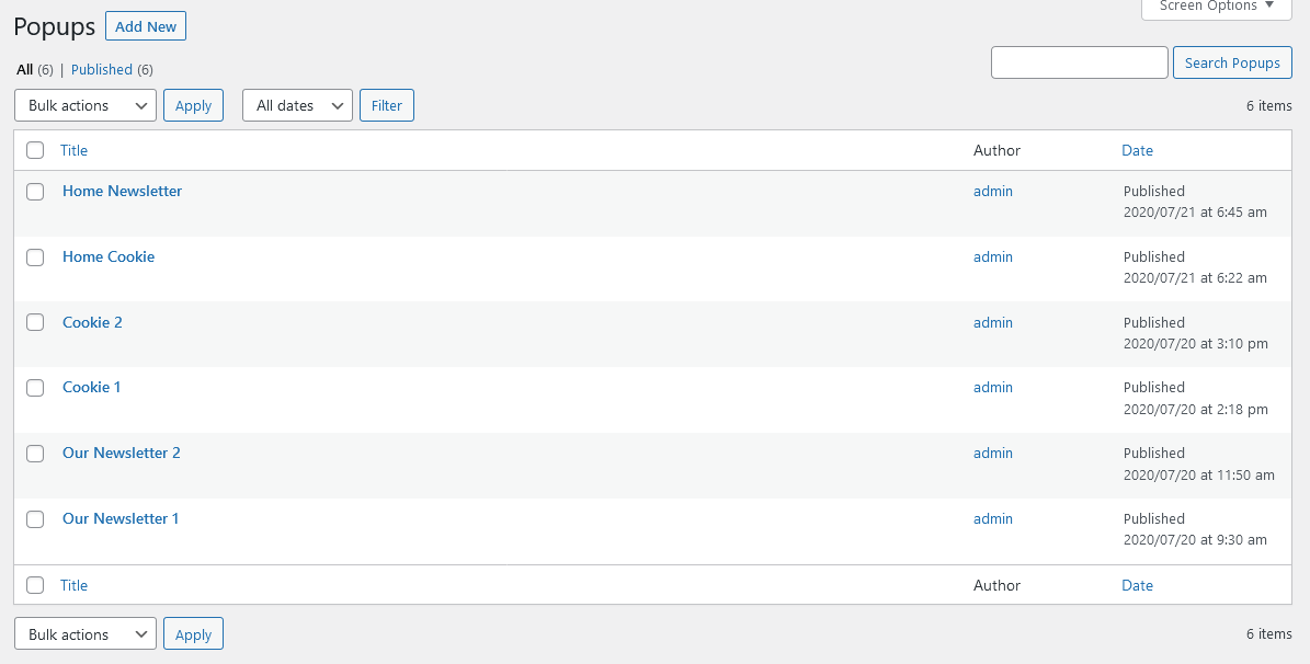
Example:
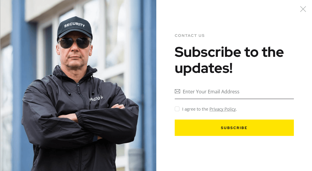
Above you can find an example of a popup notification with content taken from custom layout. The custom layouts can be managed in WP Dashboard > Layouts tab.
Booked Appointments
We have added an Appointment Booking plug-in, to let you easily manage your appointments. All the installation instructions, tutorials and any kind of guides regarding its functionality are available here.
Plug-in's settings are accessible in the "Appointments (WP Dashboard menu) > Settings" tab.
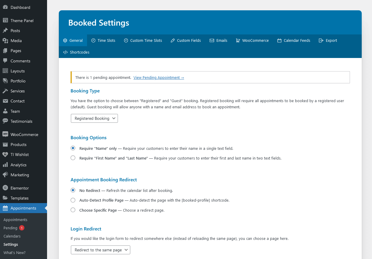
Contact Form 7
Contact Form 7 can manage multiple contact forms, plus you can customize the form and the mail contents flexibly with simple markup. The form supports Ajax-powered submitting, CAPTCHA, Akismet spam filtering and so on.
Check this link for more information. More guides are available here (video tutorial) and here.
The theme comes with pre-built contact forms that can be customized in Contact (WP Dashboard) > Contact Forms. Below you can find an example of one of them.
[contact-form-7 id="5" title="Contact form (main)"]
PLEASE NOTE! According to General Data Protection Regulation, you need to make your forms compliant. Some pre-built forms, that come with this theme, already have the corresponding "I agree..." checkboxes.
For newly created forms you should add the consent checkboxes in ONE of the following ways:
- Use
[acceptance acceptance-...]tag, like in the example below: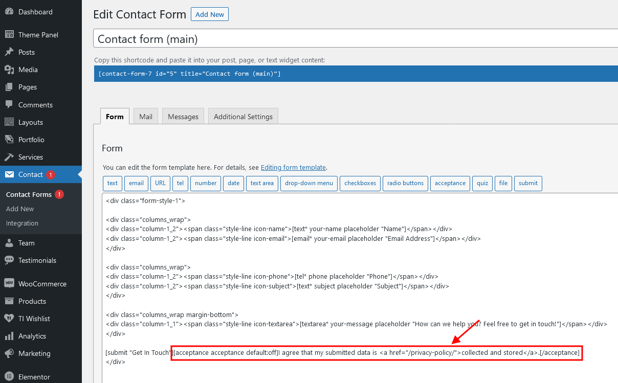
-
Use the Cookie Information plug-in (formerly WP GDPR Compliance). Navigate to Cookie Information (WP Dashboard) > Settings > Integrations and enable a GDPR form tag integration for a particular form. You can specify and activate the Privacy Policy page in the Cookie Information (WP Dashboard) > Settings > Privacy Policy tab.
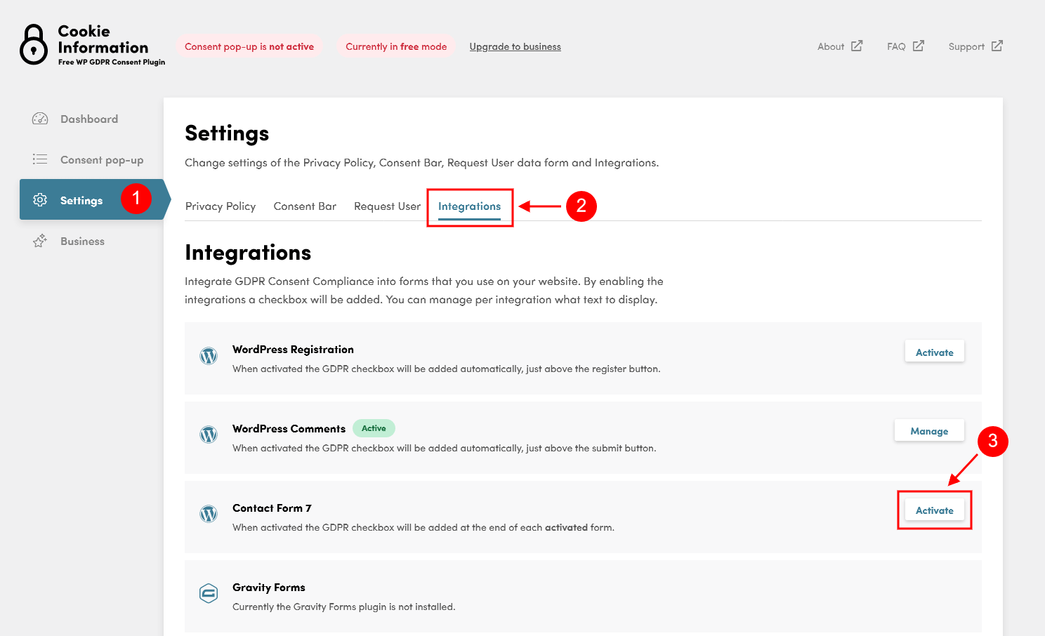
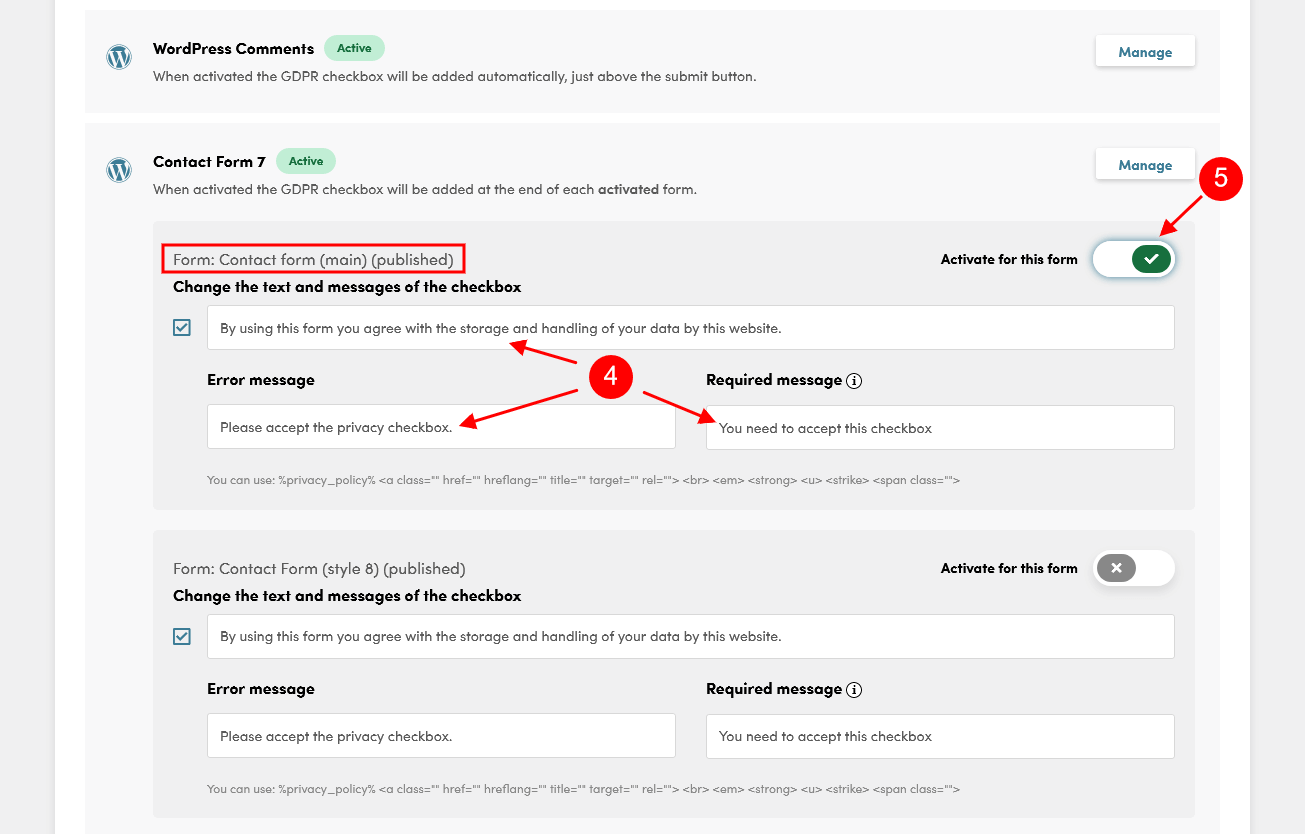
Cookie Information (formerly WP GDPR Compliance)
The Cookie Information plug-in allows you to make your website GDPR-compliant. Cookie Information GDPR Consent Plug-in supports Contact Form 7, Gravity Forms, WooCommerce, WordPress user registration and WordPress Comments. This plug-in offers a friendly installation wizard to get you started quickly.
Using the Cookie Information plug-in does NOT guarantee complete compliance to General Data Protection Regulation.
Check the links below for more information about this plug-in:
IMPORTANT! According to General Data Protection Regulation, you need to make your forms compliant. Some pre-built forms, that come with this theme, already have the corresponding "I agree..." checkboxes. For newly created forms, navigate to Cookie Information (WP Dashboard) > Settings > Integrations and enable a GDPR form tag integration for a particular form. You can specify and activate the Privacy Policy page in the Cookie Information (WP Dashboard) > Settings > Privacy Policy tab.
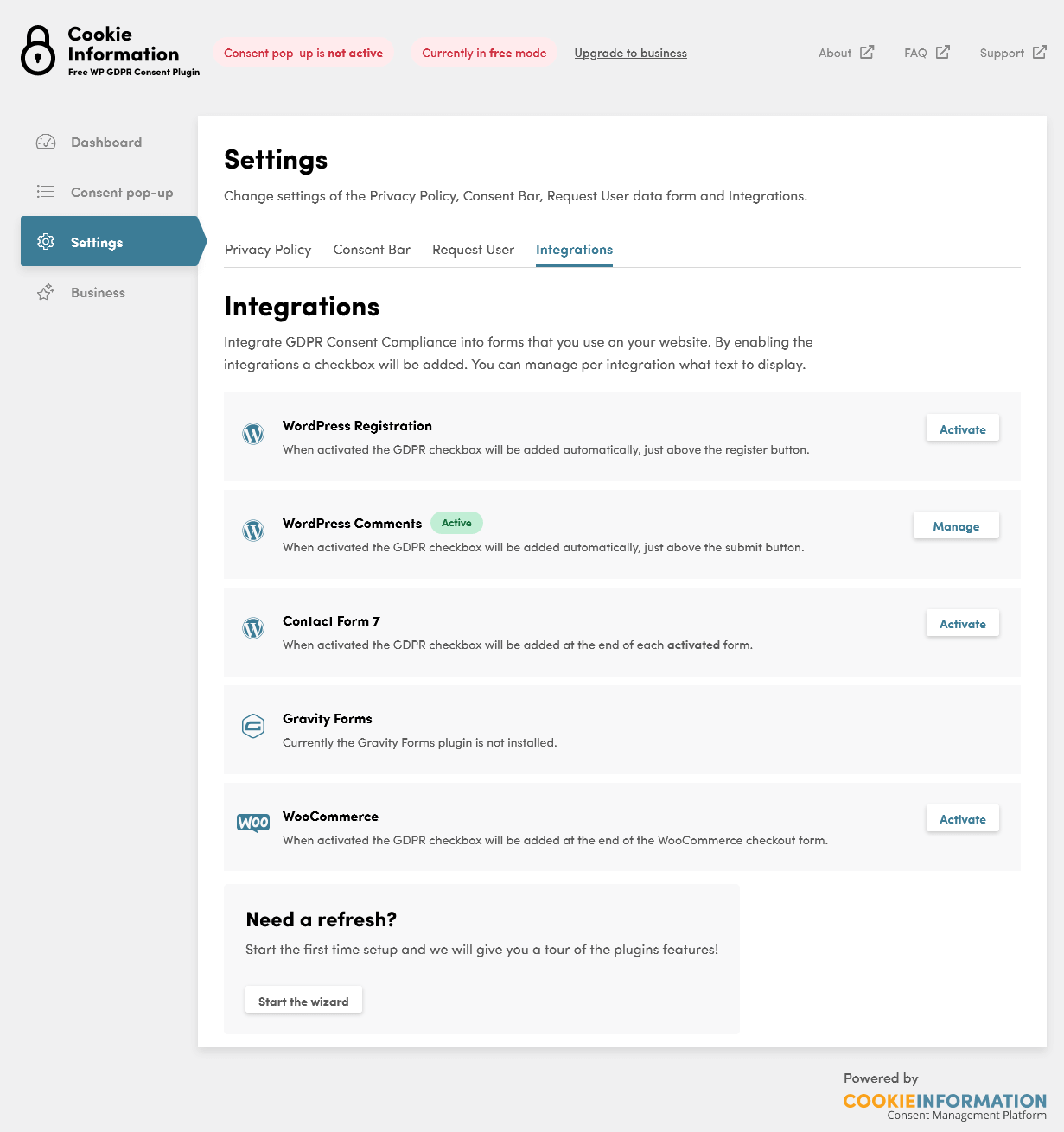
Elegro Crypto Payment
Elegro Gateway provides facilities for smooth, safe and instant cryptocurrency payments with automated exchange to EUR/USD or any other fiat currency at direct exchange rates. Payment processing fees are reasonable and calculated depending on business risk levels. Your customers can make purchases on any device and without any fees for elegro-inspired payments.
Check this link for more information.
Elementor Page Builder
To make your customization even easier we have added the Elementor Page Builder to this theme. Before you start, please check these Elementor-related tutorials. They will give you a basic understanding of how to build a page properly.
- Official Elementor Tips page
- Getting Started With Elementor
- Official Documentation for Elementor page builder
- Official Elementor Video Tutorials
MailChimp
MailChimp is a newsletter service that allows you to send out email campaigns to a list of email subscribers. MailChimp is free for lists up to 2000 subscribers, which is why it is the newsletter-service of choice for thousands of businesses.
This plug-in acts as a bridge between your WordPress site and your MailChimp account, connecting the two together.
Check this link for more information.
More guides are available here.
The backend settings can be found in the WP Dashboard menu > MC4WP > MailChimp tab.
We have used different styles of the same subscription form on our demo. Use the IDs from 1 to 11, for example element_id="style-1".
Style 1
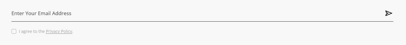
[mc4wp_form id="461" element_id="style-1"]
Style 2
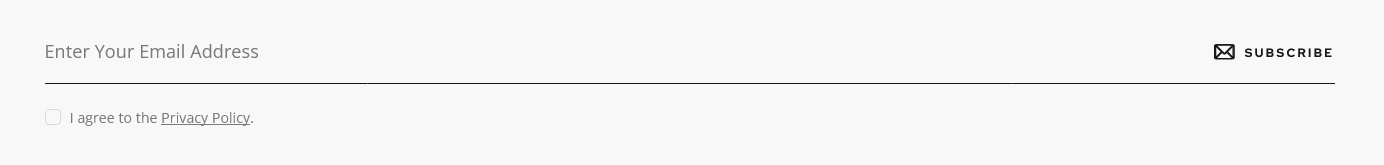
[mc4wp_form id="461" element_id="style-2"]
Style 3

[mc4wp_form id="461" element_id="style-3"]
Style 4
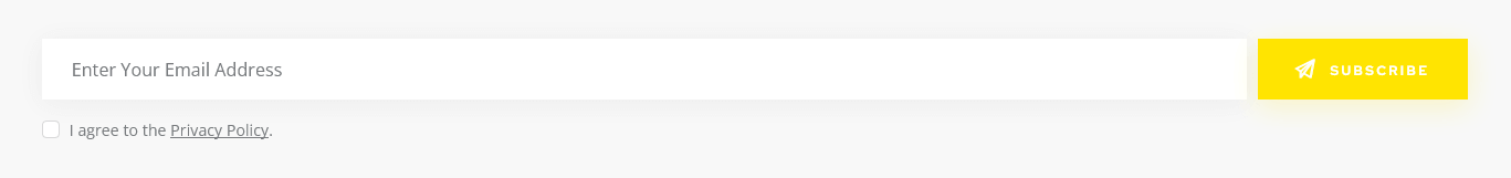
[mc4wp_form id="461" element_id="style-4"]
Style 5

[mc4wp_form id="461" element_id="style-5"]
Style 6
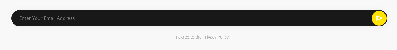
[mc4wp_form id="461" element_id="style-6"]
Style 7
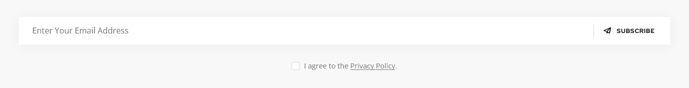
[mc4wp_form id="461" element_id="style-7"]
Style 8
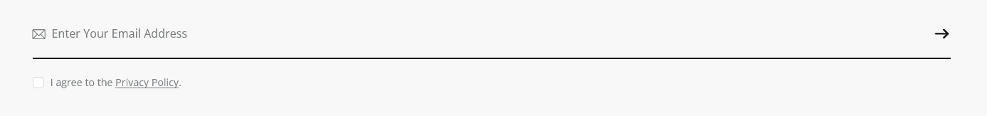
[mc4wp_form id="461" element_id="style-8"]
Style 9
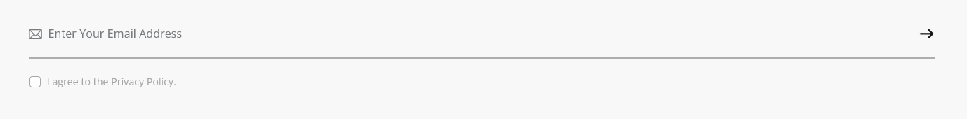
[mc4wp_form id="461" element_id="style-9"]
Style 10
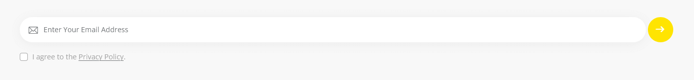
[mc4wp_form id="461" element_id="style-10"]
Style 11
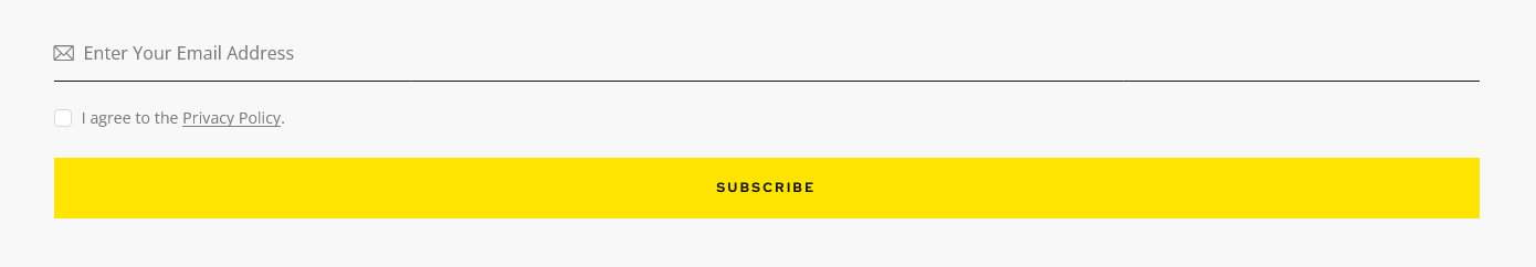
[mc4wp_form id="461" element_id="style-11"]
Slider Revolution
If you need to display posts, pages, or custom post types in a form of a slider, also check out Swiper Slider.
Our theme is fully compatible with an extremely powerful Revolution Slider plug-in. It allows you to create an unlimited number of sliders and set anywhere you want on the page within the necessary widget. Please view our article for more information about revolution slider customization.
Check the following links for more information regarding the Revolution Slider functionality:
Below is an example of the Revolution Slider's main page back-end (default slider style with slides):
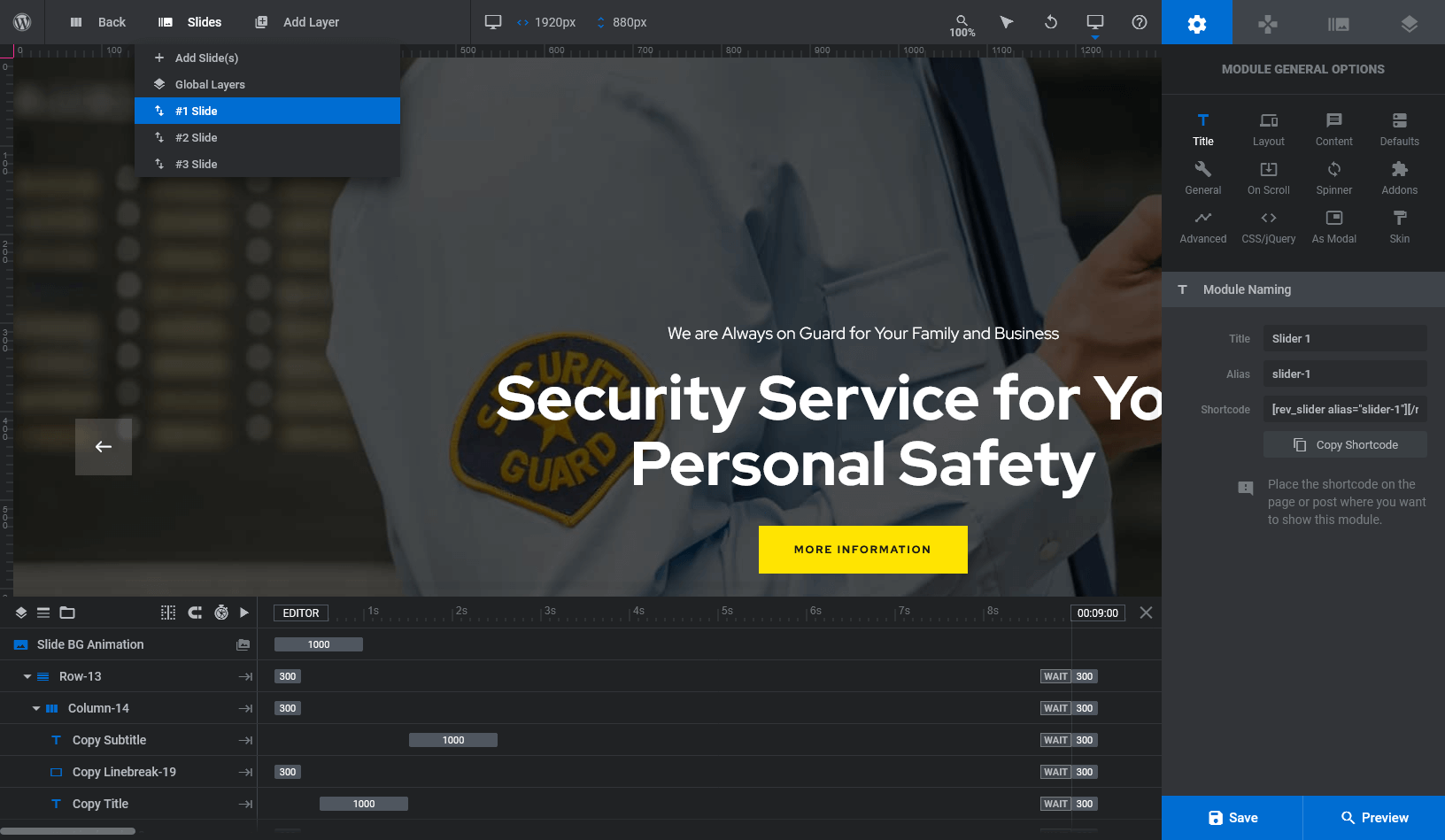
Custom CSS code is specified in Module General Options > CSS/jQuery section.
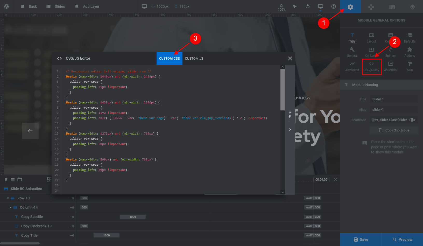
Slider Revolution with images from posts/pages, etc.
The Revolution slider also allows you to use the images from the already created website elements like posts/pages as well as from social profiles streams, etc. This method also preserves adding the needed information (text/buttons) or effects via slider layers. Such images can be specified in Slider Settings. Just open a particular slider, navigate to "Module General Options" tab (gear icon) and set the required parameters in the Content section.
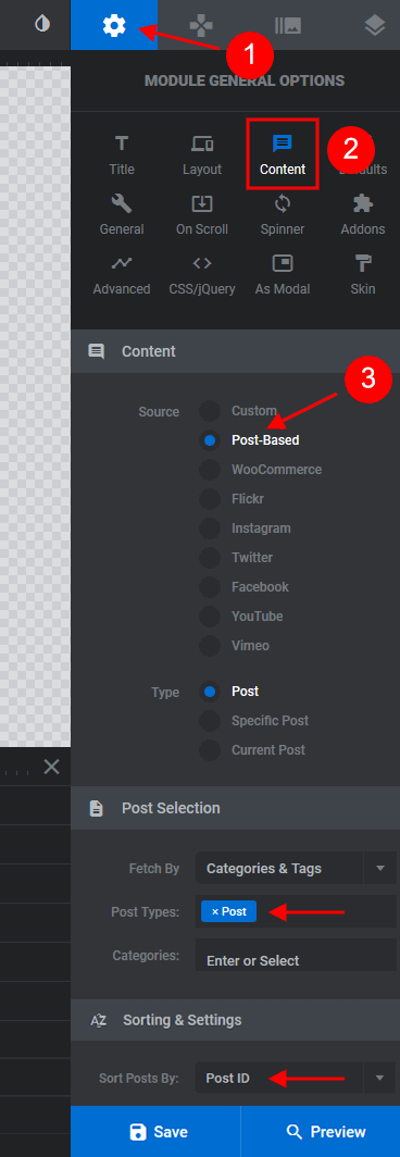
Add Slider Revolution via Elementor Widget
You can add sliders to your page using elements in Elementor Page Builder. Insert either the Revolution Slider widget (WordPress group) or Slider widget (ThemeREX Addons Elements group) to the page and choose slider engine - Slider Revoluion. You can also use a shortcode, like [rev_slider alias="slider-1"][/rev_slider].
Add Slider Revolution via Widgets area
You can also add Slider Revolution via widgets and place the slider not only in the header of the page (might vary, depending on default sidebars locations available for a particular theme).
Please note! In case you do not have a slider set up (but the Revolution Slider plug-in is already installed), you need to create it first and fill with slides by navigating to Slider Revolution tab in the WP Dashboard side menu.
- Navigate to the Appearance > Widgets in the WordPress dashboard menu.
-
Locate the Revolution Slider widget and drag and drop it to any of the available widget sets. Specify the necessary parameters and click on "Save" button. See the example below.
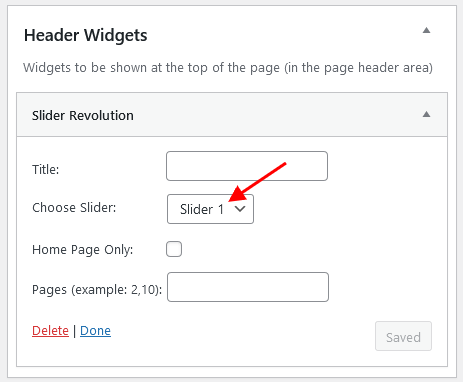
-
Navigate to the page on which you want your slider to appear and enable the necessary widget area in the Theme Options panel. For example, let's activate Slider in the "Header Widgets" section (Theme Options > Header tab).
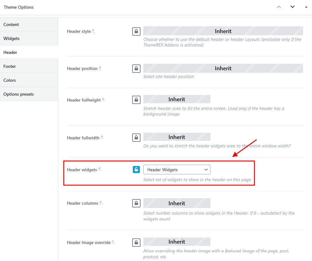
- Once it's finished click "Update" and "Preview Changes" buttons to see how it will look on the front-end.
ThemeREX Updater
This is our self-made plug-in that allows you to update the main theme as well as the bundled plug-ins through the WordPress admin panel. Once any plug-ins or theme updates are available for download, you will receive a corresponding notice in WP Dashboard > Updates. Please view the Theme Update chapter of this documentation file for more information.
TI WooCommerce Wishlist Plugin
This plug-in offers a chance to your web-site visitors to add the products they consider interesting to the wishlist and buy the products later. The customers can share such wishlists through social networks. Sharing the wishlists will bring you new potential customers and enhance the sales. You can also use a shortcode for “Add to wishlist” button and place it anywhere on the page.
Please check the links below for more information about this plug-in:
WooCommerce
WooCommerce is an industry leader e-commerce plug-in for WordPress. Our theme is fully compatible with this great tool, allowing you to turn your website into sales machine in just a few clicks. You simply need to install this plug-in and allow it to create a set of pages to display categories, products etc. Then you need to add a set of products.
We highly encourage you to read the great documentation files WooCommerce offers. These manuals help to create effective and reliable on line stores providing more features than you can imagine. Here is a list of really useful links helping you create and polish your shop.
- Documentation - official plug-in documentation.
- Free and Premium extensions - powerful toolbox bringing more features to your shop.
- iOS app for WooCommerce - this application gives you full control over your shop.
Theme Translation
We recommend using Poedit software for translation-related purposes.
To translate the theme to your language, please follow these steps:
-
Download and install Poedit software.
-
Navigate to the
theme/skins/default/languages/folder and locate.potfile. Copy it to your desktop for editing.
-
Double click on the
.potfile. In the Poedit window click on the "Create New Translation" button, choose the necessary language of the translation from the dropdown list and click "OK."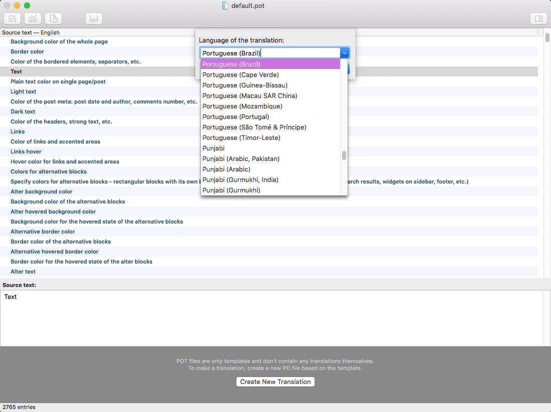
-
Now select the constant text string you need to translate from the "Source text - English" field and type in the necessary translation into the "Translation" field.
You can translate as much as you want, just go through the file and click on each string in "Poedit" and add your translation.
-
Next, you have to save the changes to your
.pofile using the naming convention based on the language code (e.g.ptfor Portuguese) followed by the country code (for instance_BRfor Brazil). To do that click on the "sheet" icon (you can also use hotkeysCMD+Shift+Sin OS X or Win+S in Windows) and type in the name according to the screenshot below.
The first lower-case letters define the language, whereas the second upper-case letter defines the country. In most cases, the language and country are the same, like “de_DE” for Germany.
However, there is a difference for languages like English or Portuguese, which are spoken in several countries natively. In this case, the difference is in the first and second letter pairs; for the UK, the code would be en_GB, whereas the en_US stands for the USA. If you are not familiar with the codes for your native language and country, then visit the GNU website. See Language Codes and Country Codes for the lists of codes.
PLEASE NOTE! If you use the wrong naming convention WordPress can not process your translation.
-
When saving your
.pofile, Poedit automatically creates a new.mofile, with the same naming convention. According to the example above, the file would be called pt_BR.mo.
-
Upload the
.poand.mofiles you just created to the.../languagesfolder. Make sure these files are in the same directory as thedefault.potone. -
Our theme is using ThemeREX Addons plug-in, so some translation should be done in language files of this plug-in in the
.../wp-content/plugins/trx_addons/languagesdirectory. There is also atrx_addons.potfile in this directory.
Generate the.poand.mofiles according to your language. See the file names on the example below:
trx_addons-pt_BR.po,trx_addons-pt_BR.mo.
Make sure that the language of your files is the same as in your WordPress admin panel > Settings > General Settings section.
For more information on how to use Poedit, please check the following resources:
Sources and Credits
In this section you can find additional information regarding fonts, clipart, .XD files used in this theme.
-
Fonts:
-
Default Skin: "'Open Sans', 'sans-serif'"; "'Red Hat Display', 'sans-serif'"; "'Lora', 'sans-serif'";
-
You can also check the
proguards/skins/default/skin-setup.phpfile for more detailed information on this matter. -
Please note! To manage fonts quantity available for upload edit
'max_load_fonts' => 5variable in thetheme-specific/theme.setup.phpfile.
-
Default Skin: "'Open Sans', 'sans-serif'"; "'Red Hat Display', 'sans-serif'"; "'Lora', 'sans-serif'";
- Icons:
- Fontello icons set. You can expand the list of available icons by adding new ones from the fontello website. In order to add new icons proceed to
wp-content/themes/your-theme/skins/default/css/font-icons/config.json. Watch this video guide for more information.
Please note, the location ofconfig.jsonfile and website page builder with available set of widgets/shortcodes in your theme may vary from the video provided! -
You can specify the type of icons (font icons/images/SVG) you want to use in the
theme-specific/theme.setup.phpfile.
- Fontello icons set. You can expand the list of available icons by adding new ones from the fontello website. In order to add new icons proceed to
-
Clipart:
- Images were taken from https://unsplash.com/, https://www.shutterstock.com/ and https://www.pexels.com/.
-
IMPORTANT!
Please be aware that all clipart images included in this theme are copyrighted to their respective owners and are not available for download with this theme. Clipart images can not be used without express permission from the owner and/or need to be purchased separately.
Nevertheless, you can request the image IDs/references by contacting our support department.
-
XD Files:
IMPORTANT! Please note that we do not include theme related.XD filesinto the theme package, because it might significantly increase the size of a downloadable archive. In case you need these files you can always request them by contacting our support department as well.
Page Speed Optimization
This chapter is for those who whould like to speed up their websites and care about the page loading speed. There are a lot of different ways to make your website work faster, but we will focus on caching plug-ins we have used on our demos, though they are not provided with the theme.
A lot of users access the website at the same time. This makes the server work slowly and takes more time to load the web page for each user. Caching is the way to store the current version of your web page on the server and prevent from sending requests to the server for each user each time.
Below you can find short description of the caching plug-in we have used on our demo as well as its main settings. Please feel free to play around with the plug-in's settings yourself in order to receive the better result.
WP-Optimize - Clean, Compress, Cache
WP-Optimize is all-in-one WordPress performance plug-in (not provided with the theme) that is responsible for cleaning your database, compressing images and caching your website.
Please check the links below for more information about this plug-in:
PLEASE NOTE! There is no unique recommended configuration of the plug-in's settings, suitable for every website. Please find out your own best combination of settings.
Once the plug-in is active, the WP-Optimize section will appear in your WordPress Dashboard.
Here are some main settings from our demo. Treat the screenshots below as examples only!
Database
Images
Cache
Settings
Thank you for purchasing our theme. We are happy that you are one of our customers.
If you come up with any theme-related questions that are beyond the scope of this help file, feel free to contact us. We will respond as soon as possible (within 24 – 48 hours, usually faster). We are open from 10am to 7pm (CET), from Monday till Friday.